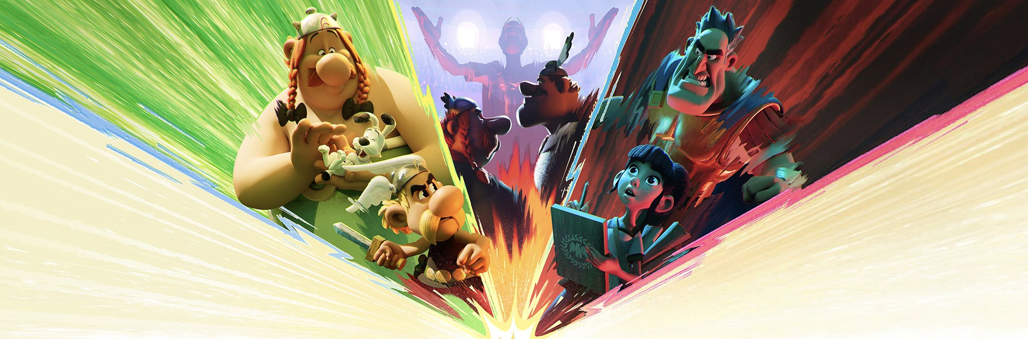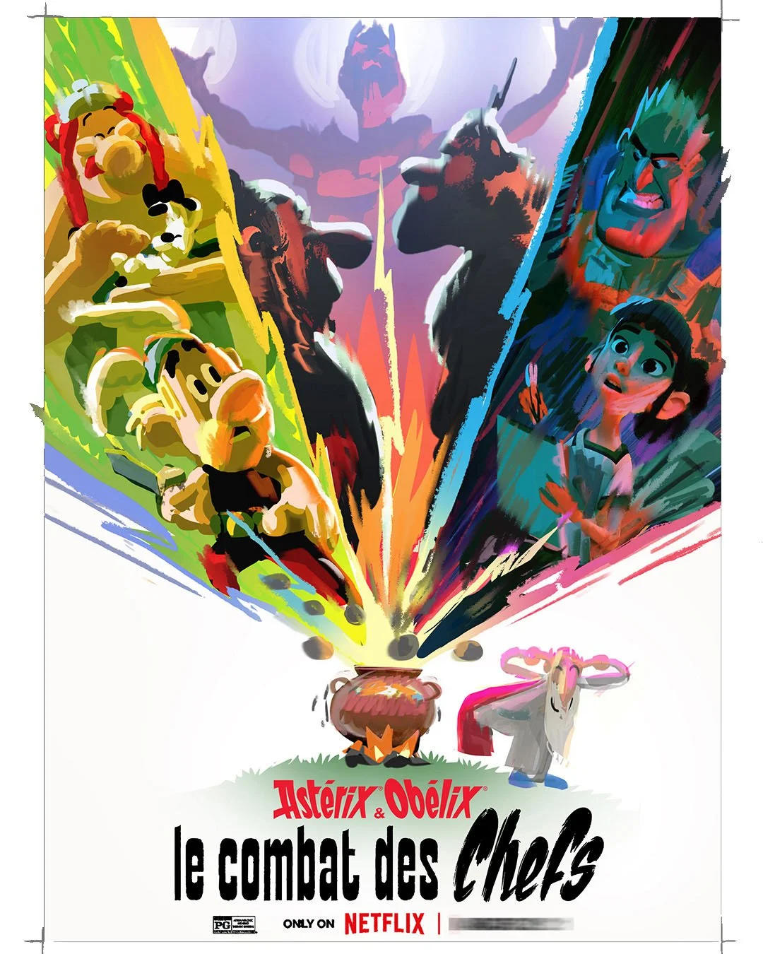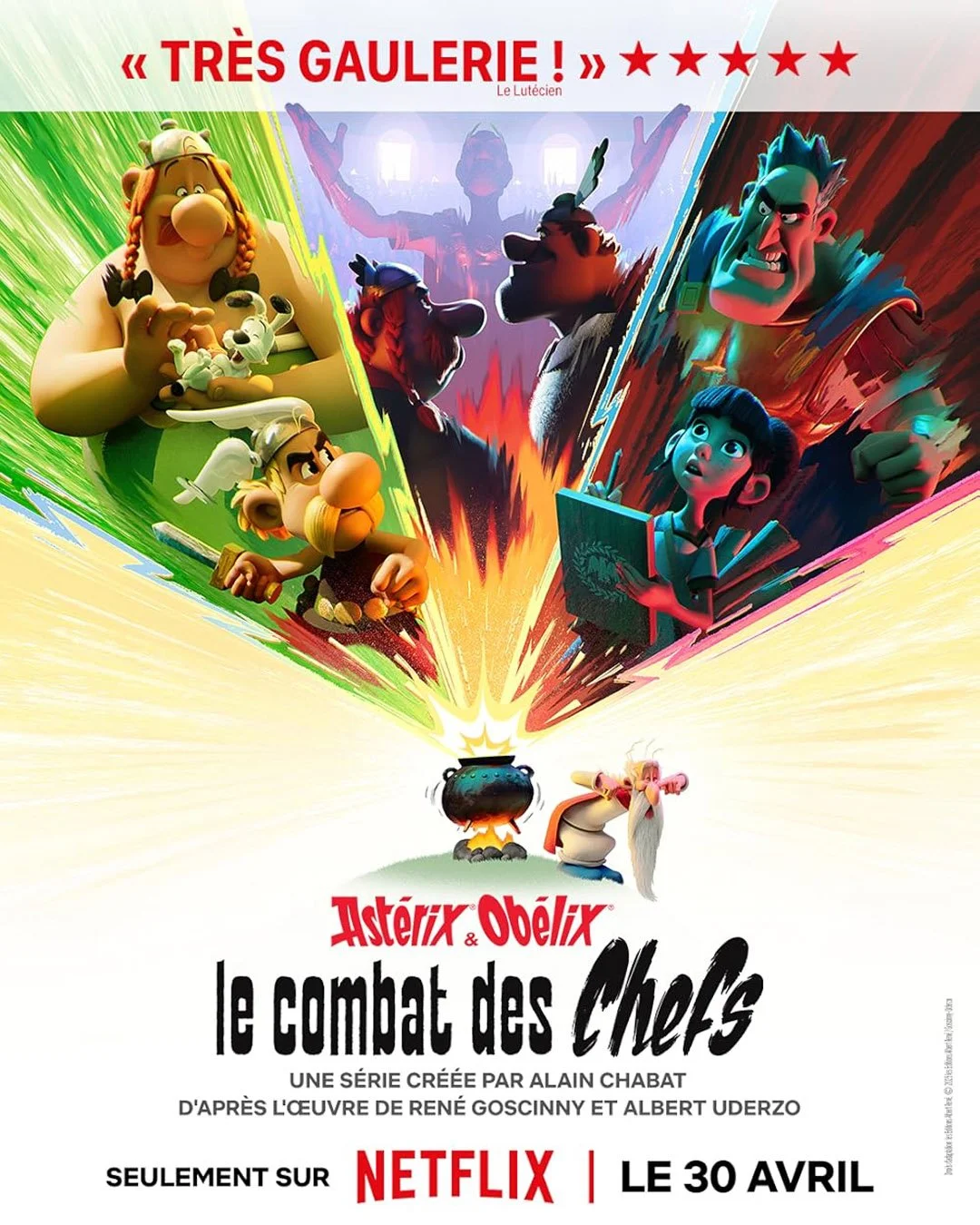
Asterix & Obelix: The Big Fight
Mini Series - Production Designer - NETFLIX / TAT
I worked as Production Designer on the five-episode miniseries from 2022 to 2025. Working closely with directors Alain Chabat & Fabrice Joubert, I defined the visual identity of the series, led the art department at TAT in Toulouse, and oversaw the CGI pipeline: from modelling, surfacing, FX, lighting, and compositing to final colour grading.
Throughout production, I produced design sketches, colour keys, and visual briefs, and provided feedback, paint-overs and approvals across departments.
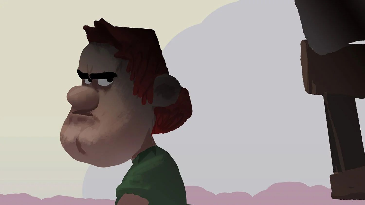
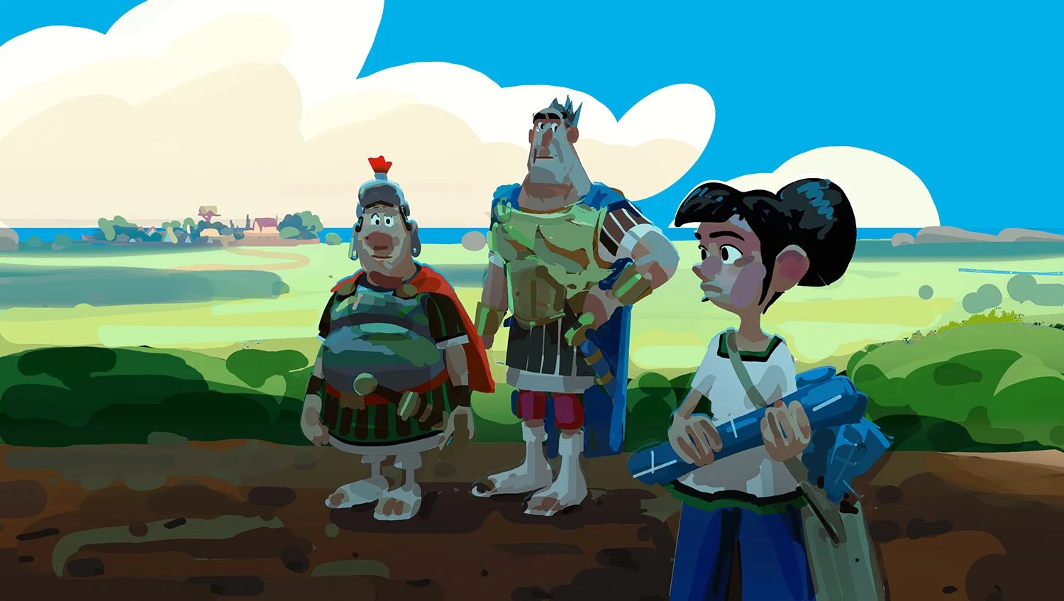
CHARACTERS
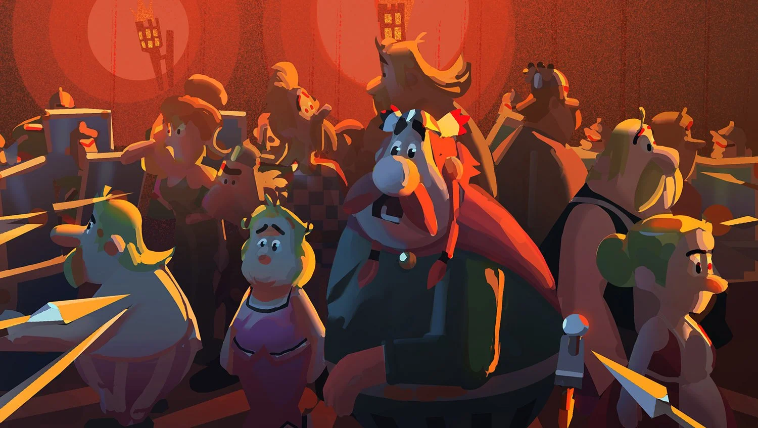
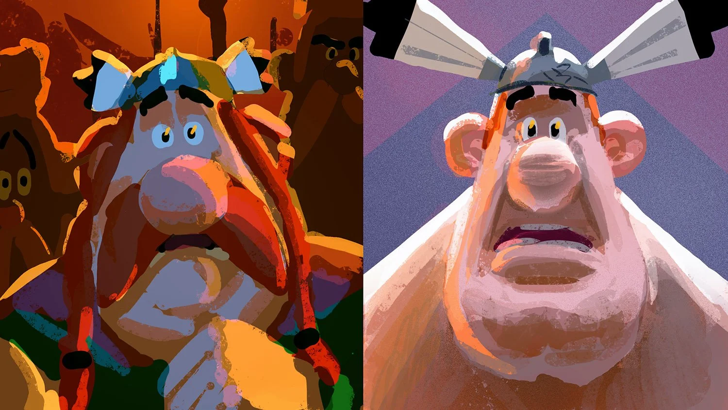
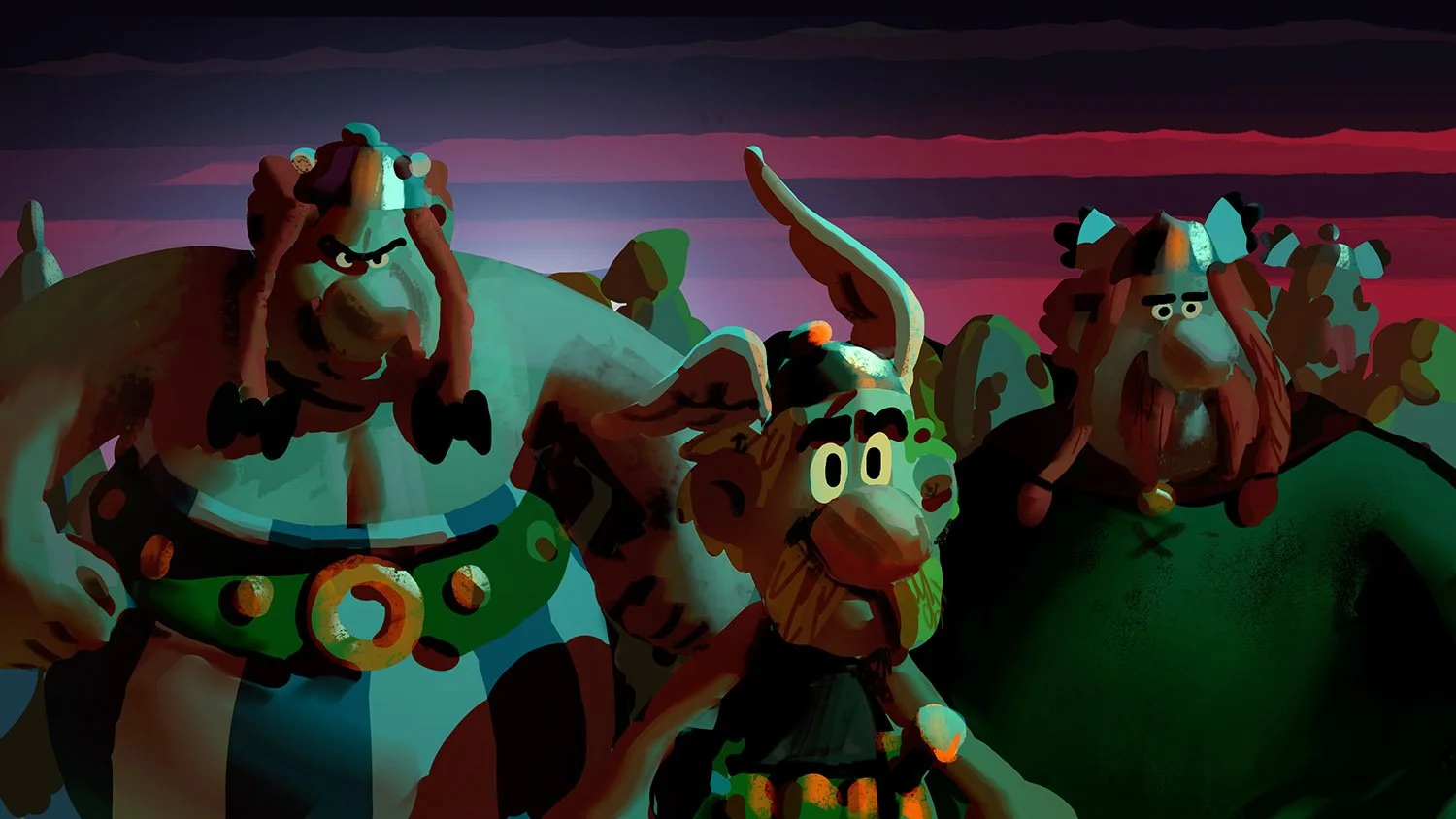
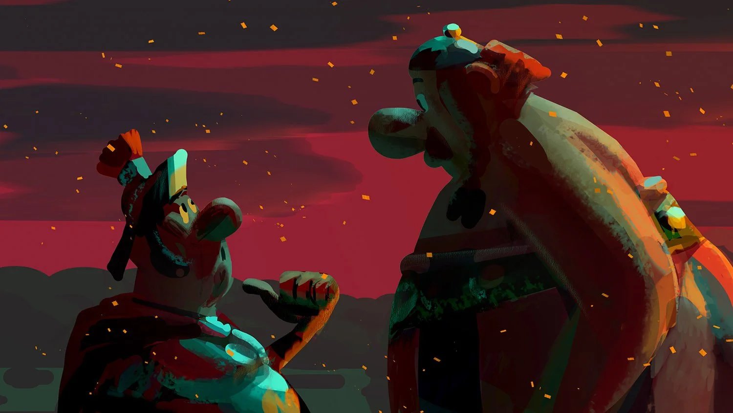
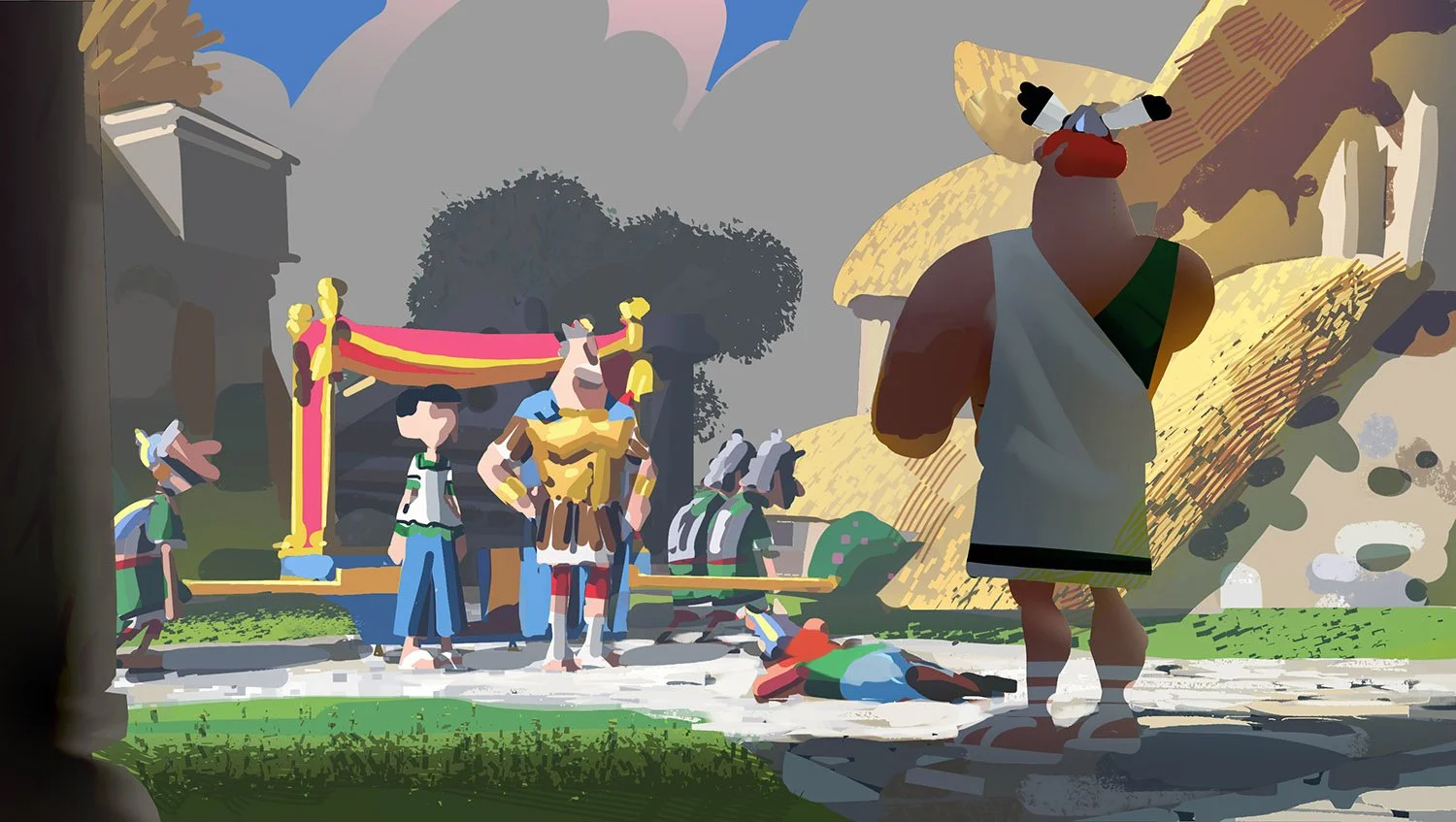
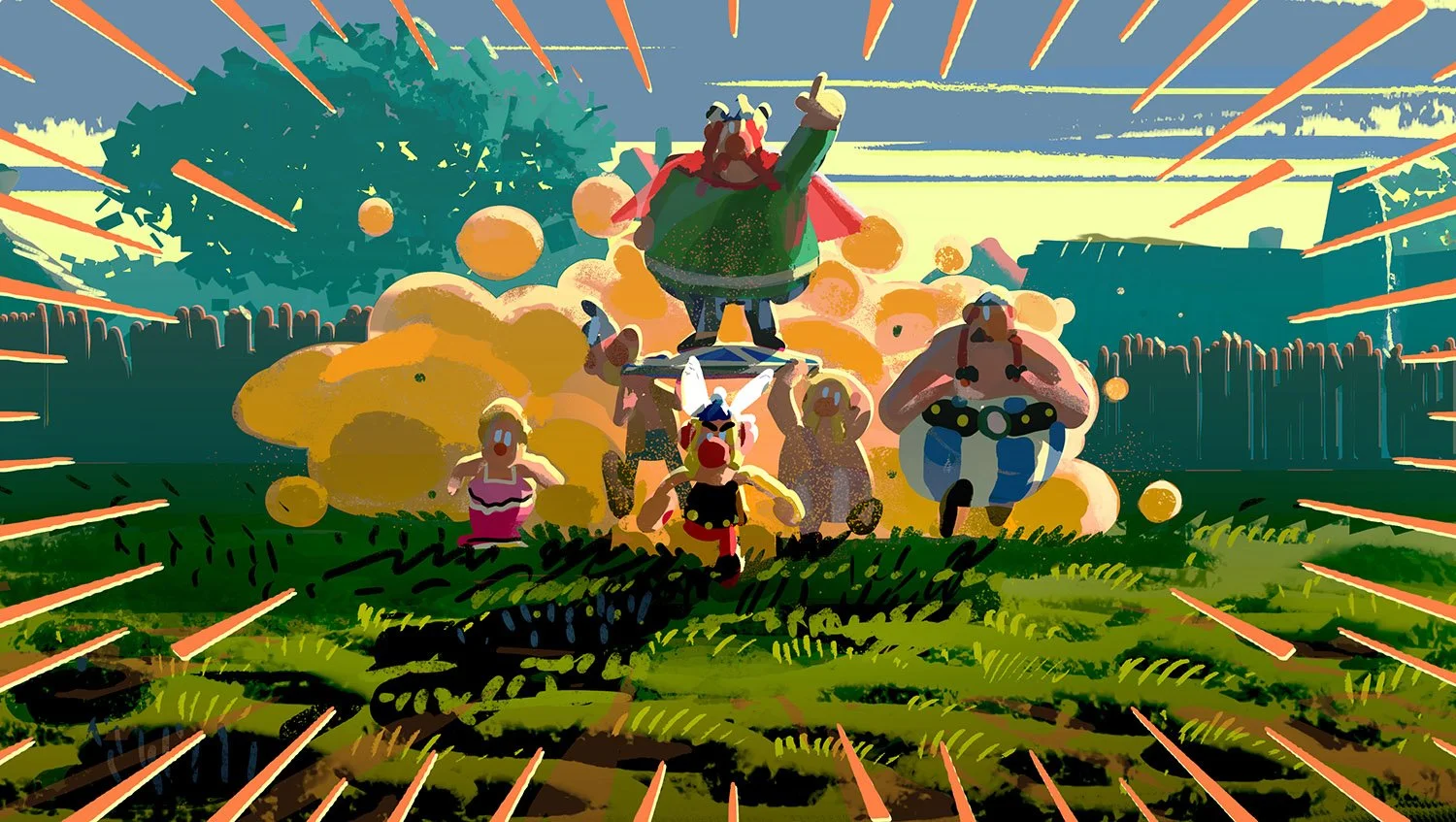
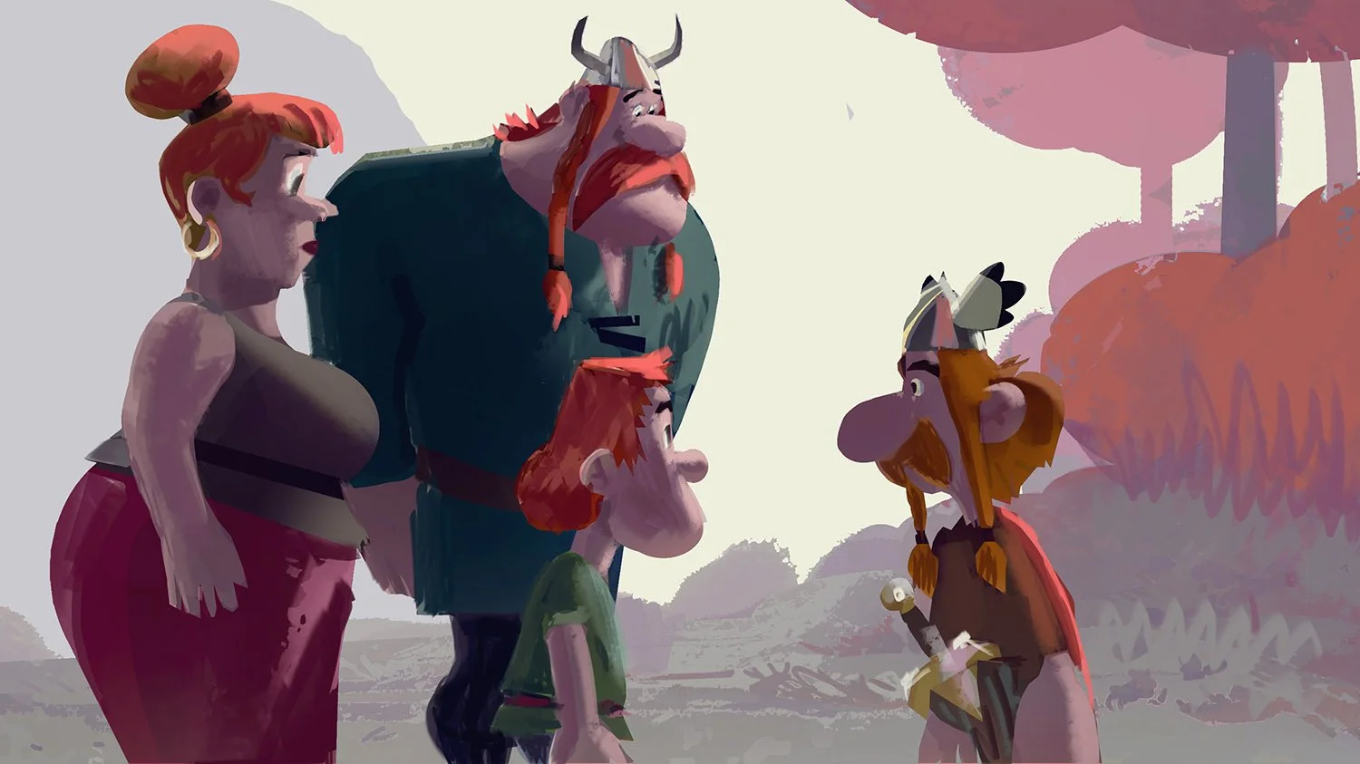
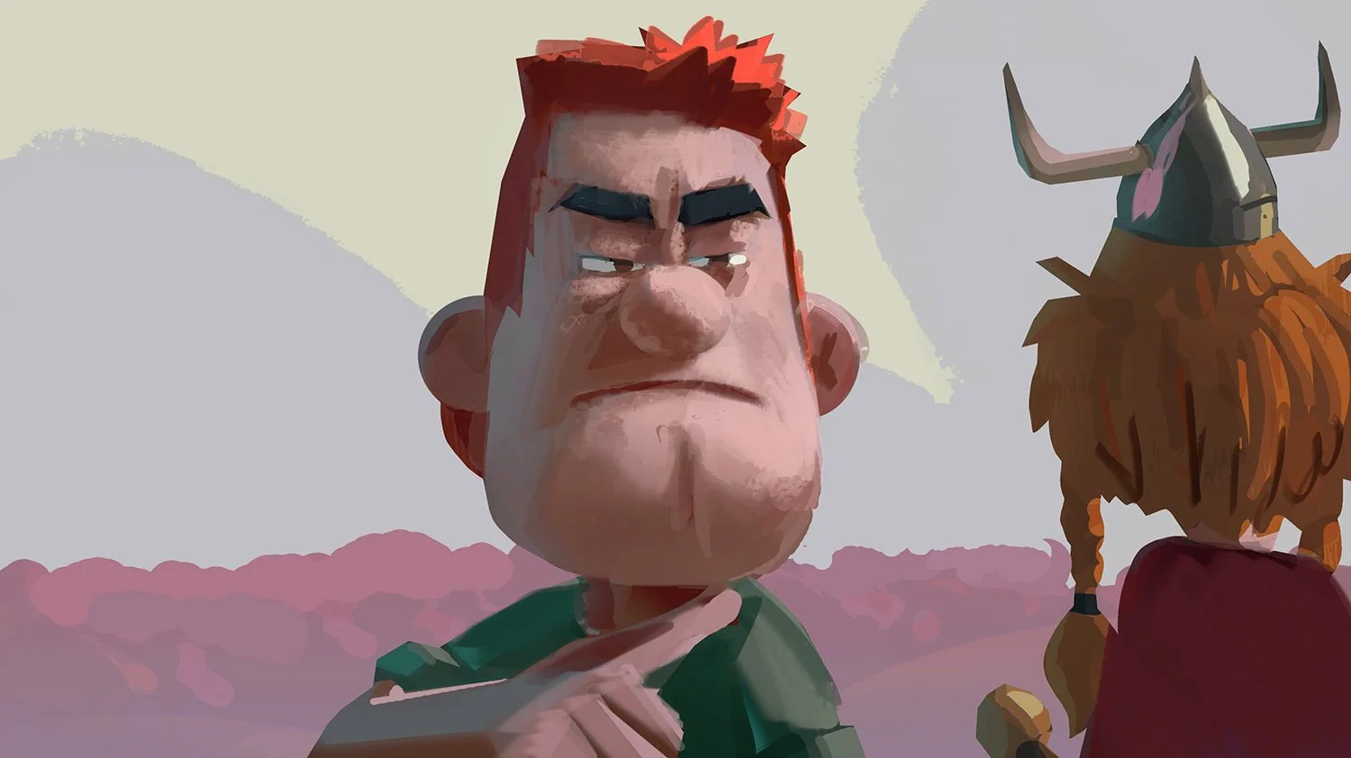
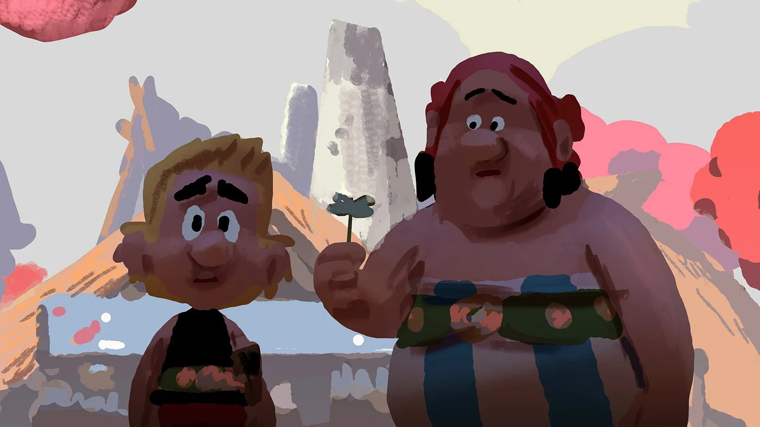
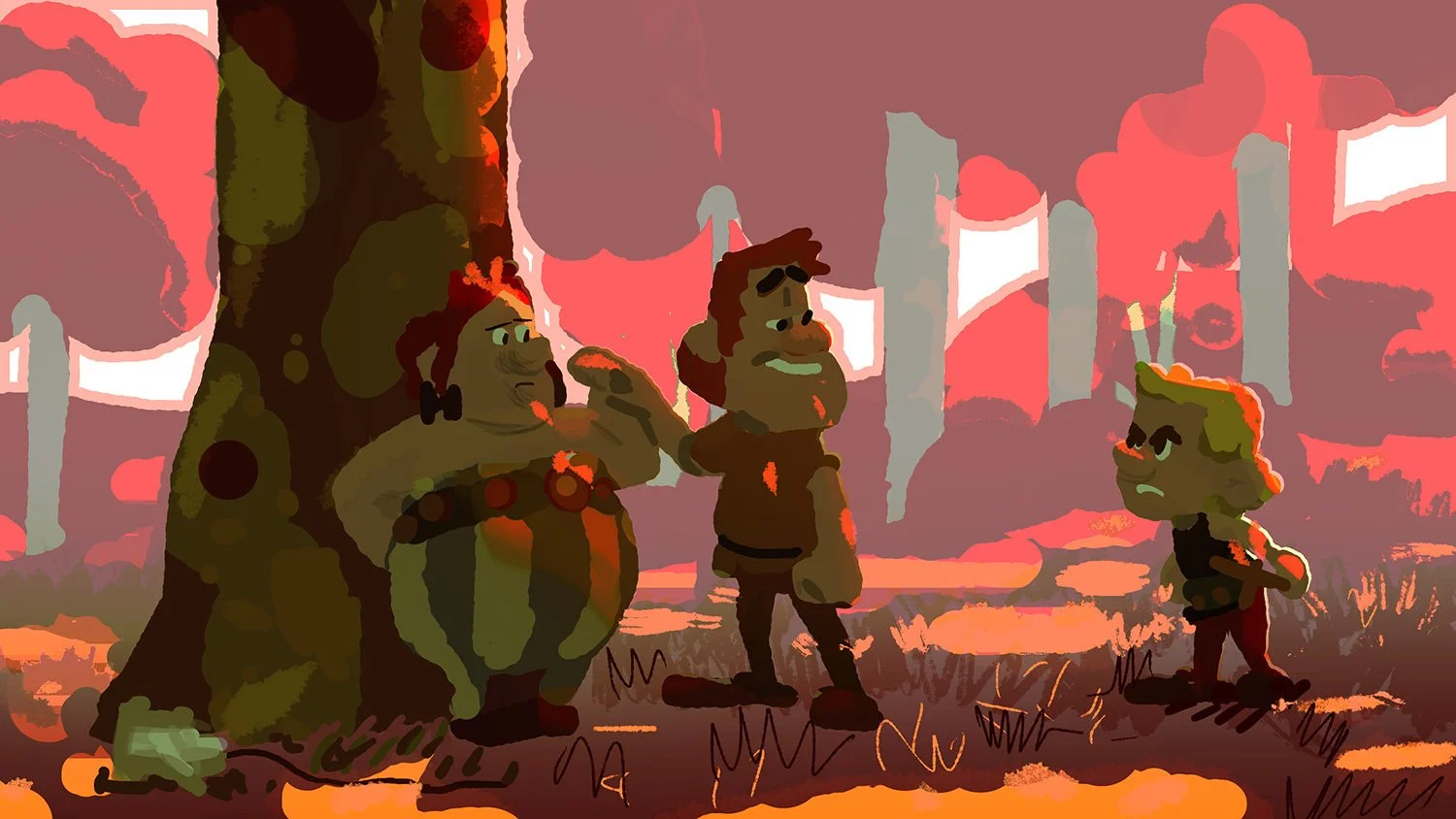
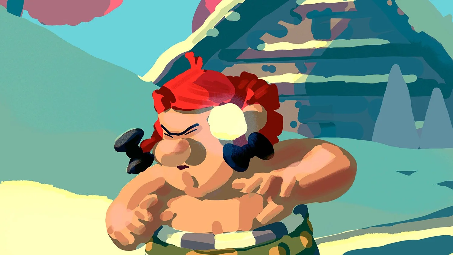
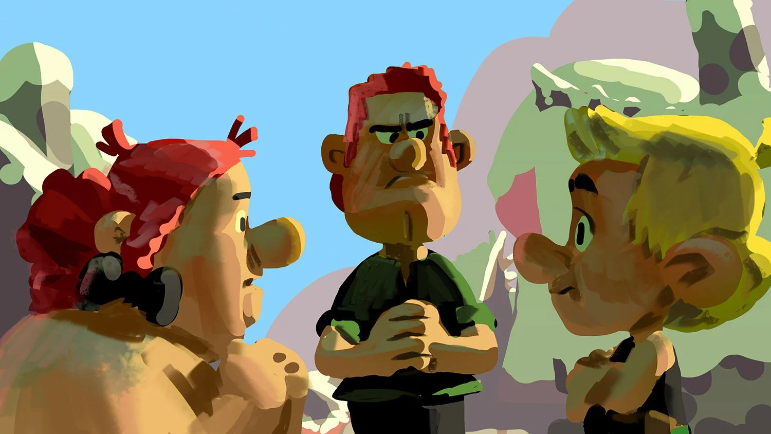
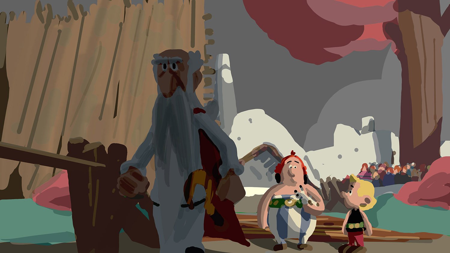
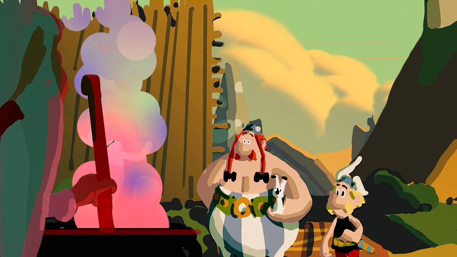
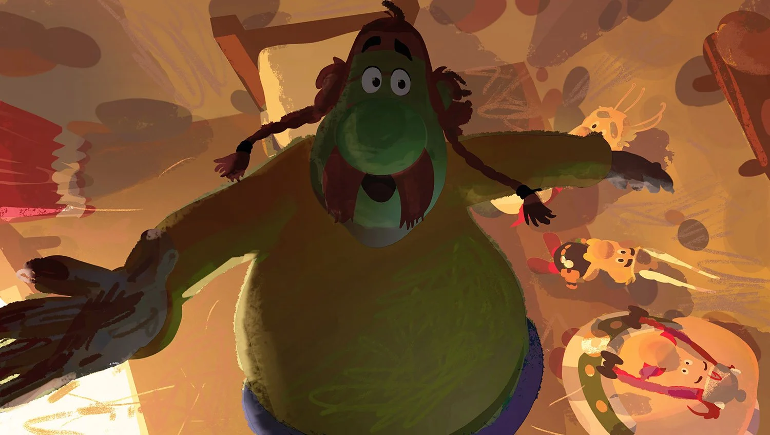
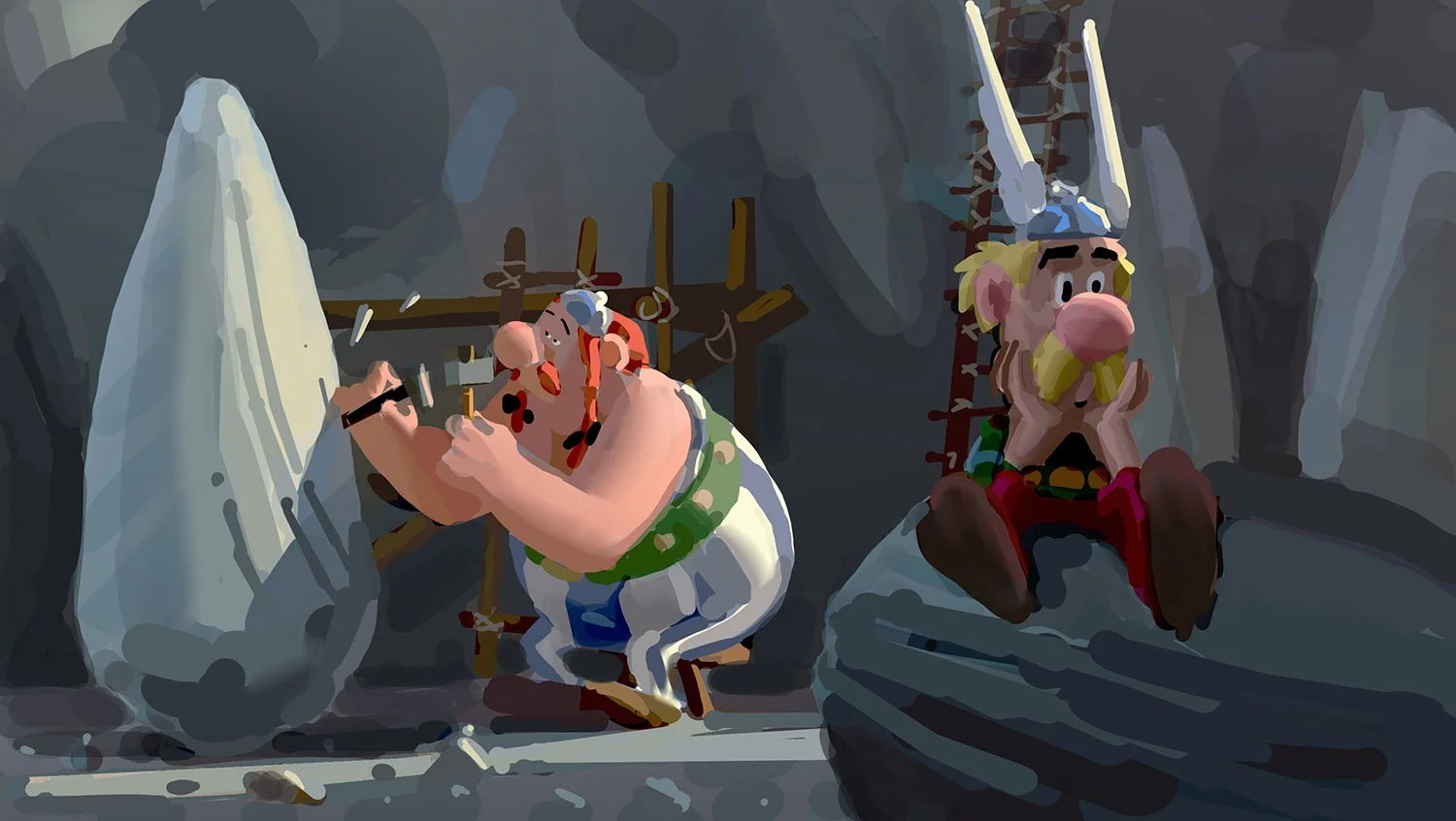
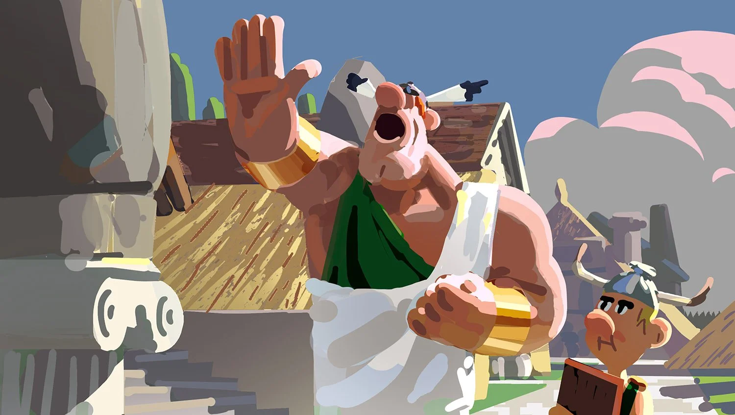
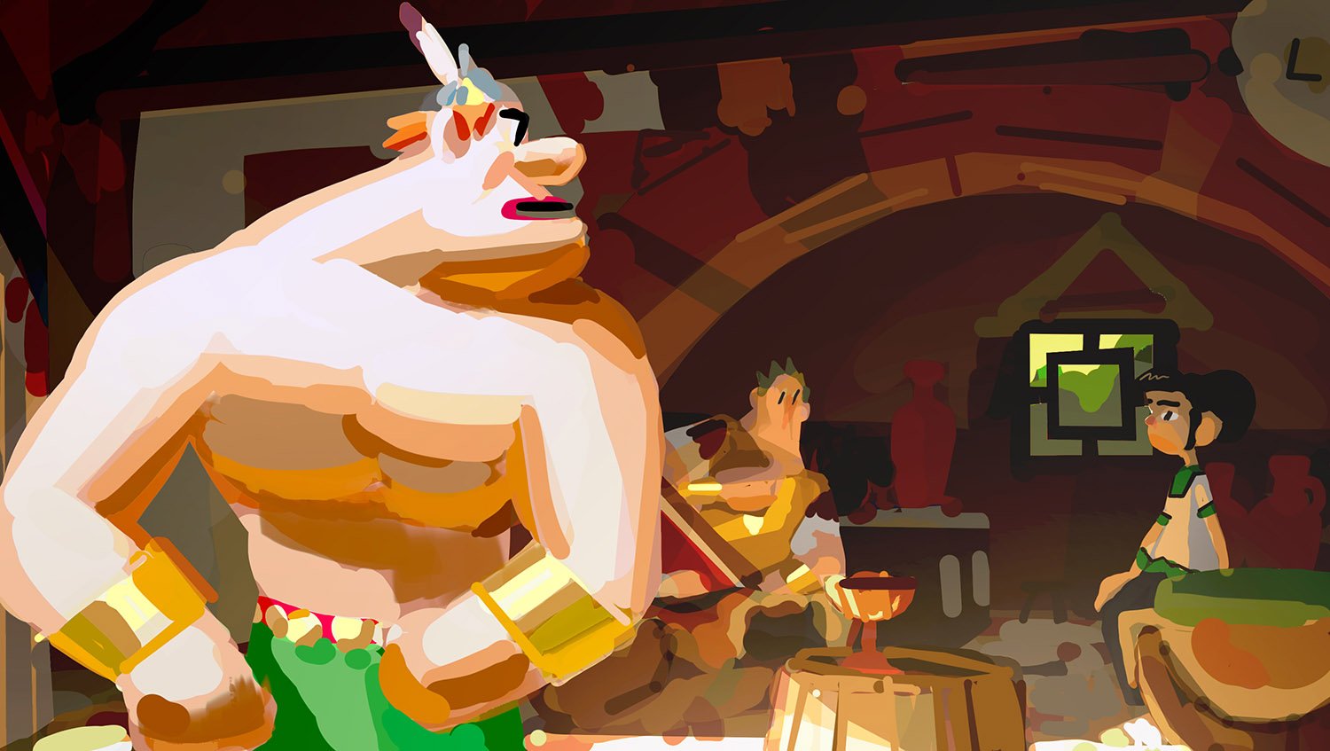
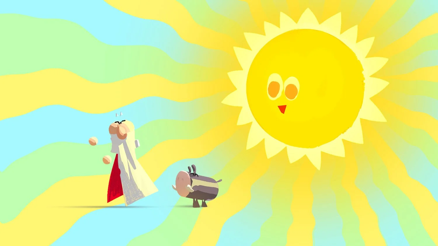
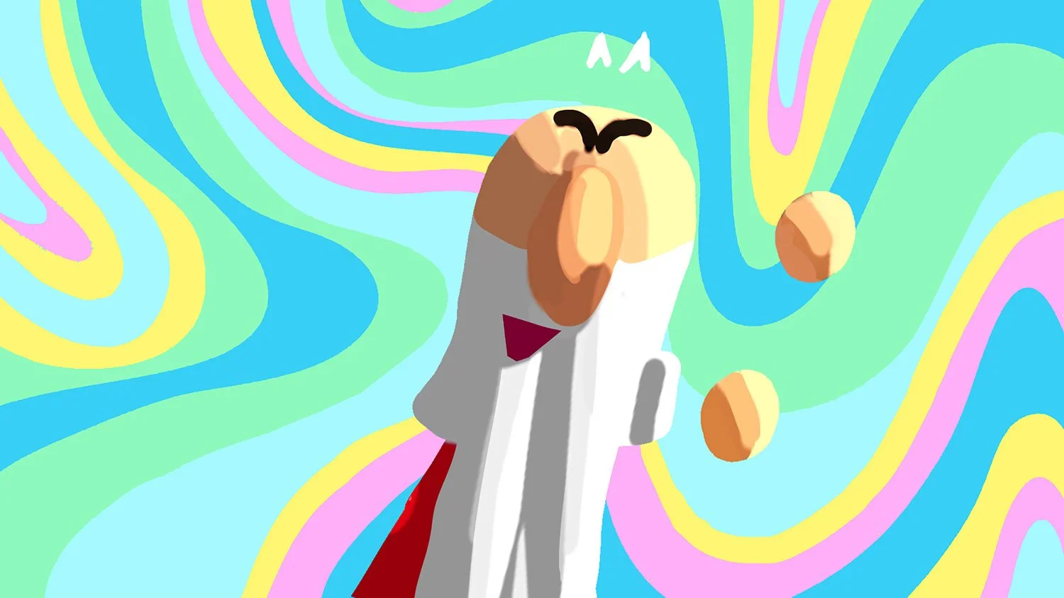
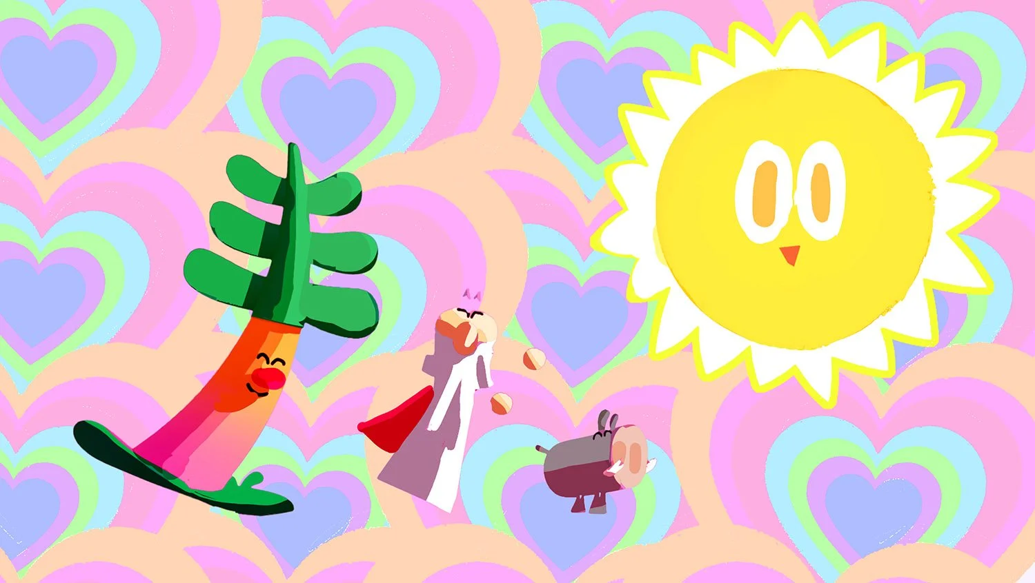
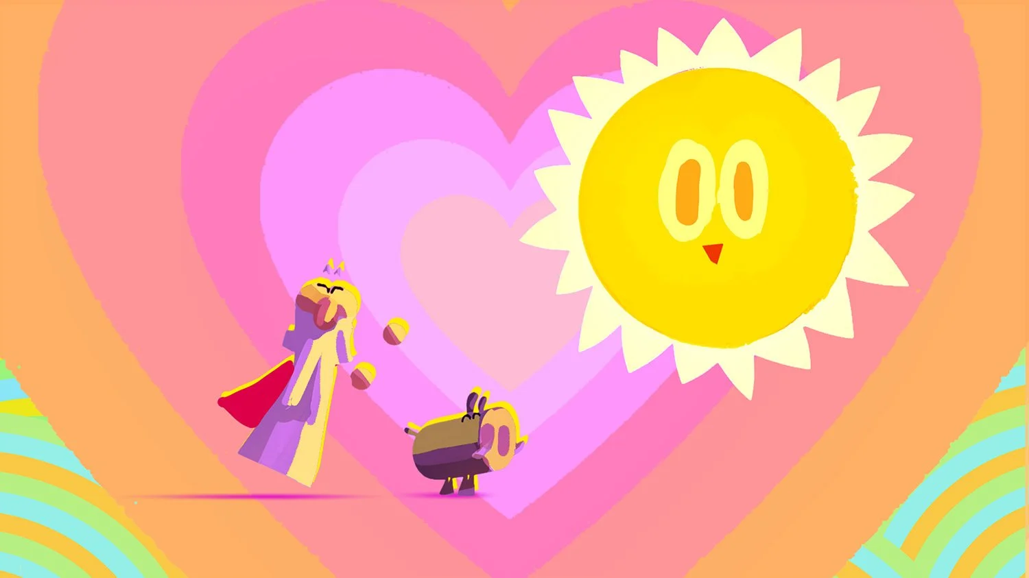
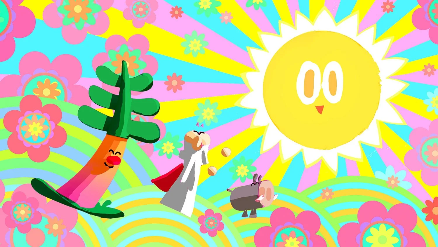
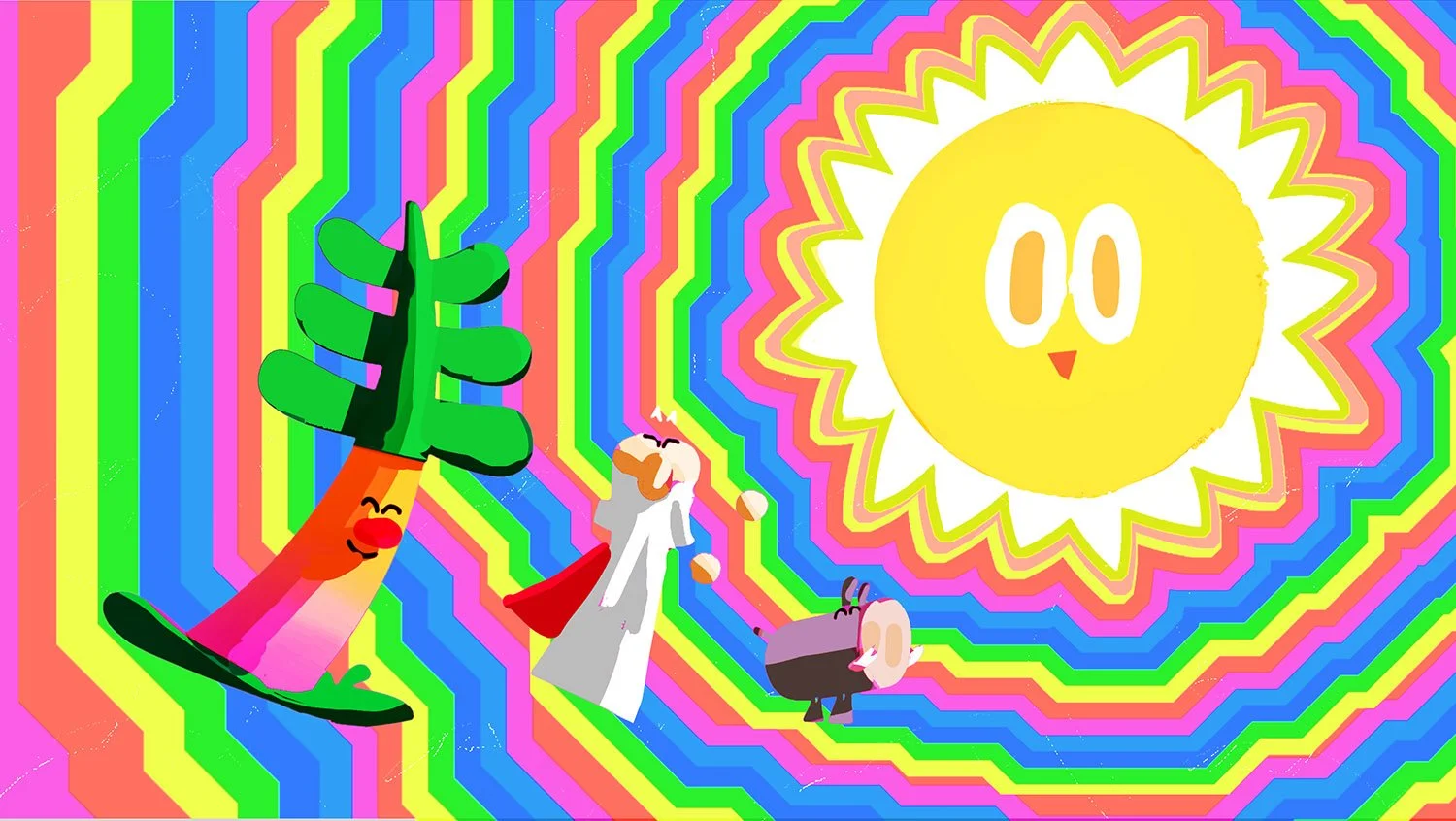
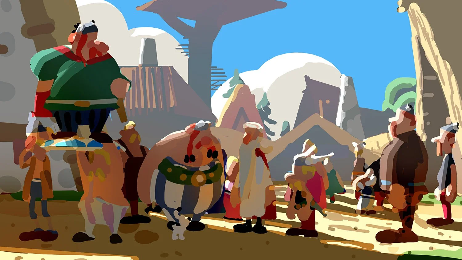
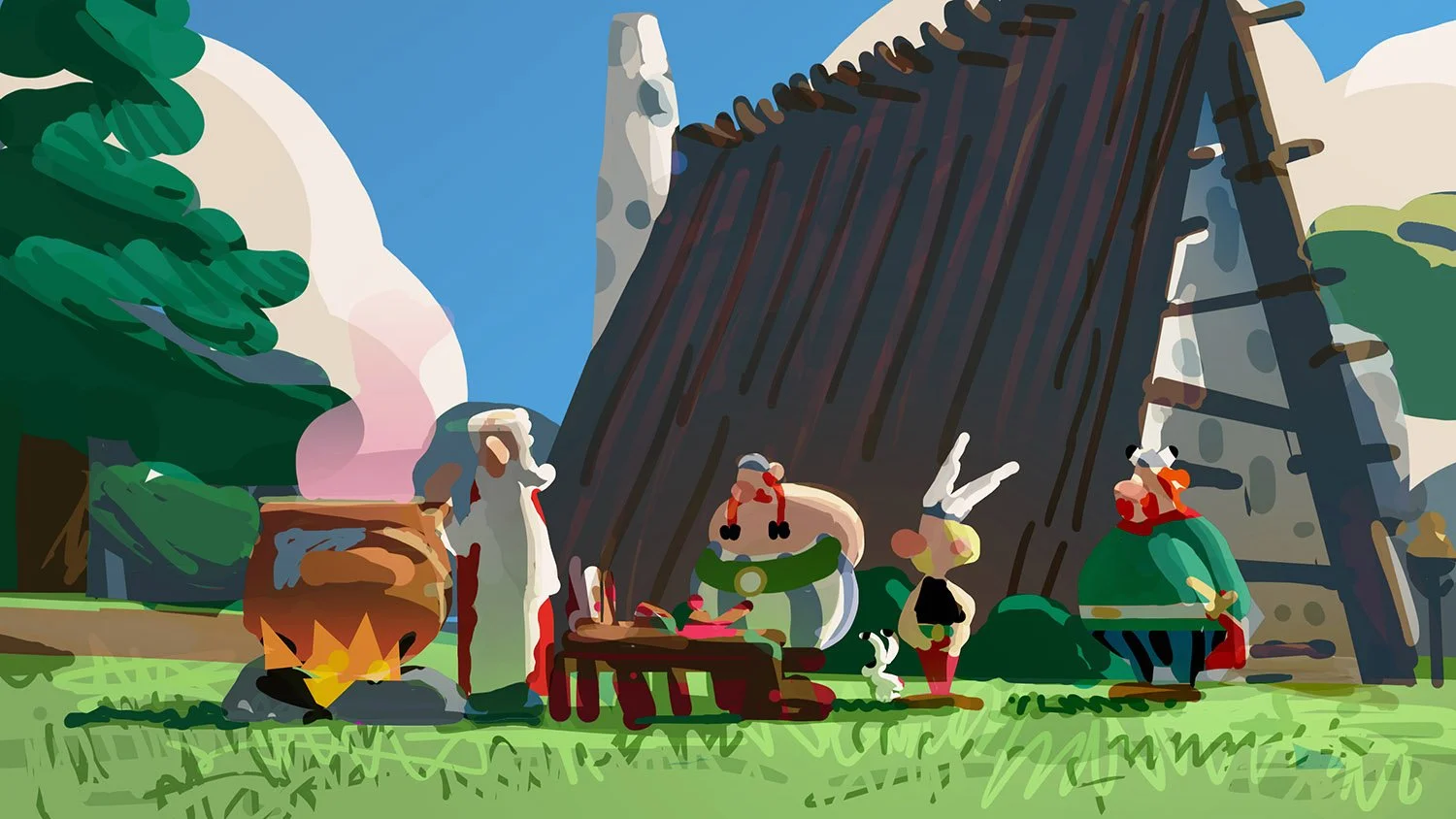
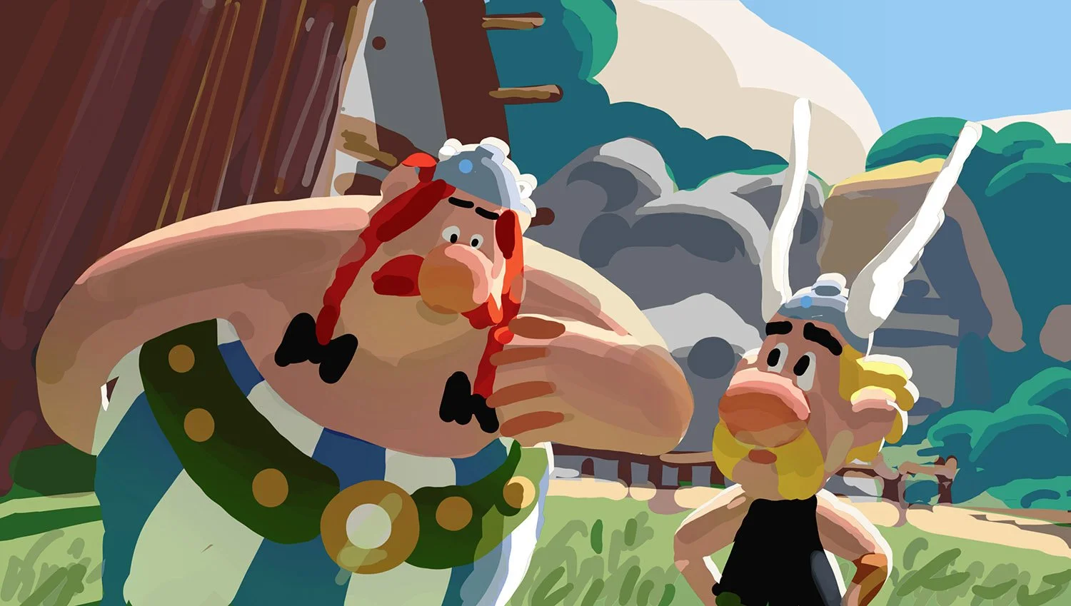
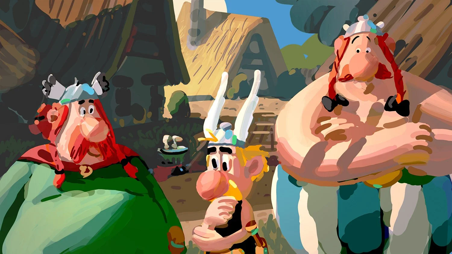
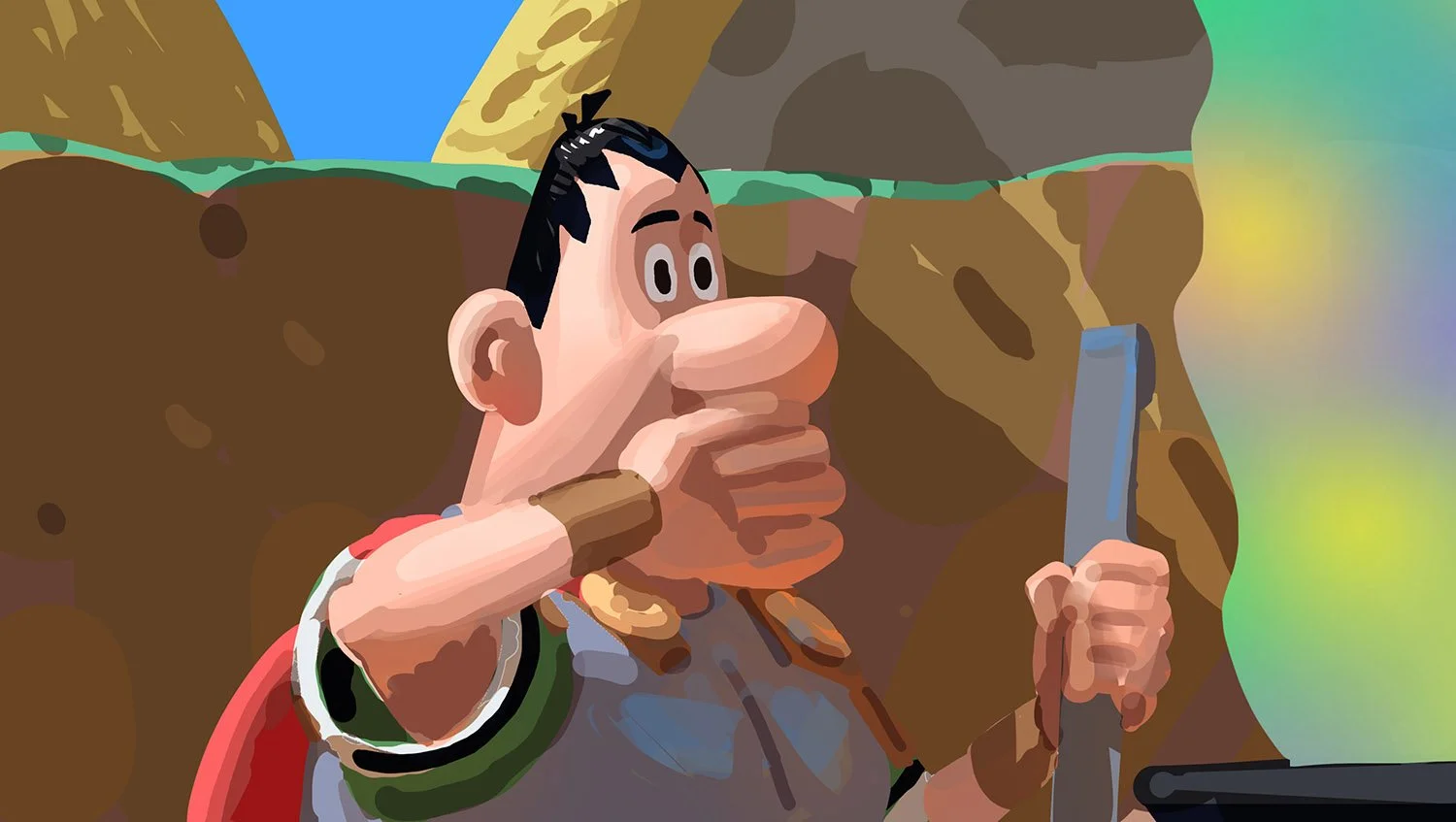
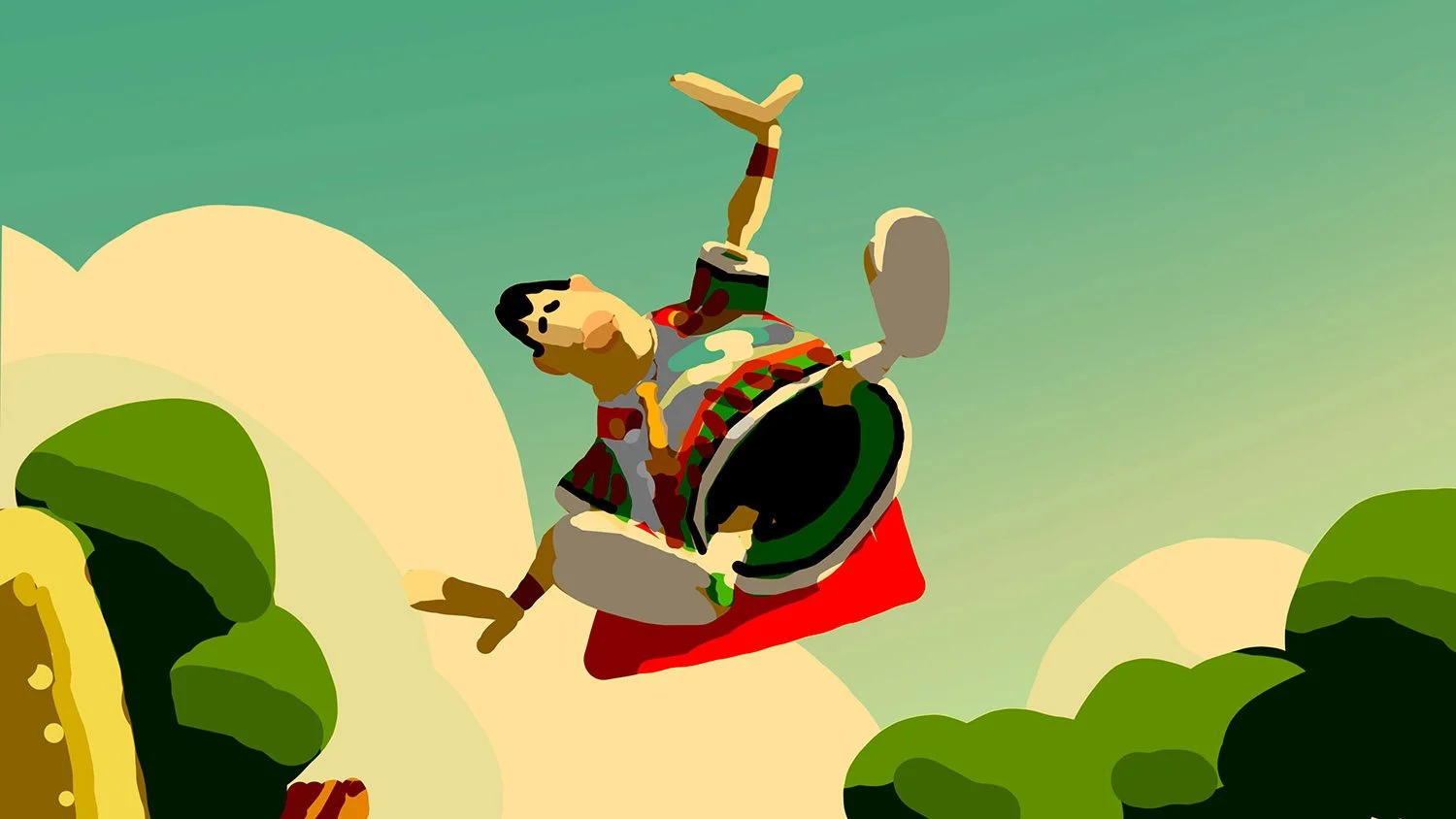
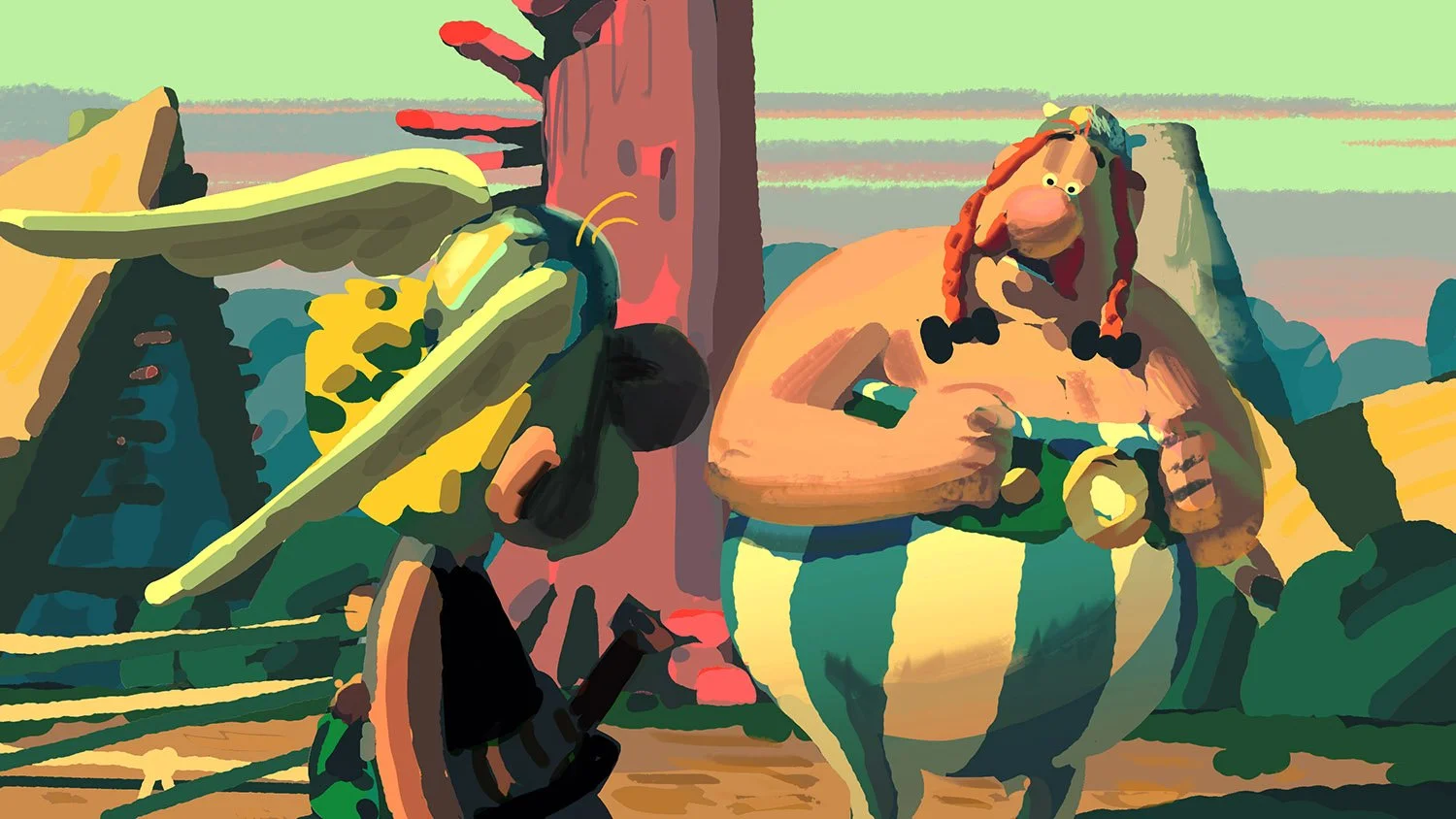
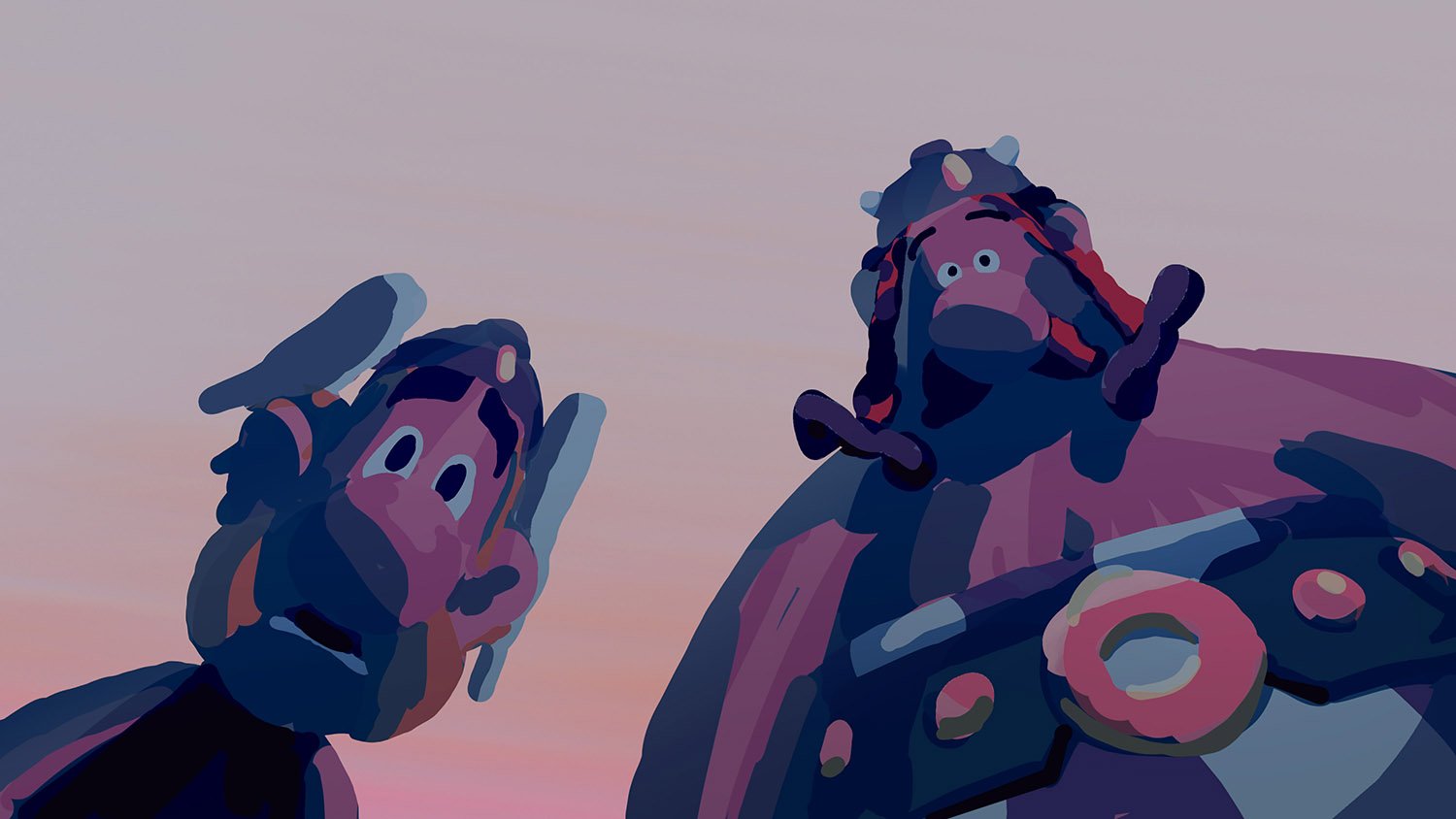
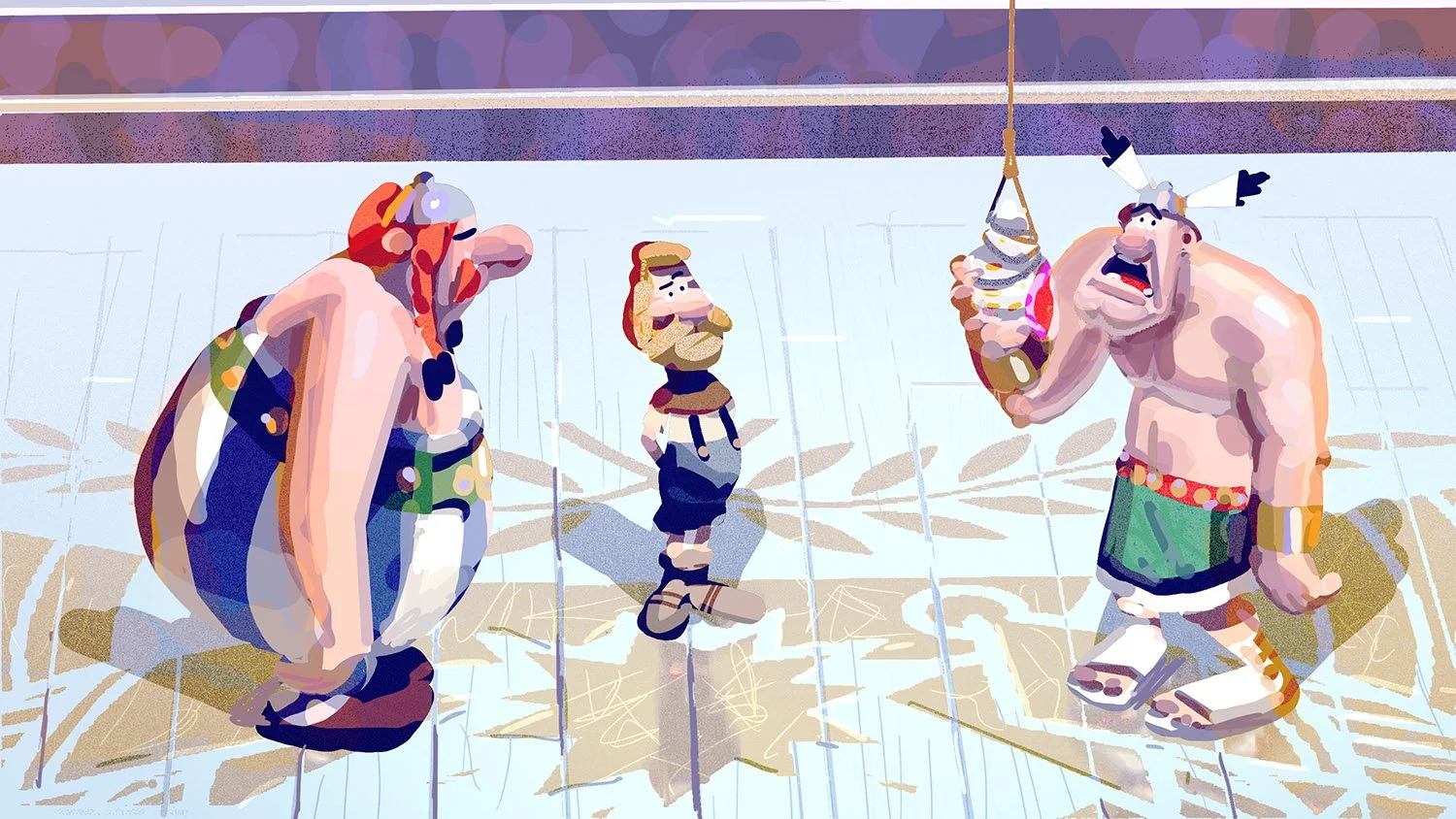
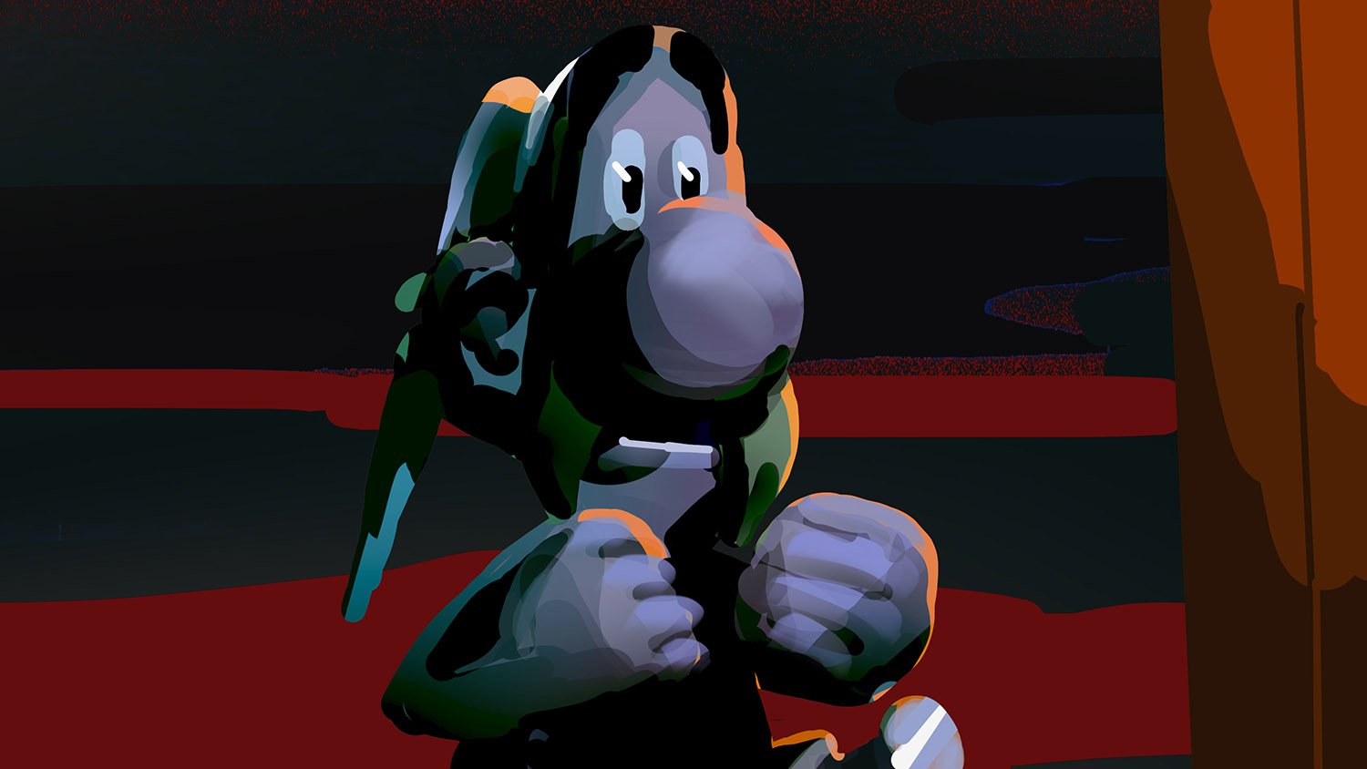
We stayed as faithful as possible to the original comic book’s shape language, preserving its iconic silhouettes and proportions created by Albert Uderzo.
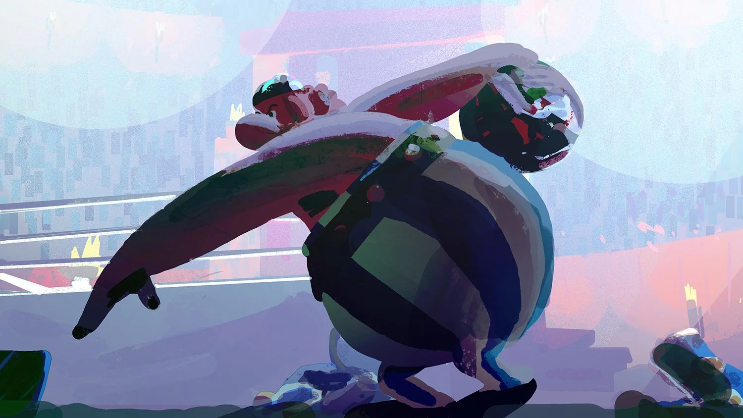
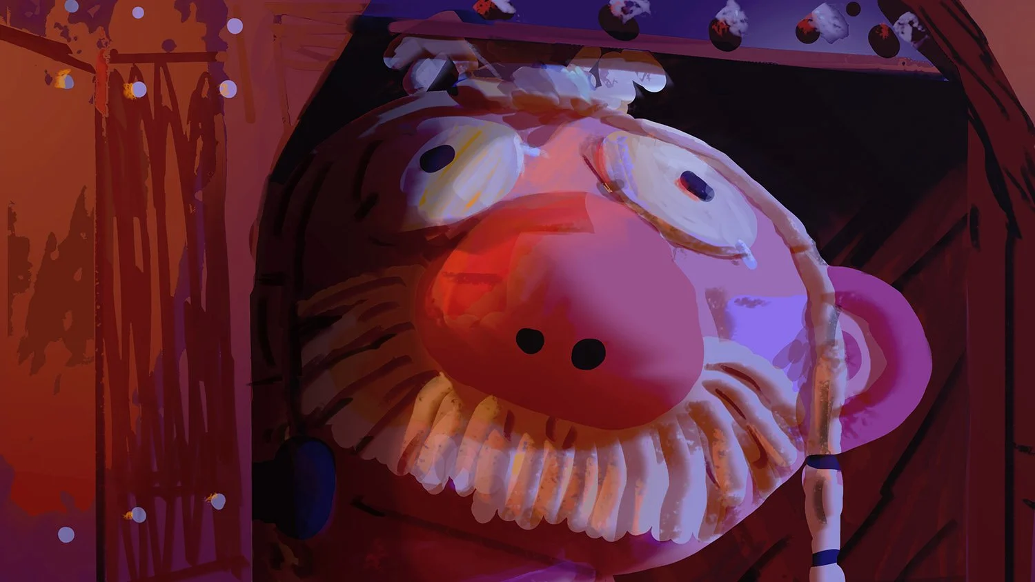
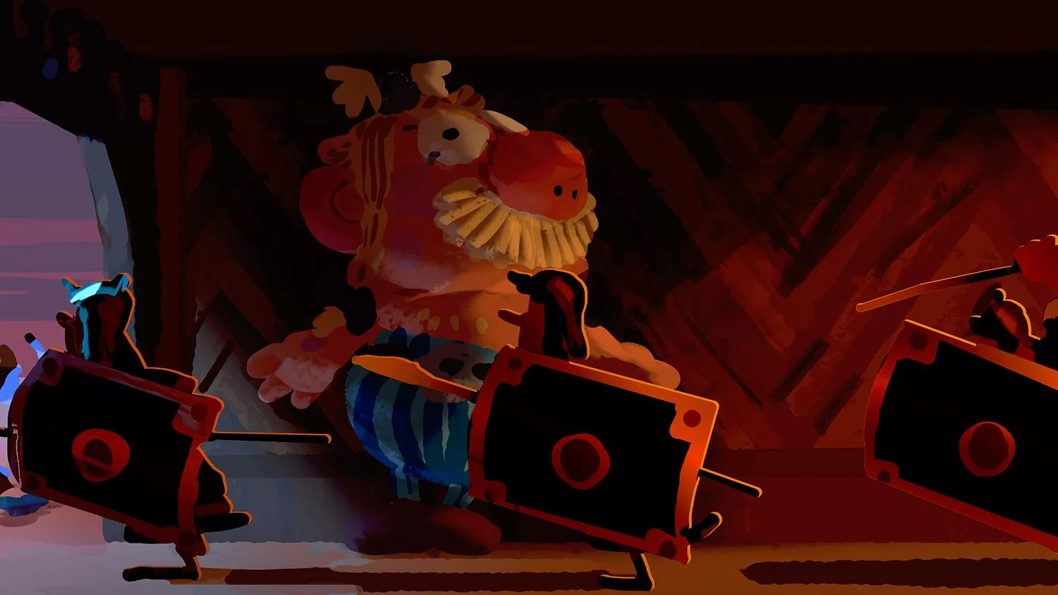
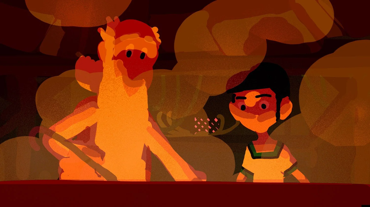
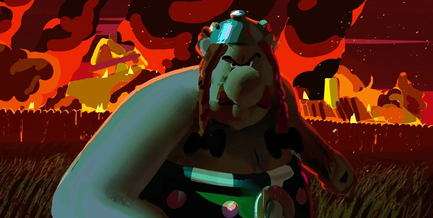
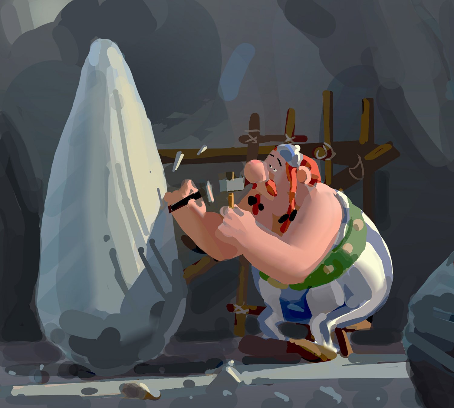
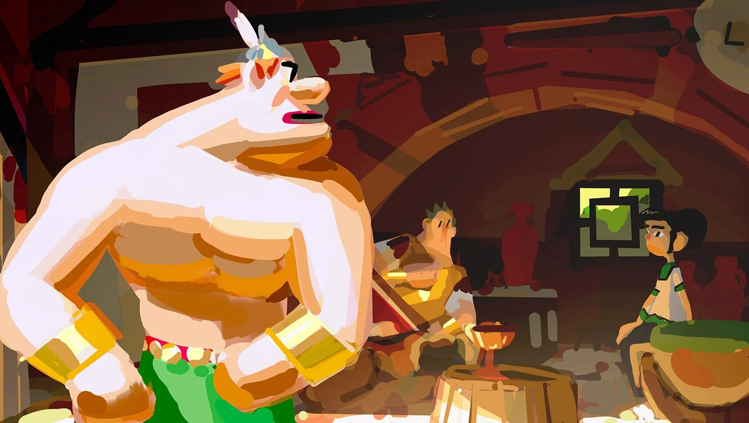
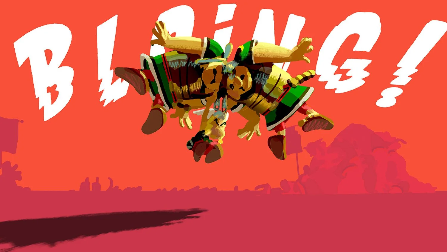
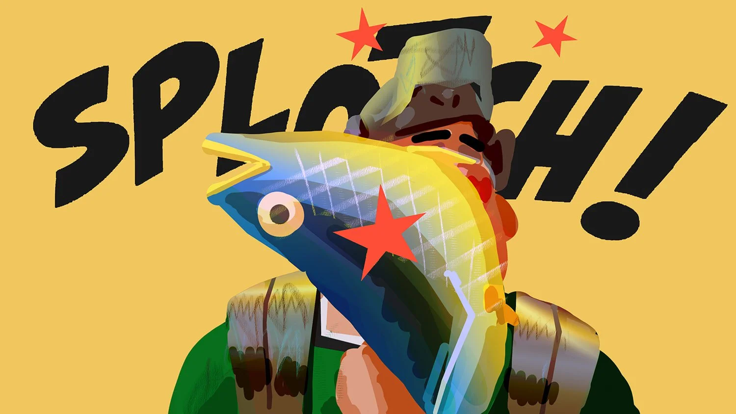
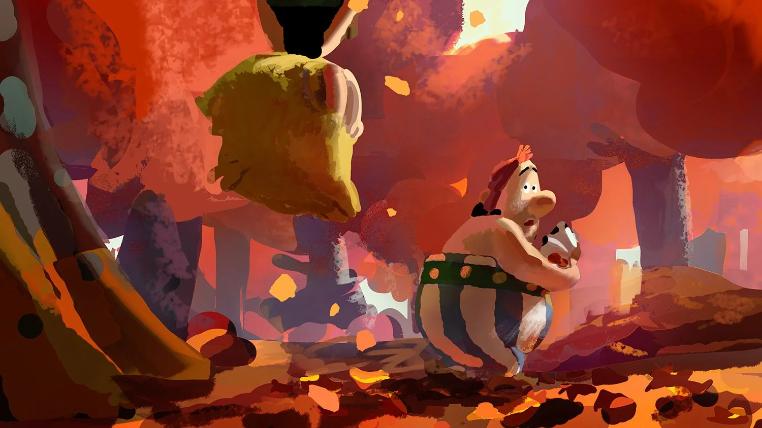
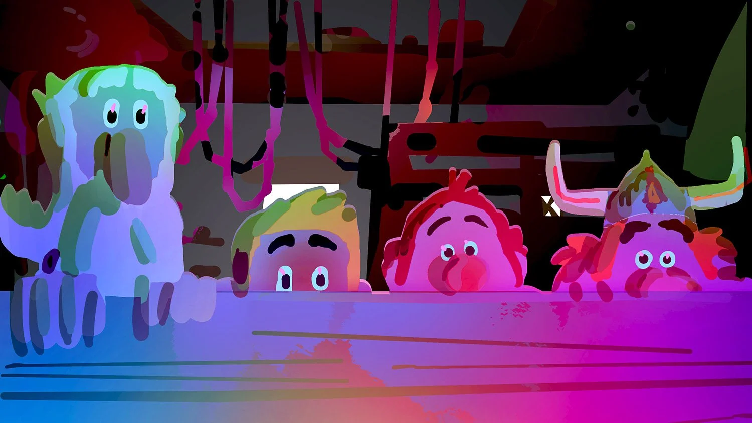
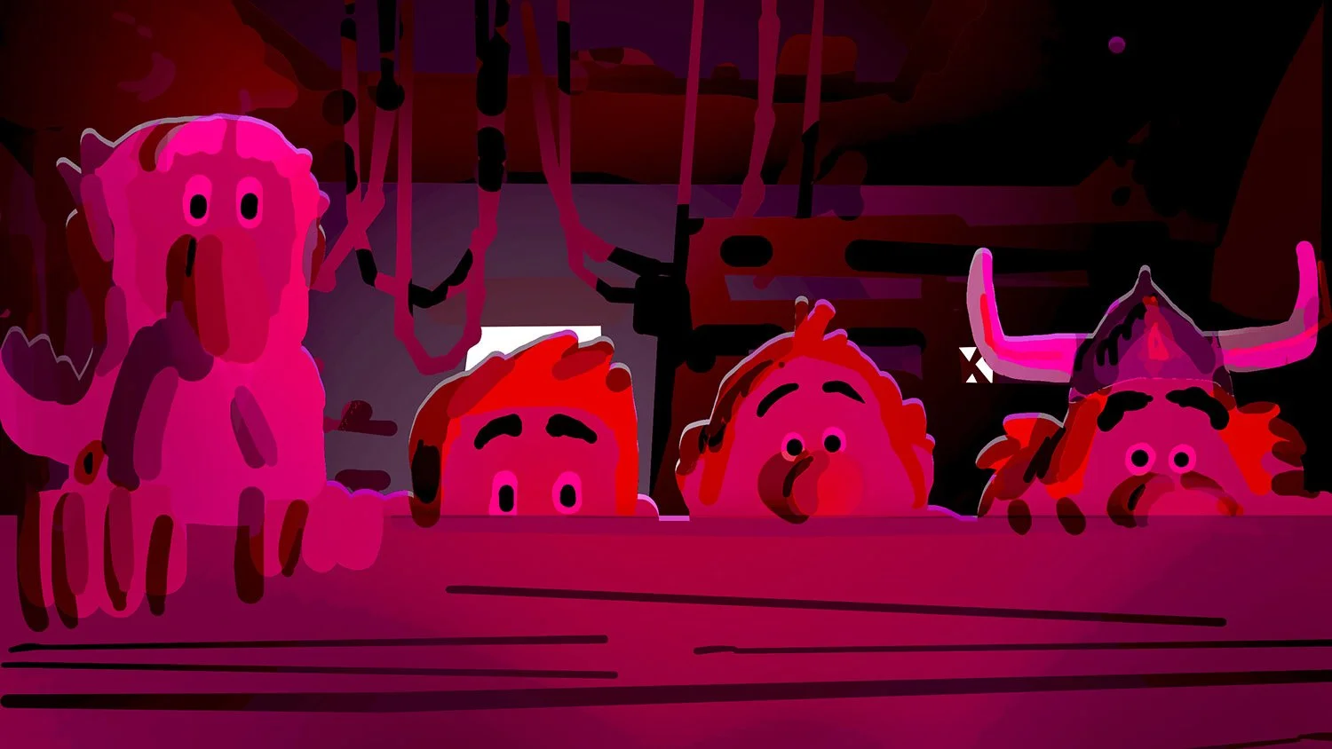
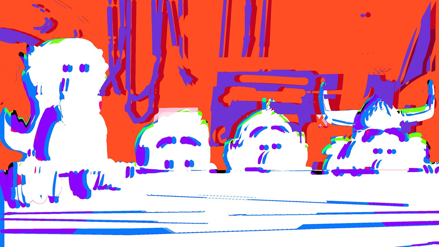
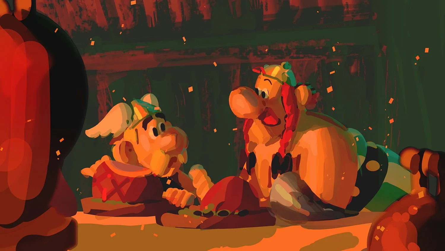
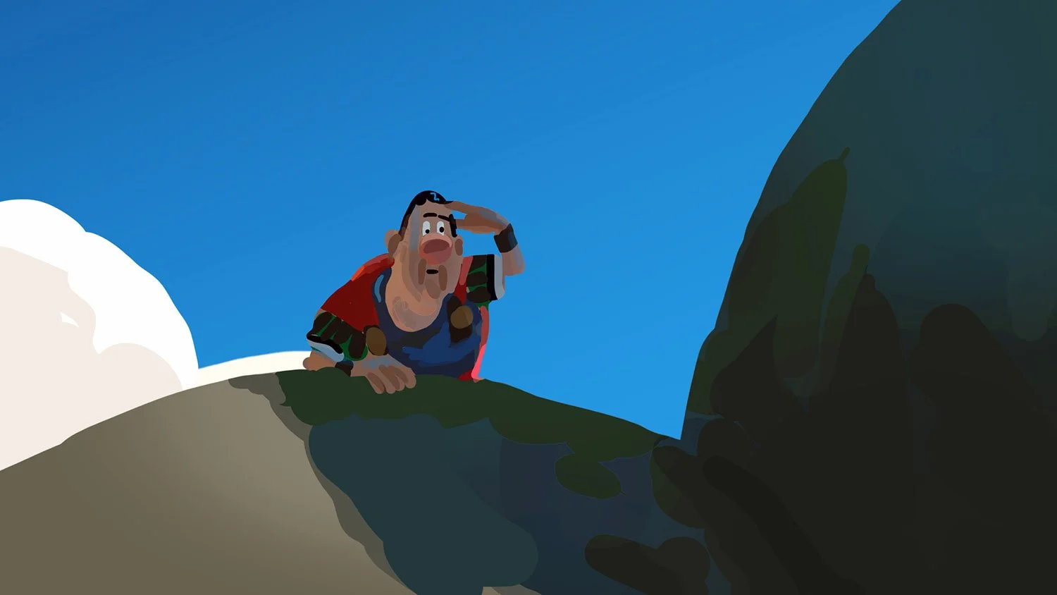
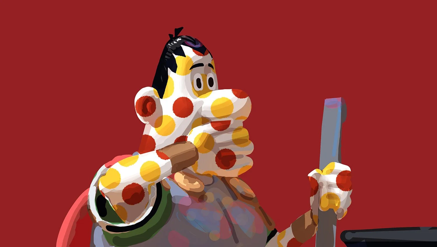
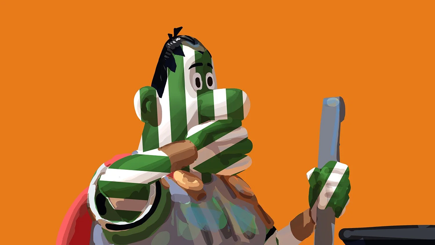
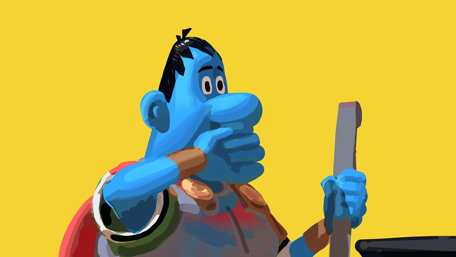
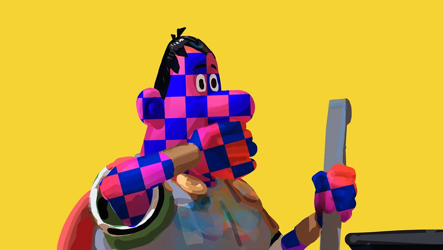
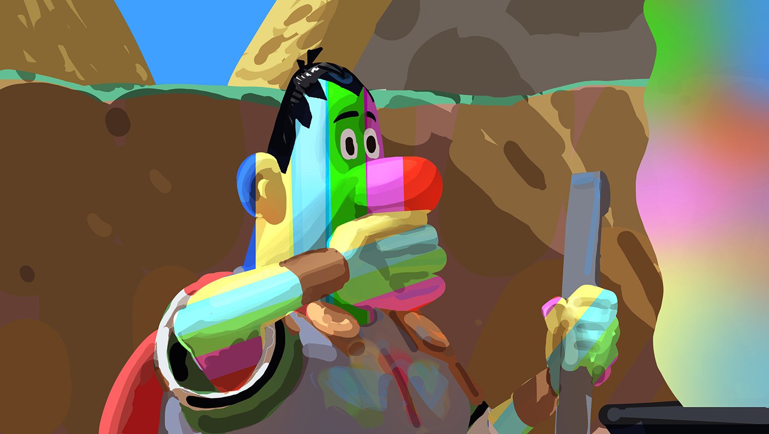
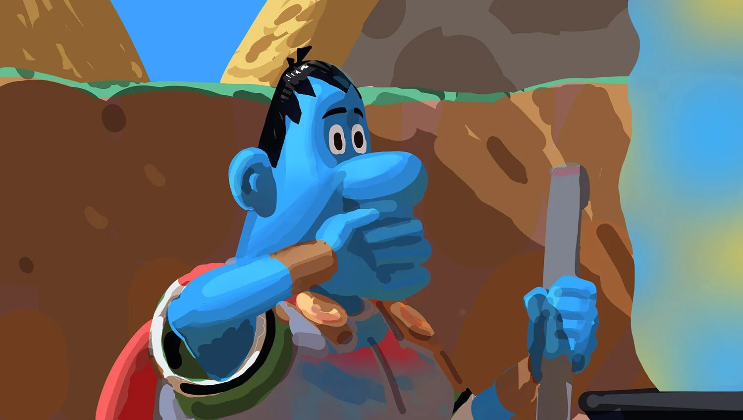
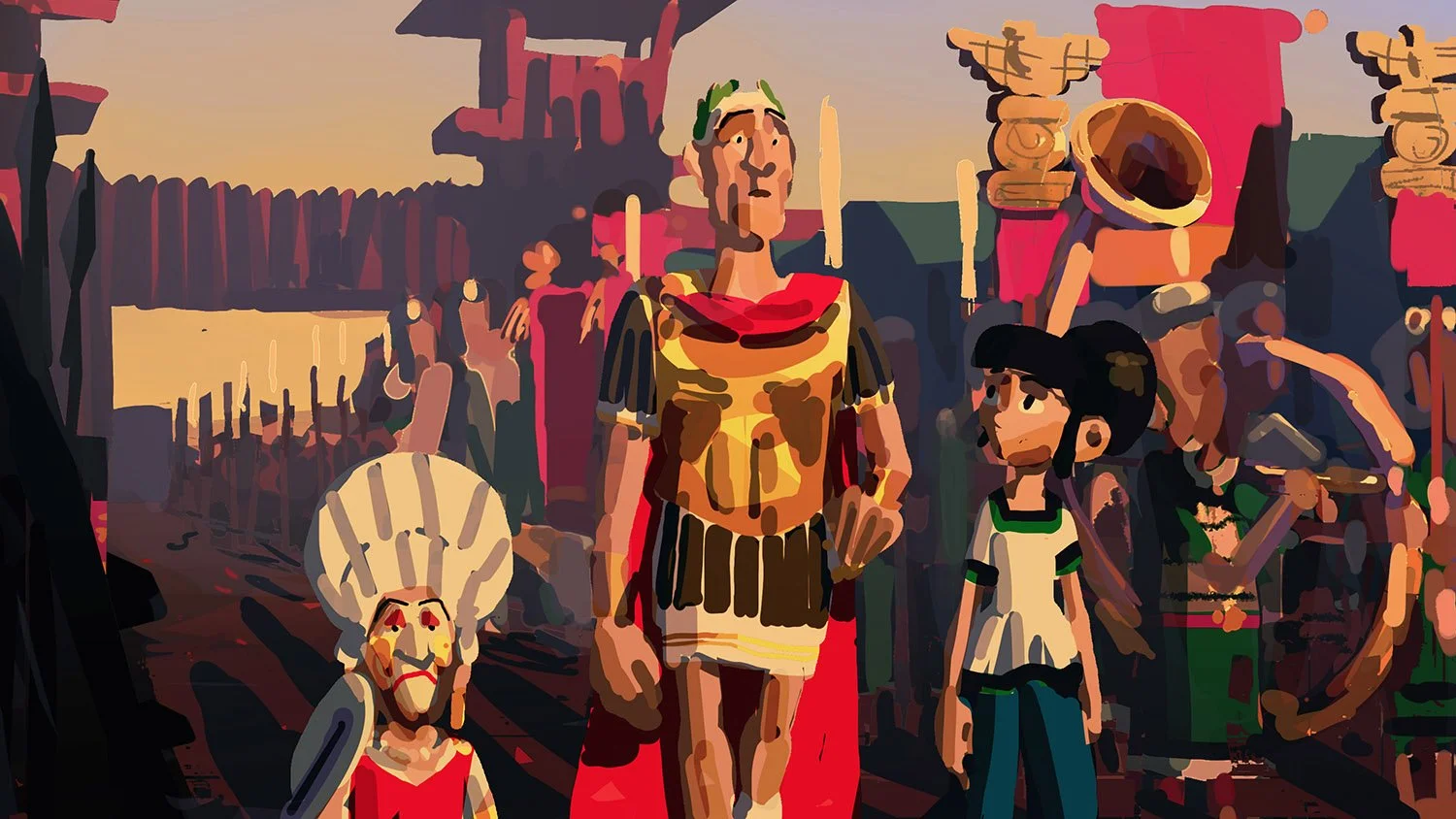
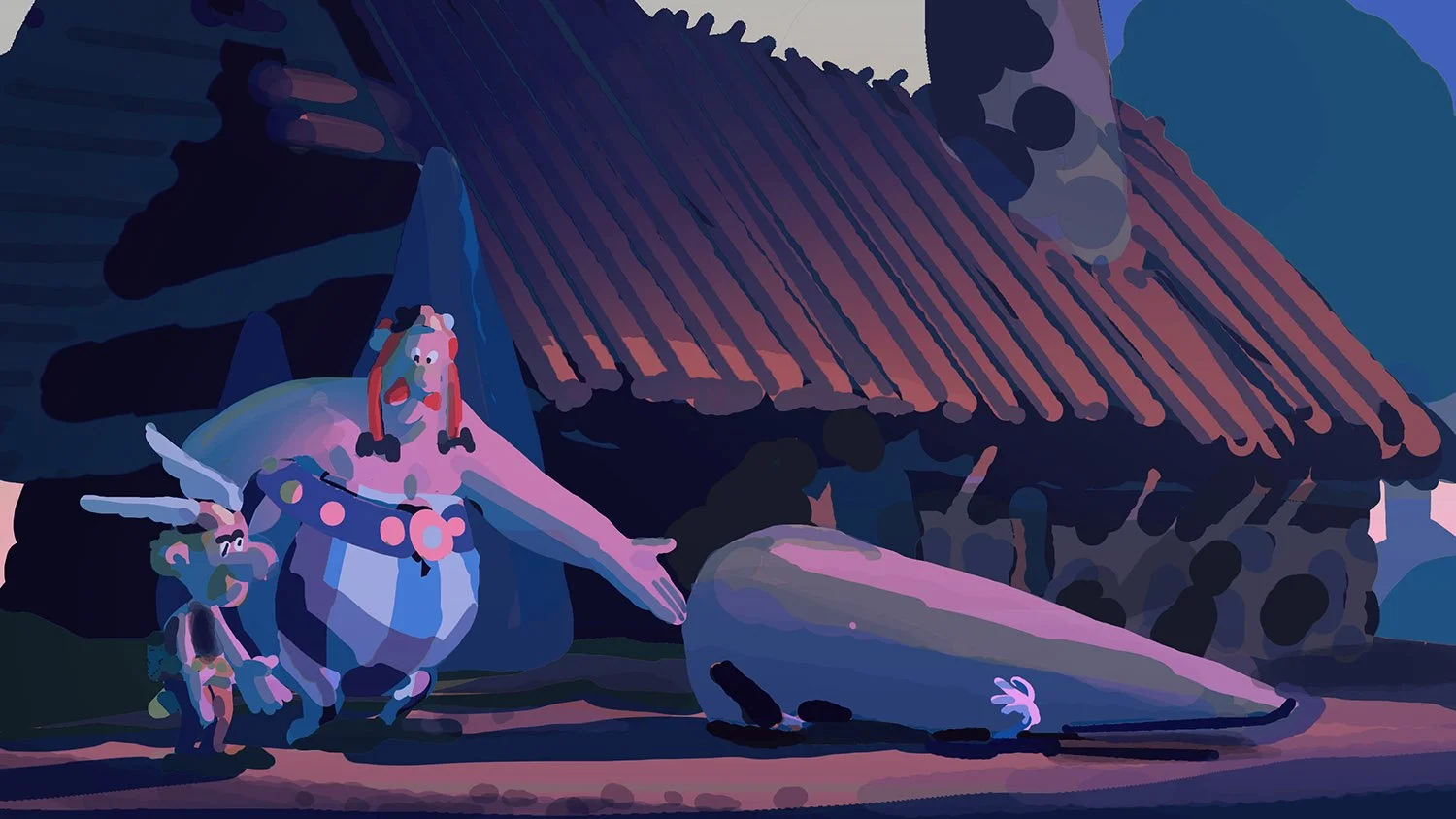
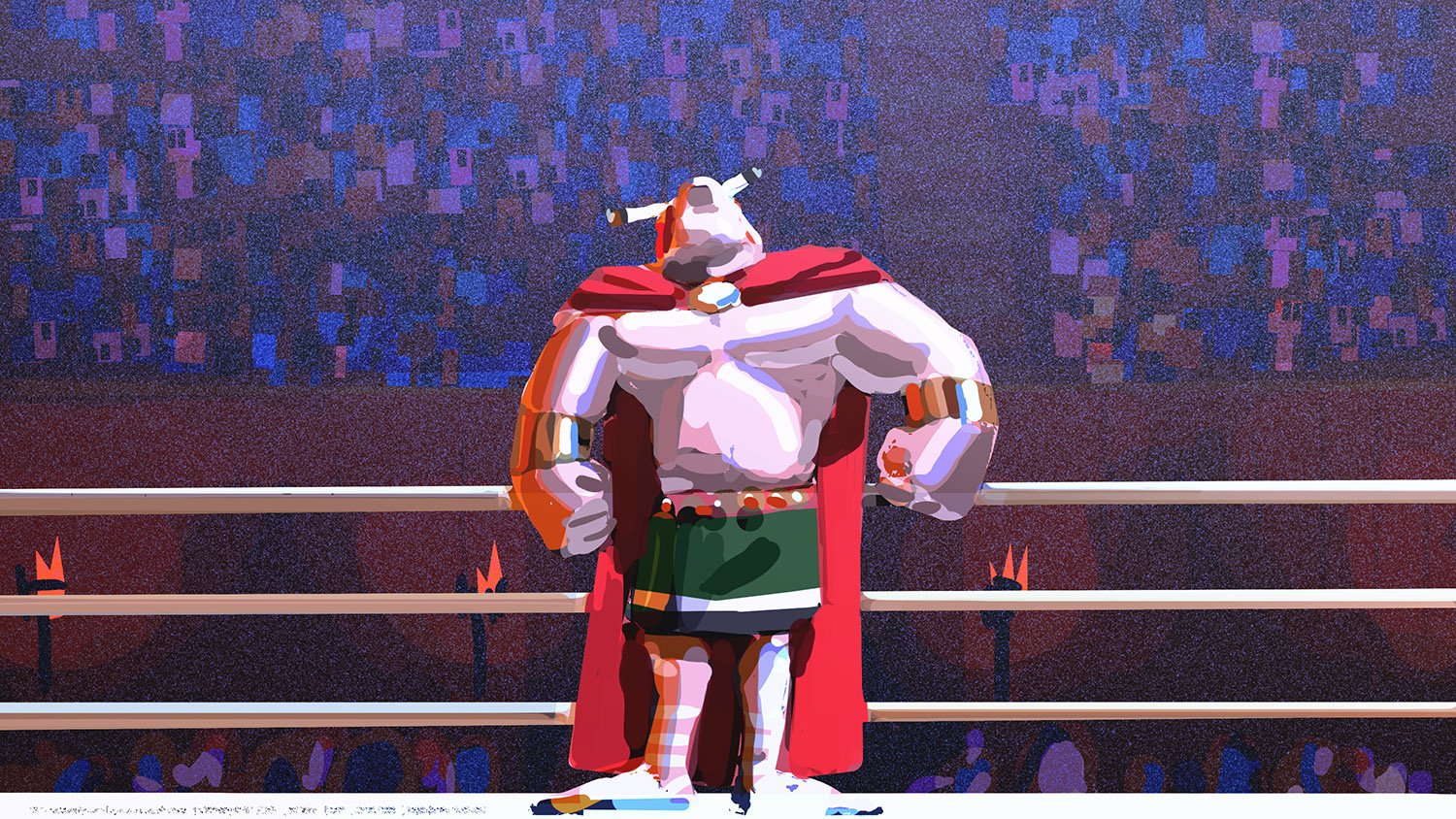
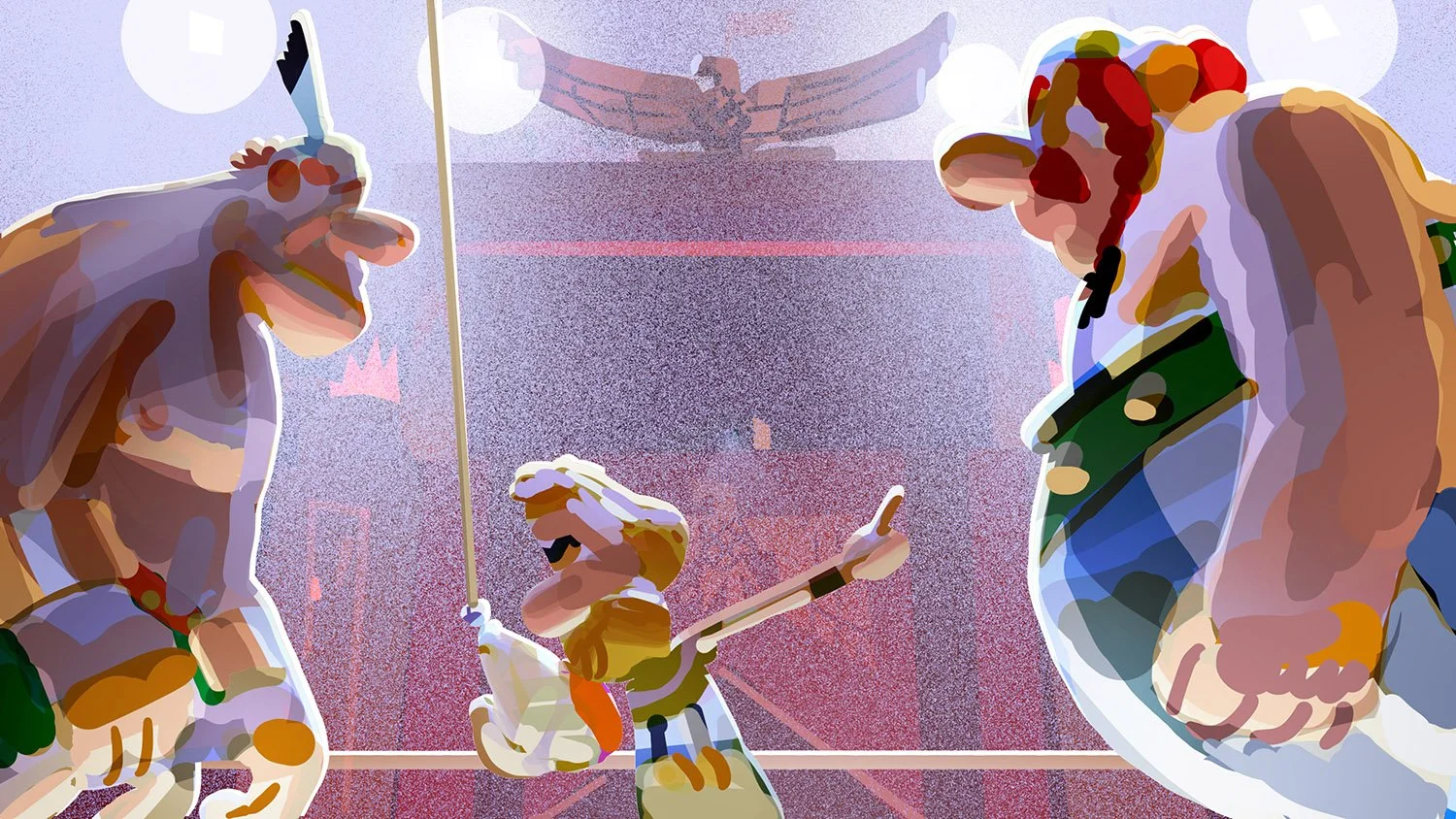
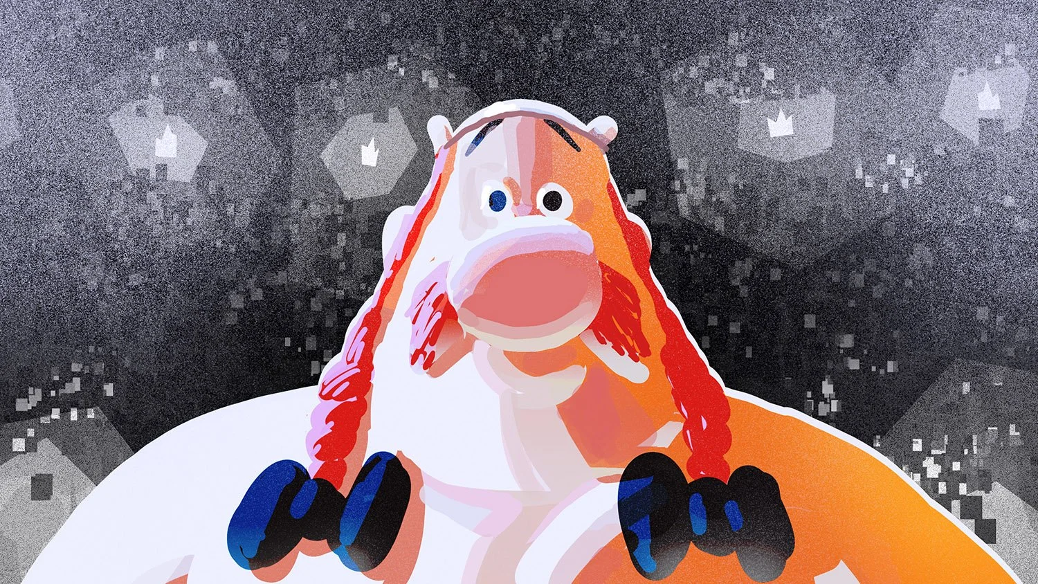
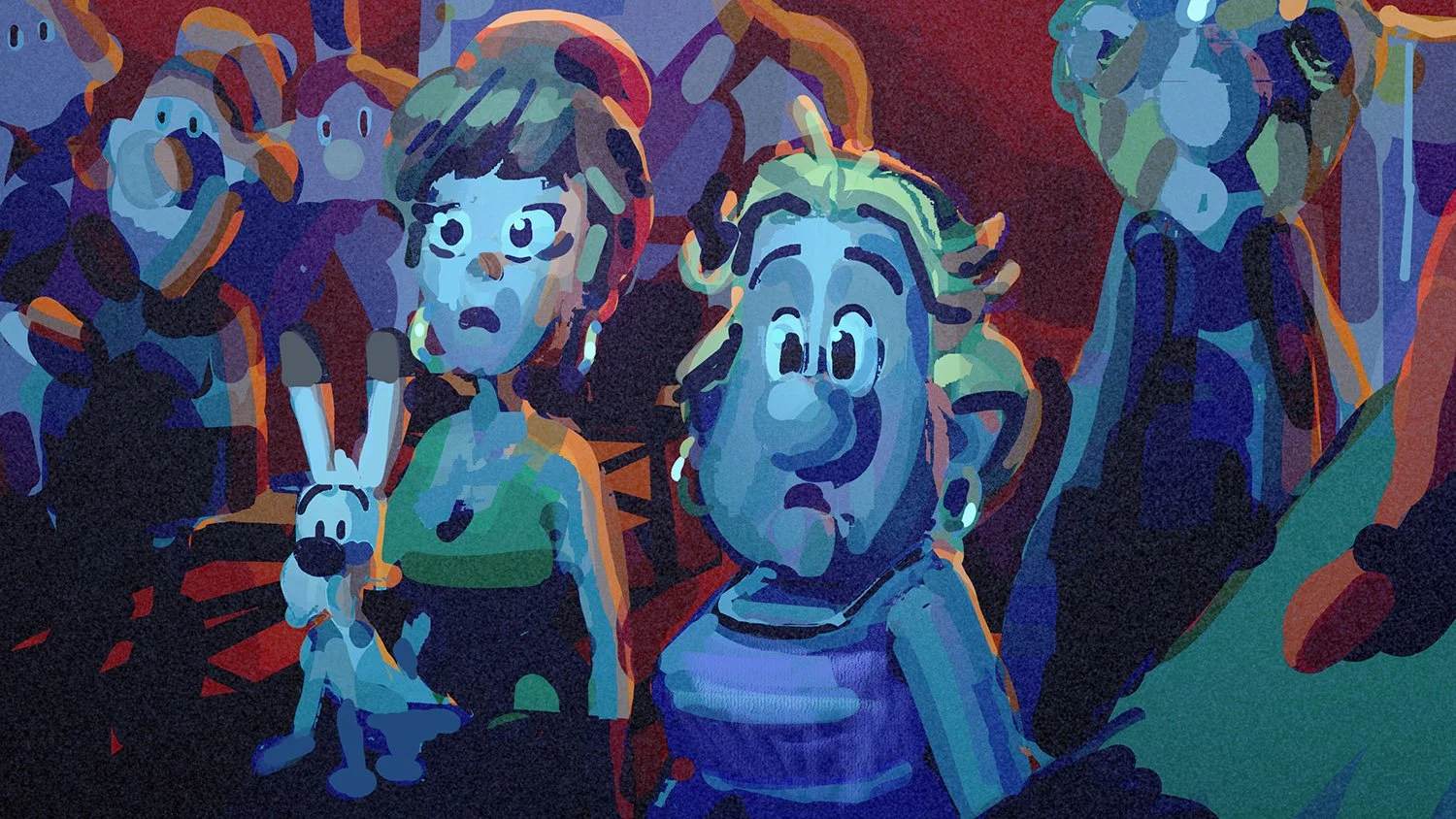
For the series, character design was shared between Borja Montoro and Juliaon Roels. In terms of surfacing and lighting, the goal was to achieve a tactile, playful look: minimalist skin textures contrasted with more realistic textiles and costume materials. This approach gives the characters the physical presence of stop-motion puppets, grounding them in the world while retaining the charm of the original designs.


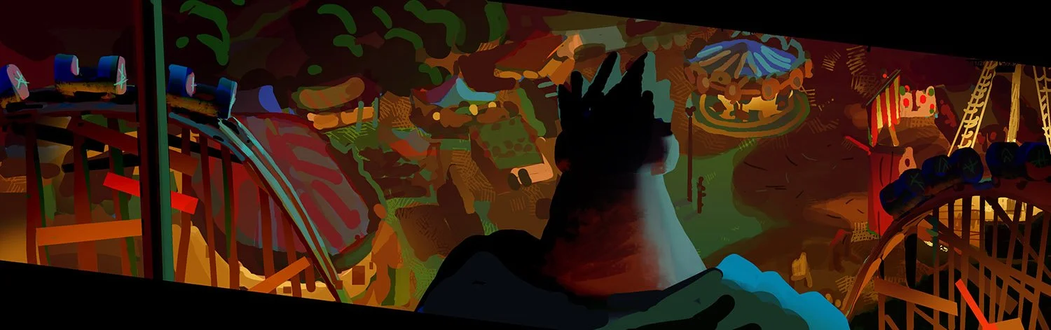
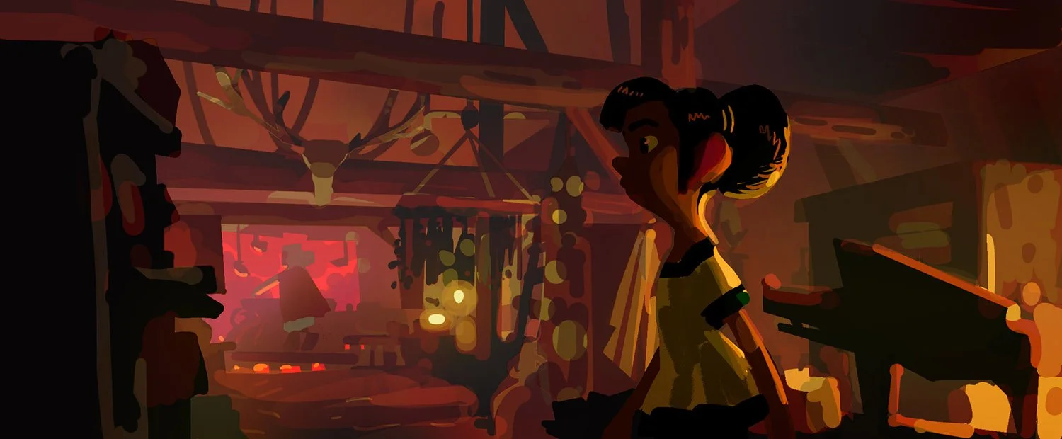
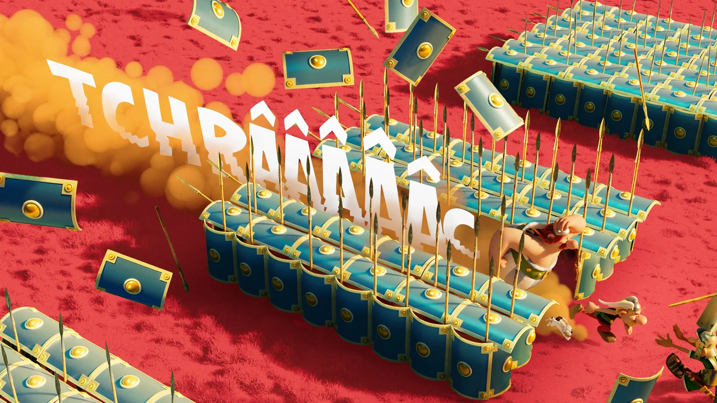
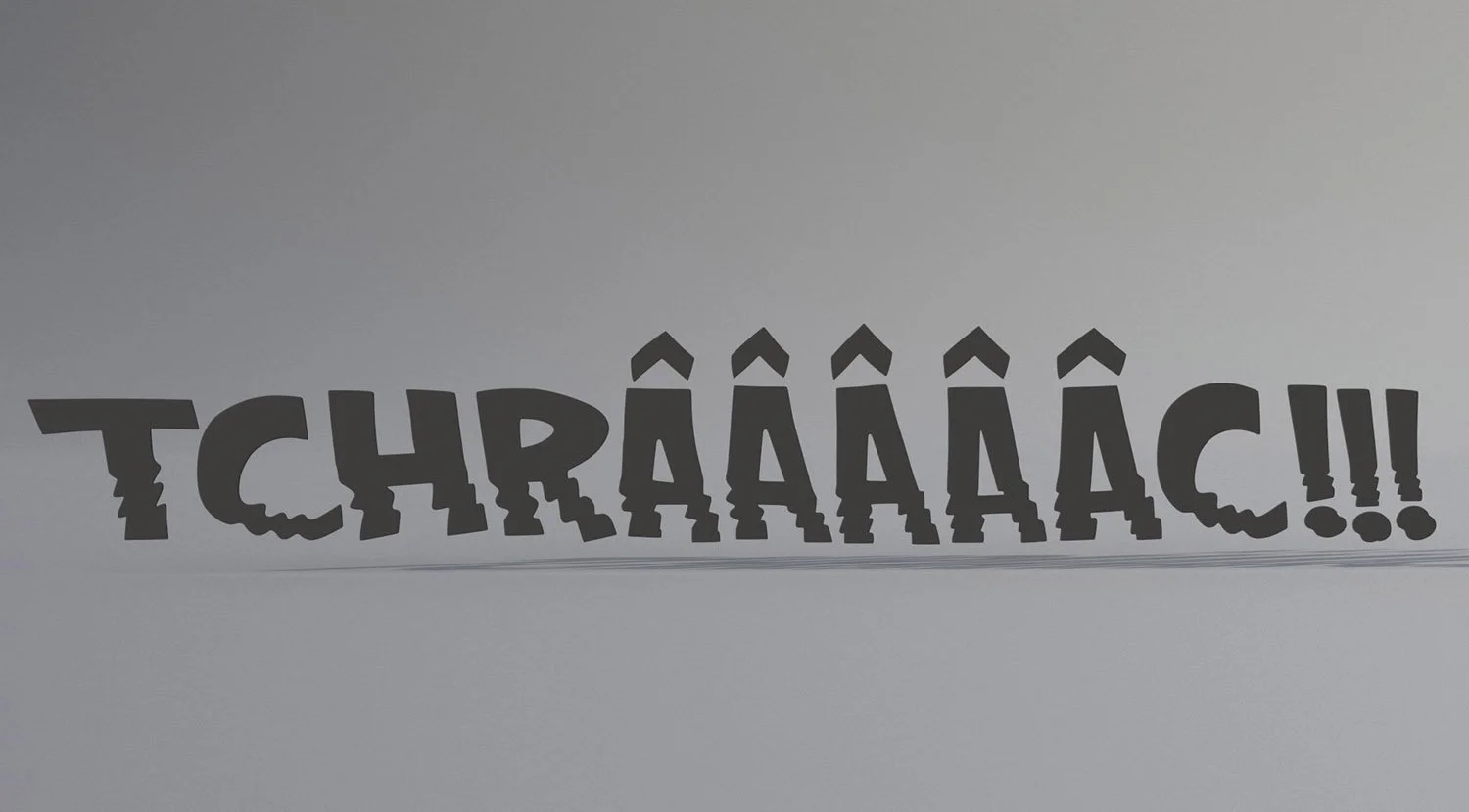
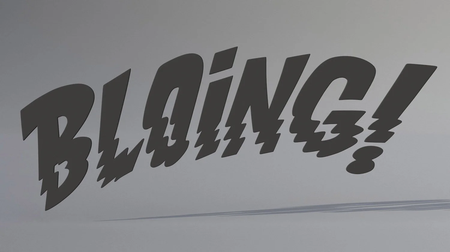
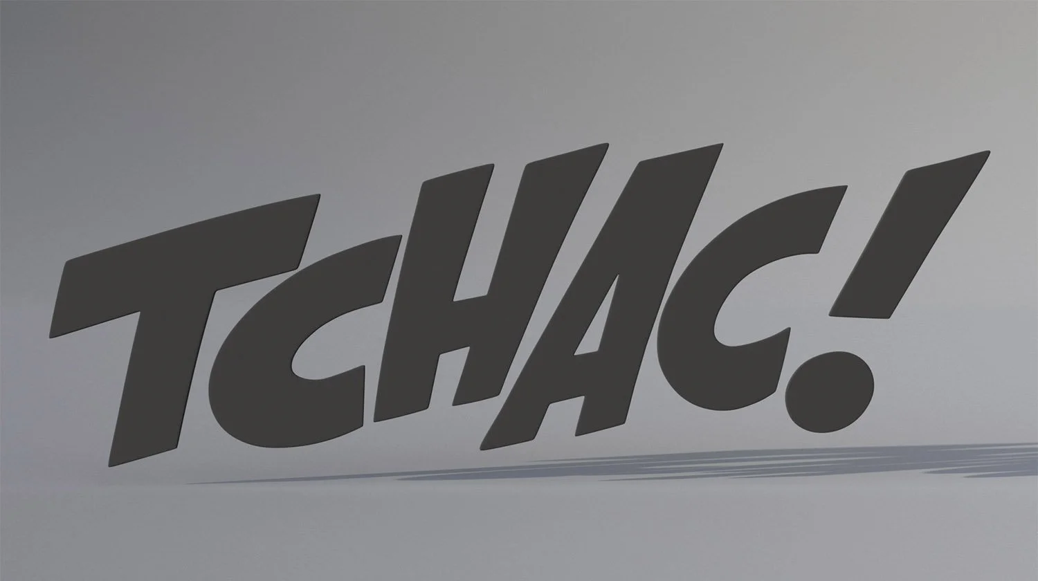
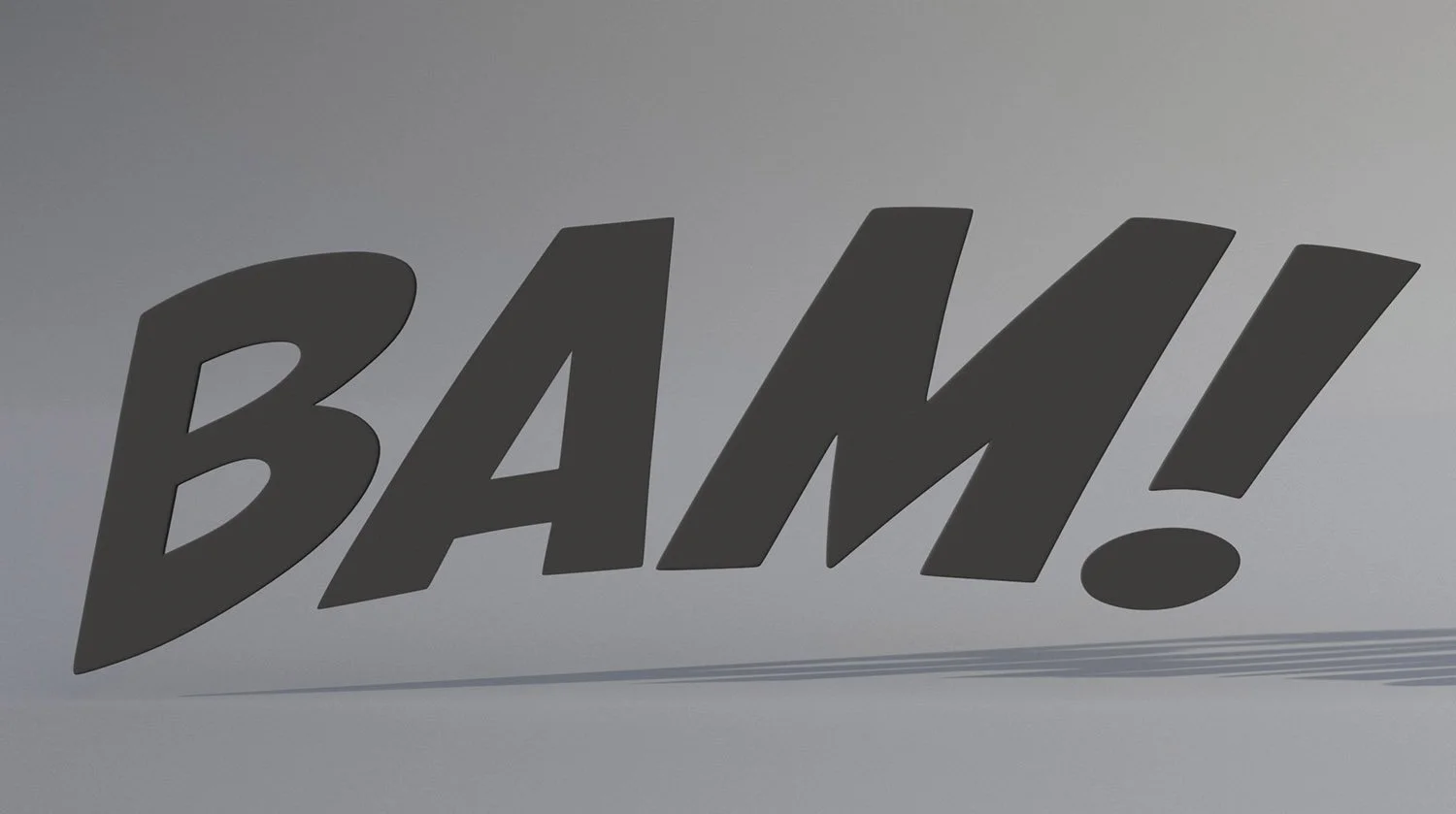
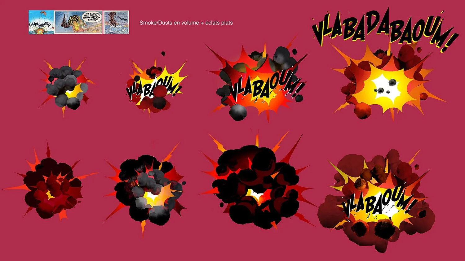
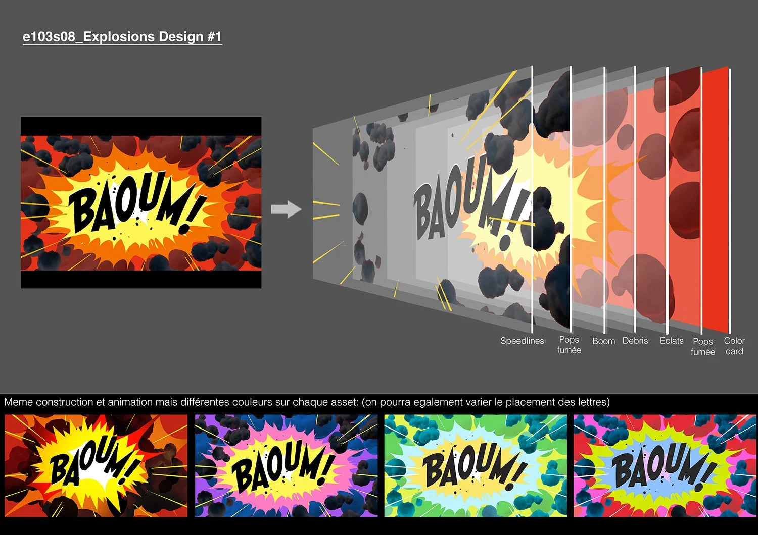
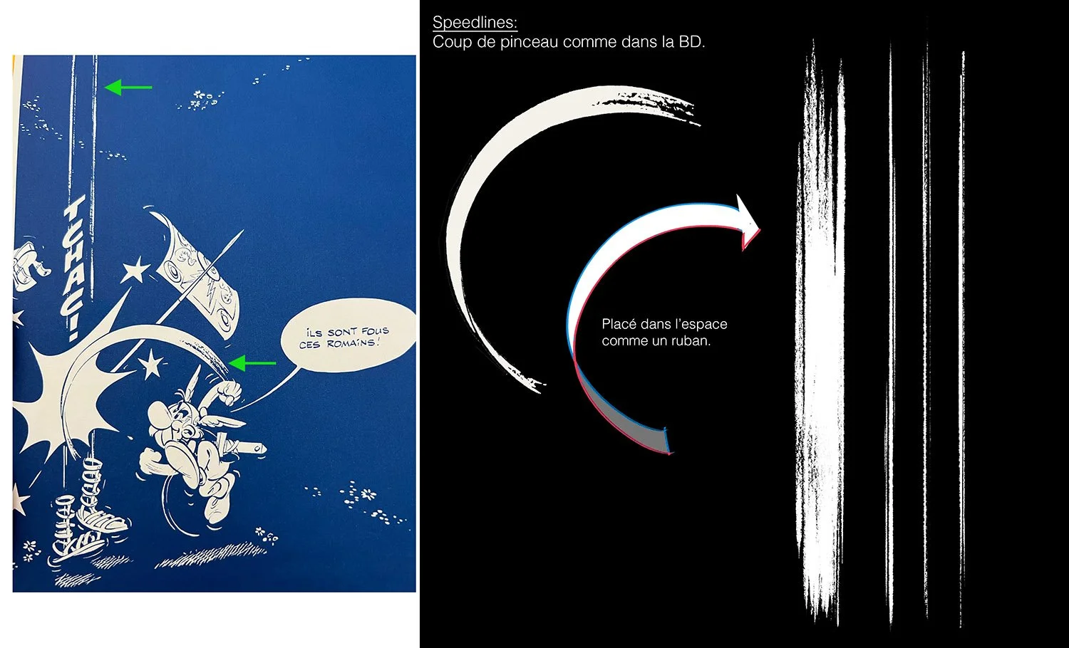
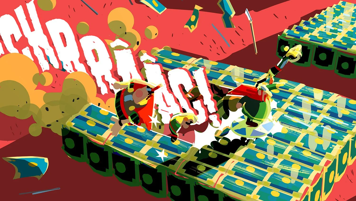
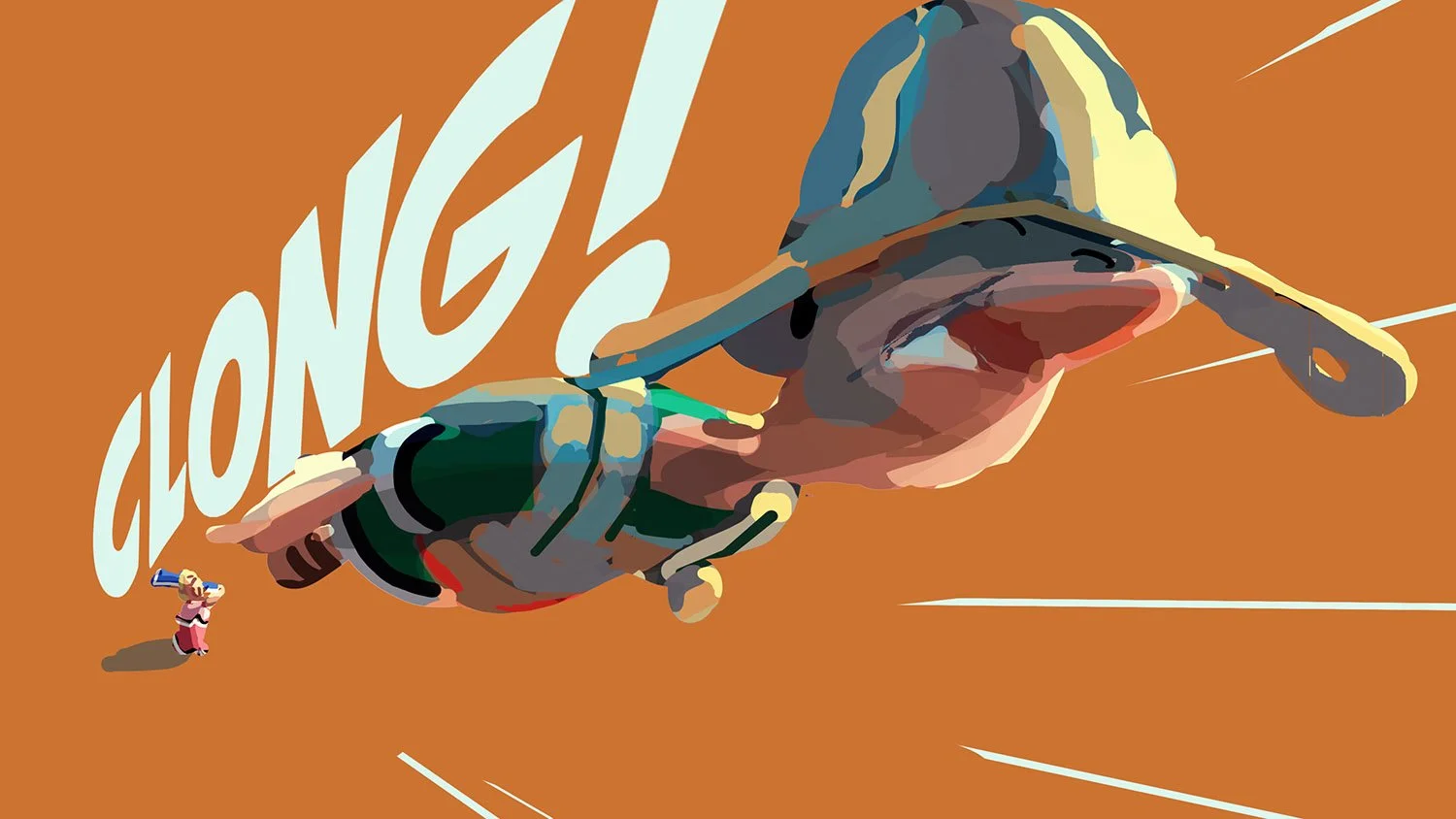
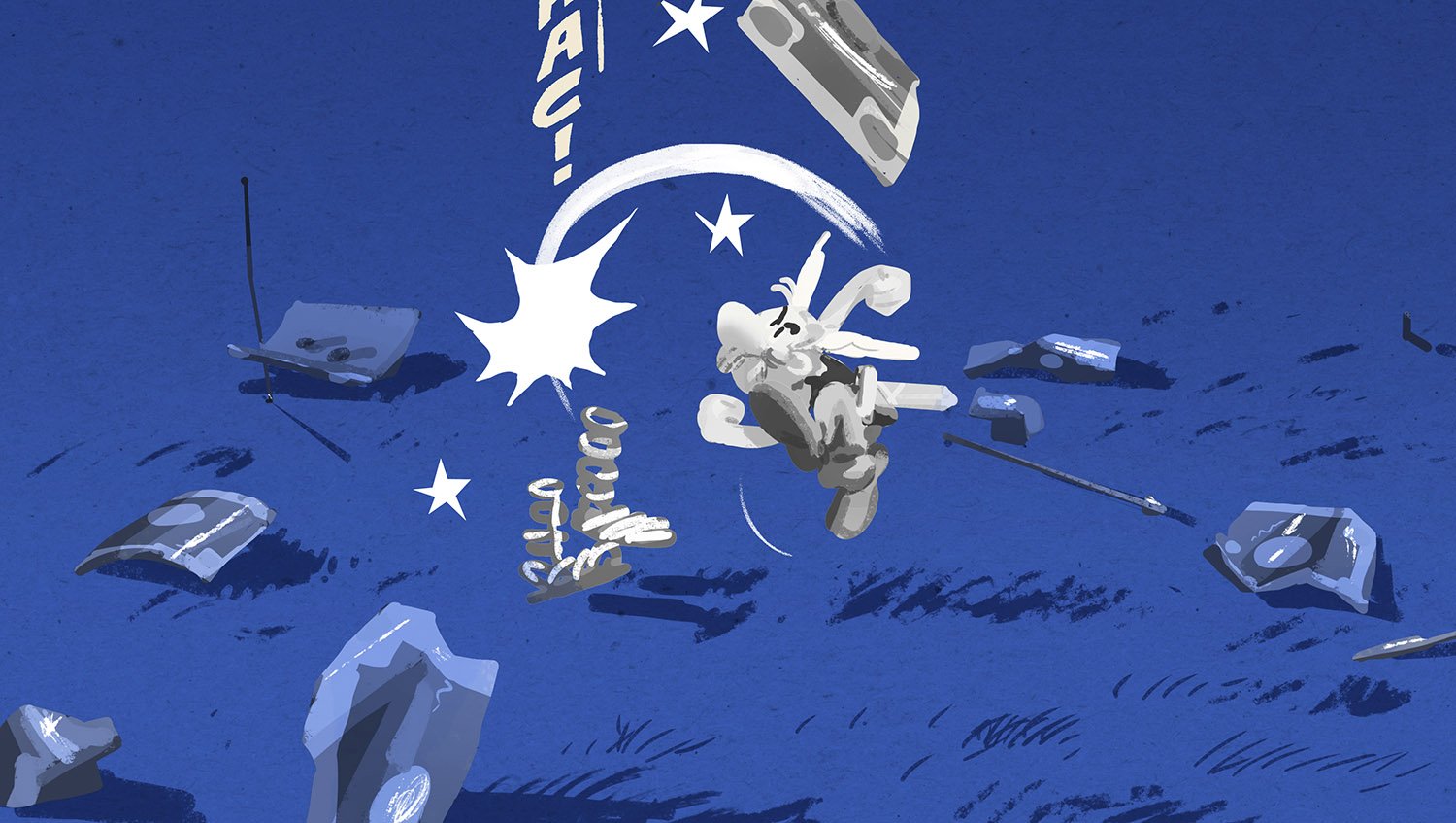
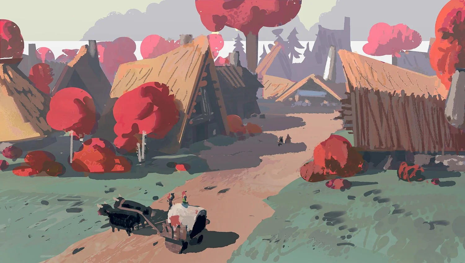
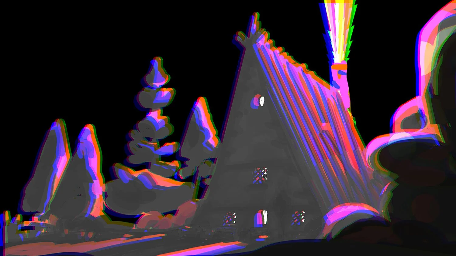
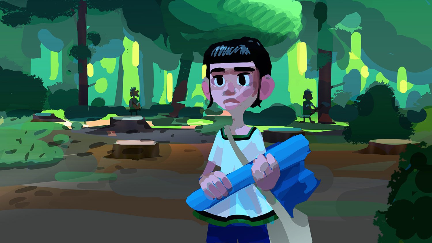
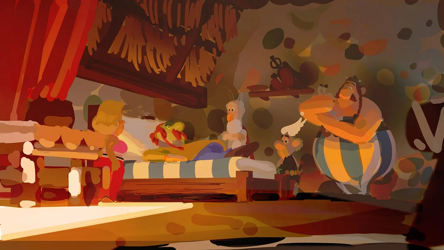
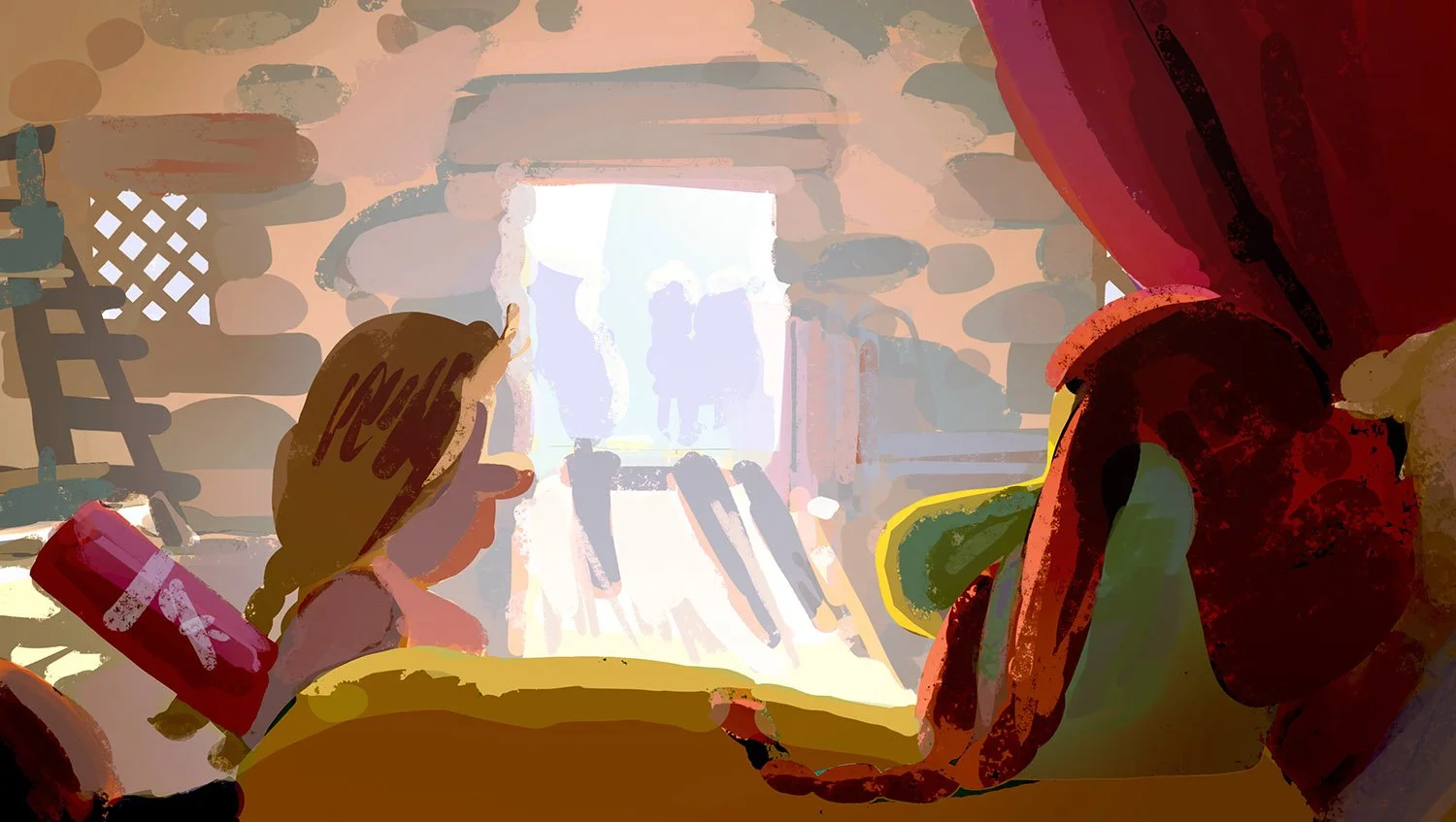
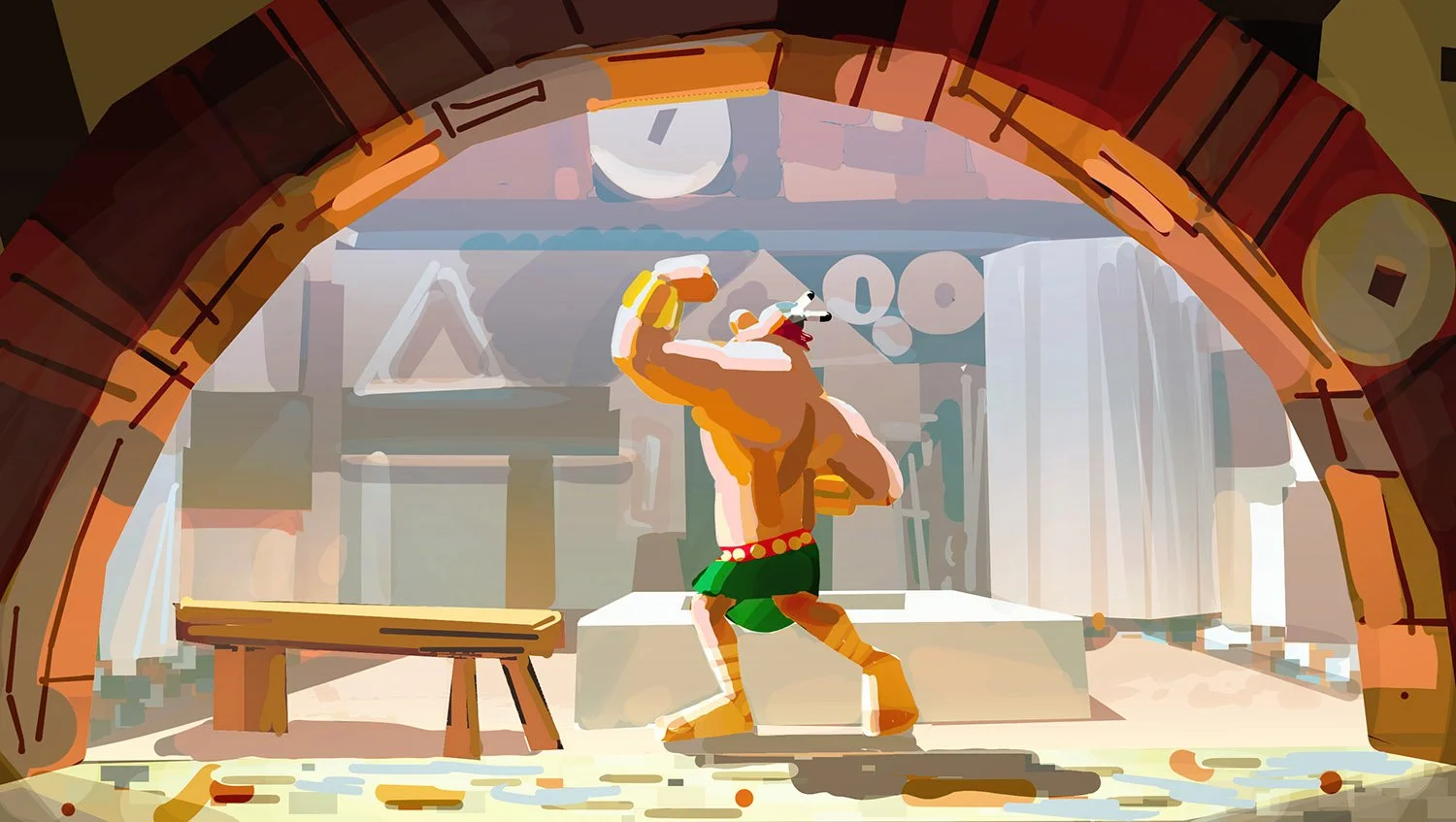
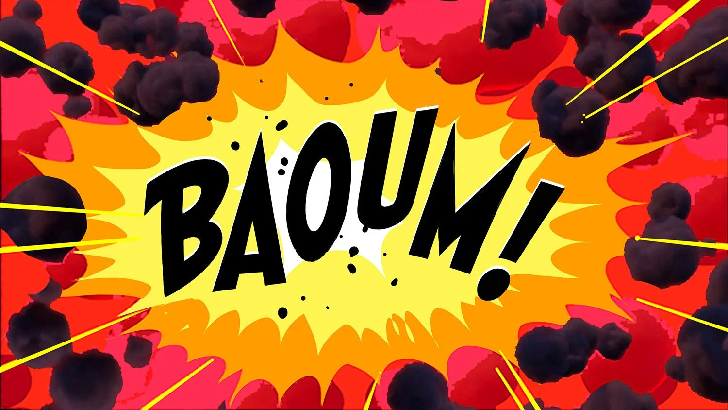
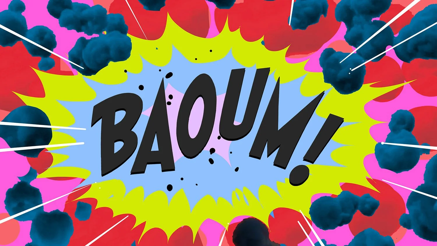
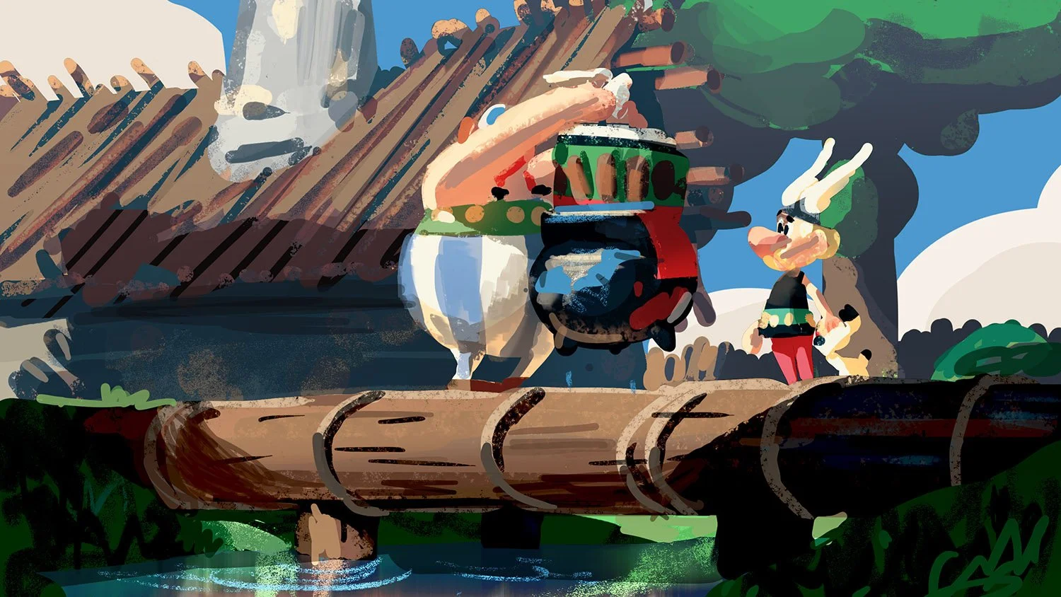
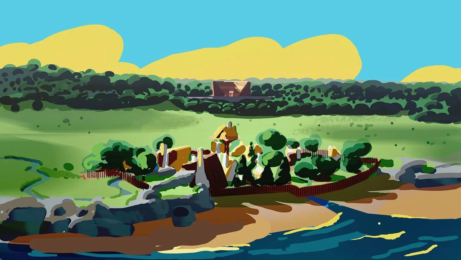
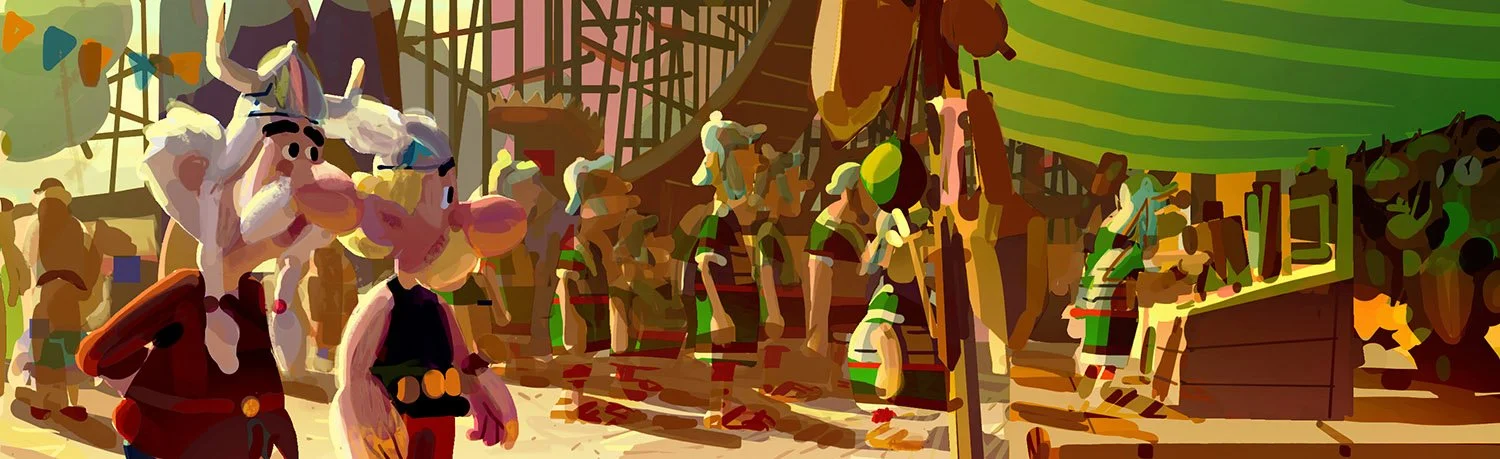
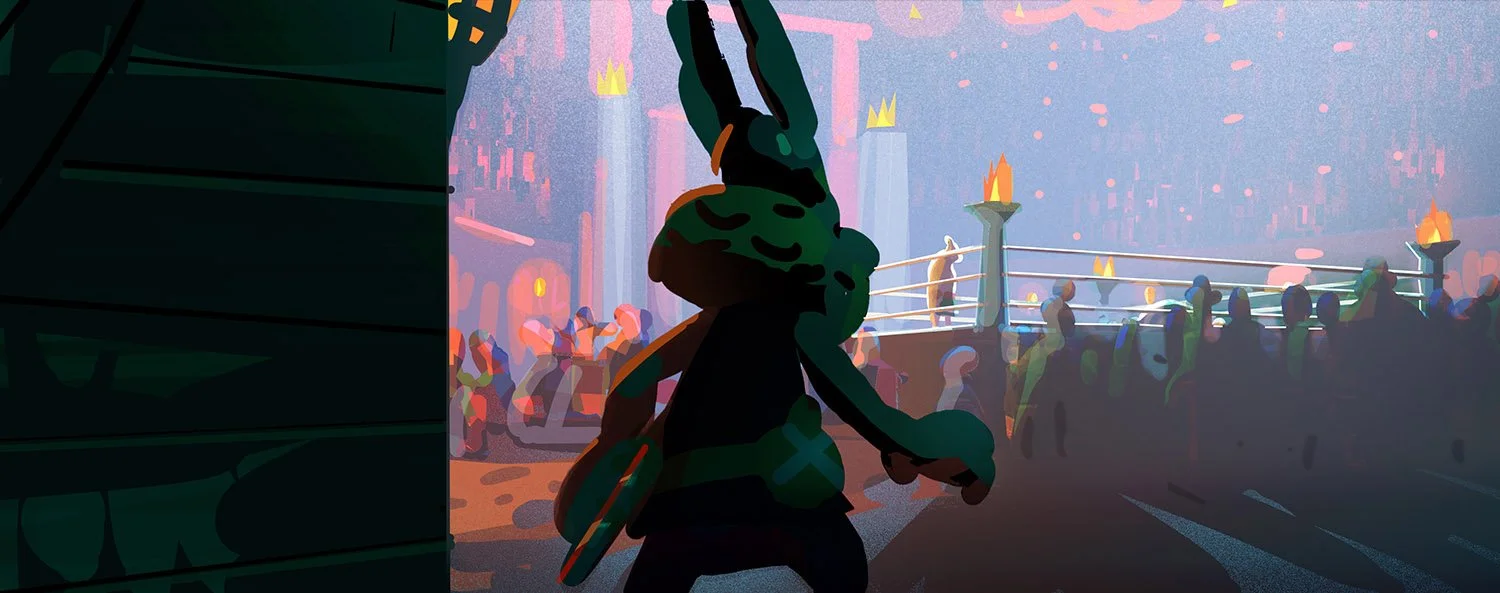
The goal was to create a world that feels tactile, cinematic, and story-driven. My background in stop-motion has been a strong influence for the look of the environments, with grounded materials and physical textures giving them weight and presence. On top of this tactile base, we introduced bold 2D elements, such as colour cards and onomatopoeias, to stay as close as possible to the spirit of the original comic books.

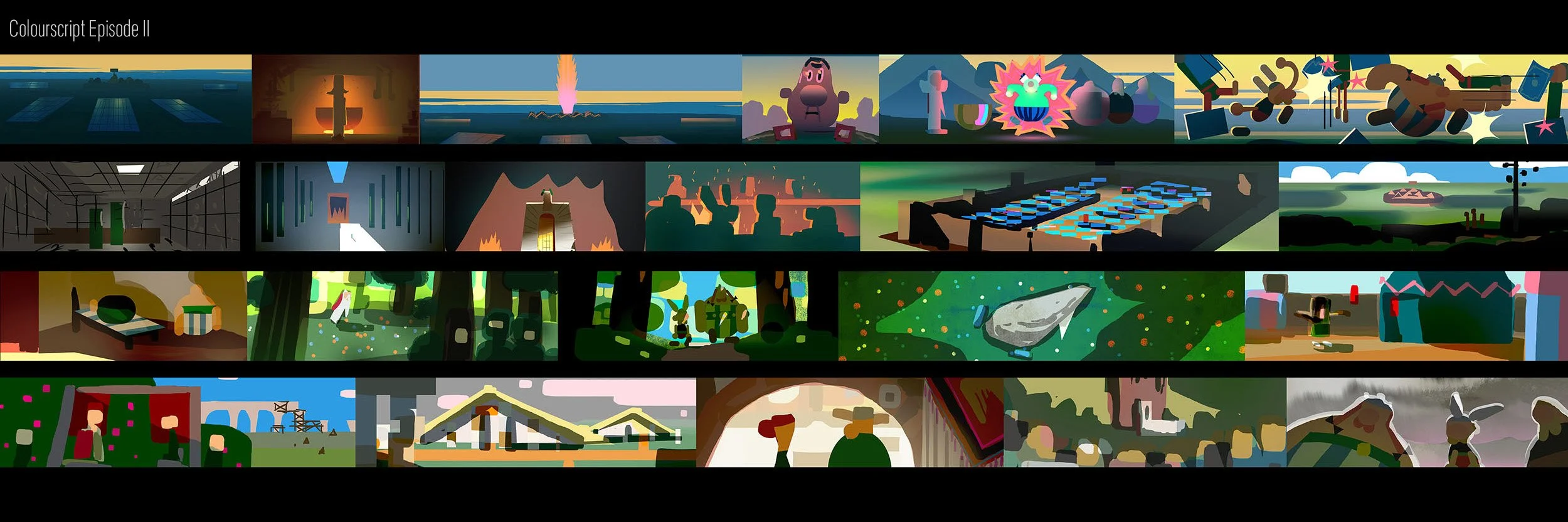
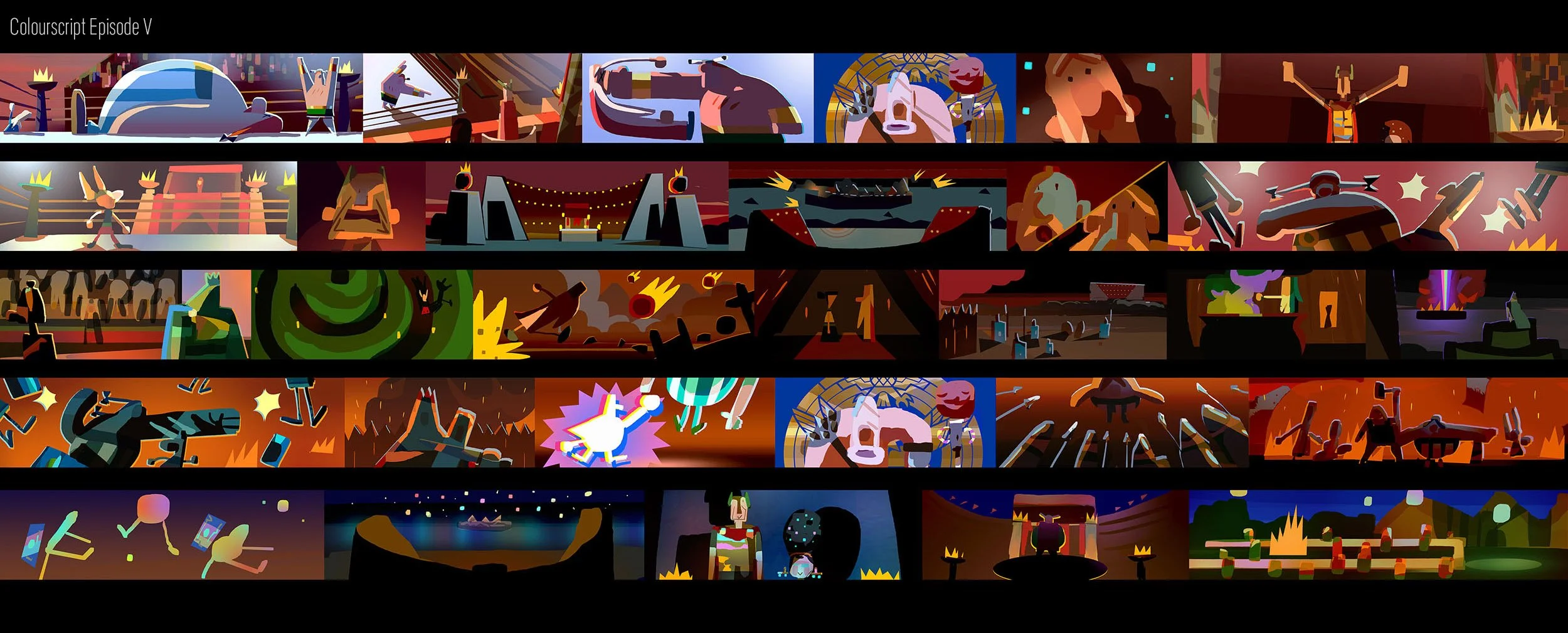
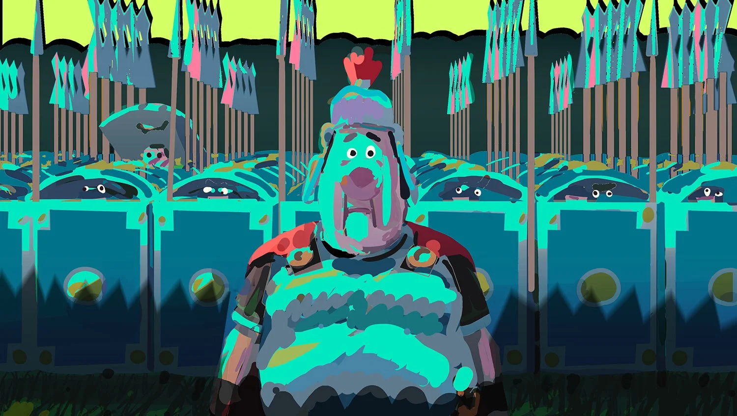
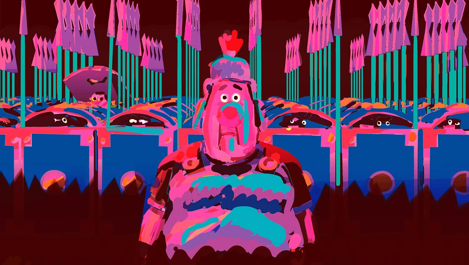
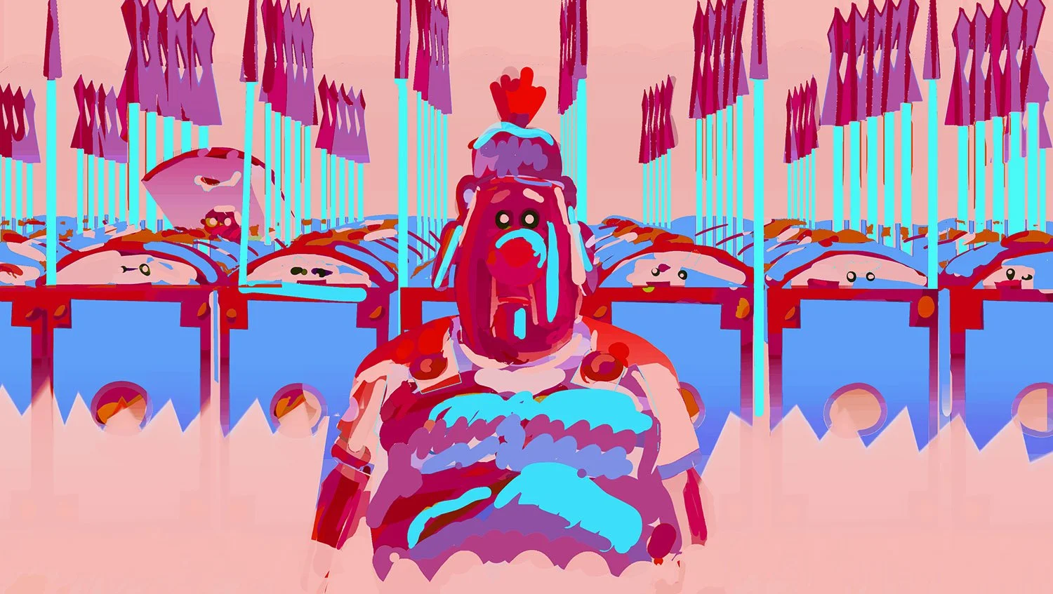
COLORSCRIPT:
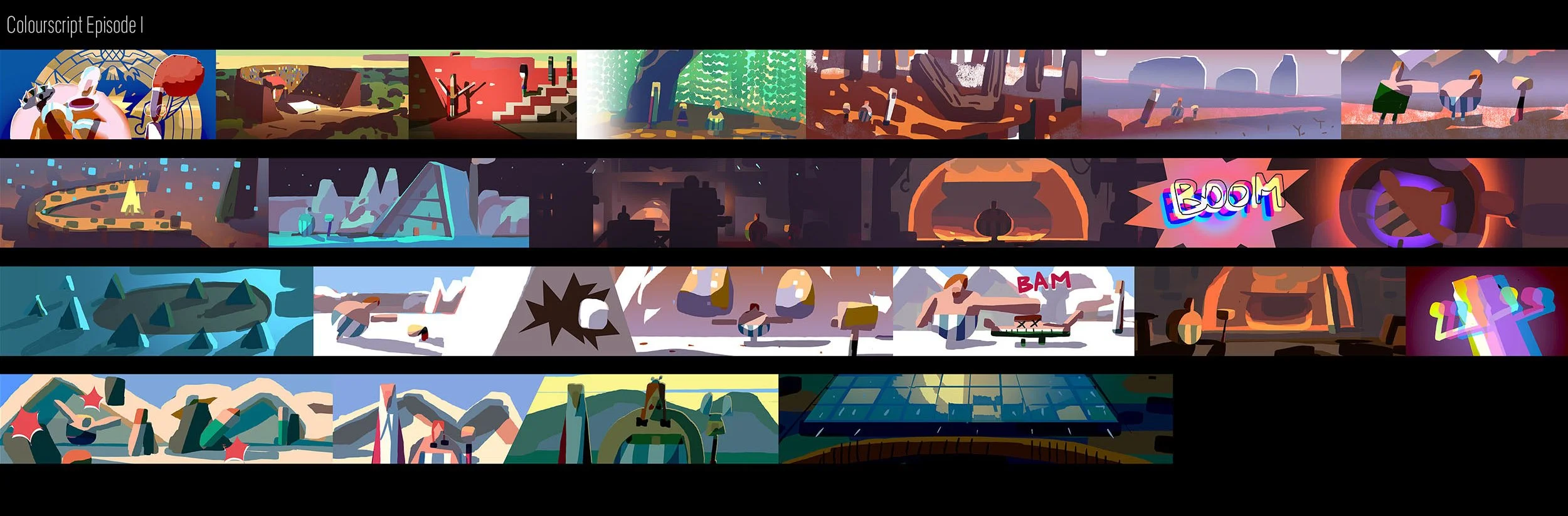
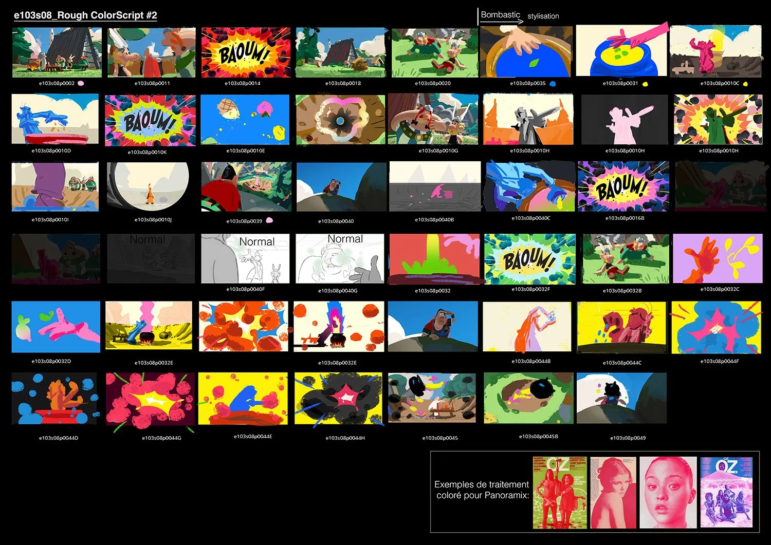
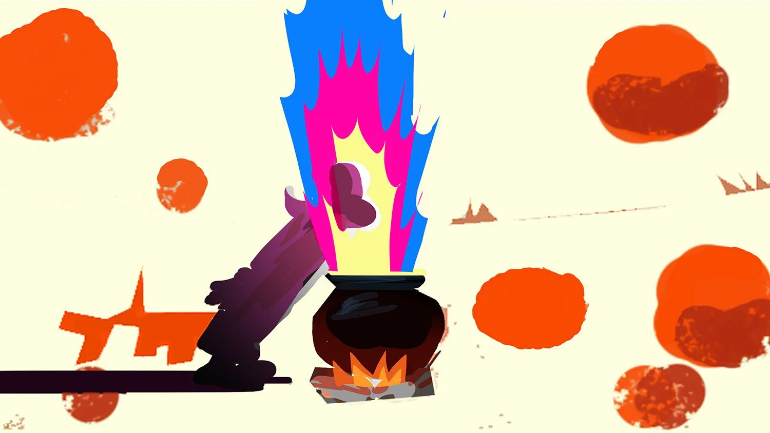
One of the first things I did when joining the project was to create a colourscript for the five episodes. Working from the script pages, it helped me visualise the show as a whole and later became a valuable tool to discuss ideas with the directors and brief the art team. It provided overall context and, since the episodes were not produced in chronological order, it was especially useful to quickly see when each set would appear in the story.
As the story and edit continued to evolve during production, new ideas emerged along the way. At a certain point, I stopped updating the colourscripts and focused instead on developing colour keys. As a result, you may notice some differences between the colourscripts and the final show.


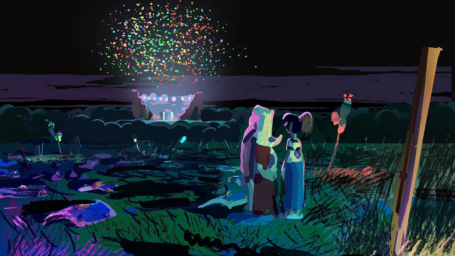
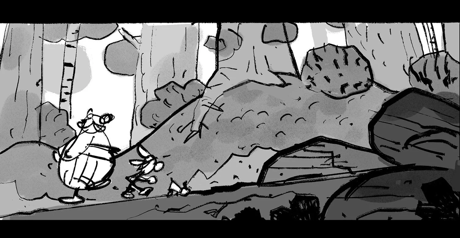
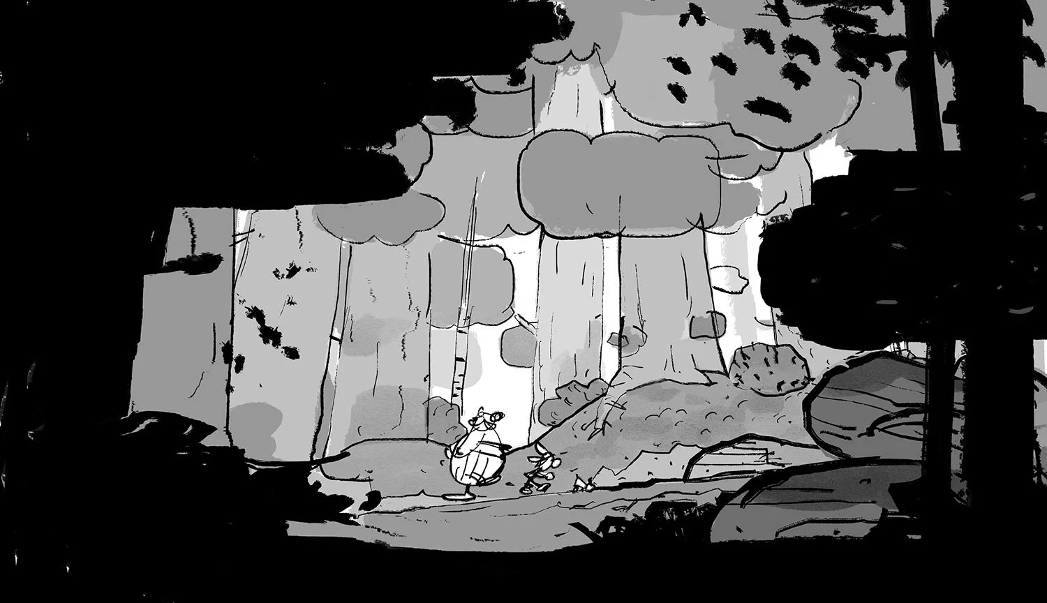
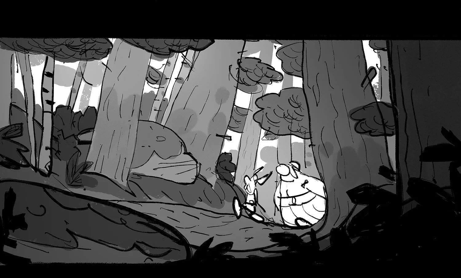
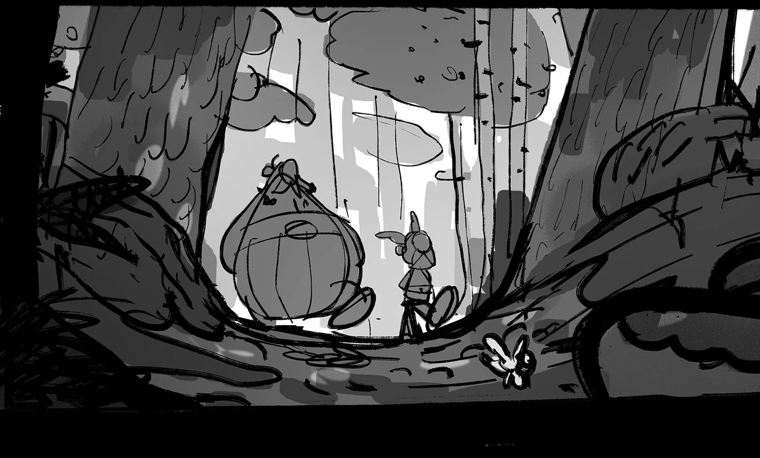
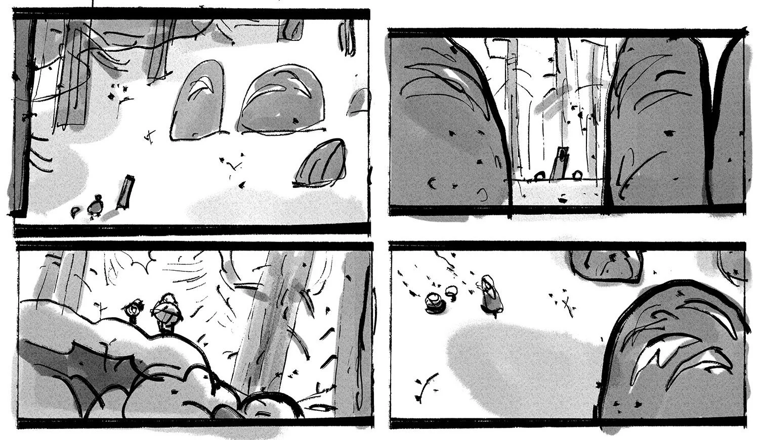
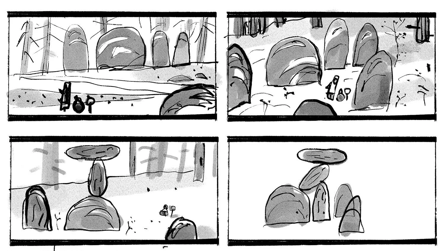
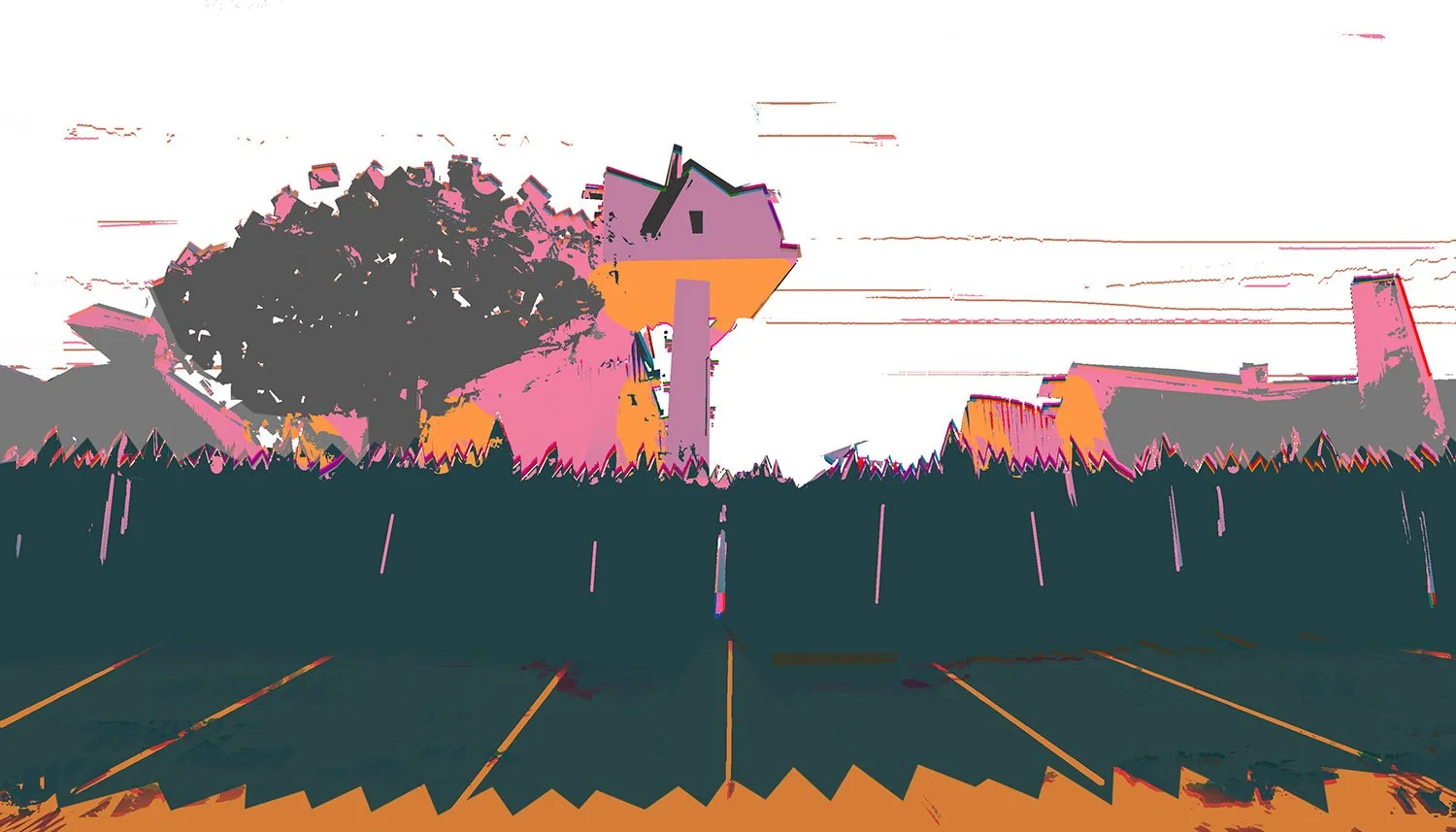
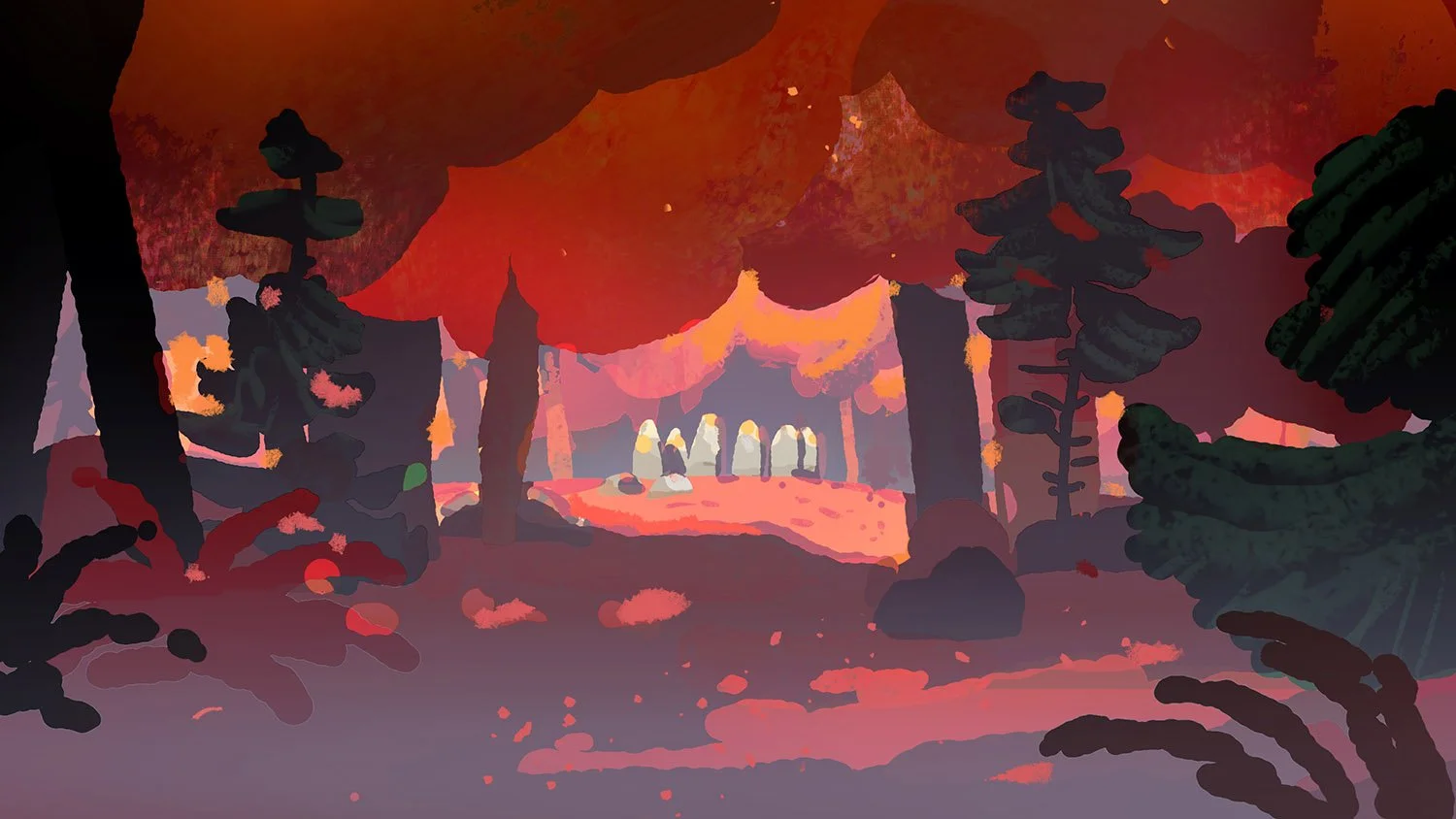
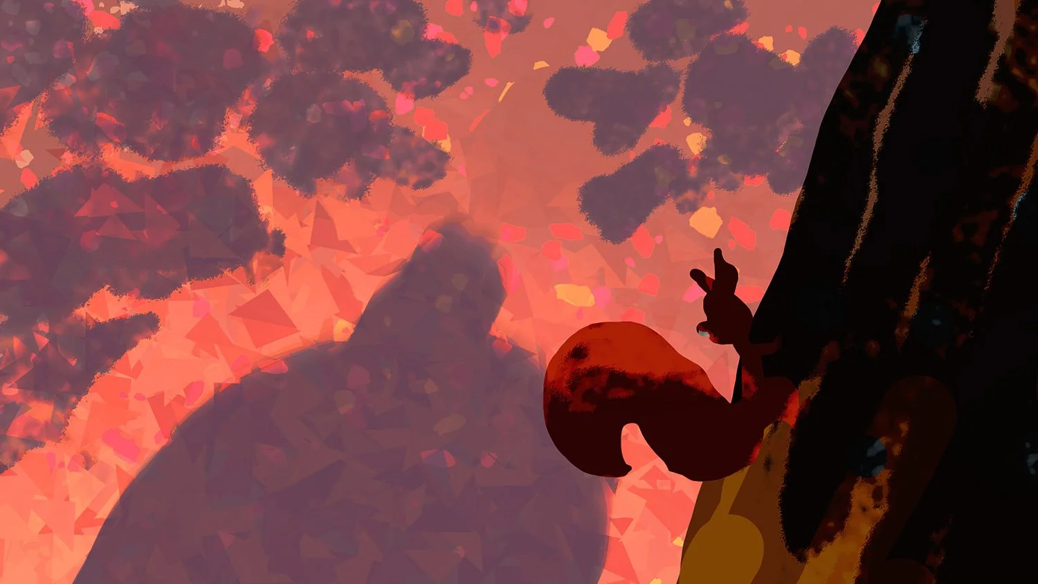
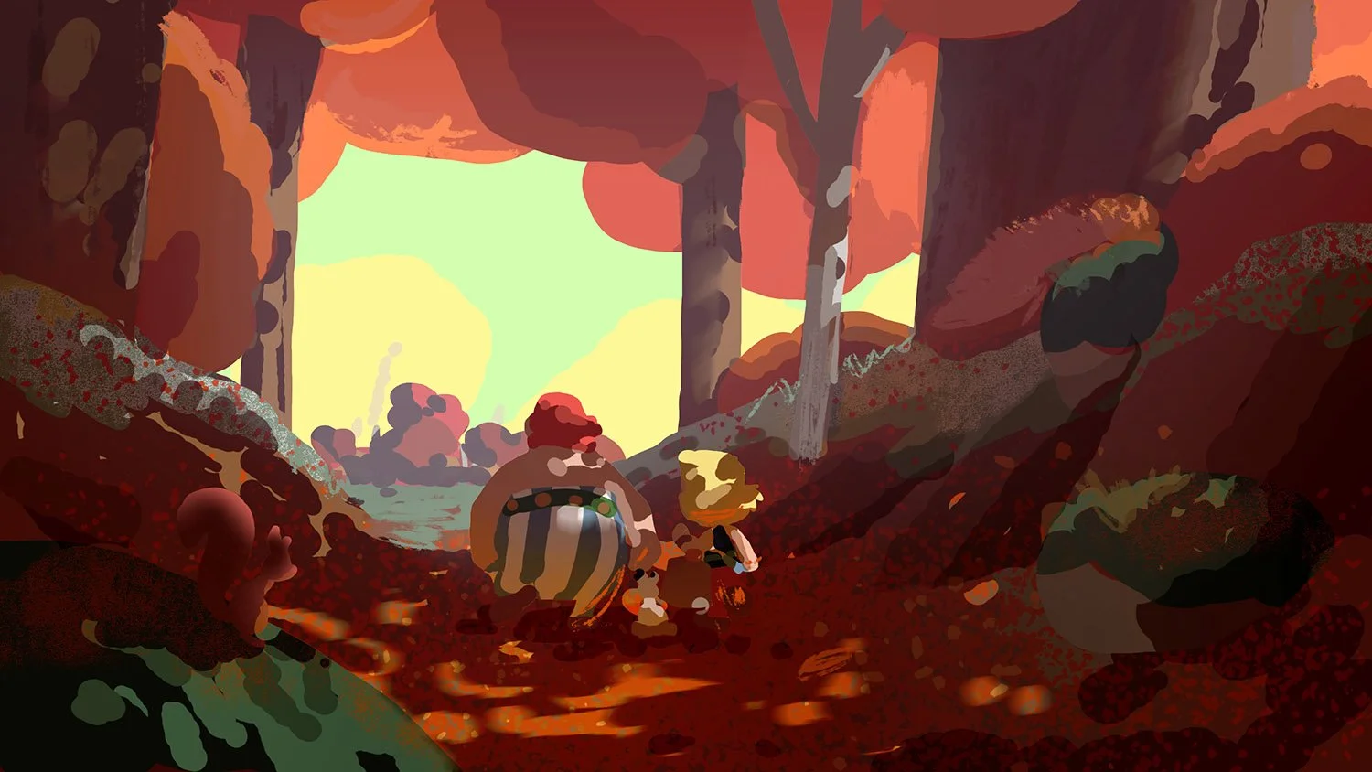
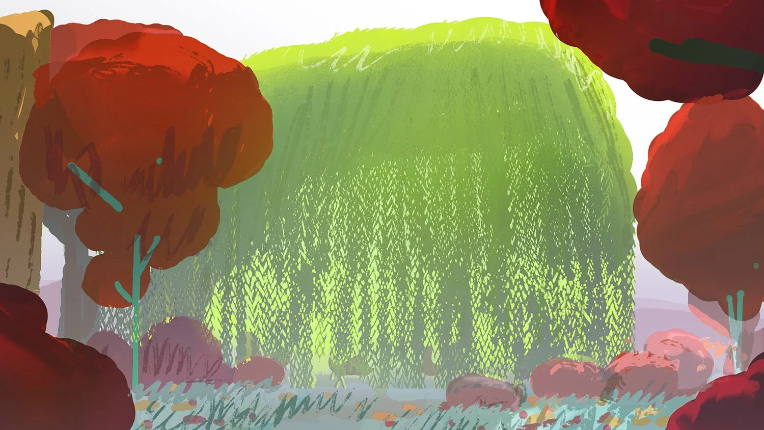
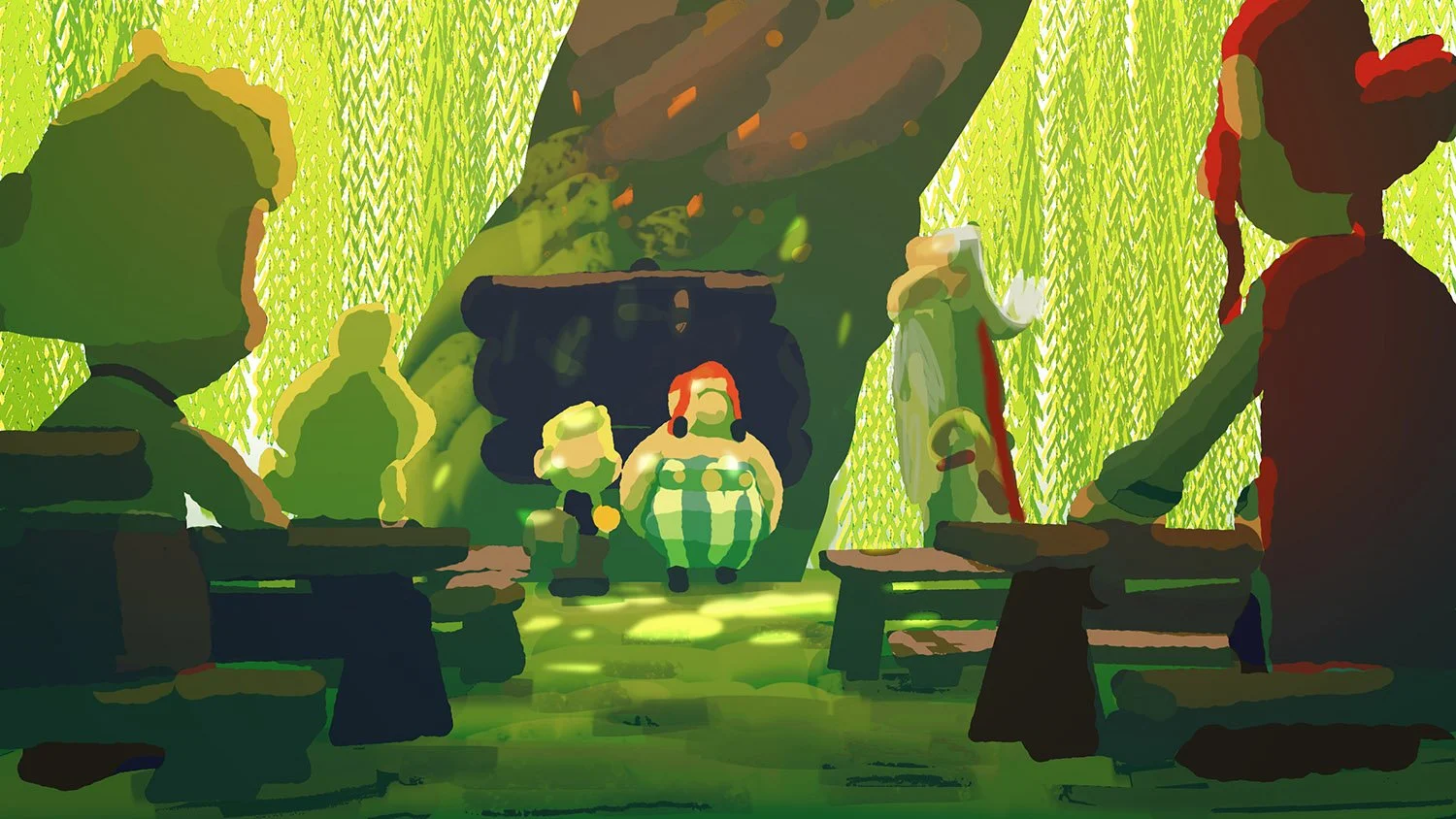
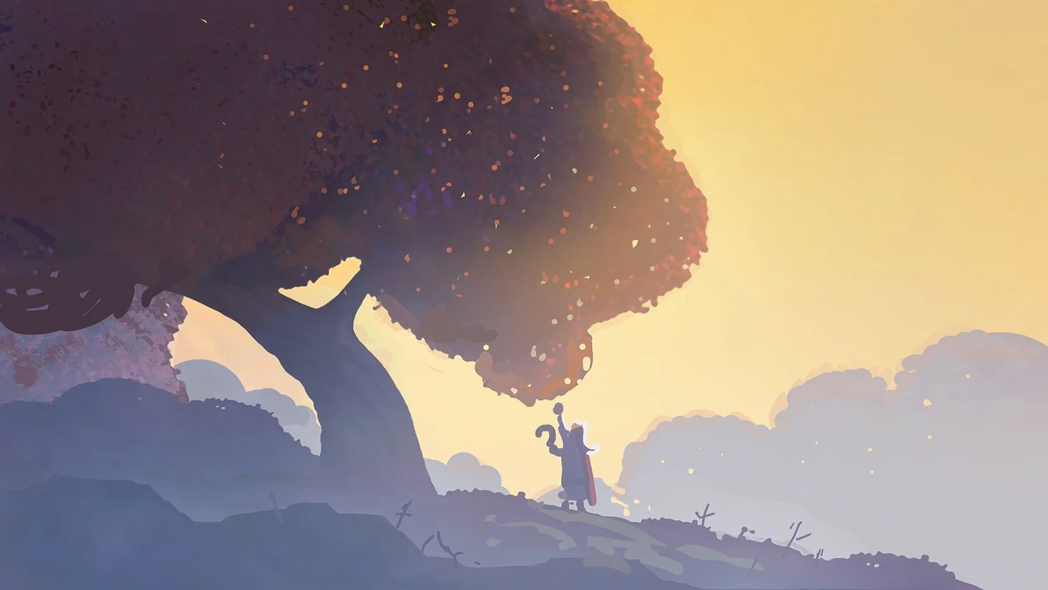
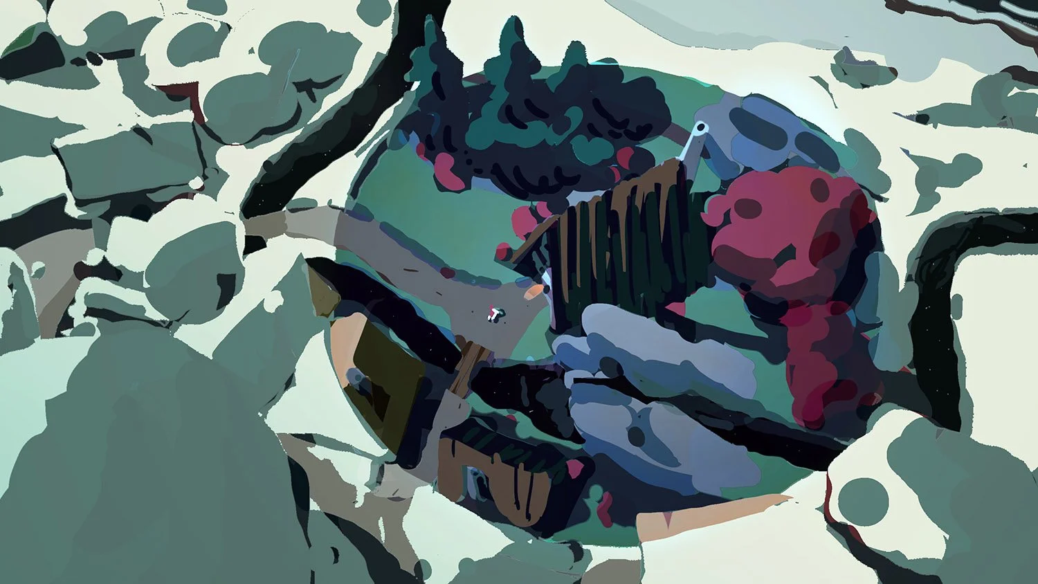
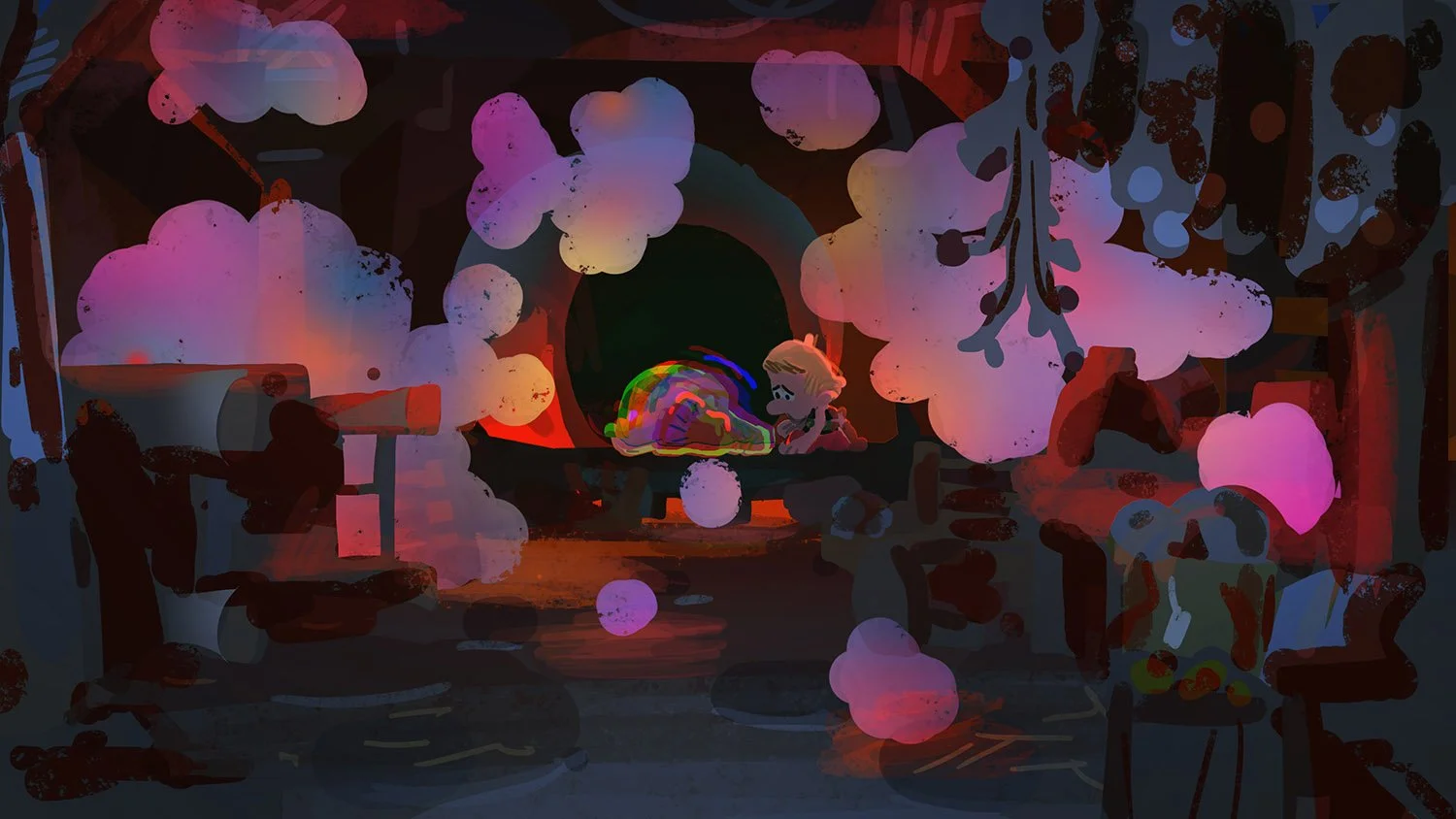
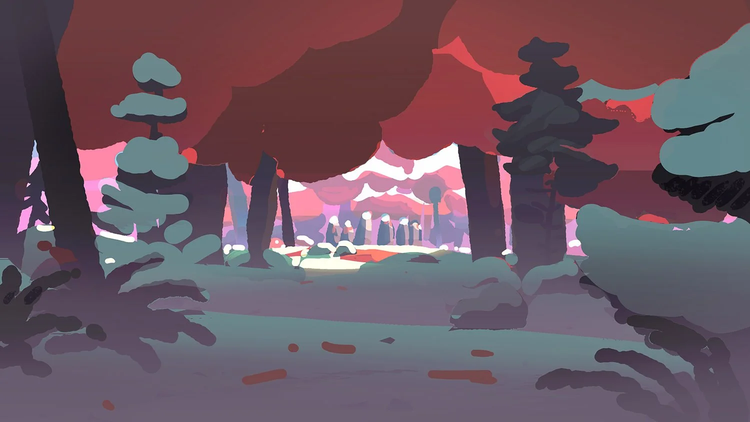
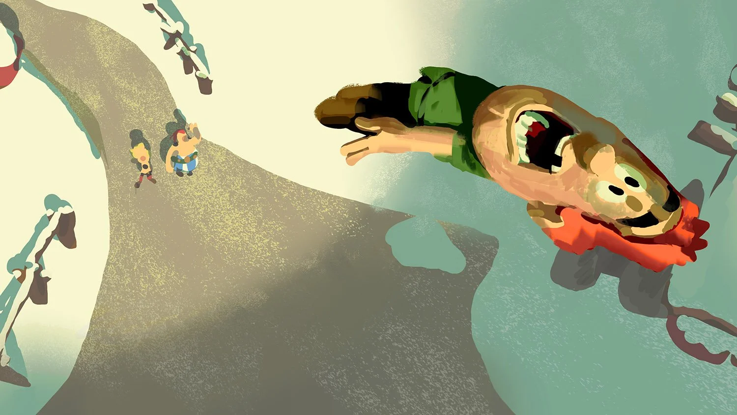
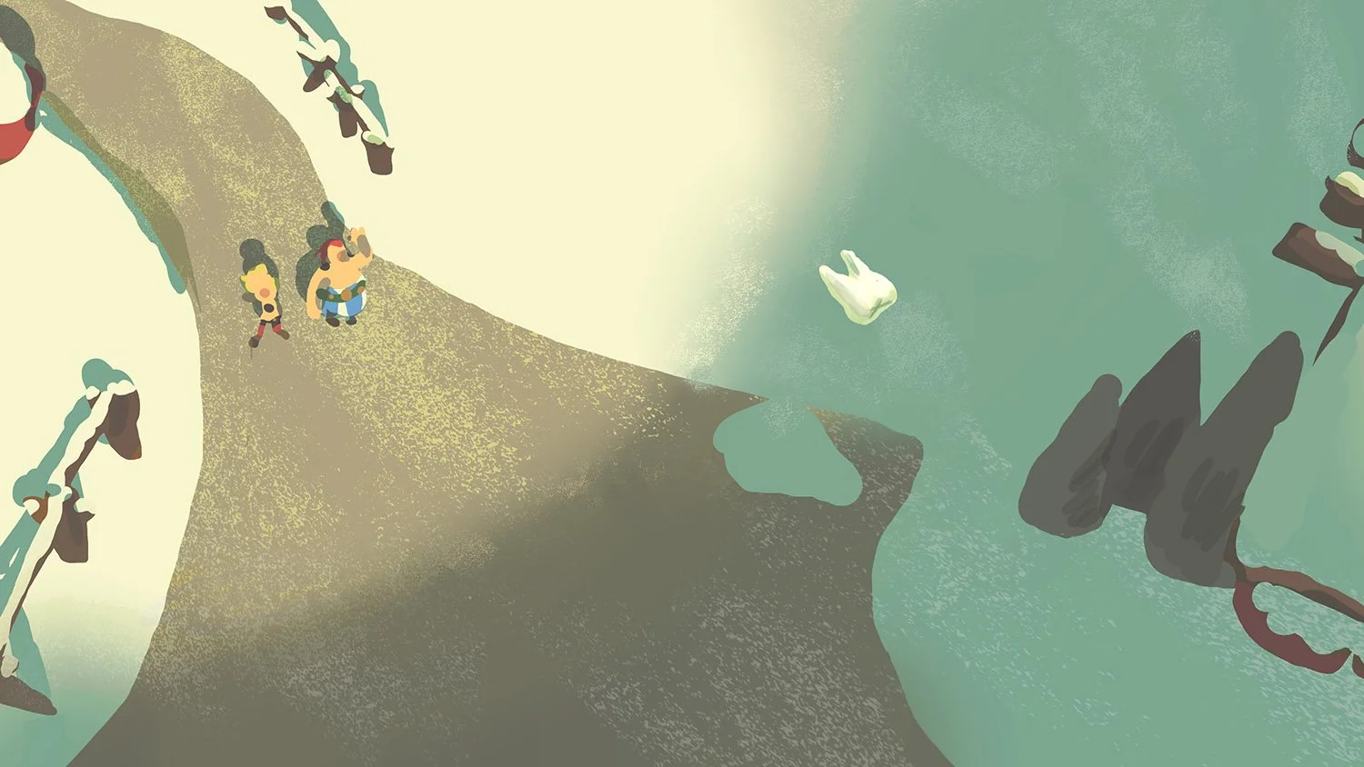
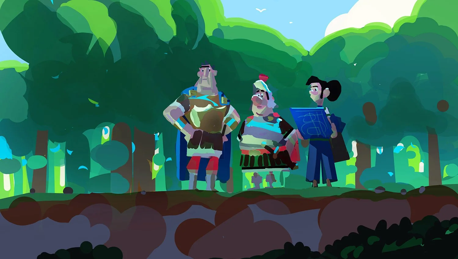
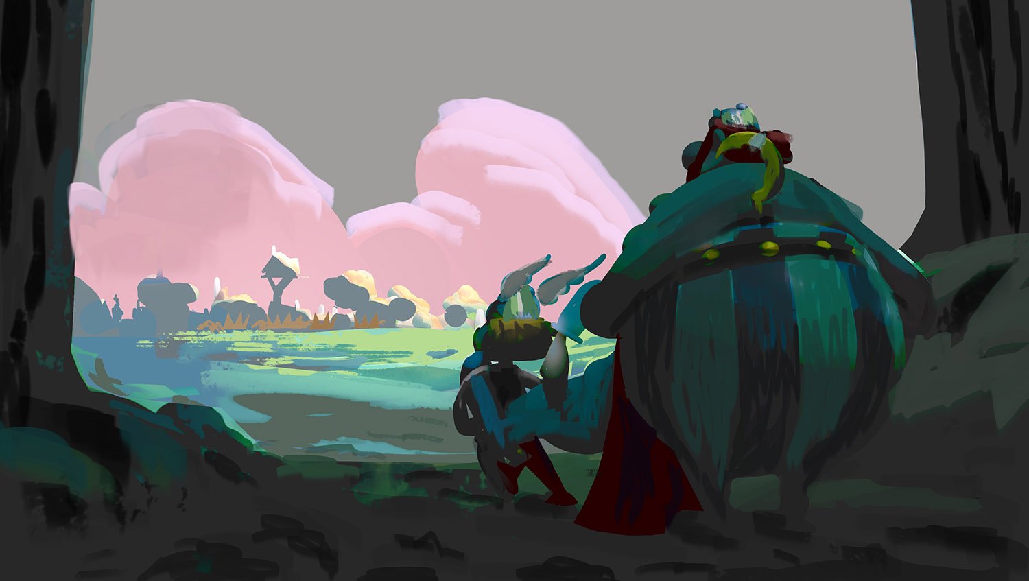
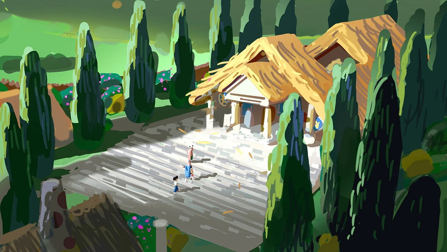
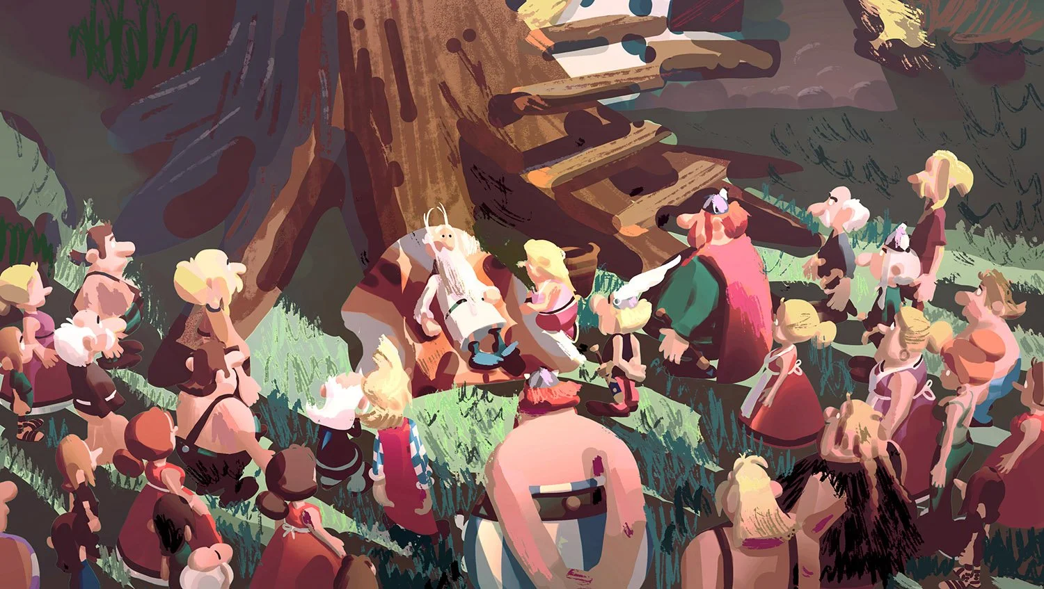
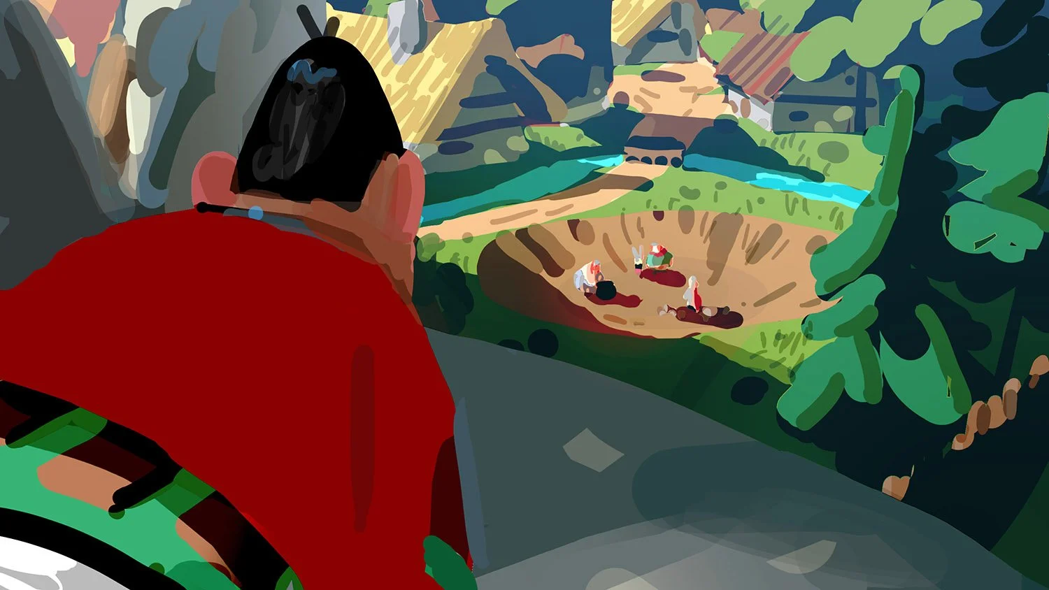
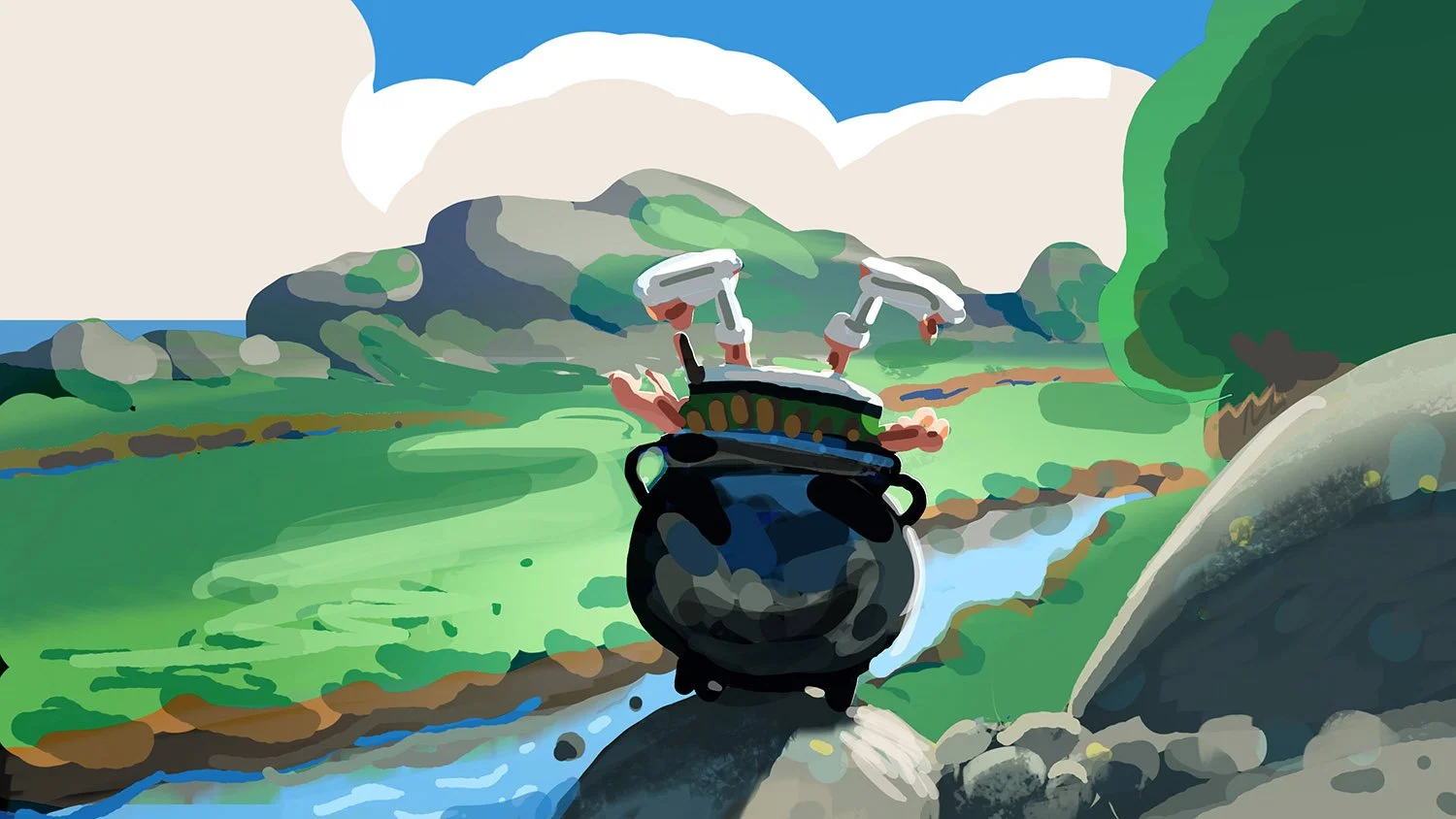
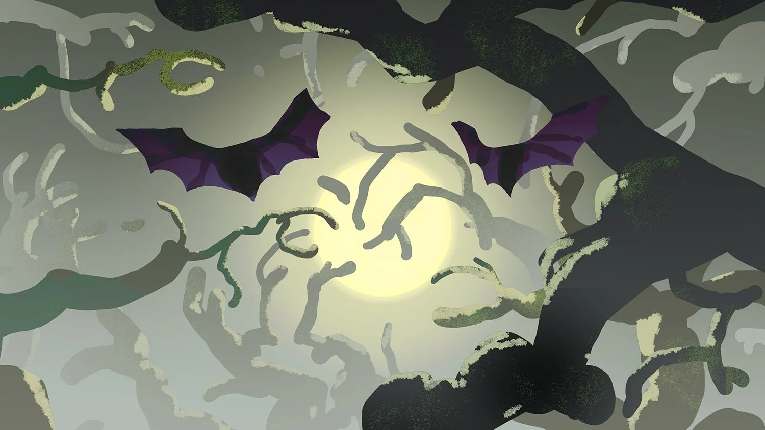
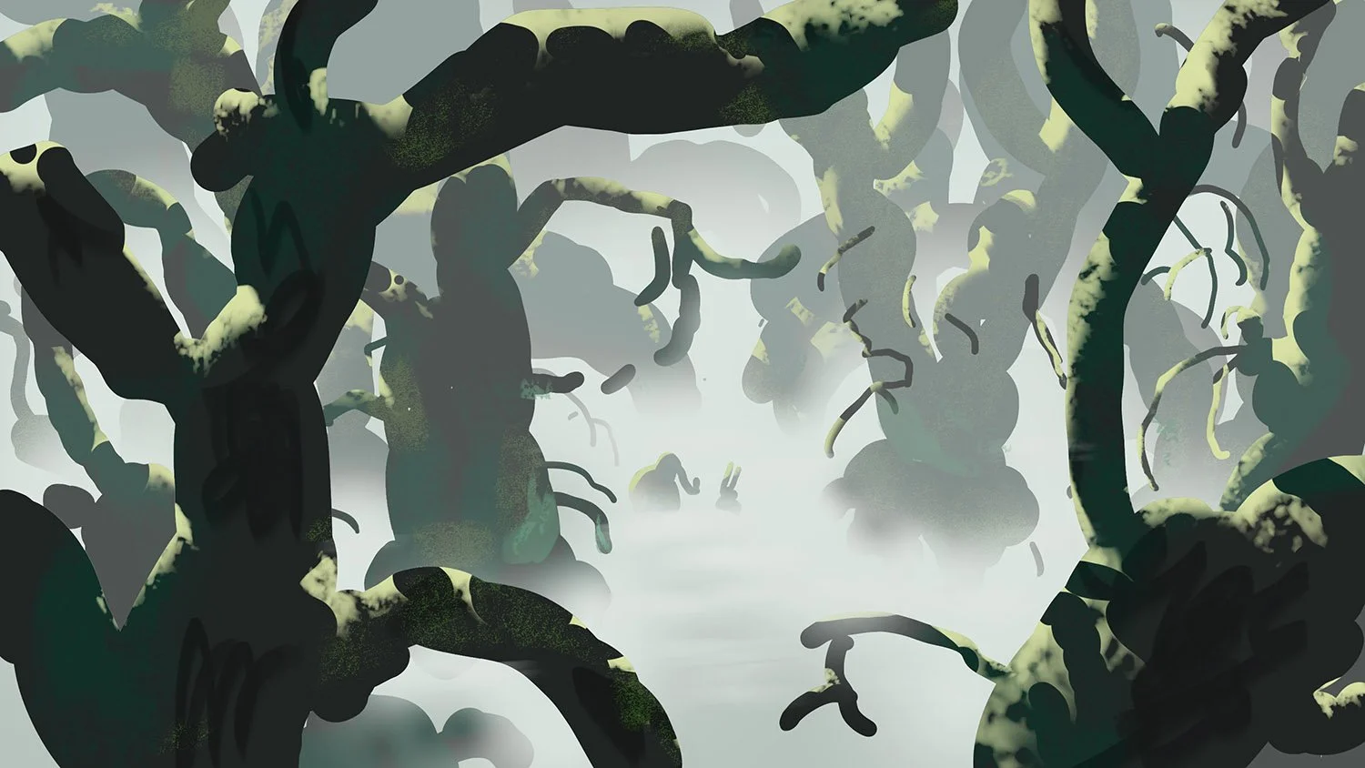
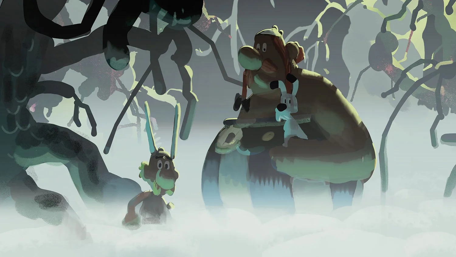
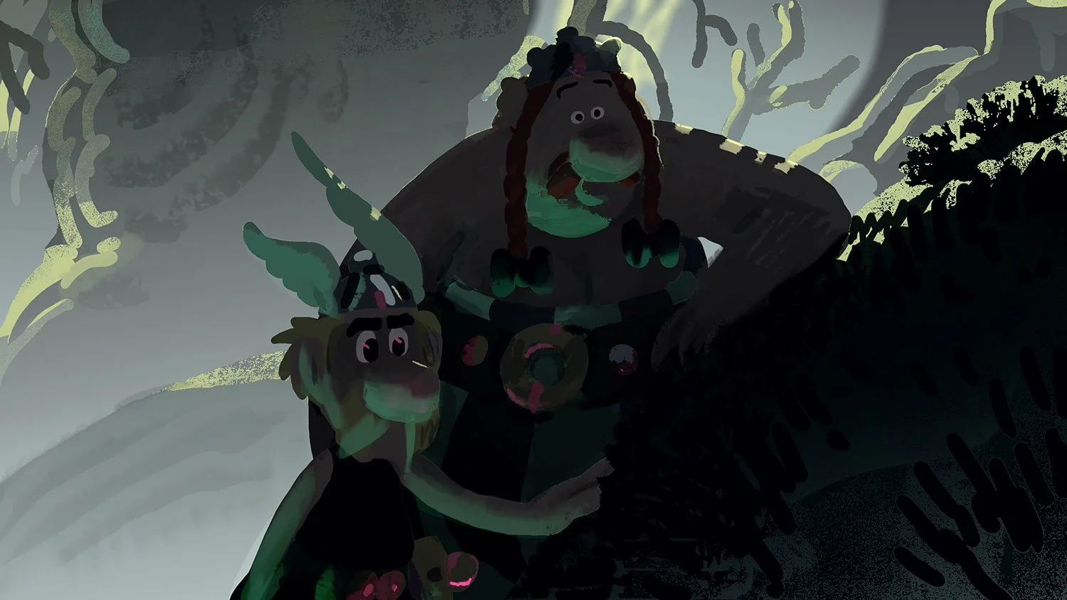
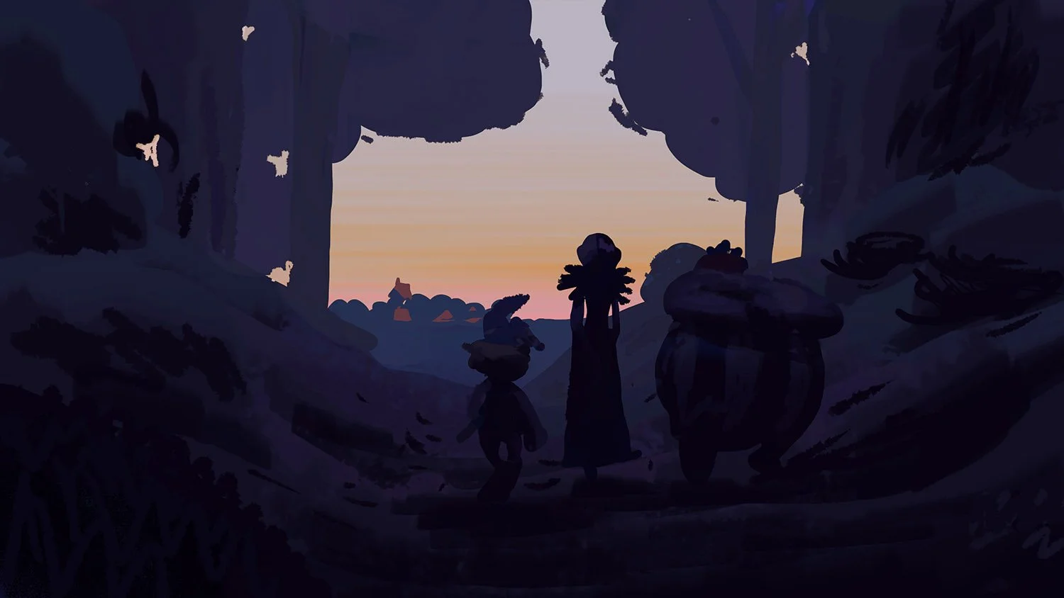
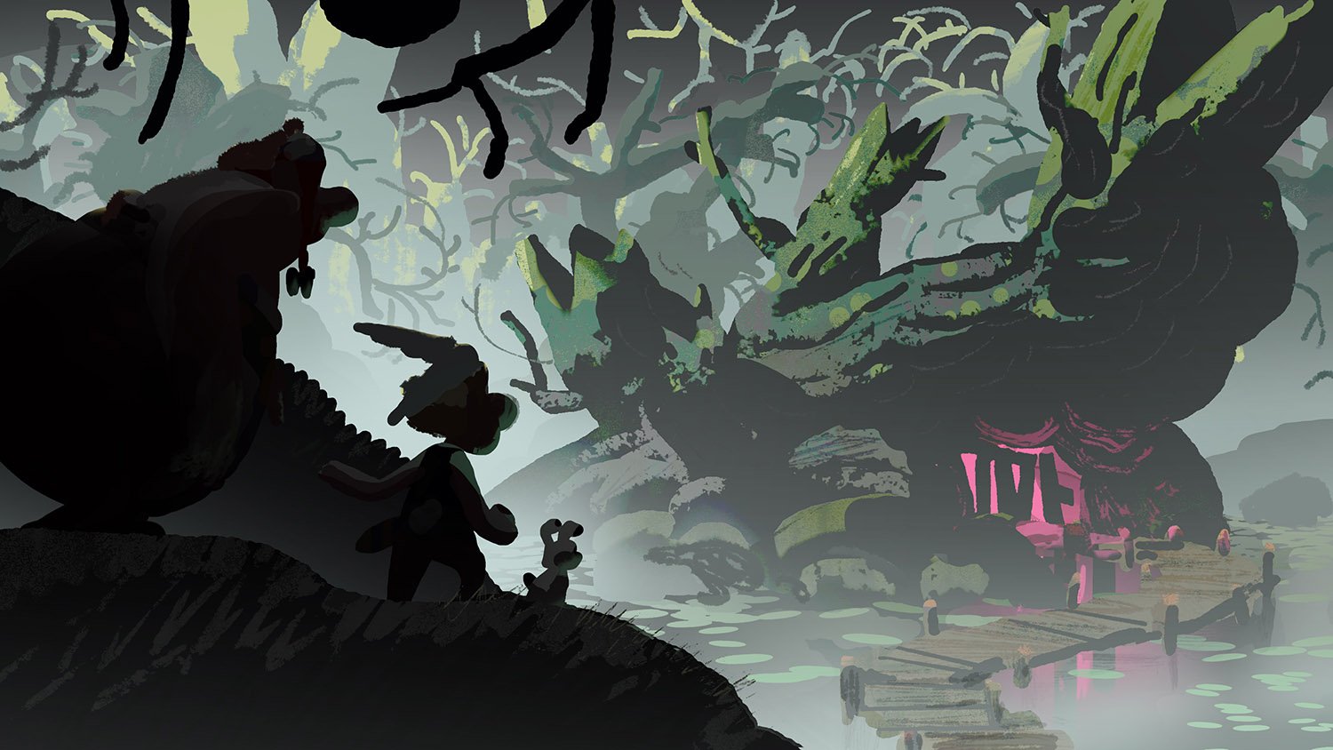
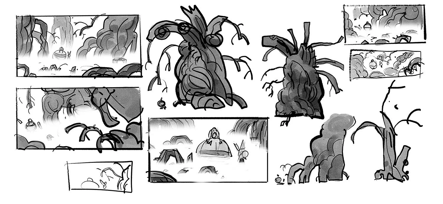
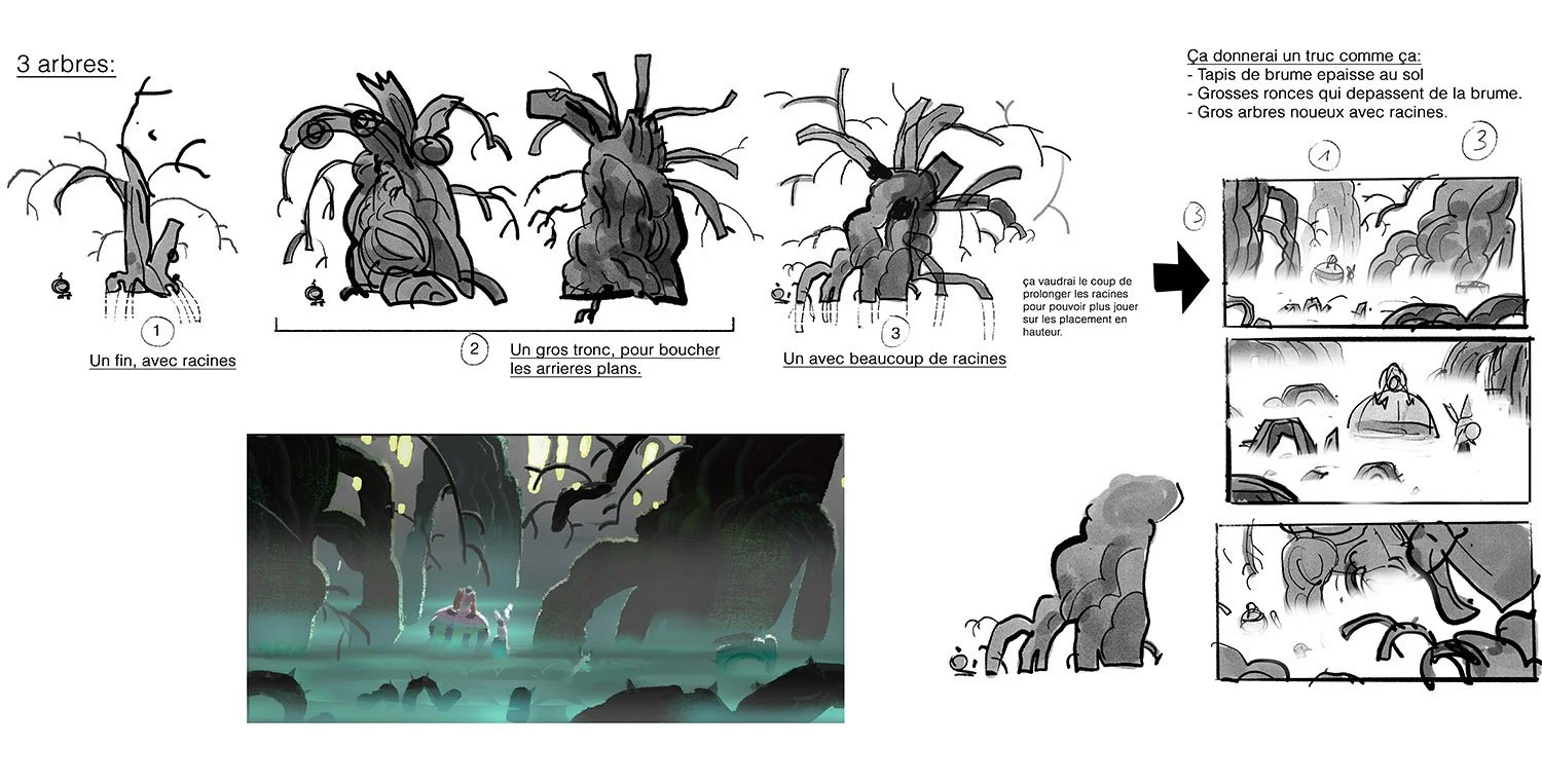
THE FOREST:
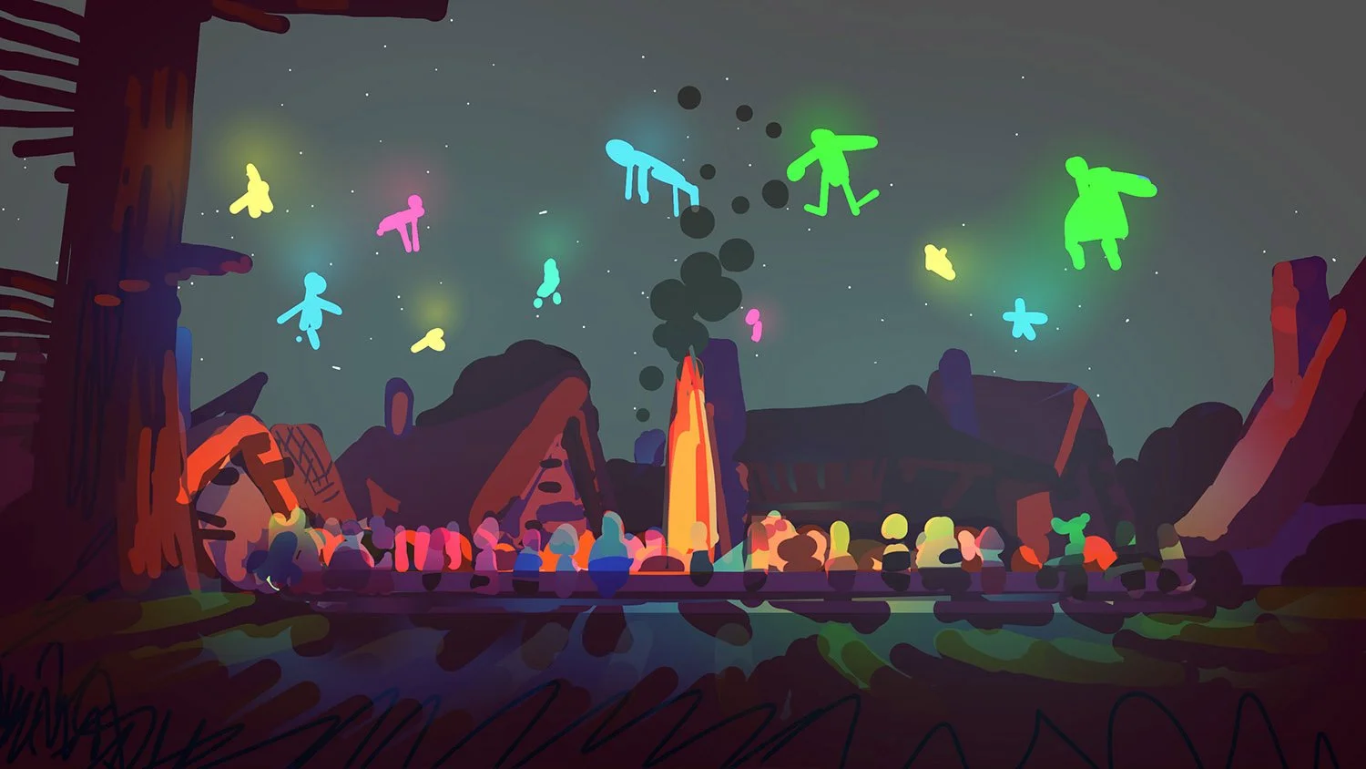
We treated the forest as a welcoming, almost sacred space: a natural cathedral. Soft shapes, filtered light, and mossy textures create a serene environment.
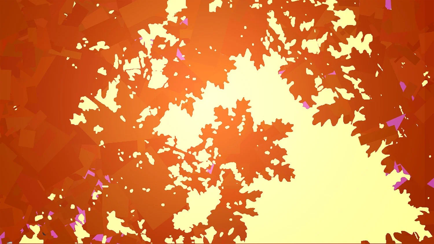
The stylised far background areas of forest are always backlit and treated in a bright and graphic way to evoke stained glass.
Final CG render
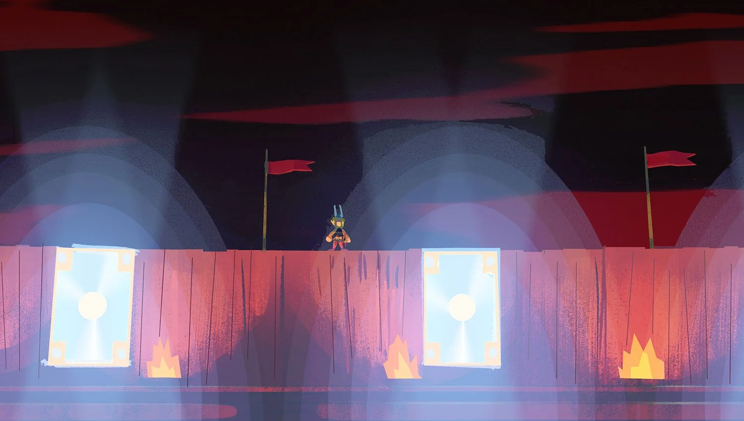
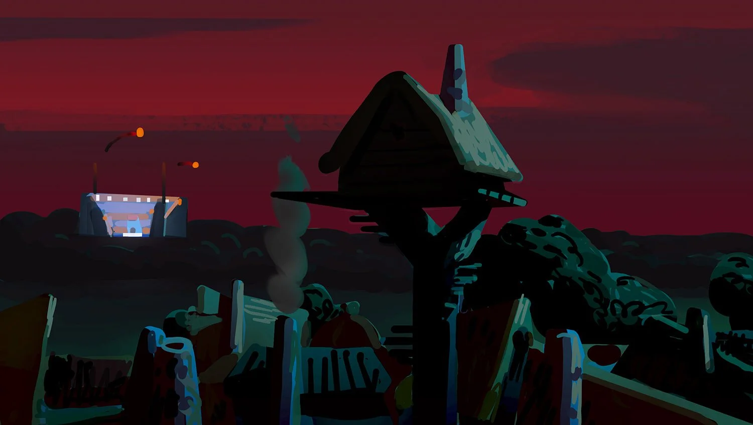
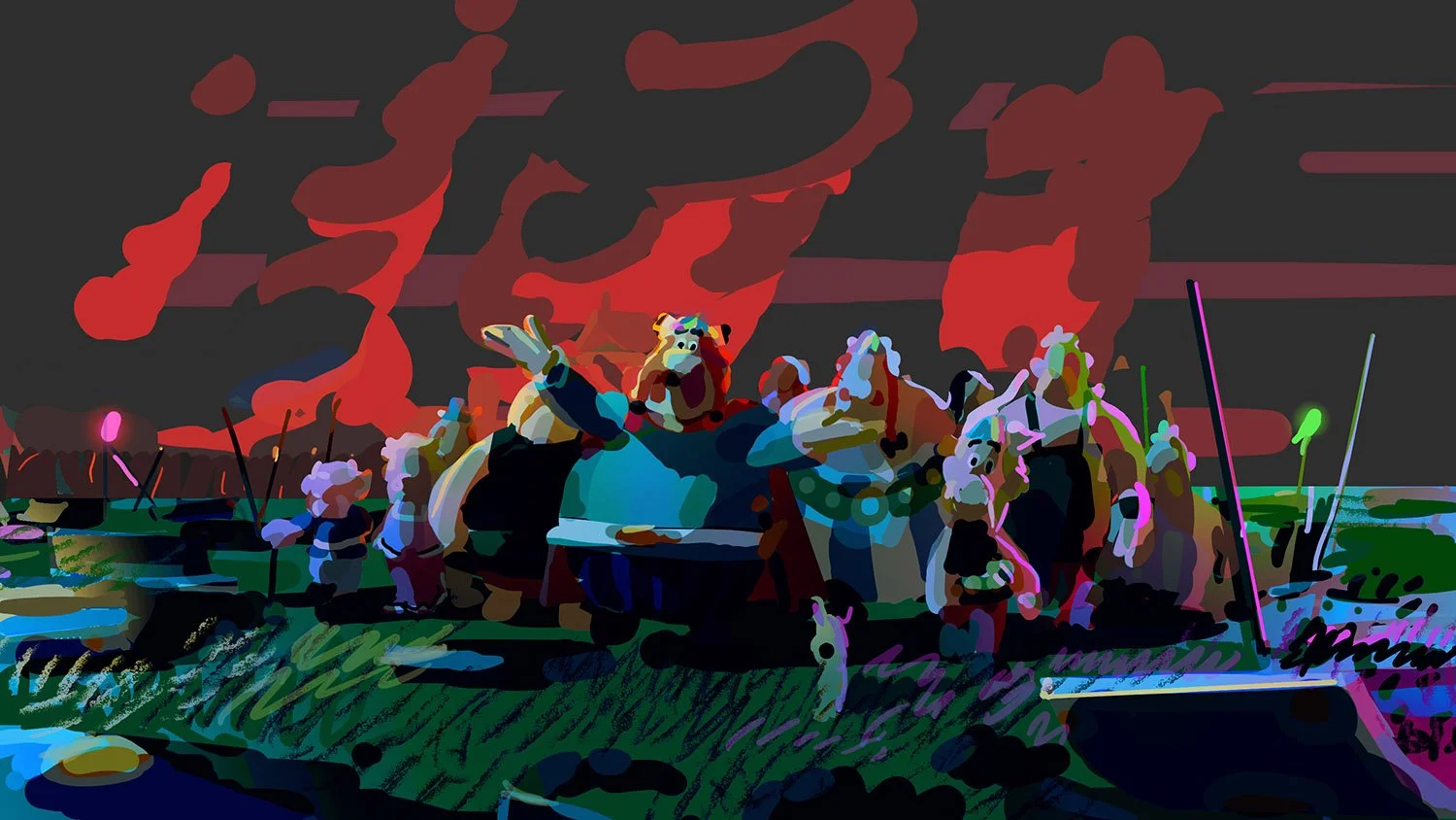
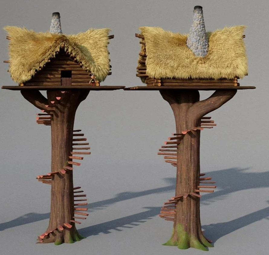
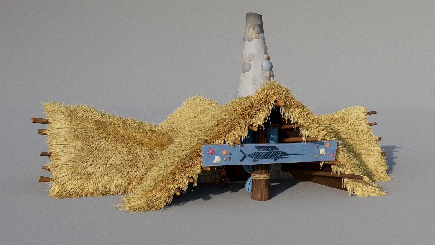
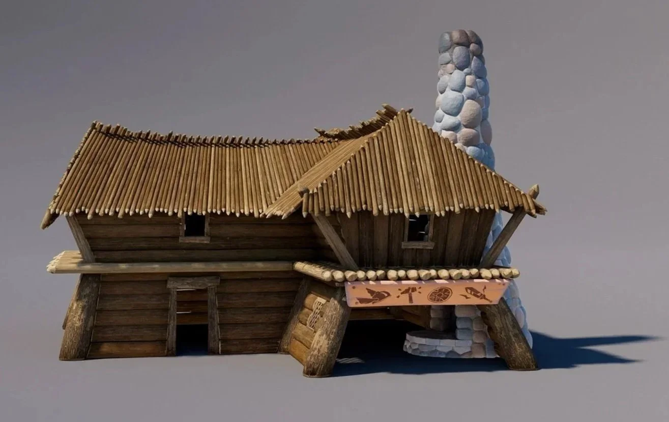
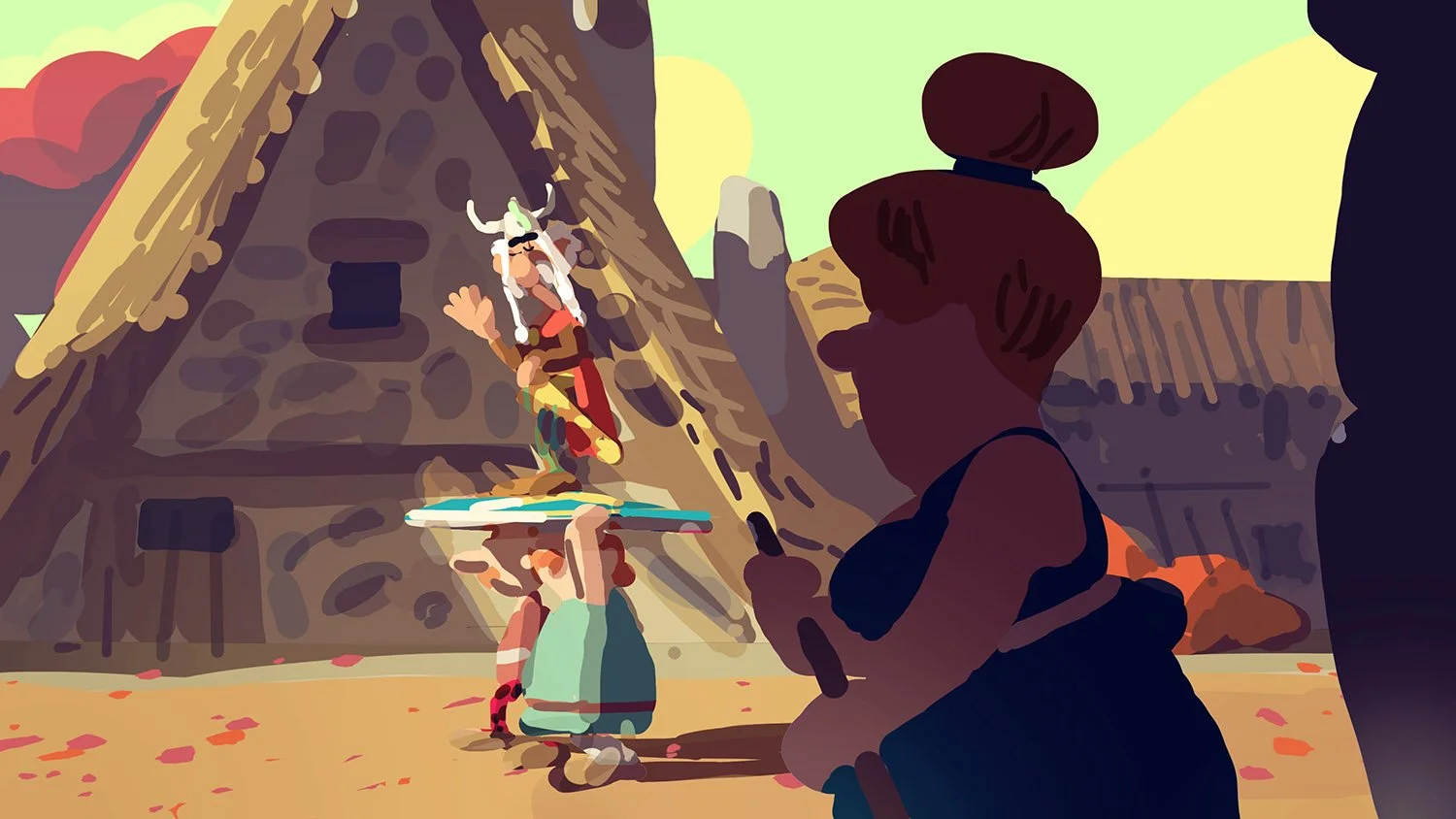
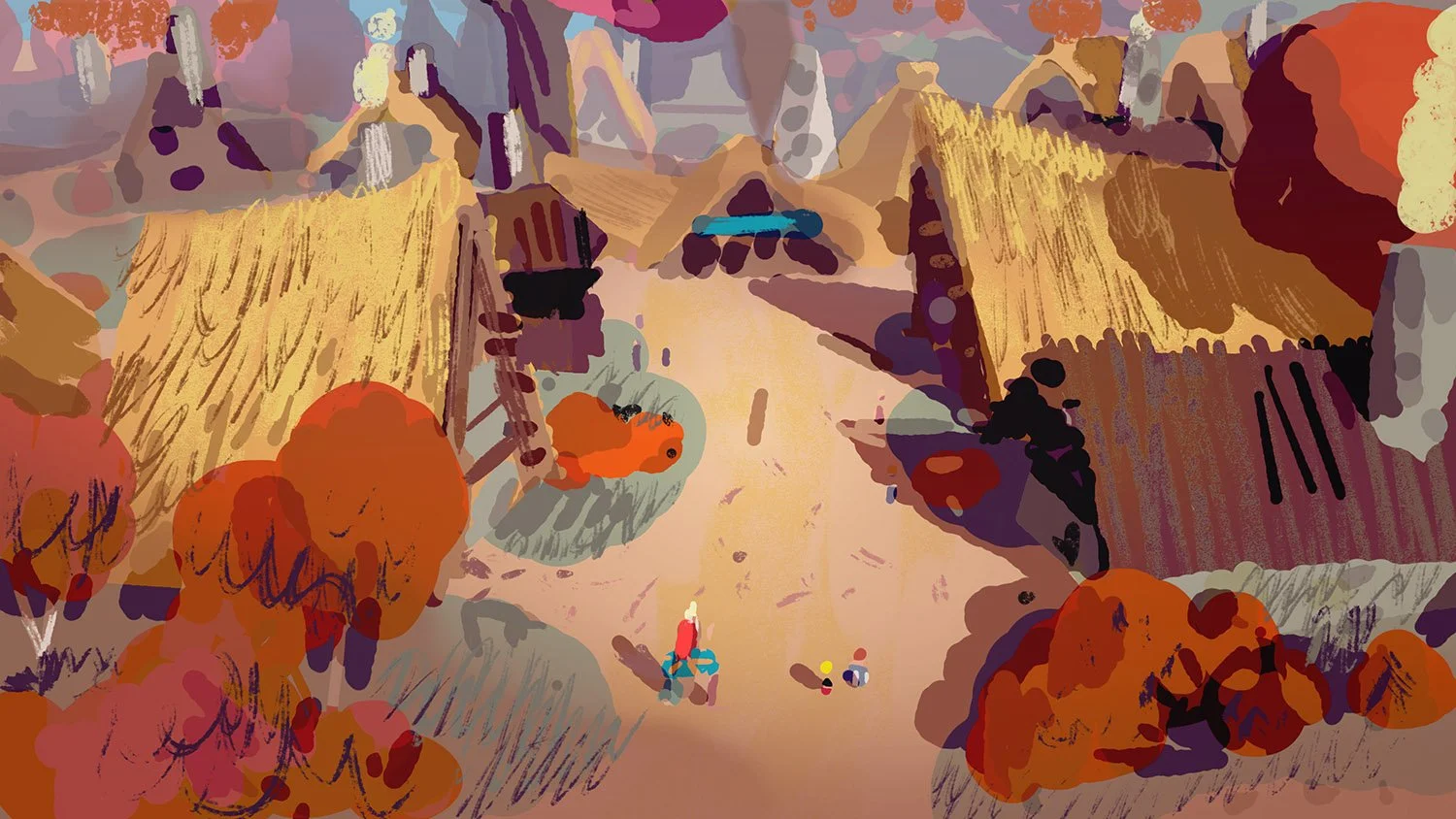
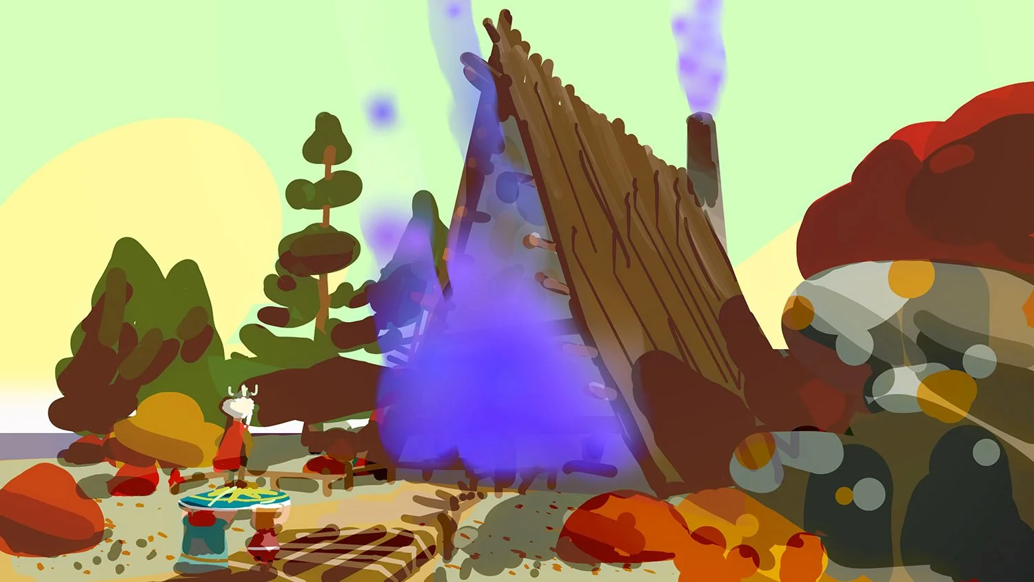
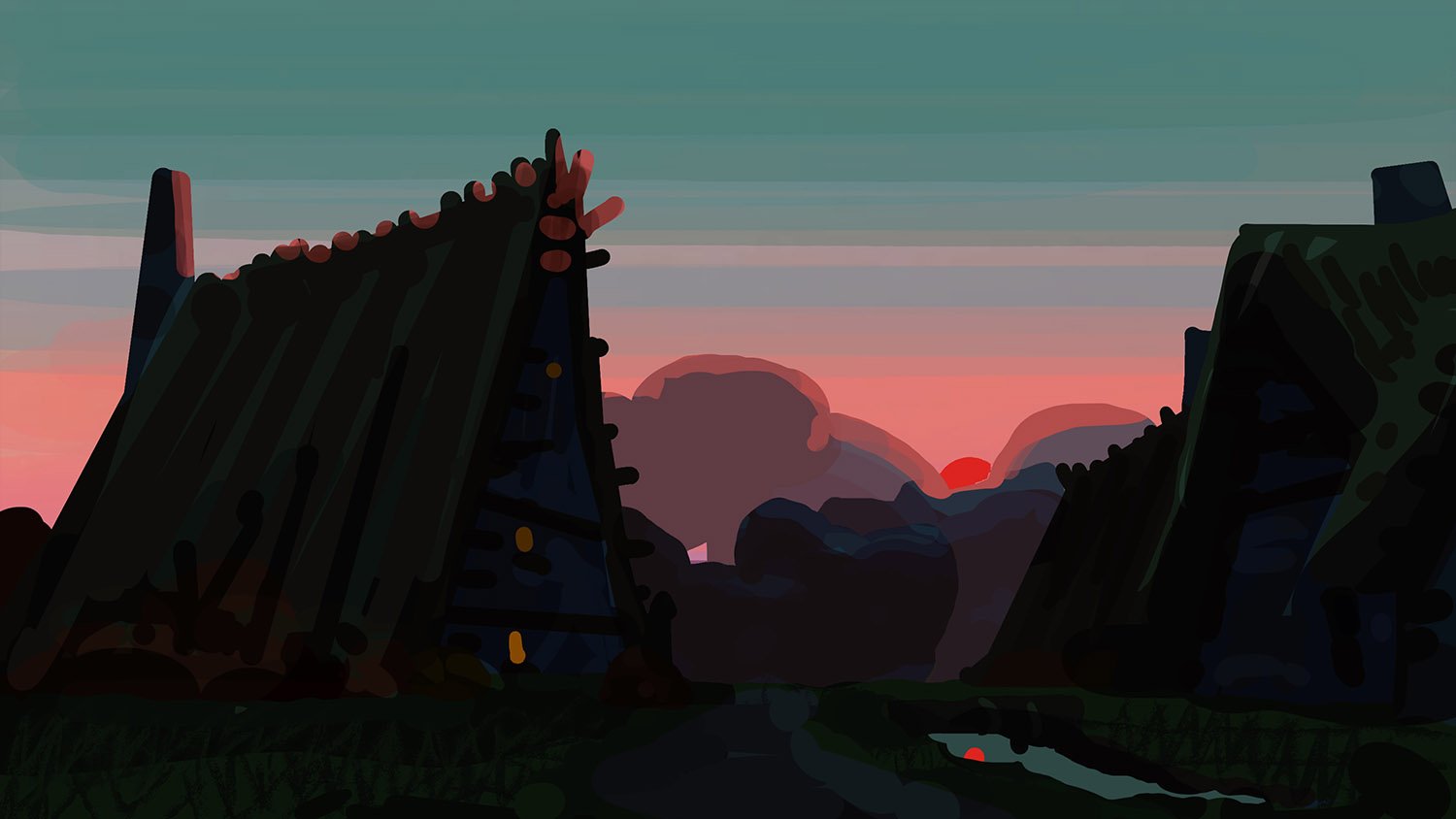
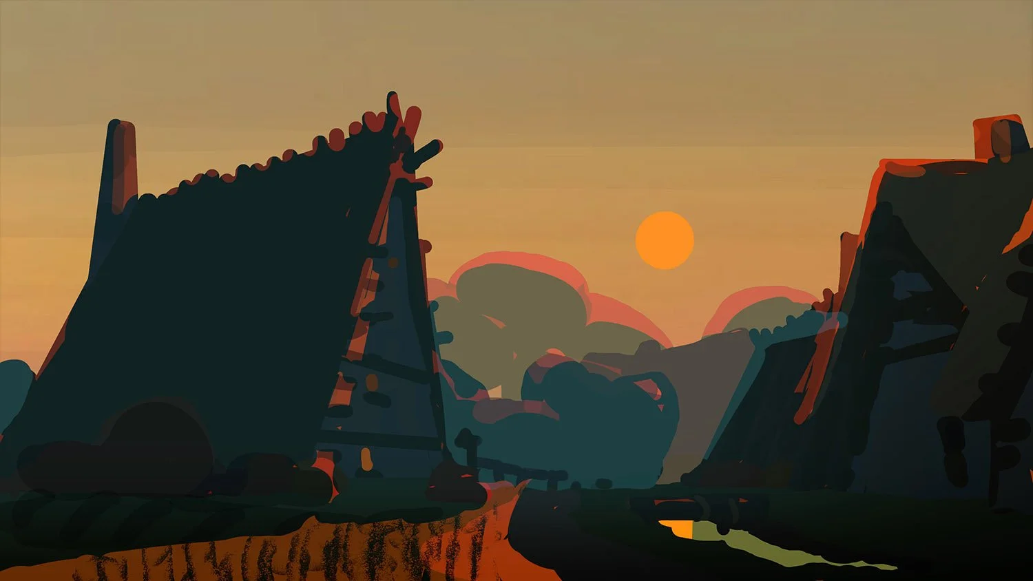
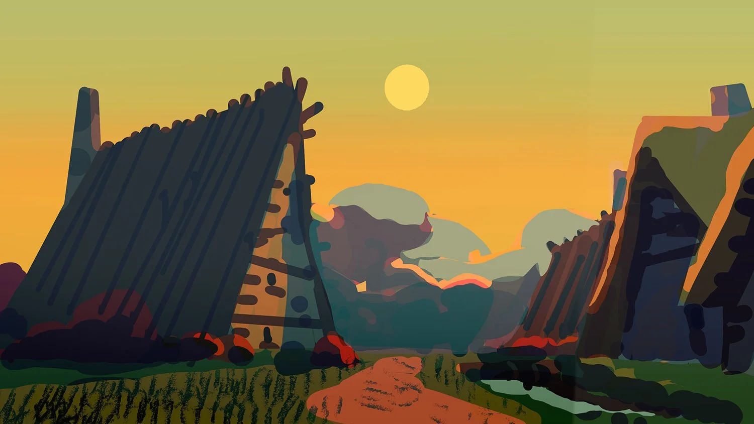
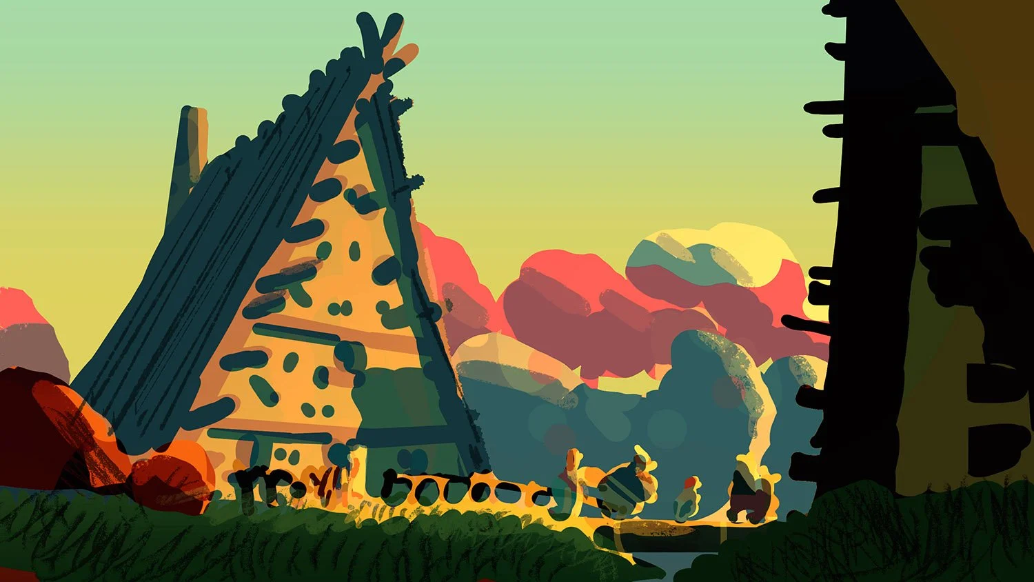
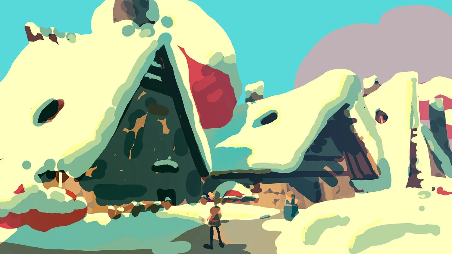
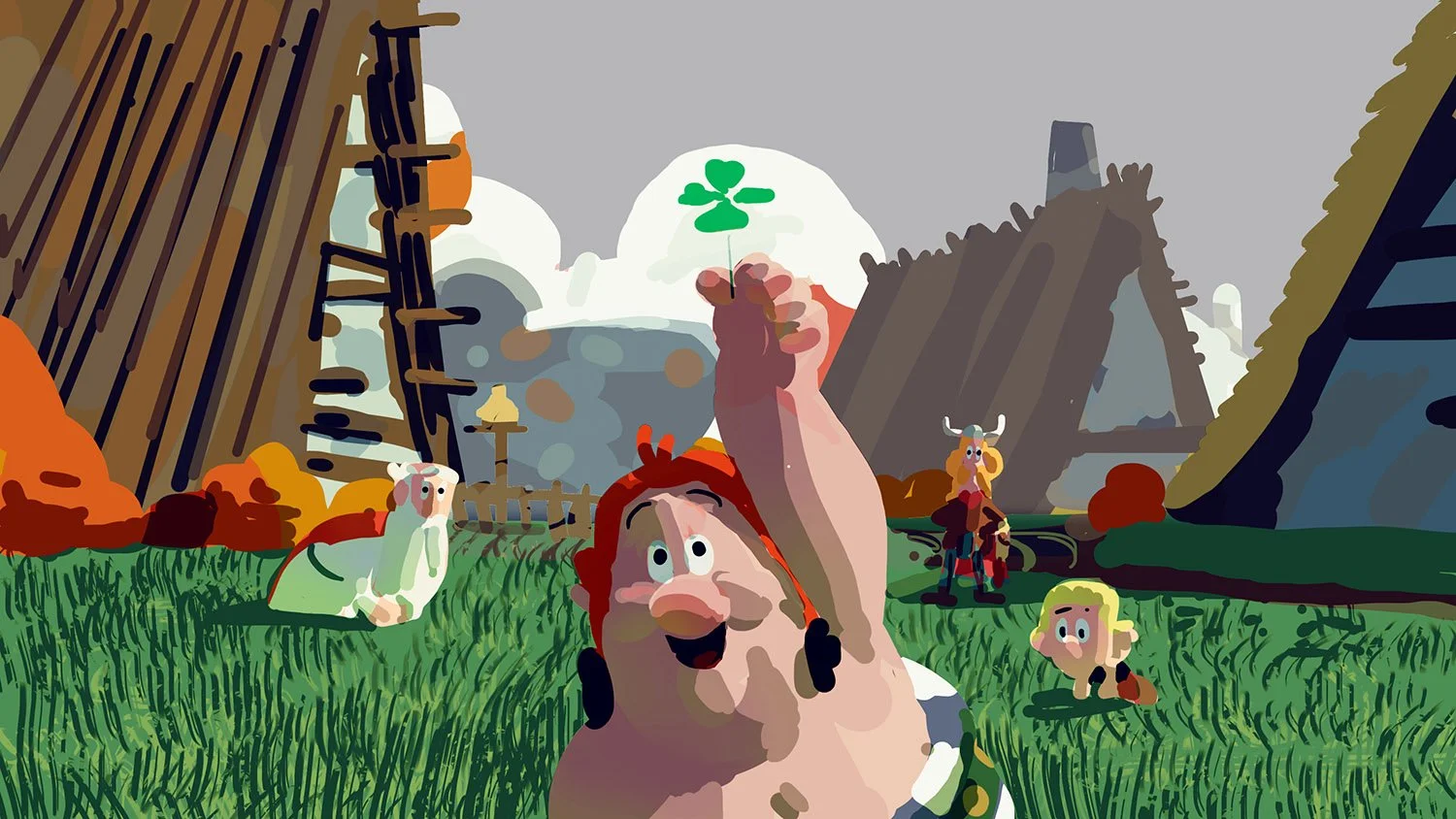
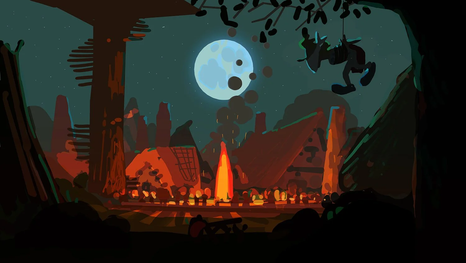
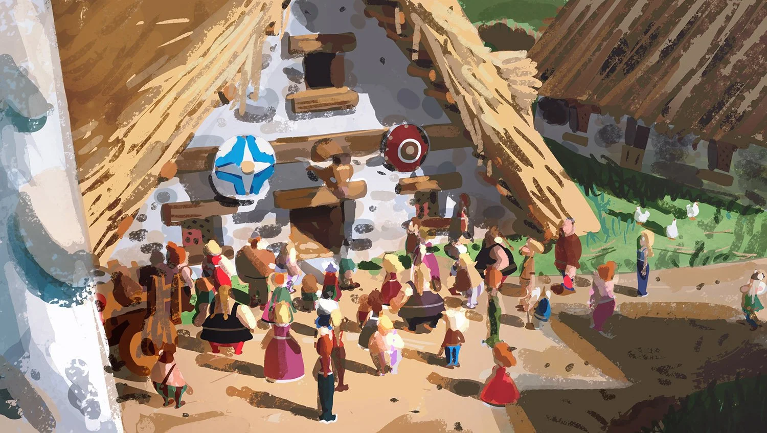
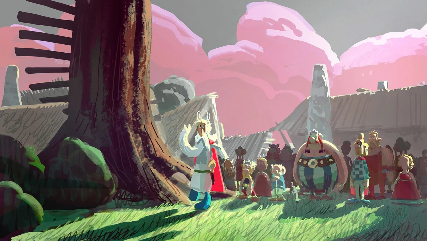
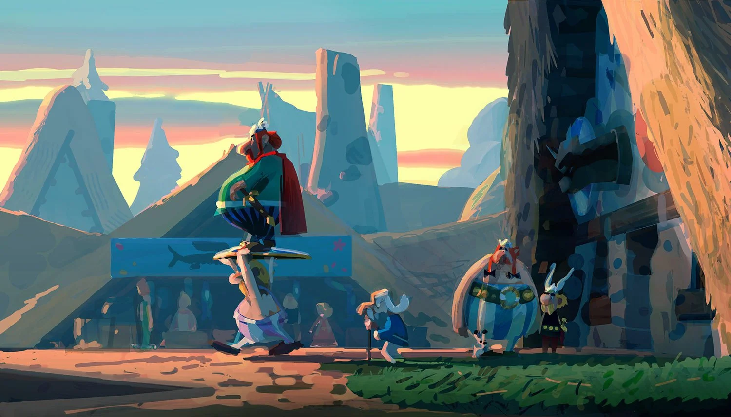
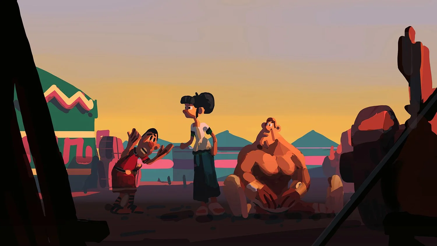
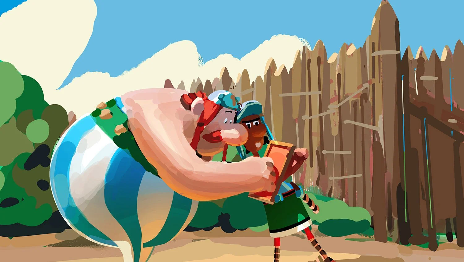
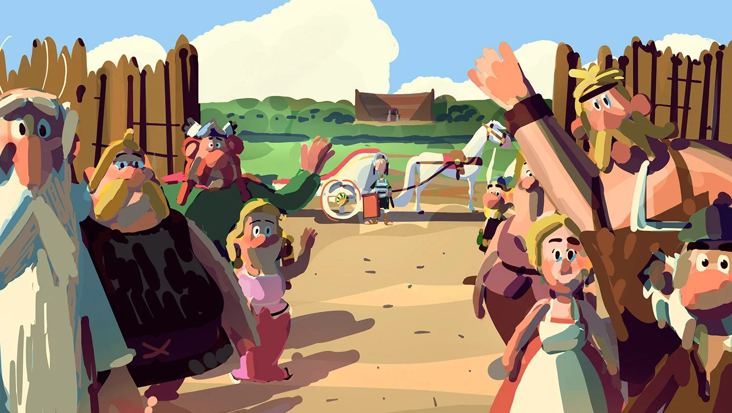
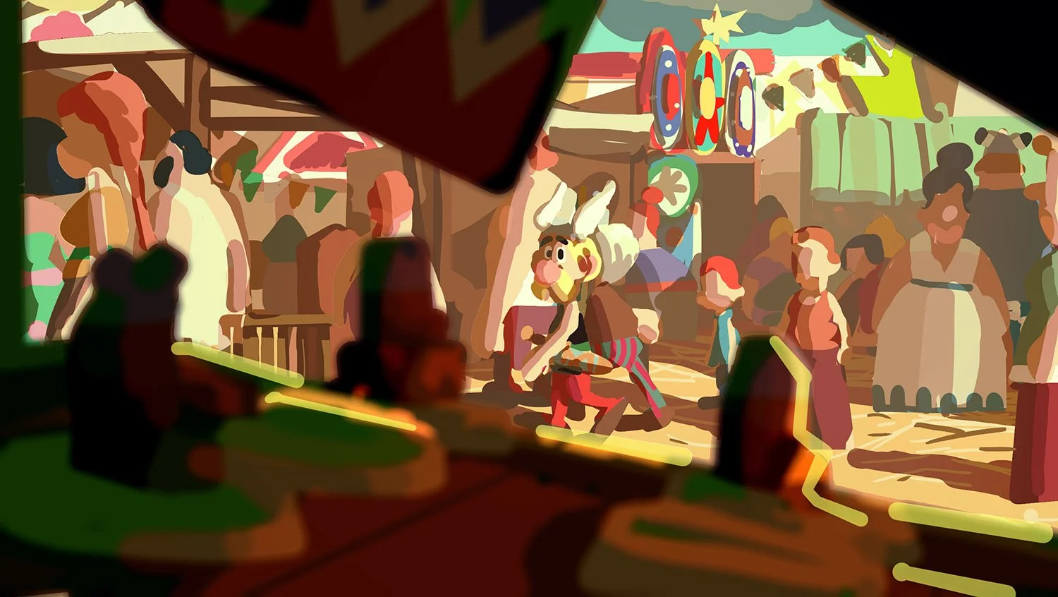
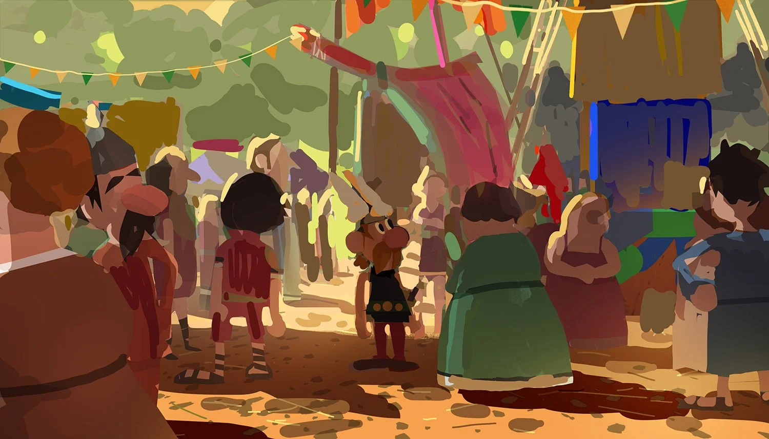
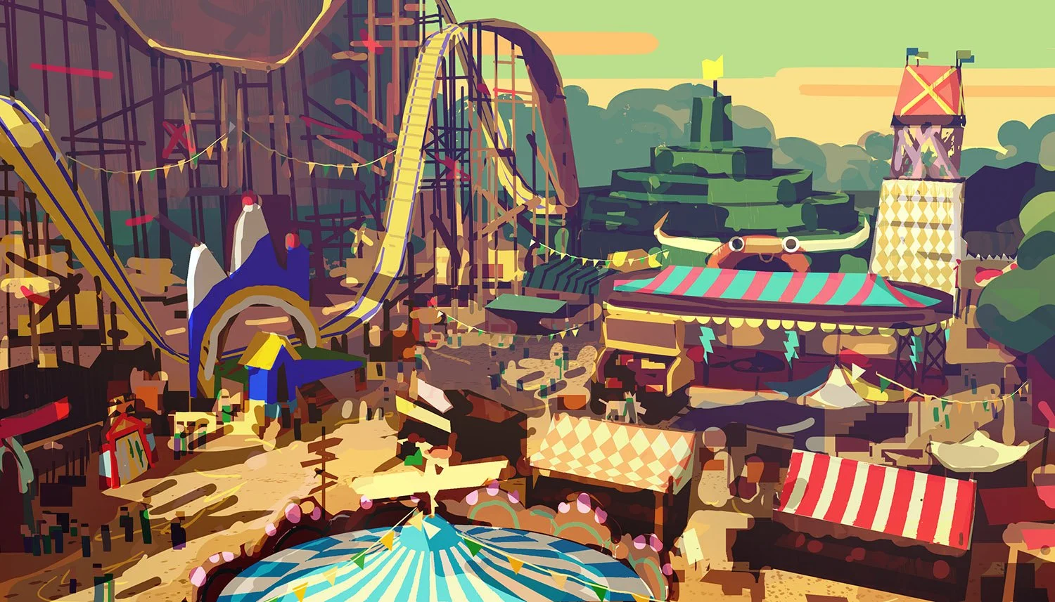
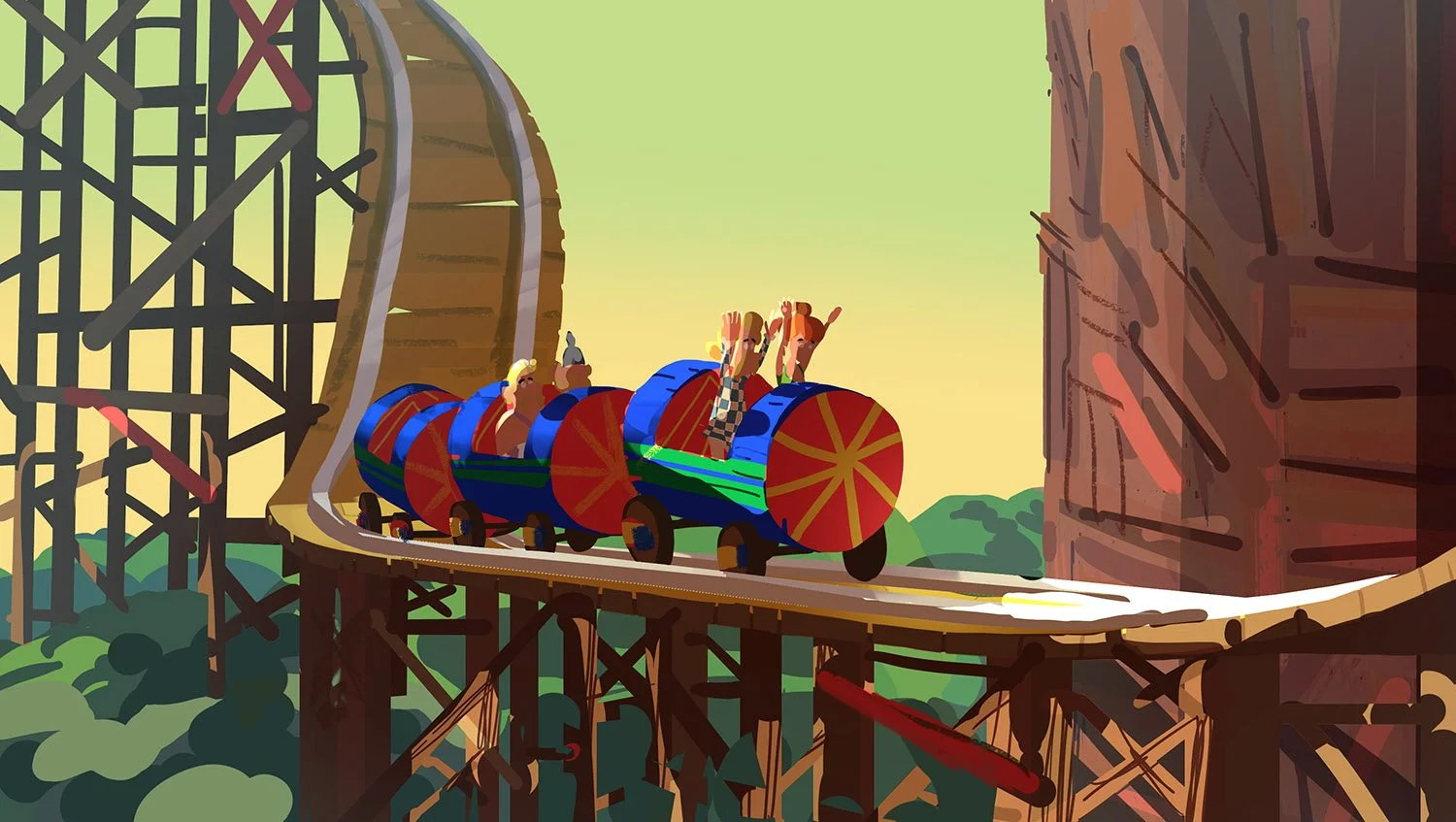
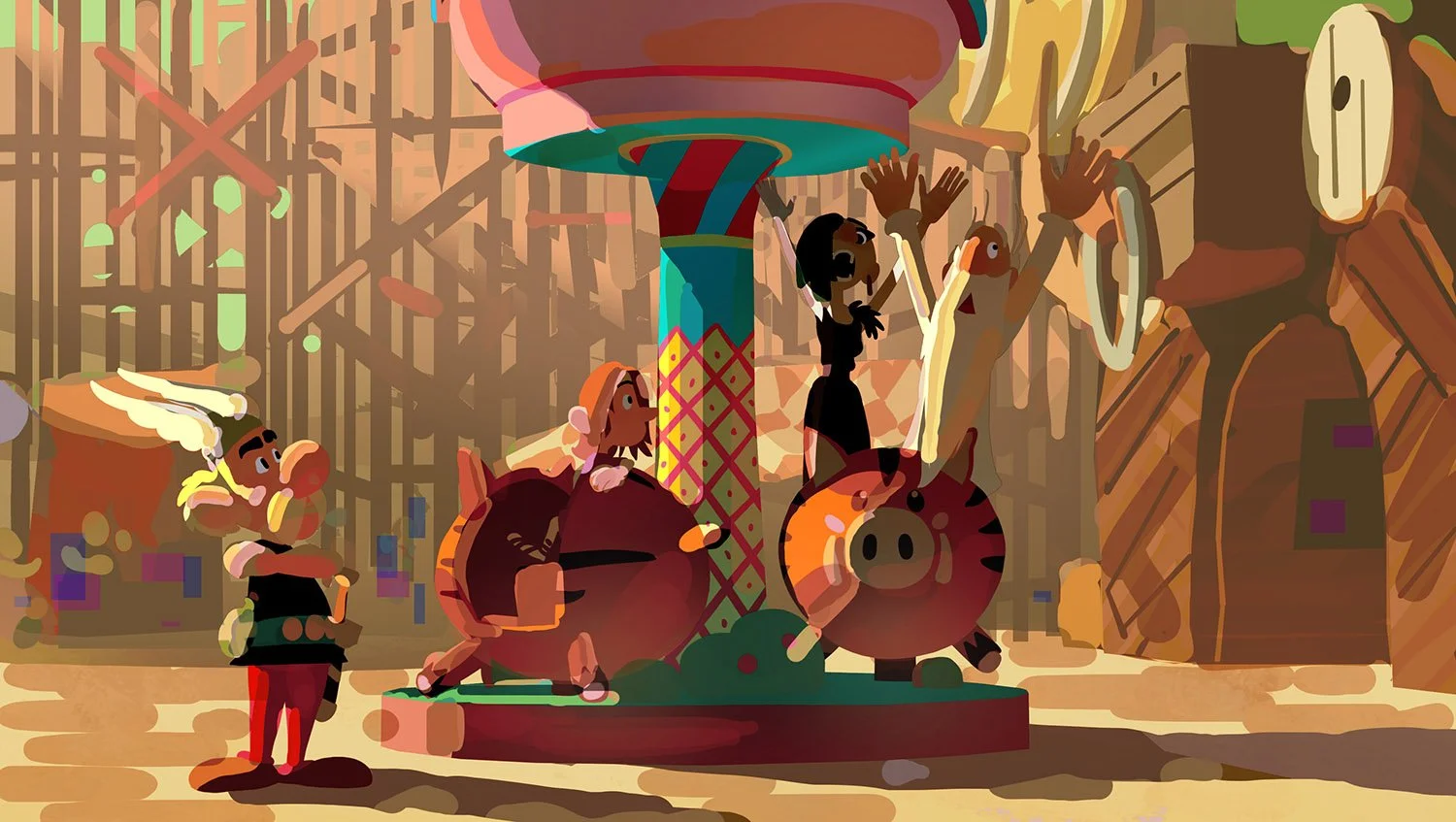
THE VILLAGE:
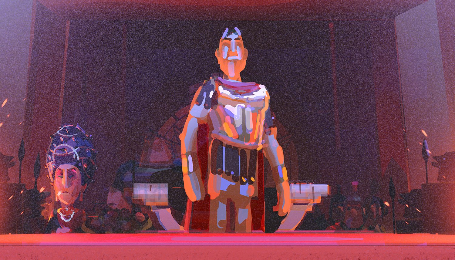
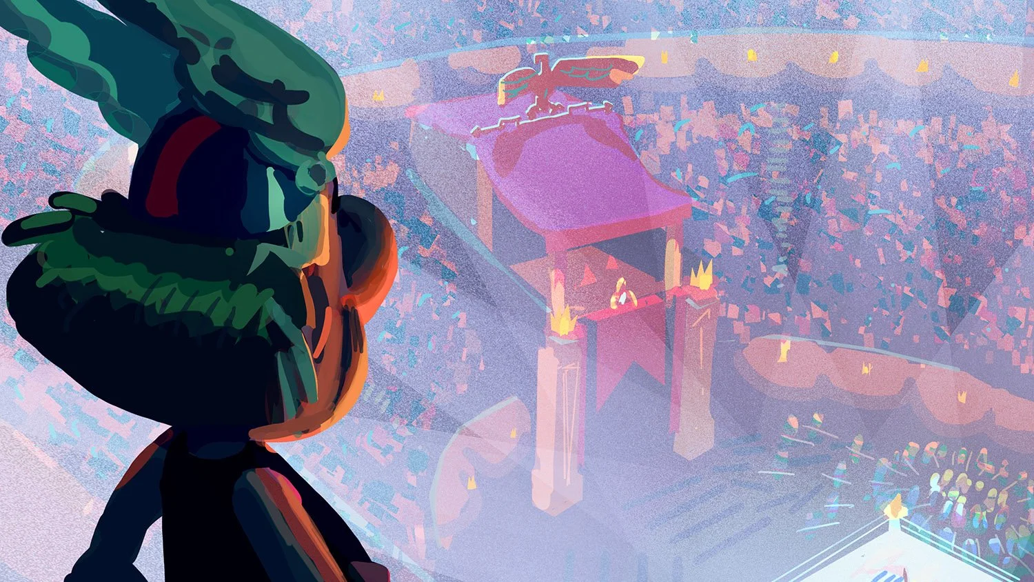
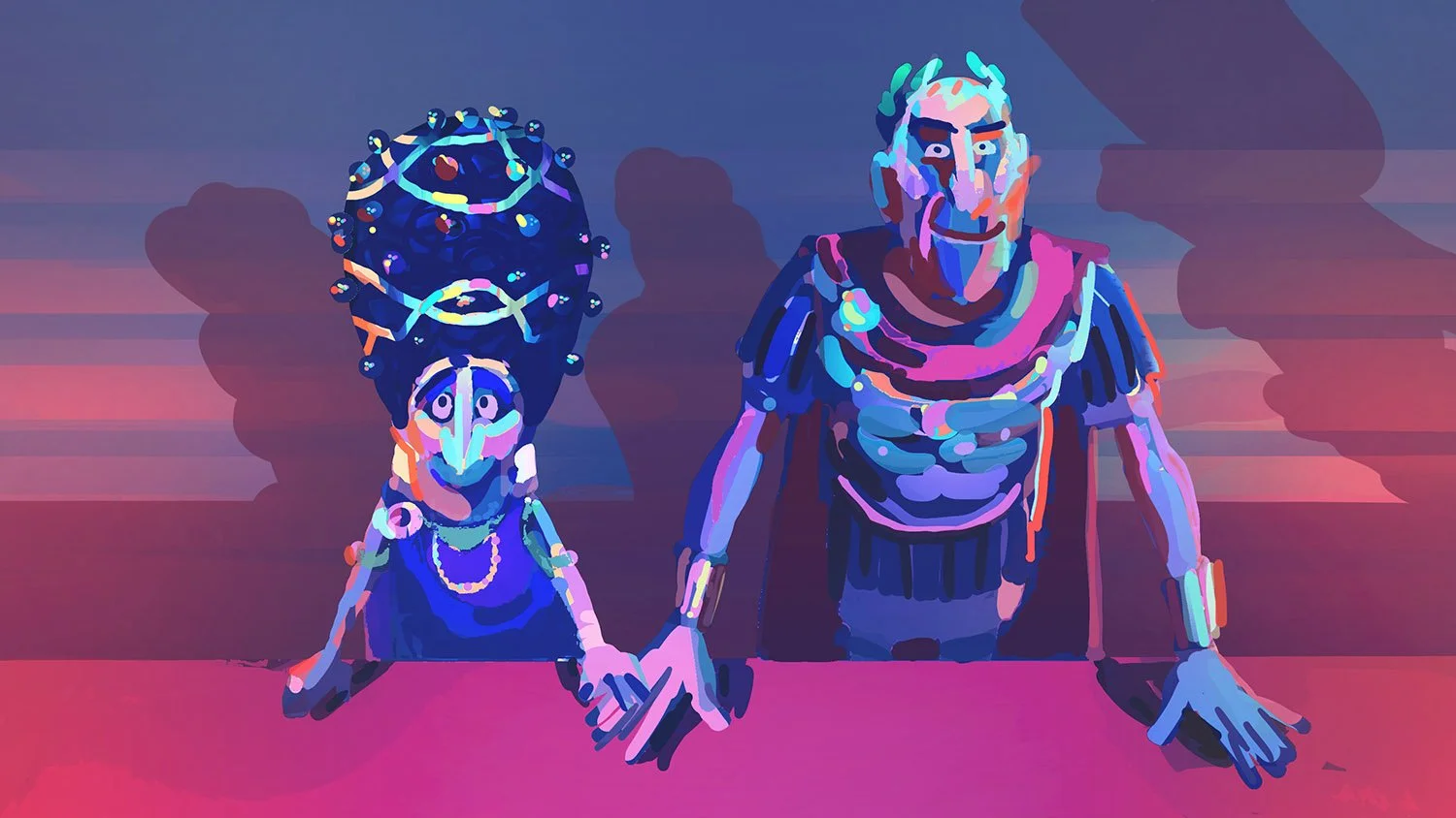
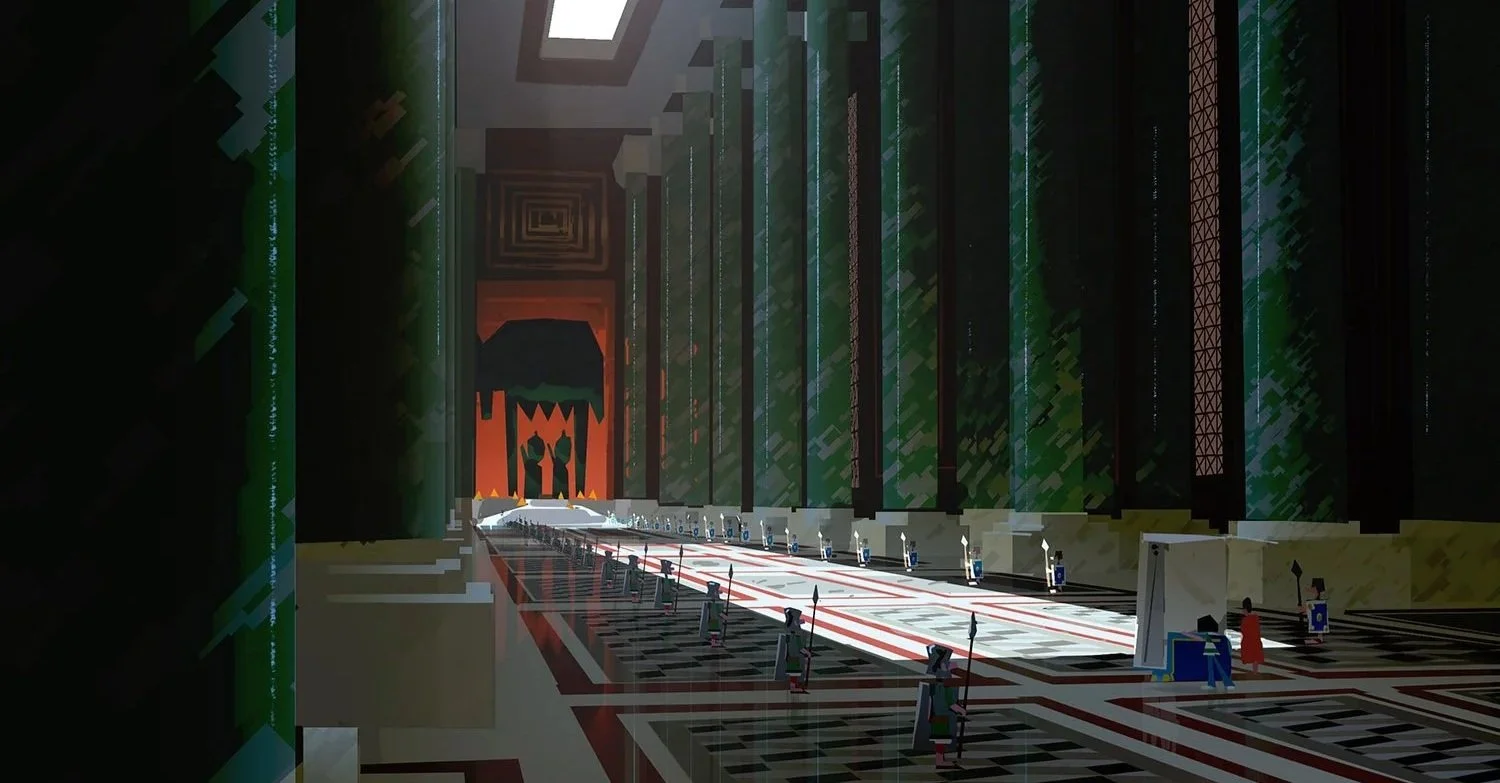
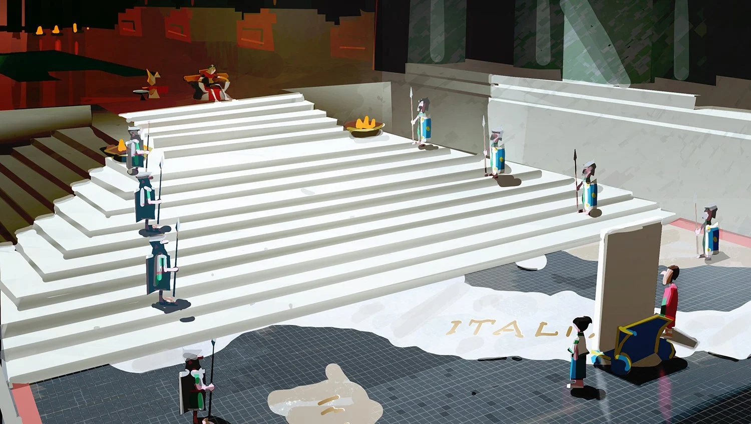
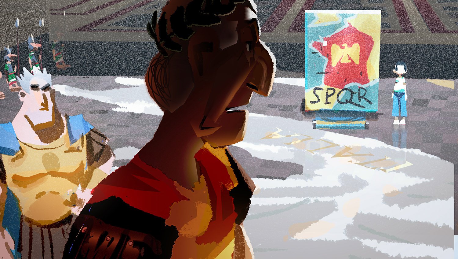
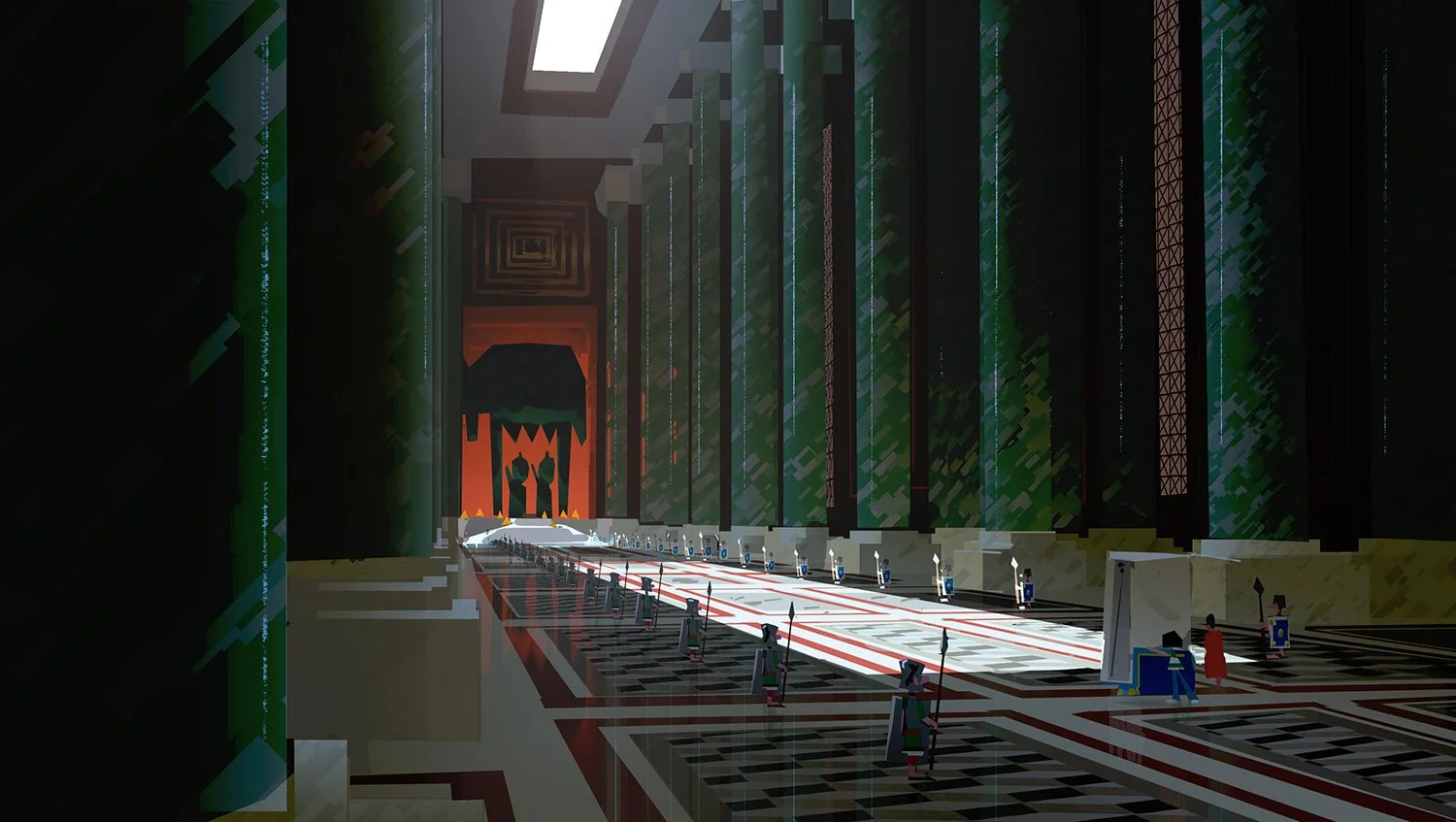
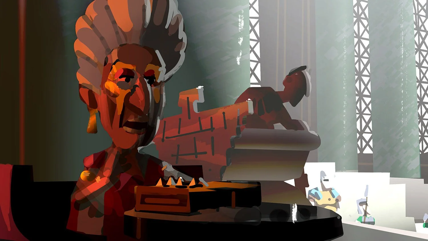
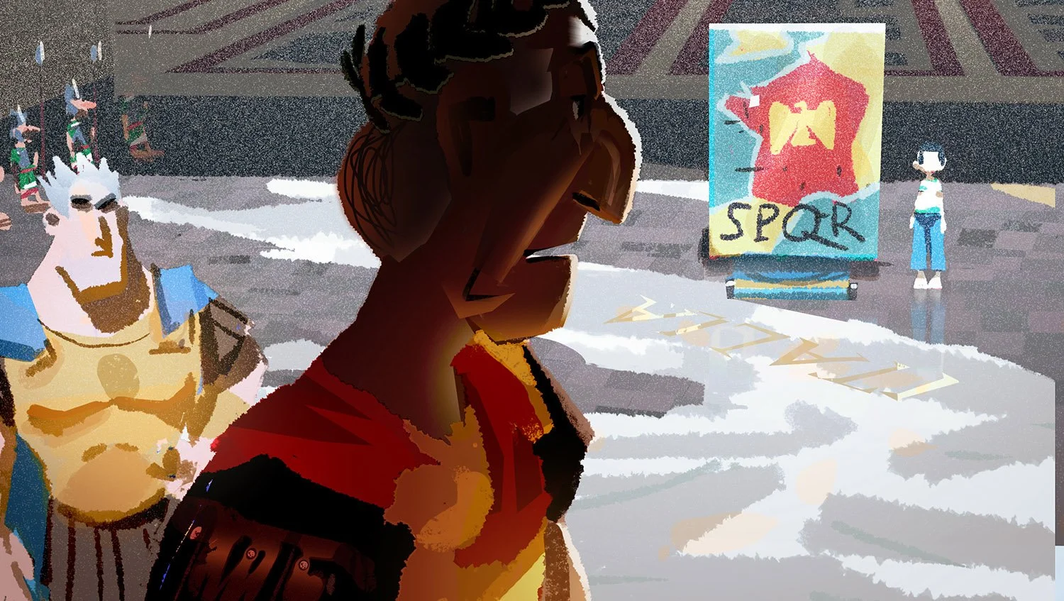
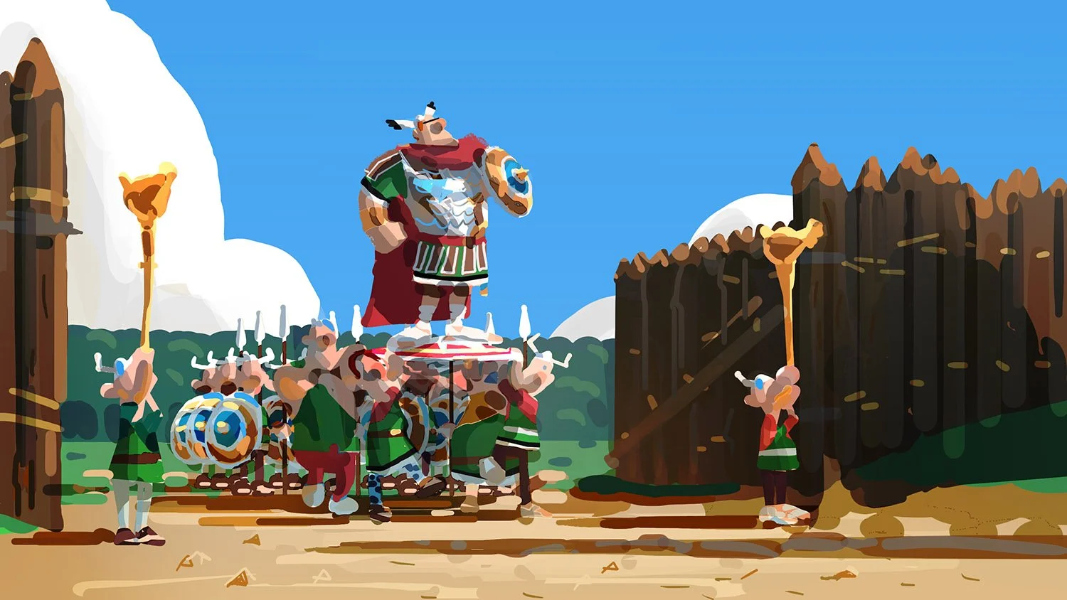
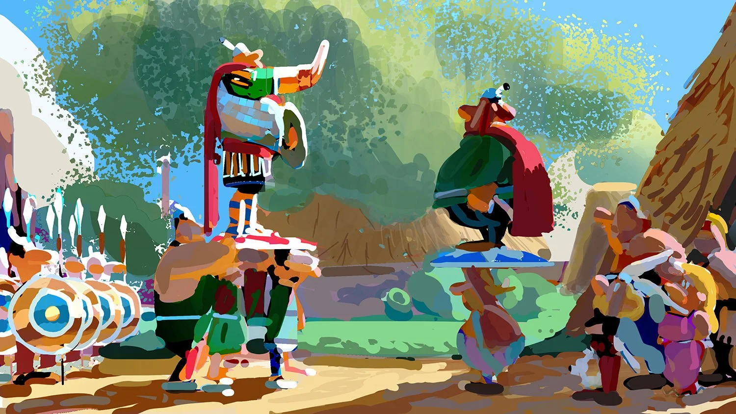
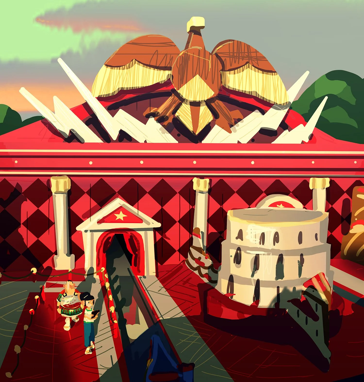
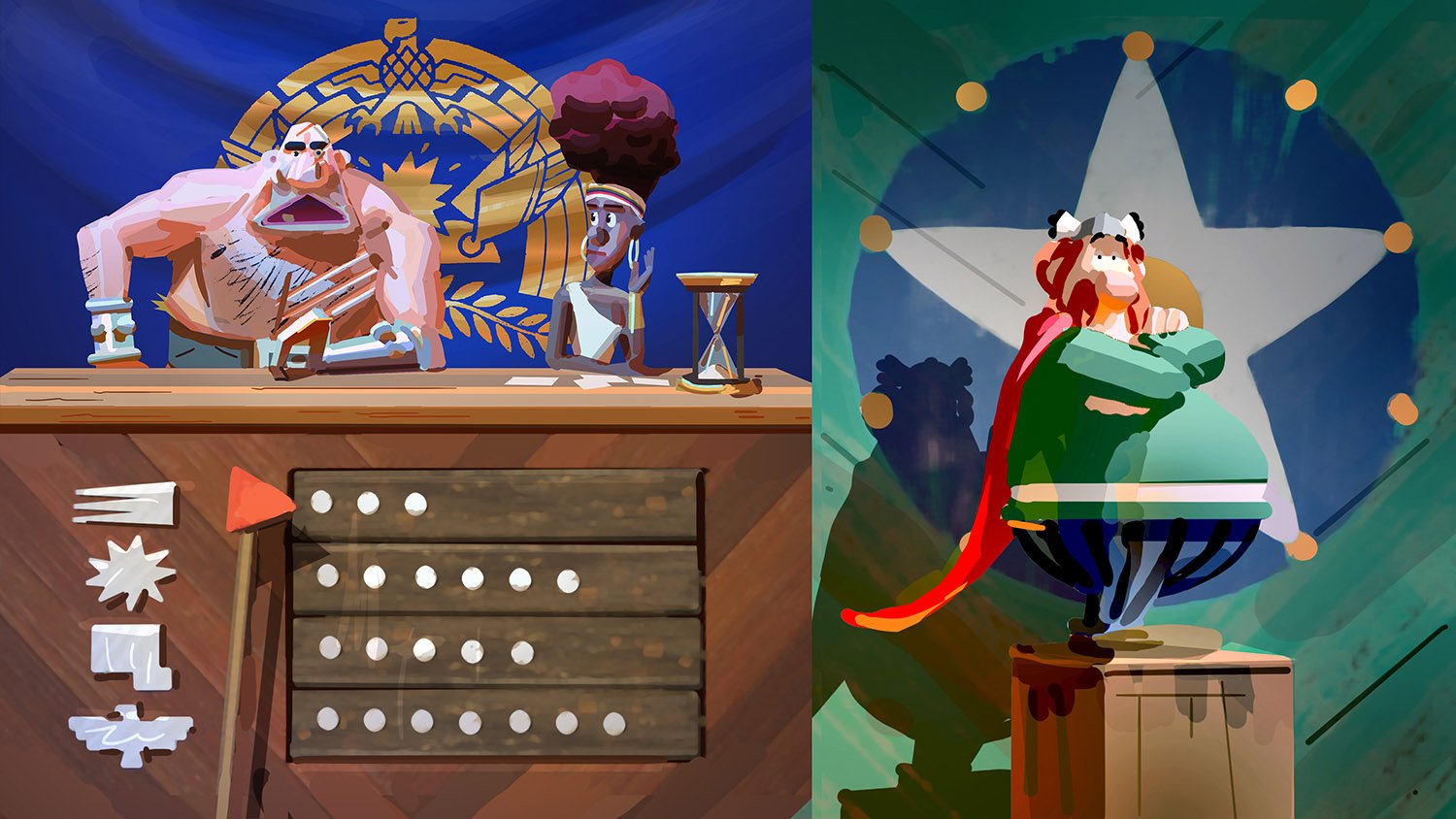
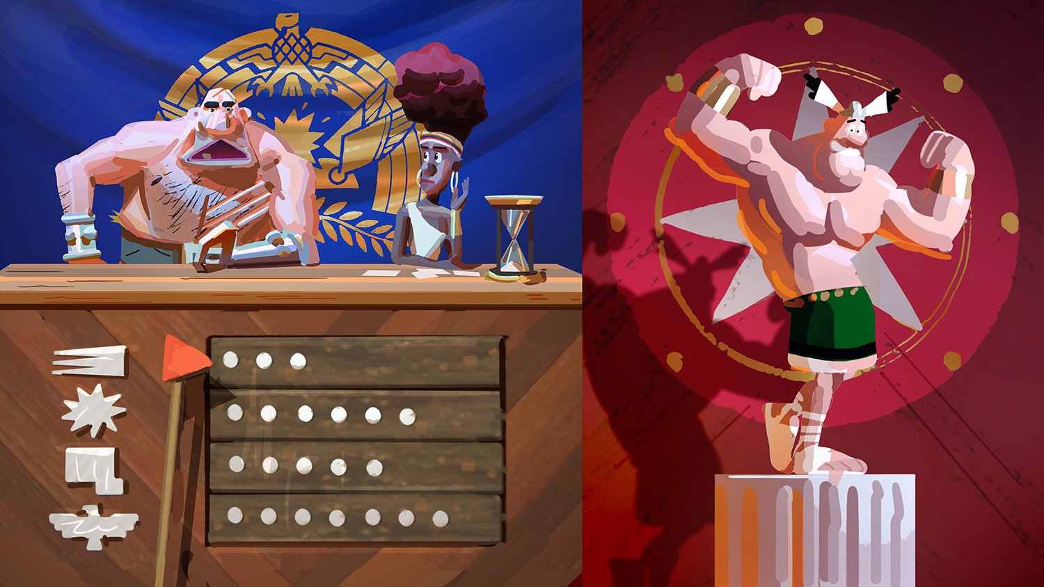
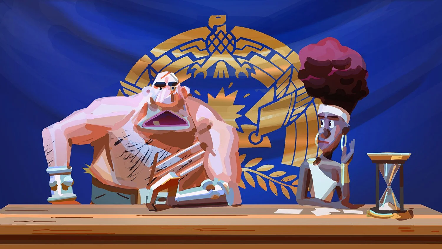
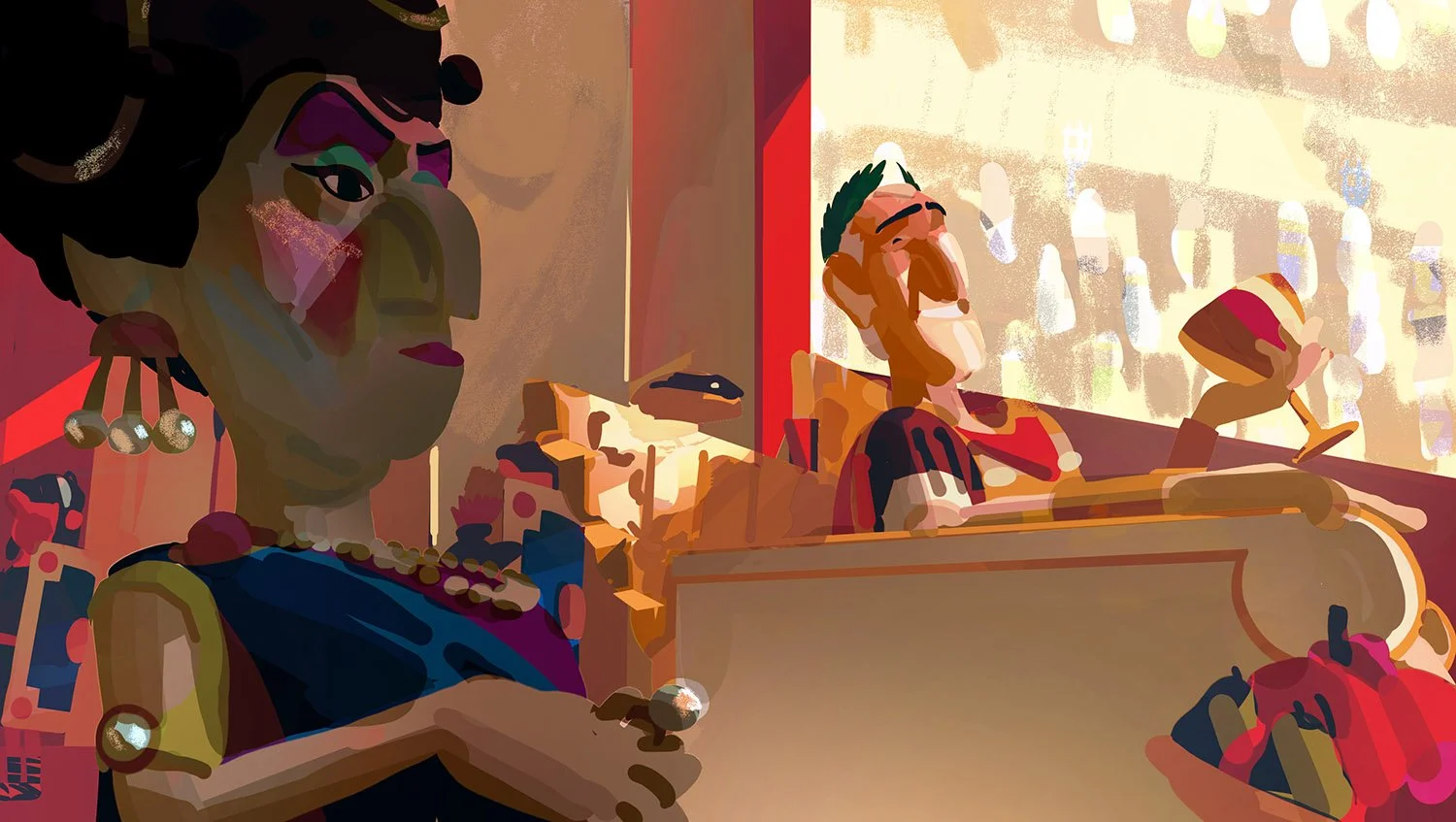
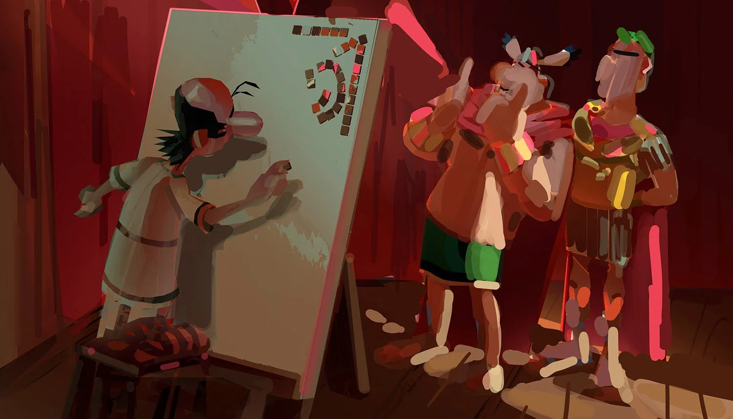
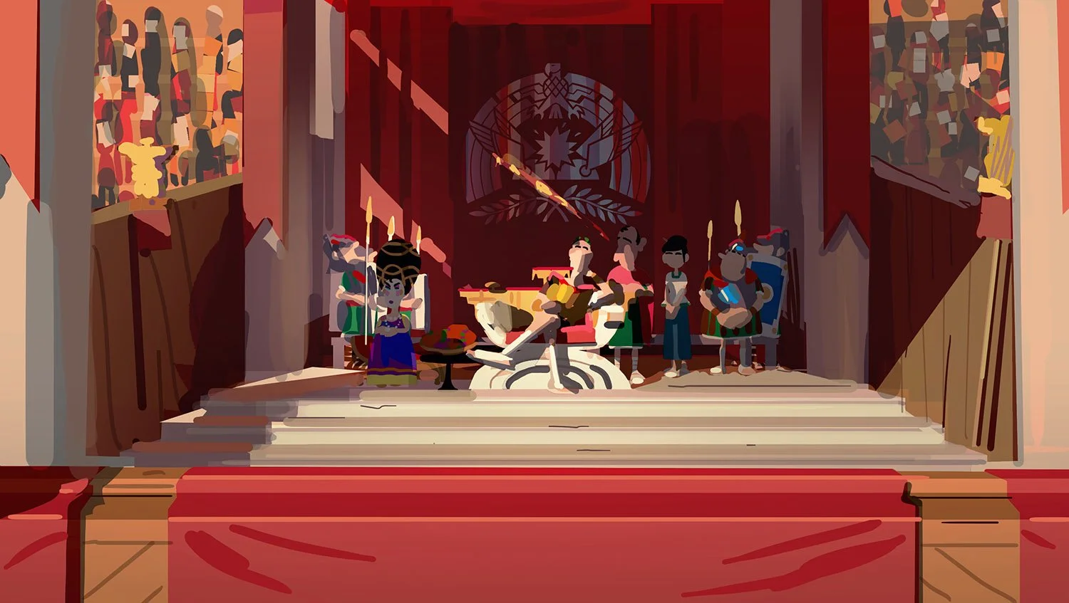
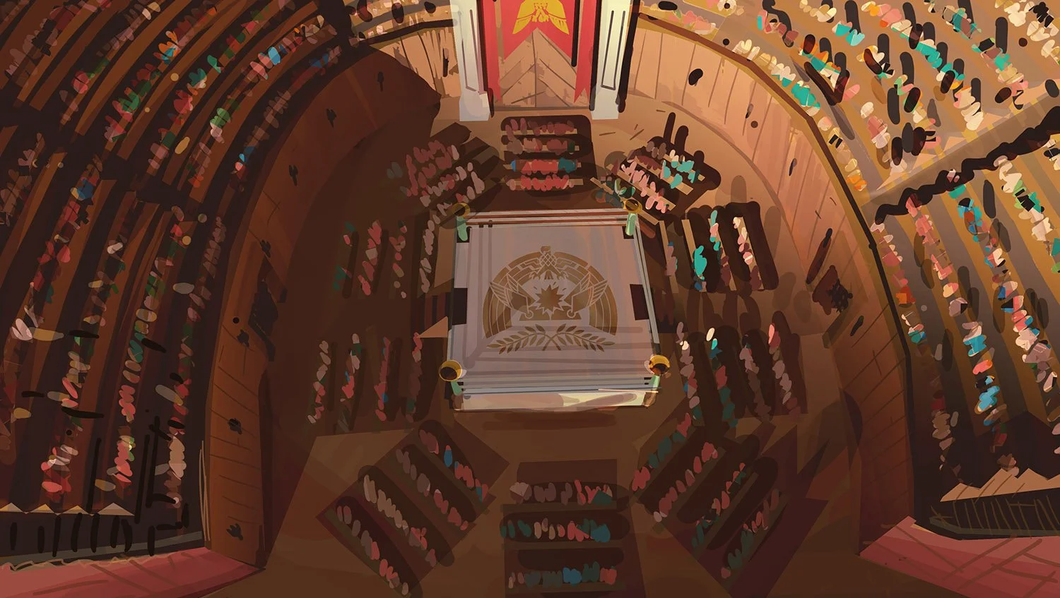
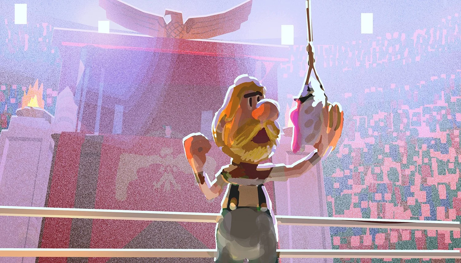
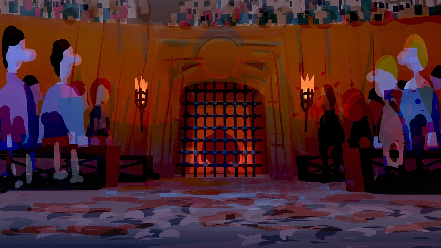
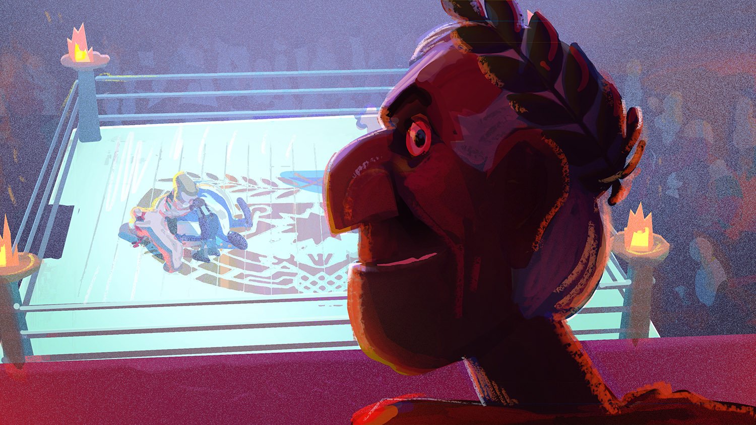
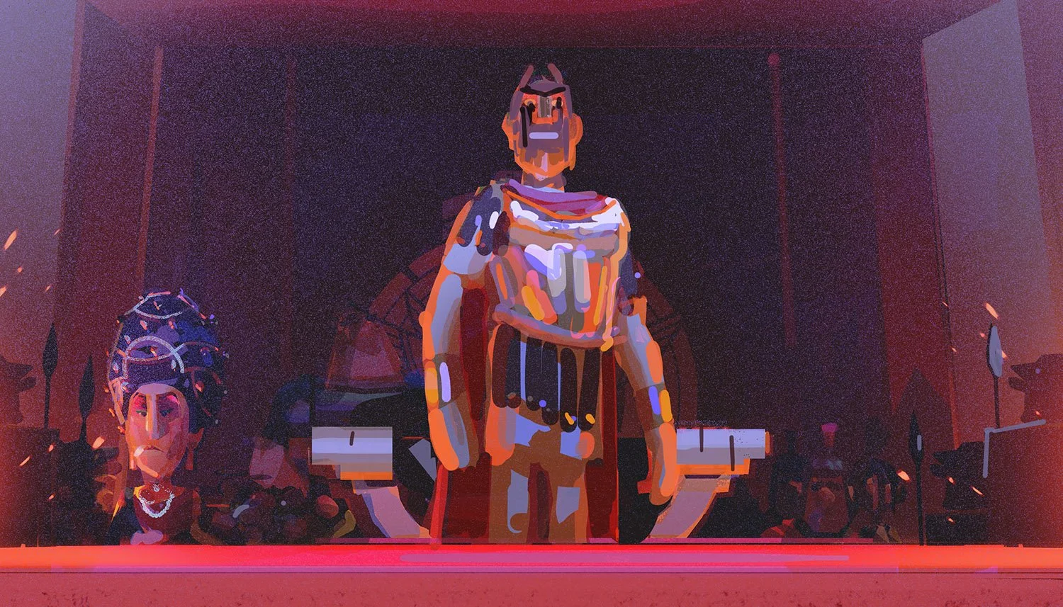
CAESAR’S PALACE:
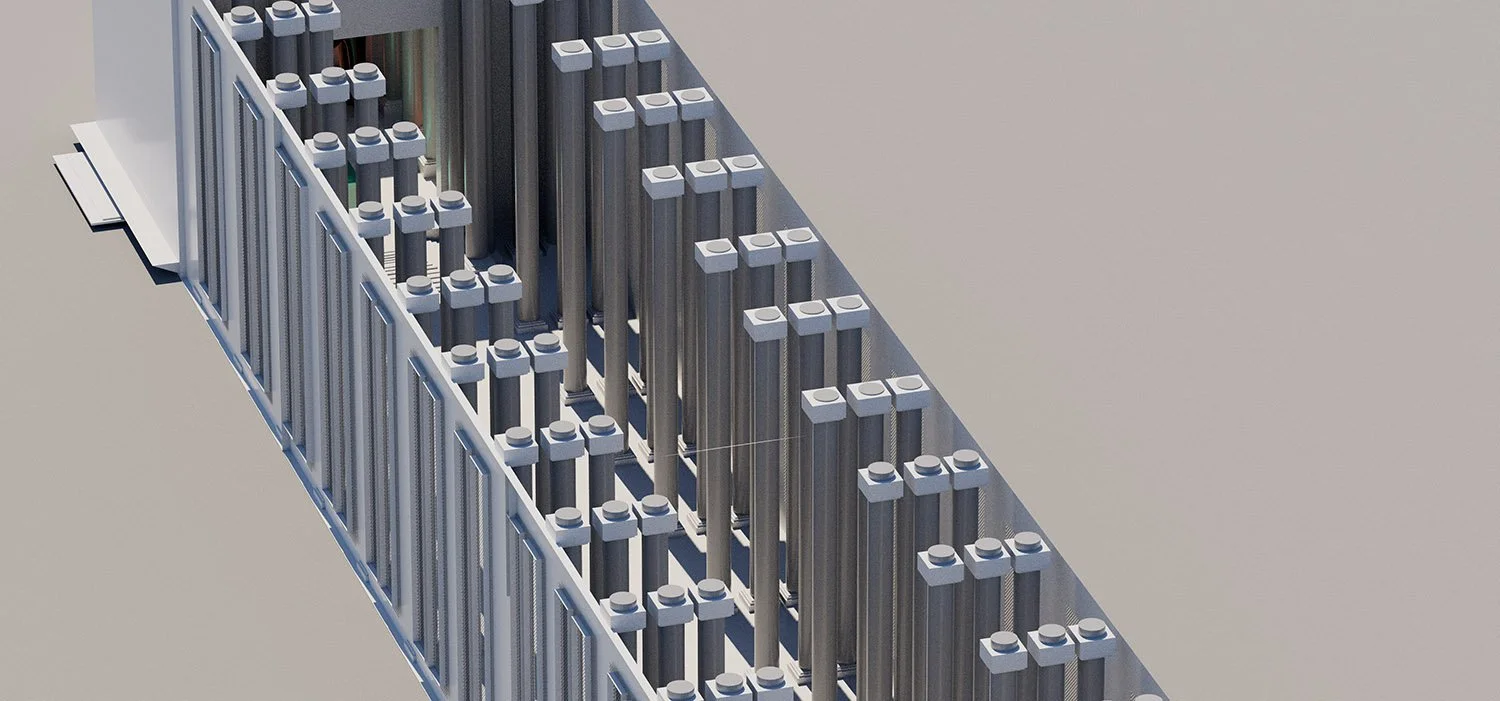
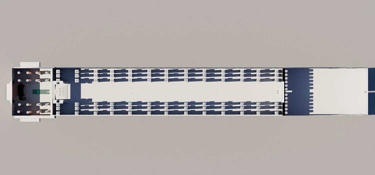
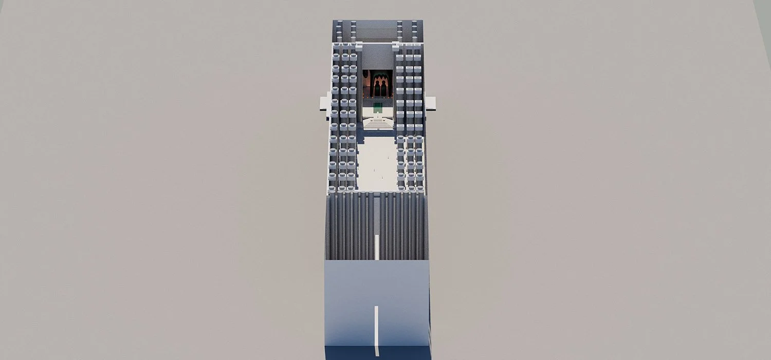
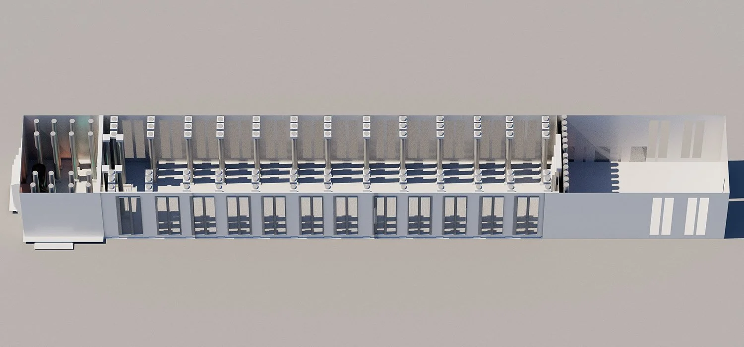
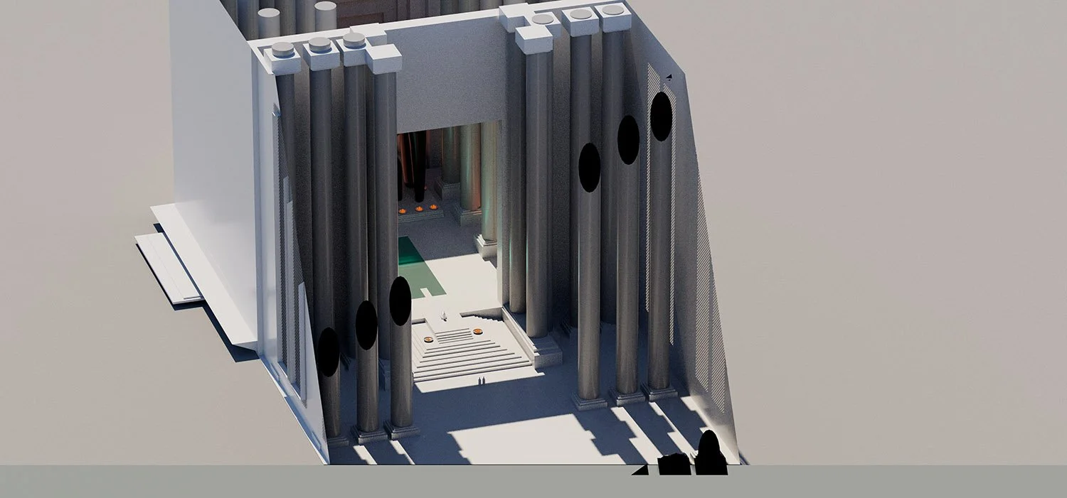
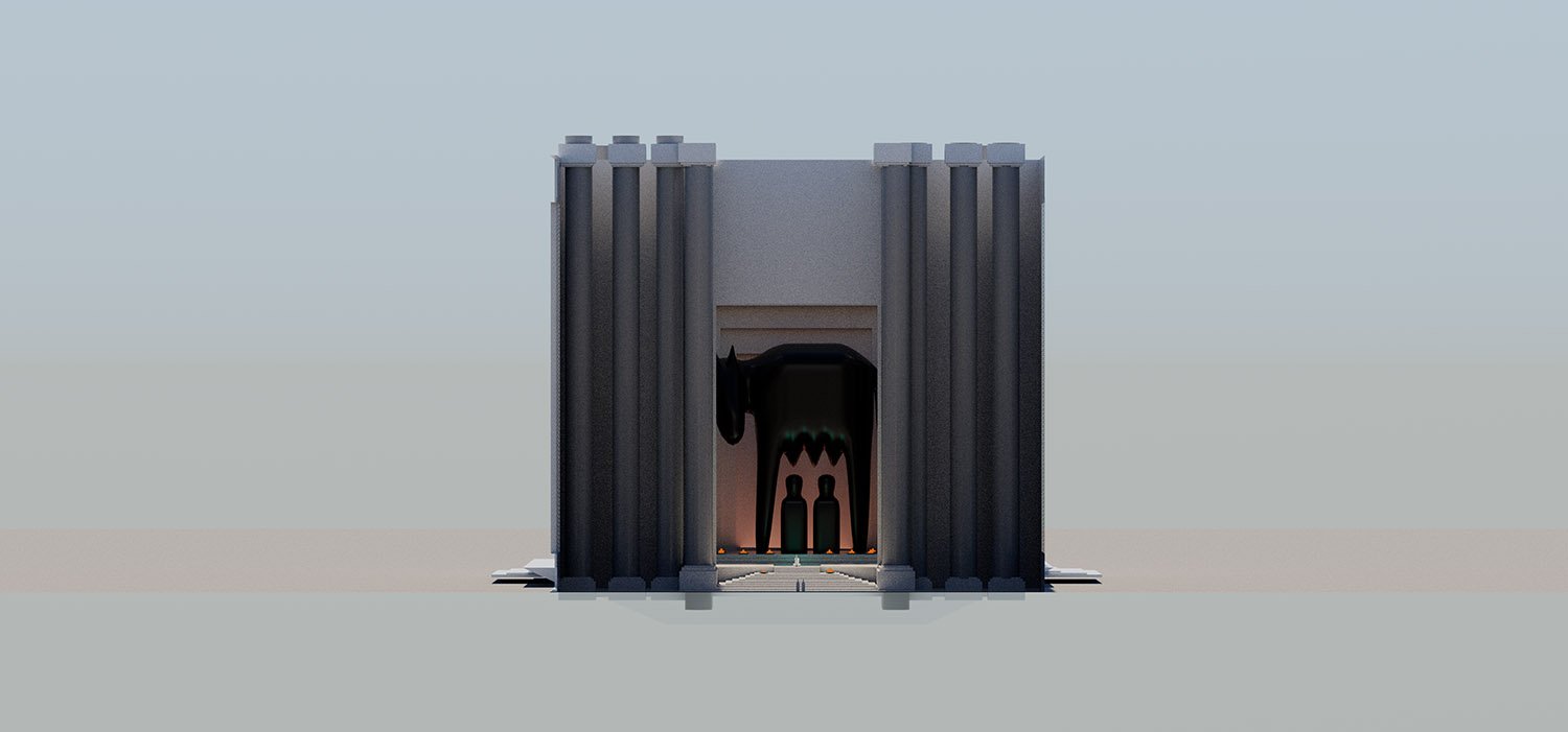
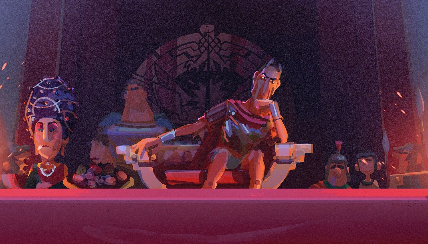
The palace embodies totalitarian power: monumental scale, harsh geometry, and cold materials designed to make individuals feel small. Vertical repetition, heavy columns, and vast empty spaces symbolise authority and control, visually reinforcing the empire’s dominance over the Gauls. The monumental sculpture, inspired by the ancient Capitoline Wolf with Romulus and Remus was reimagined through the lens of totalitarian architecture: minimalist and brutalist shapes.
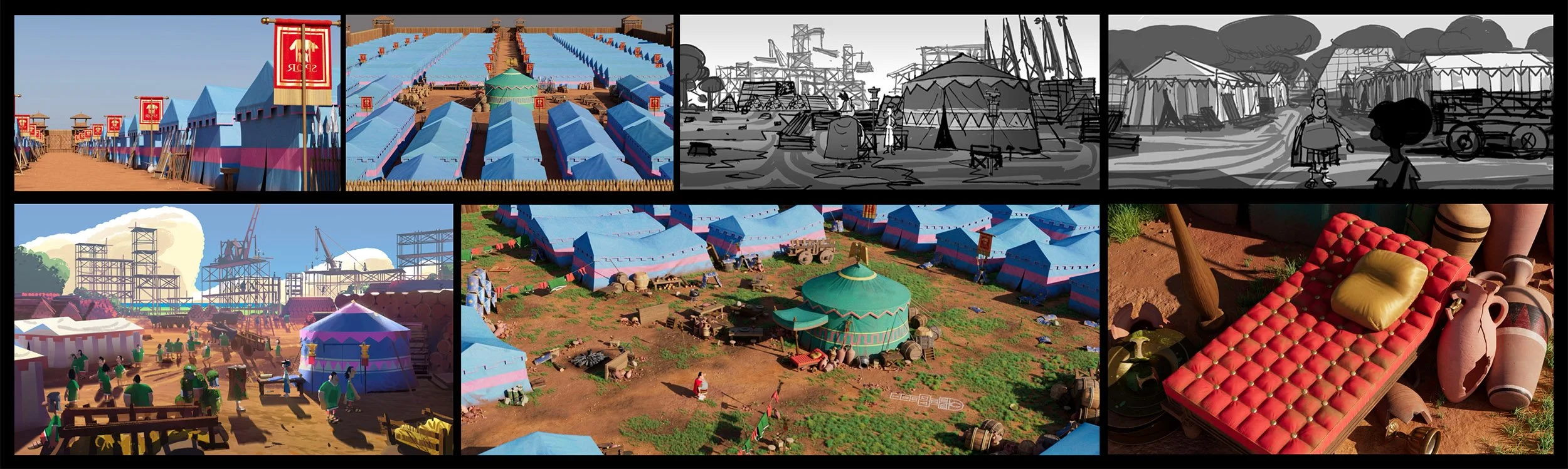
I roughly mocked up the set in Maya, to define the design, proportions and scale, as well as the lighting sources and cinematography options before passing it down to the art department who produced the final designs for modelling and surfacing.

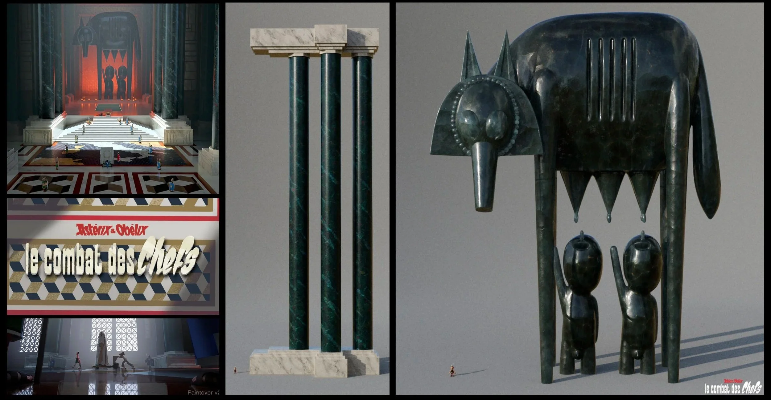
Surfacing renders and paintovers.
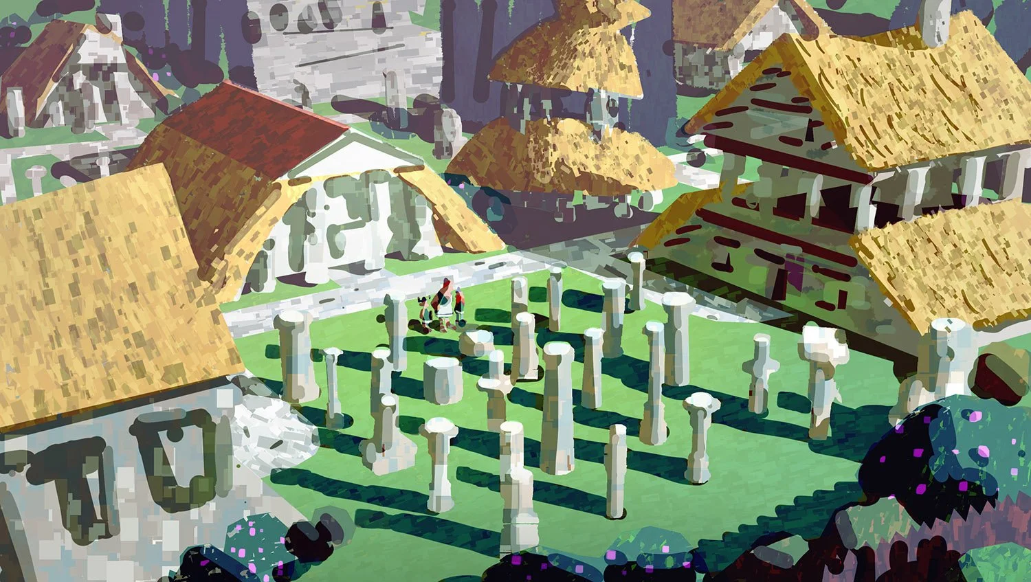
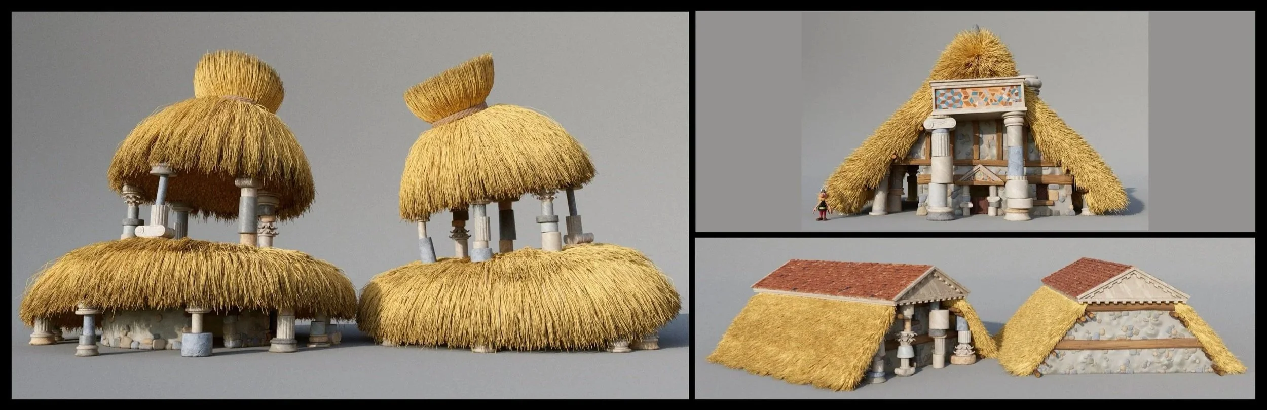
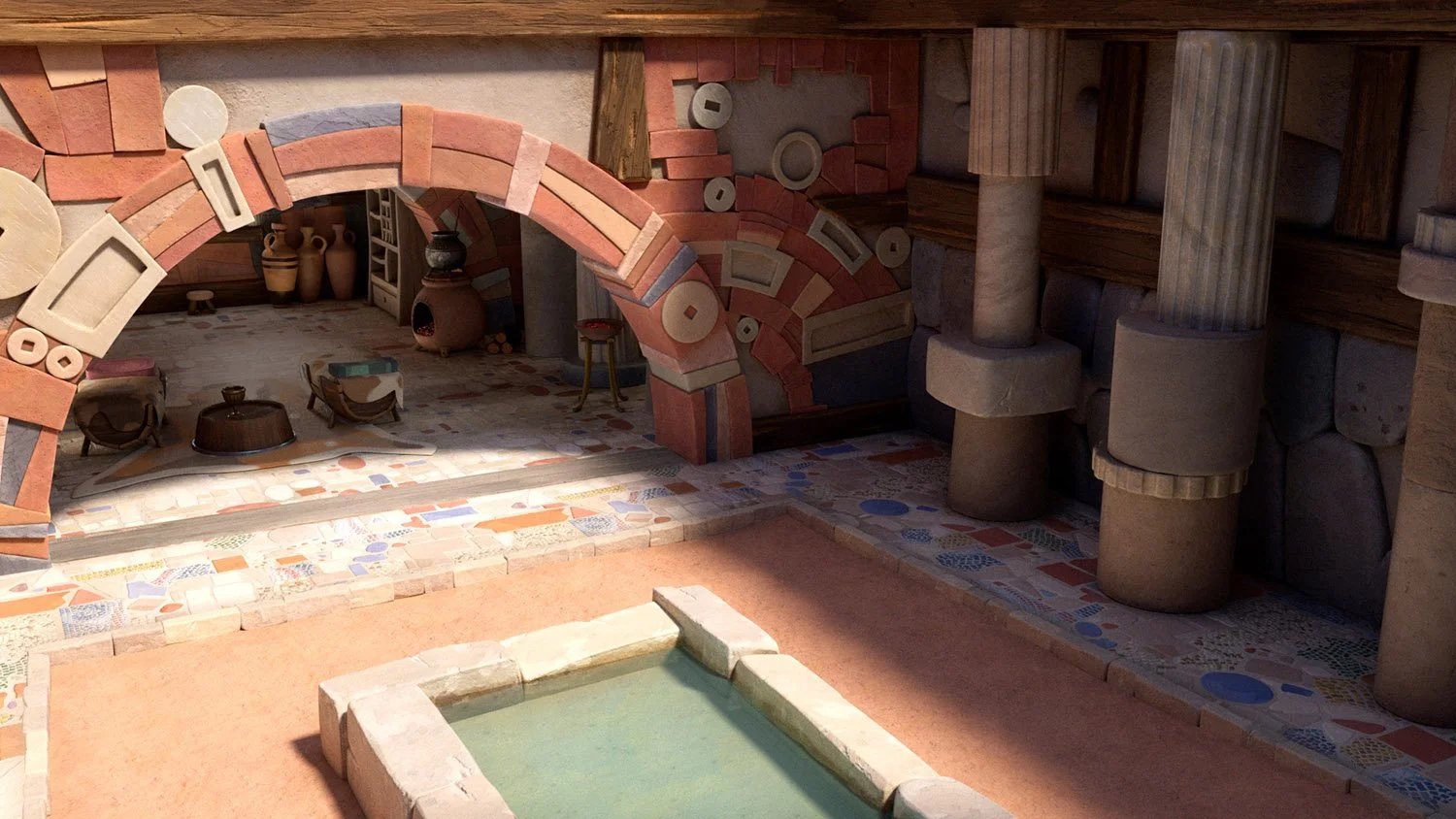
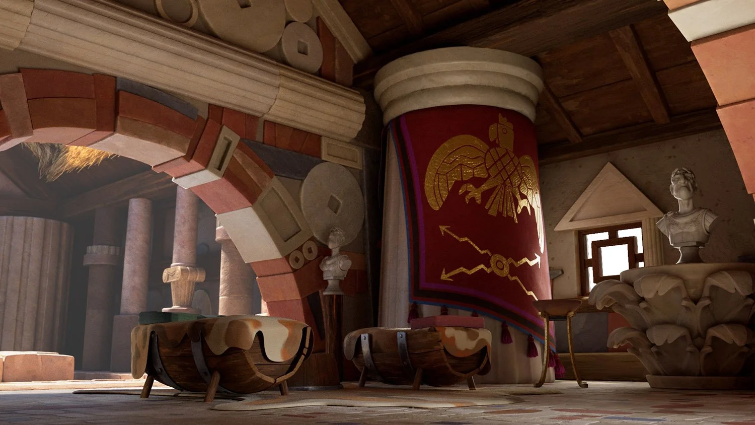
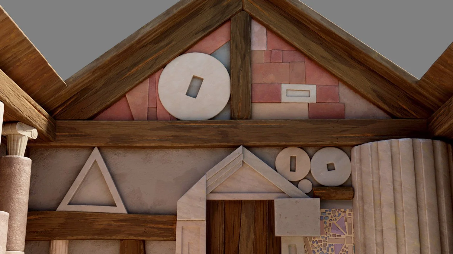
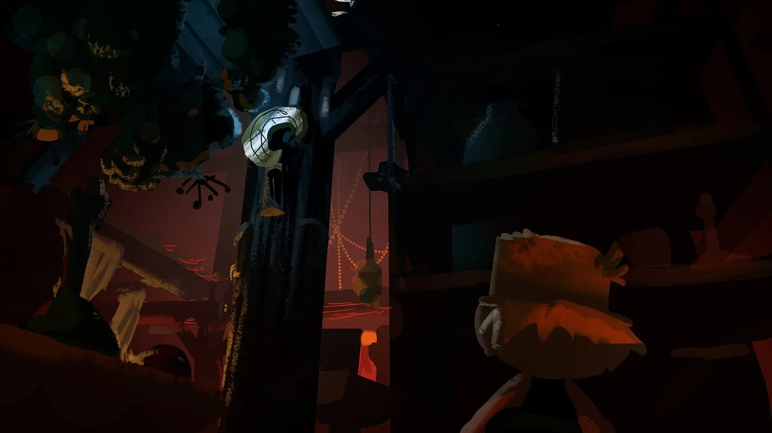
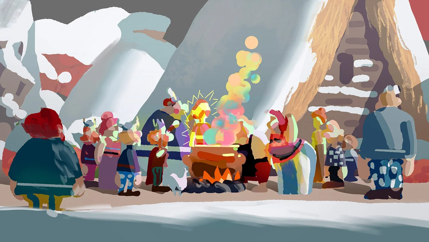
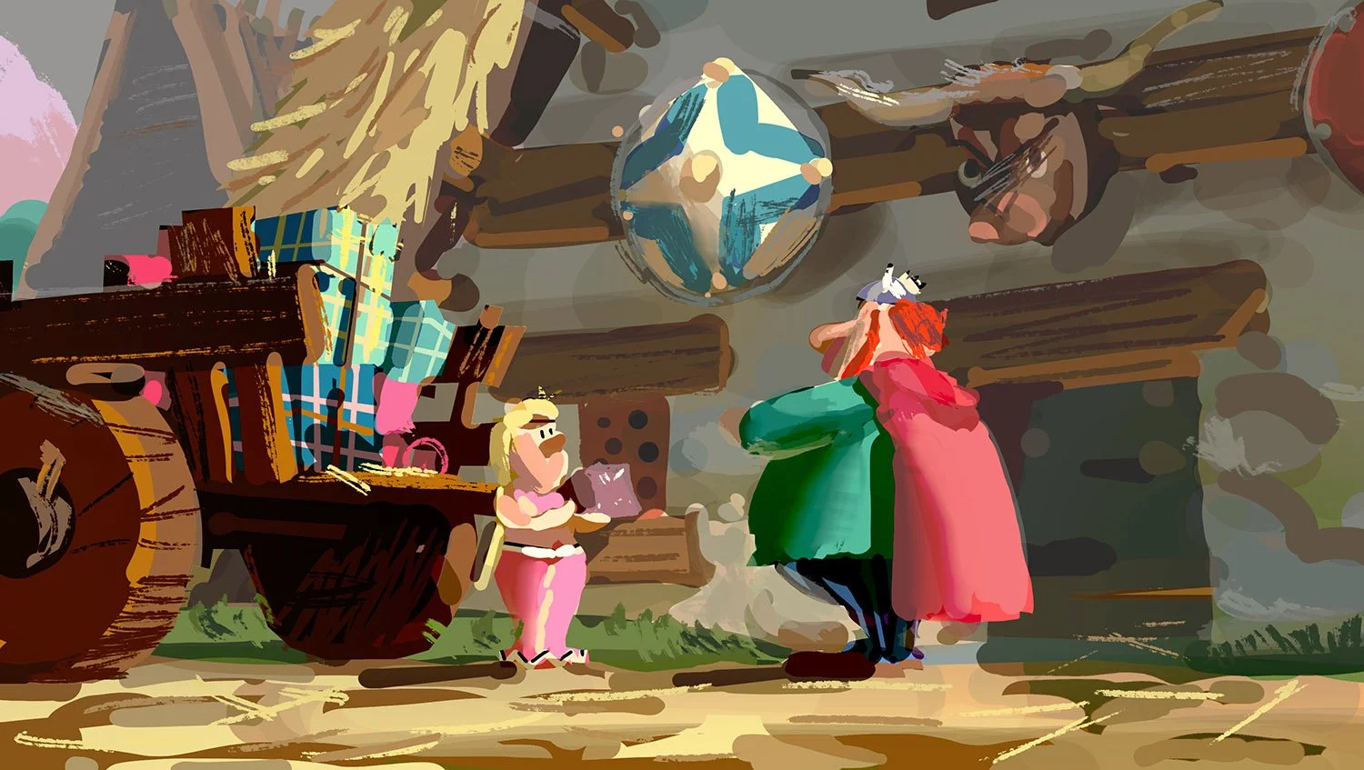
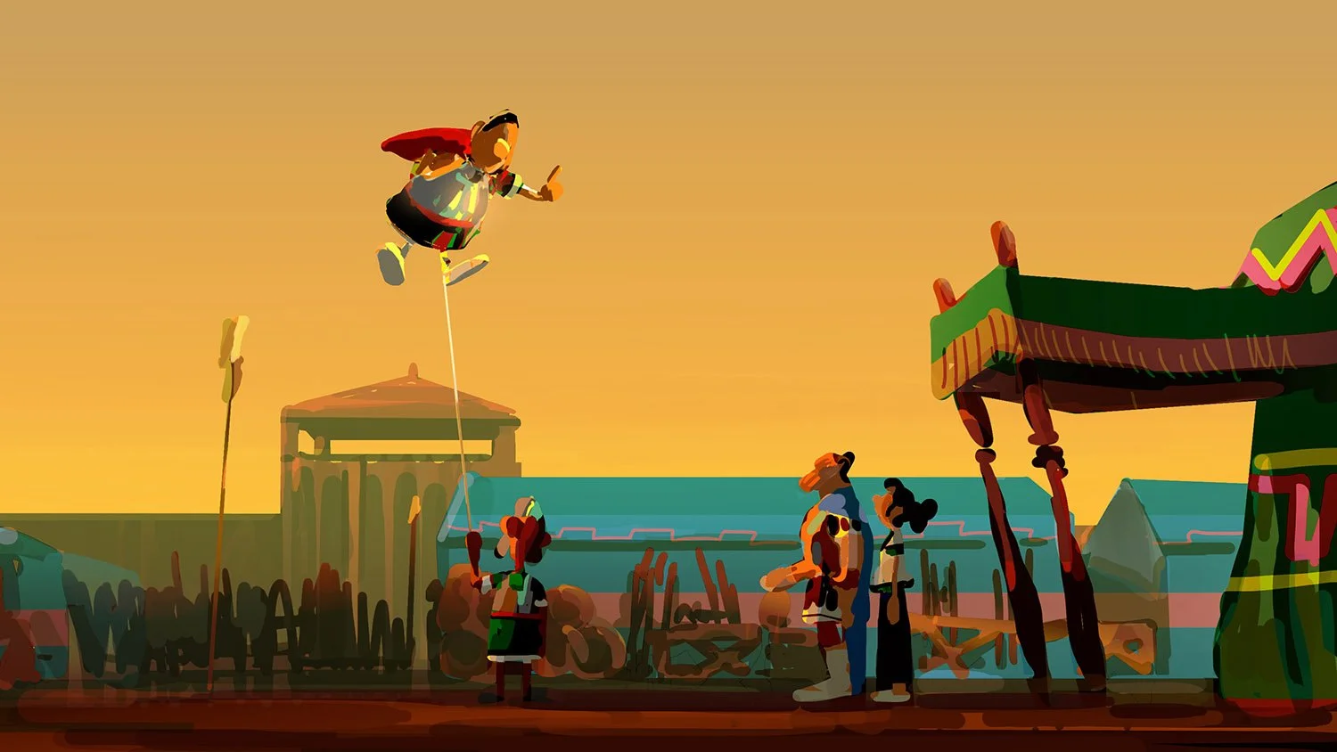
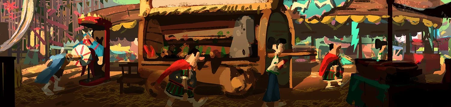
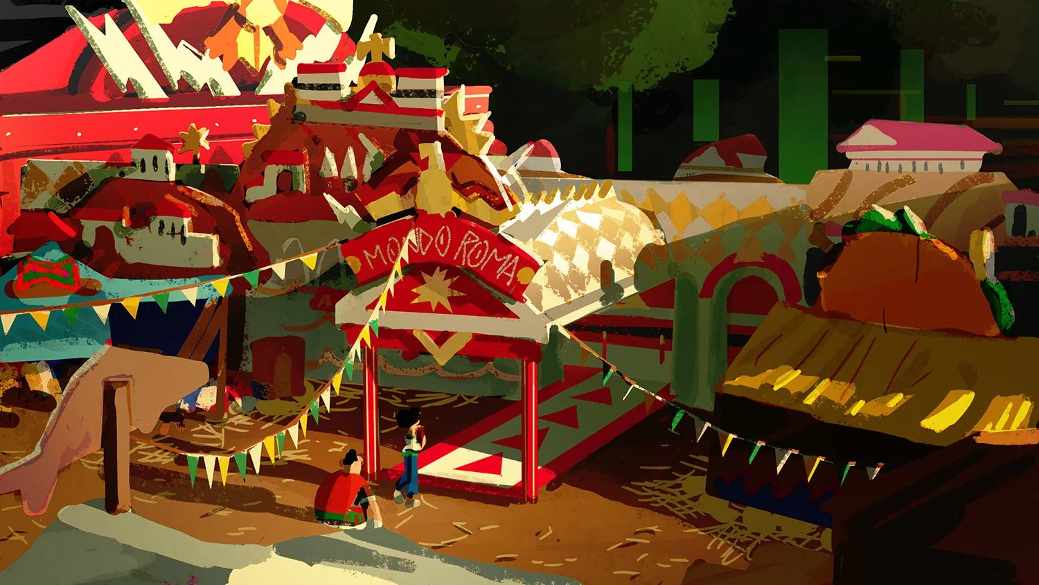
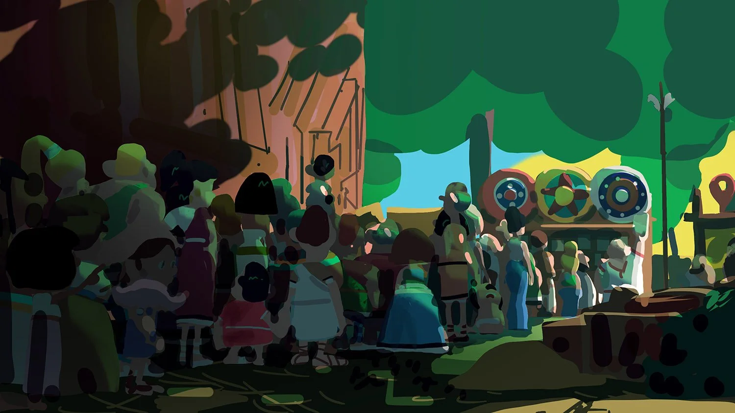
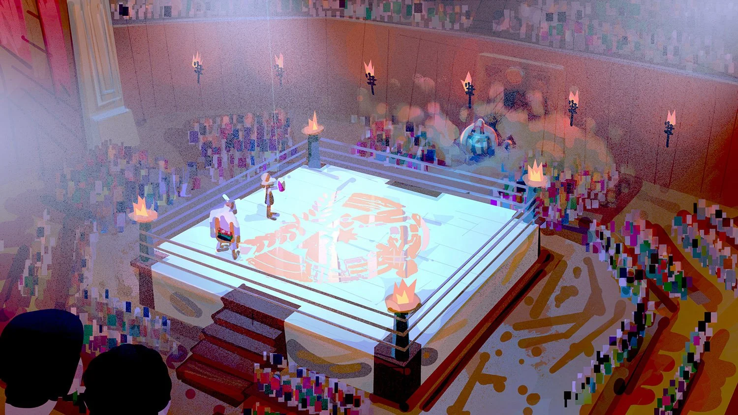
SERUM
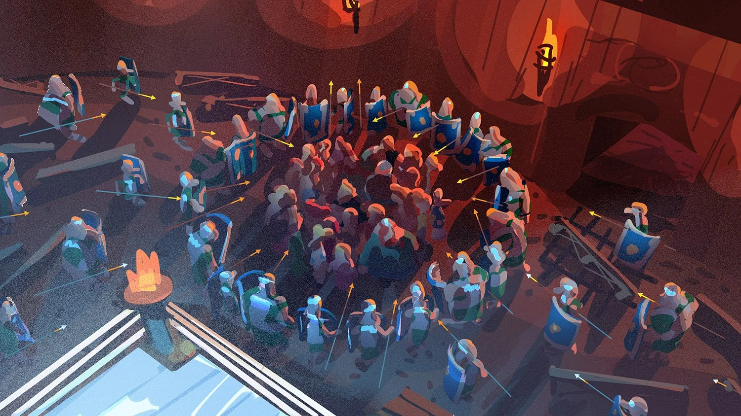
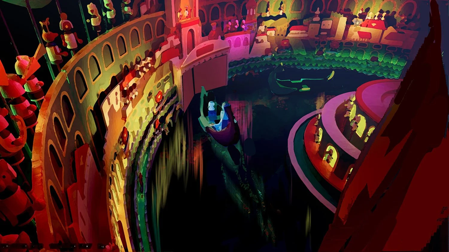
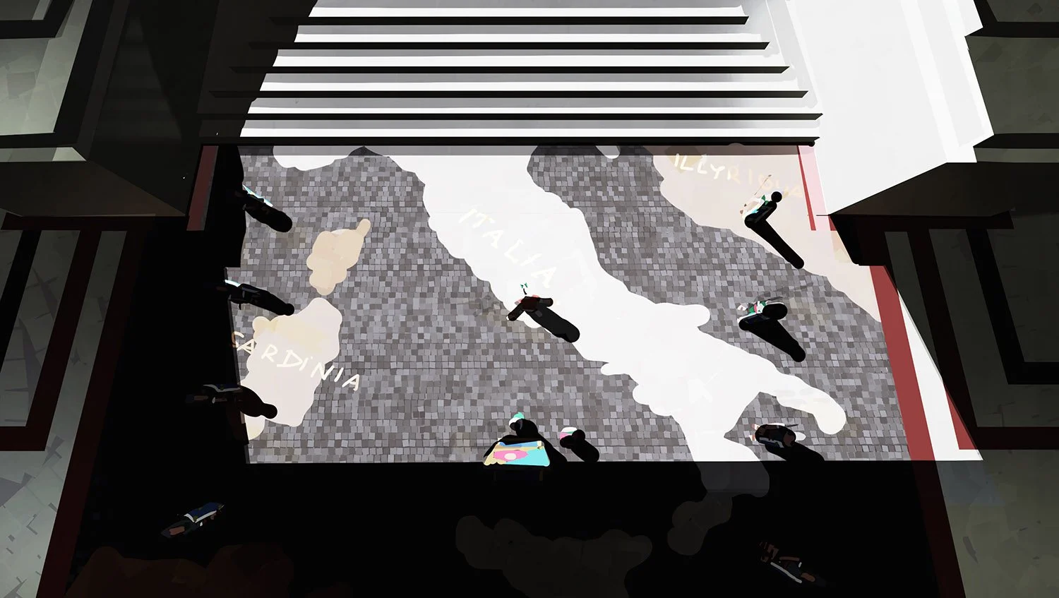
This hybrid village represents a clash of identities, combining Roman order with Gallic tradition. The result is intentionally awkward and incoherent: patchwork of salvaged columns, mismatched mosaics, and hybrid structures. The design visually reinforces the story’s theme of forced assimilation.


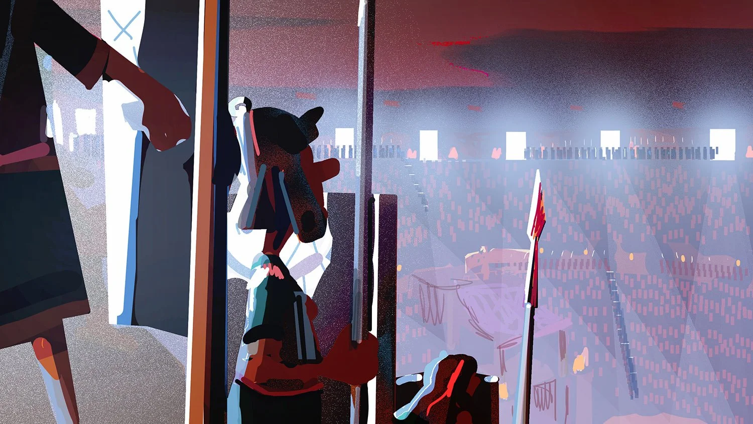
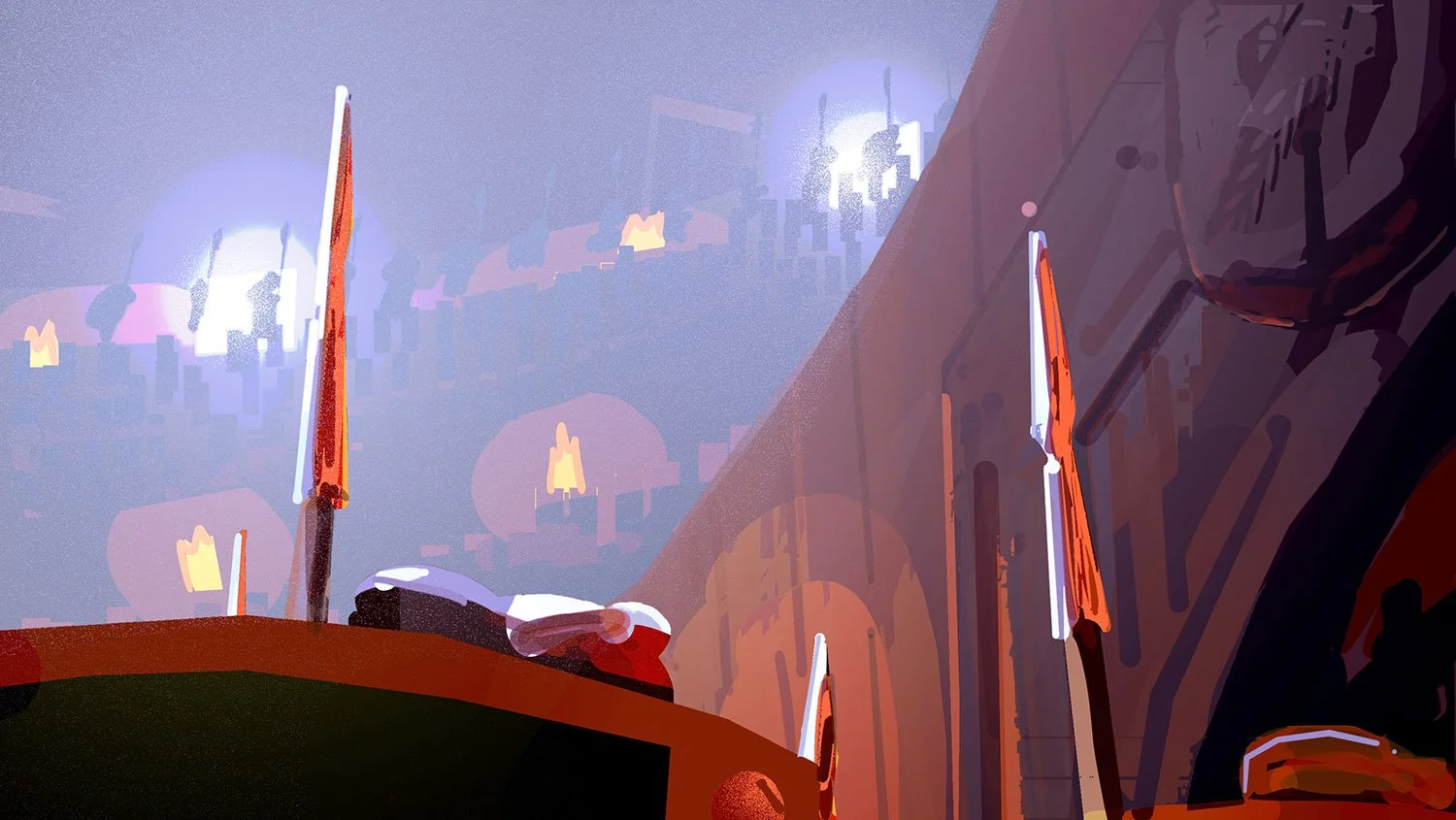
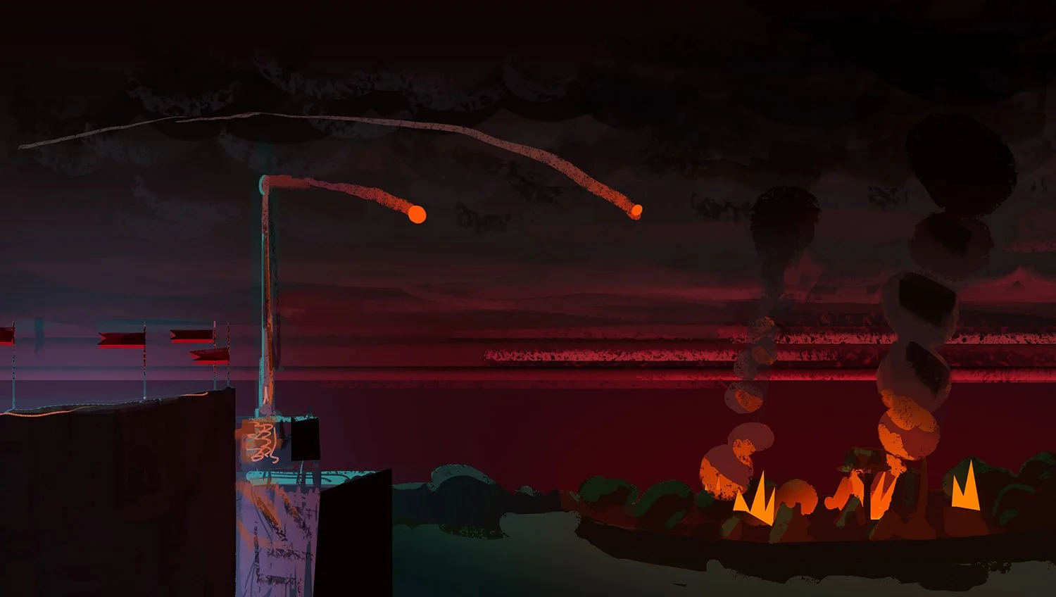
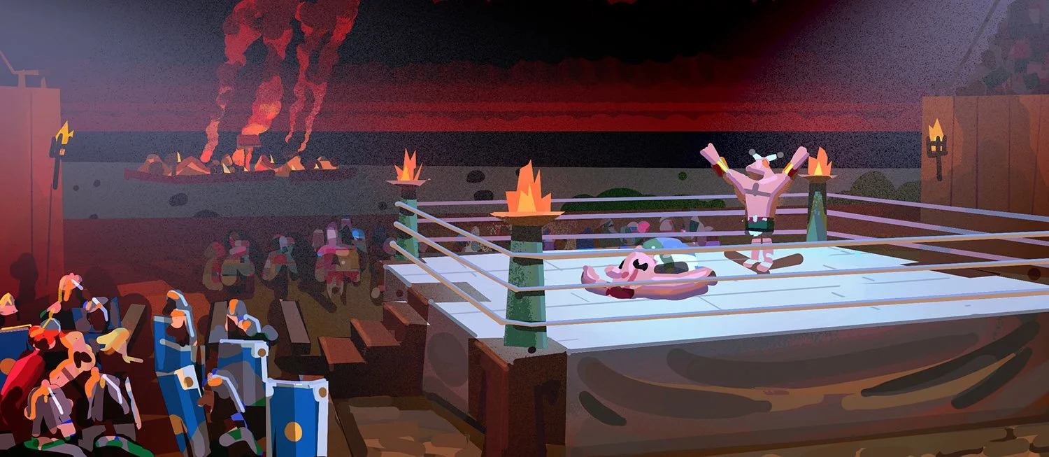
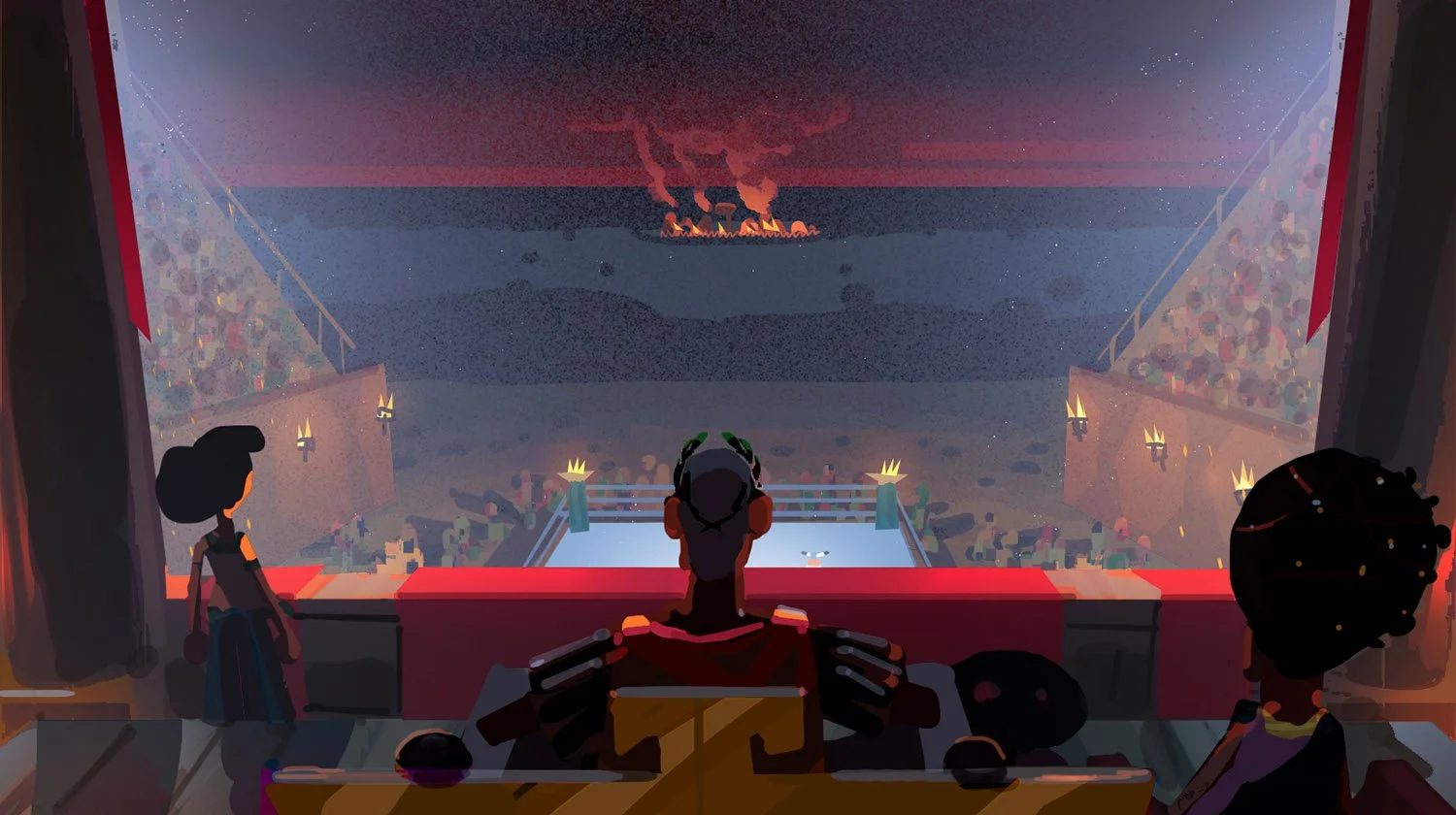
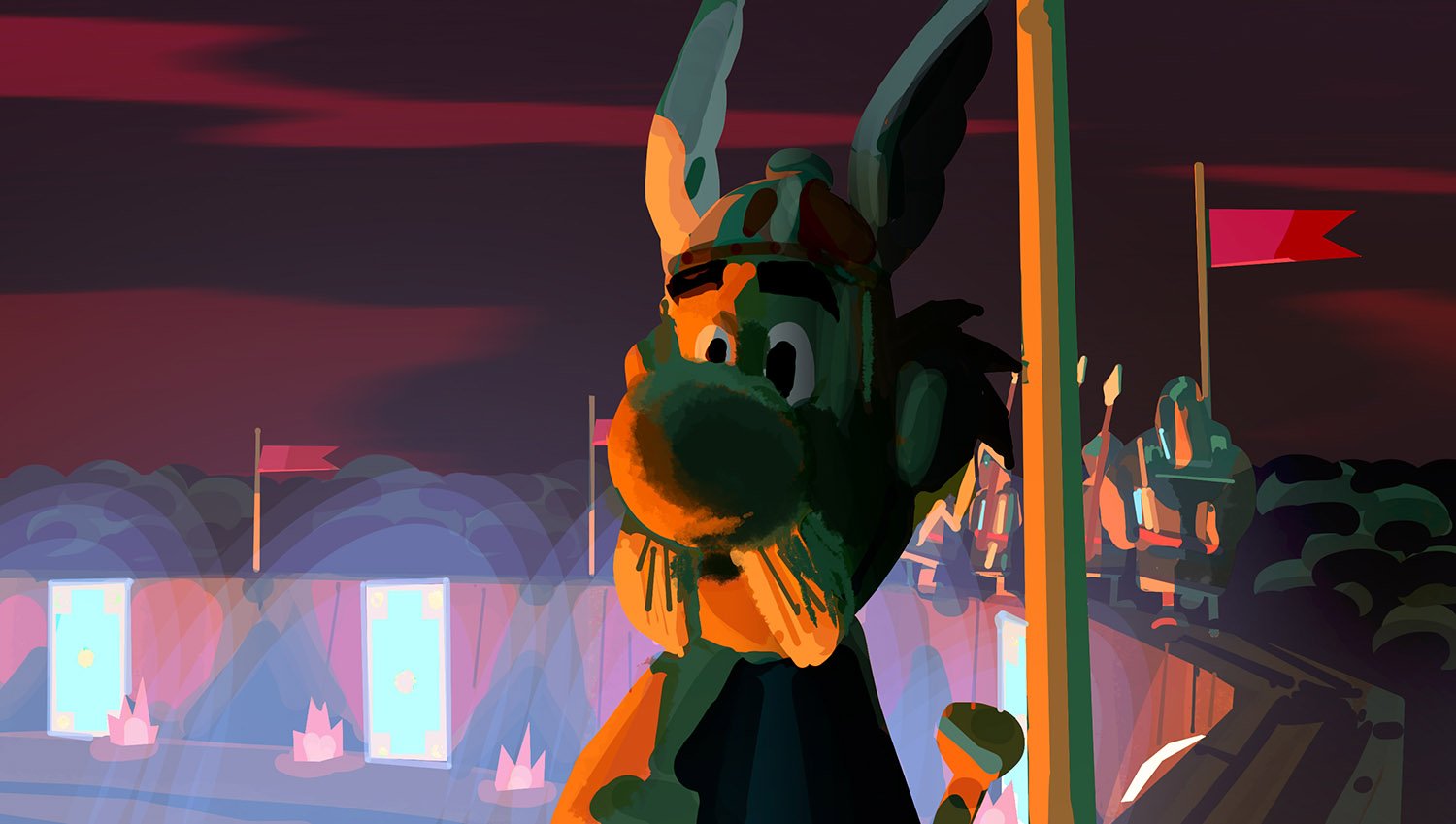
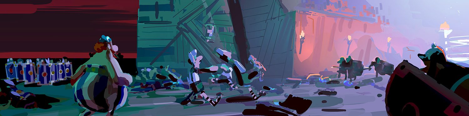
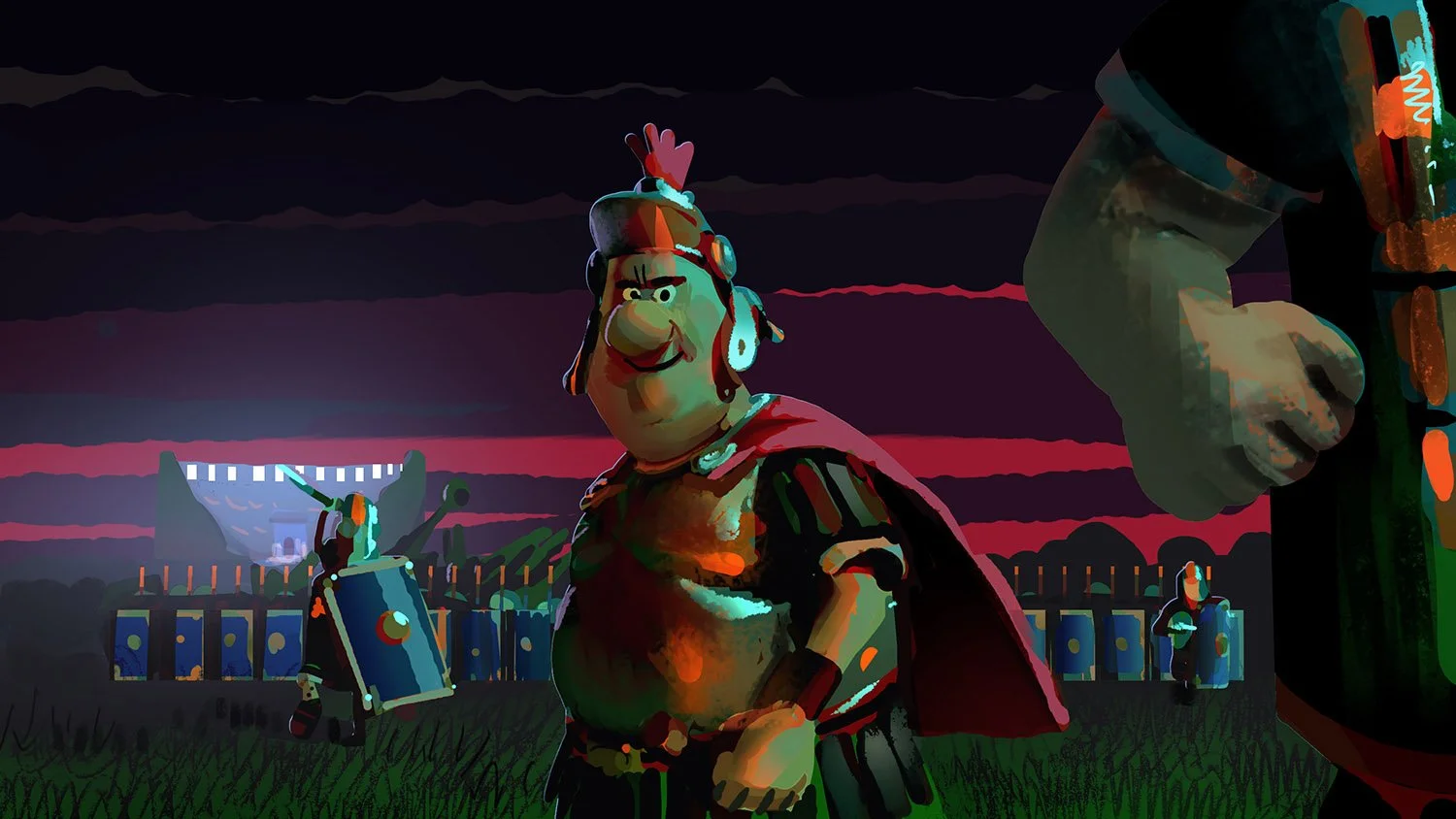
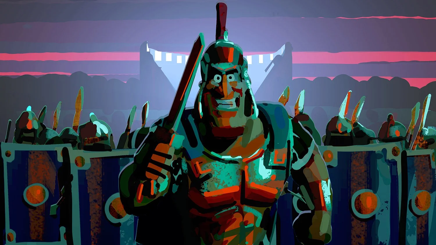
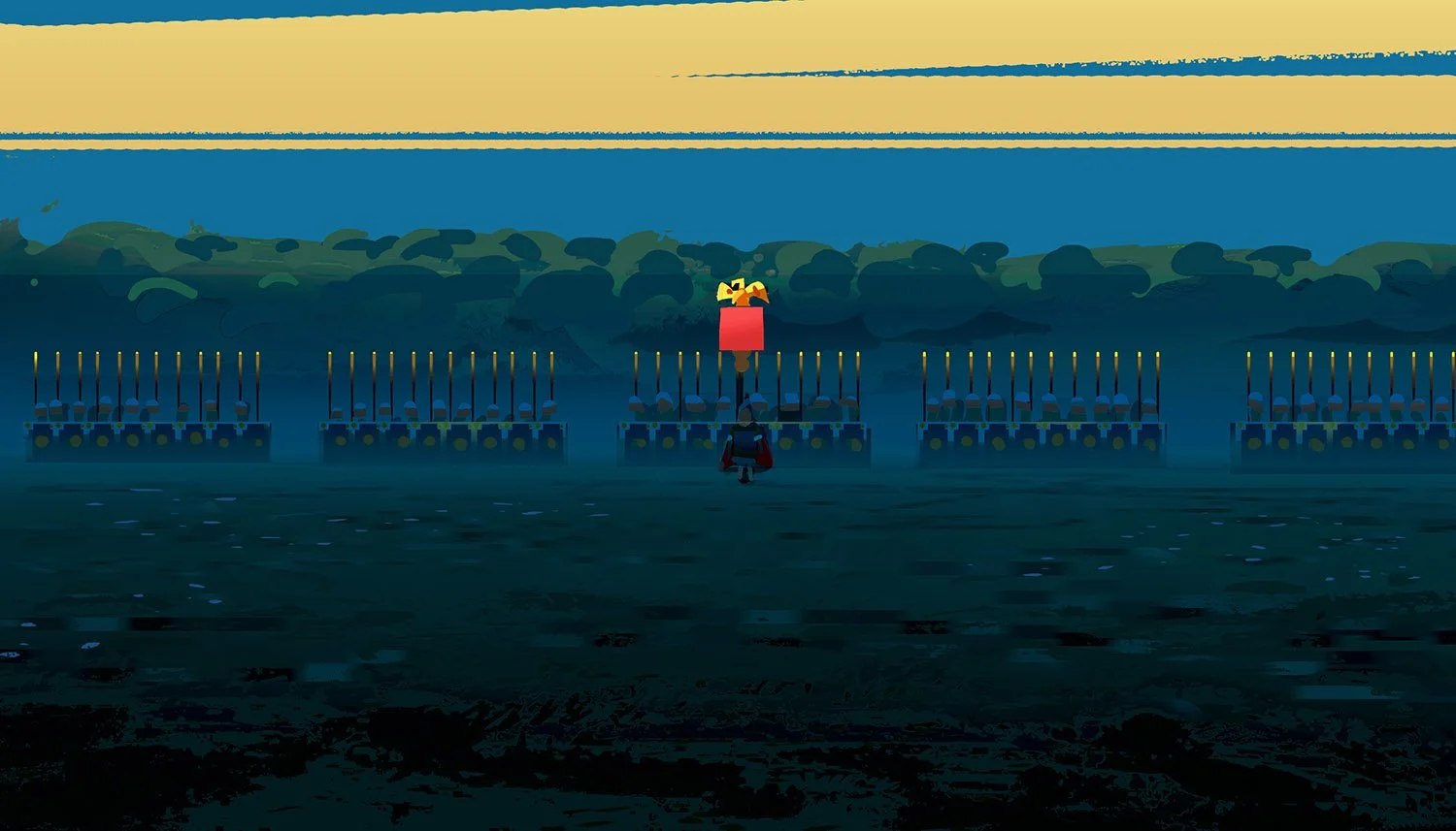
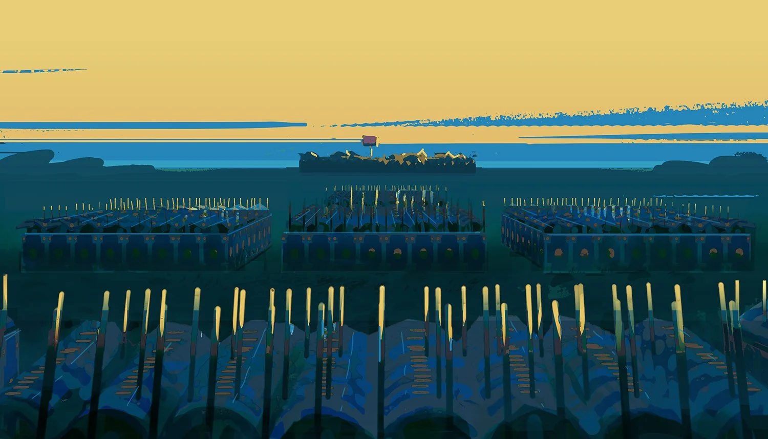
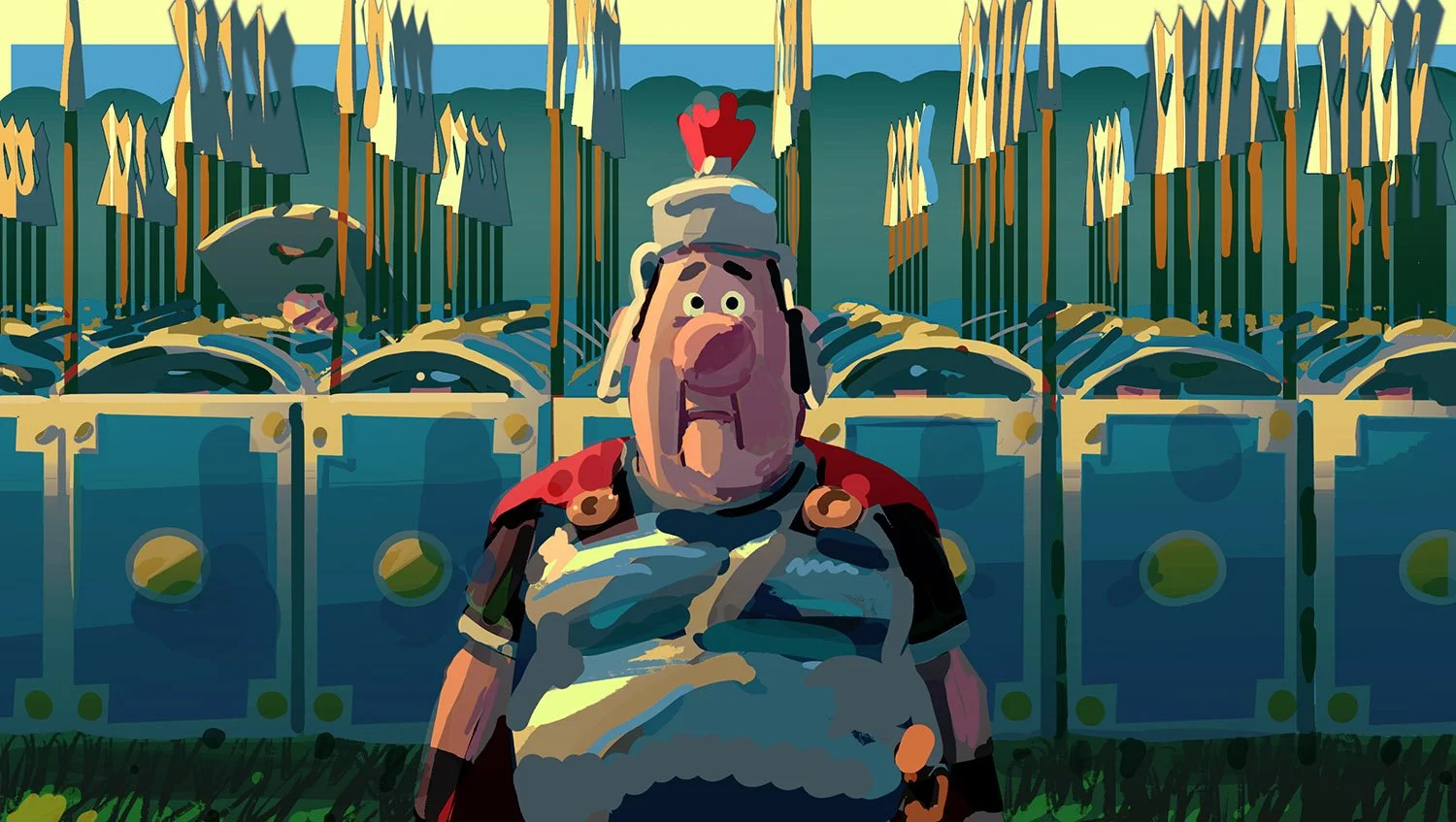
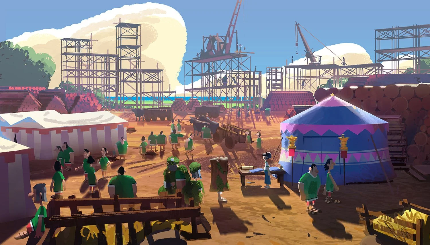
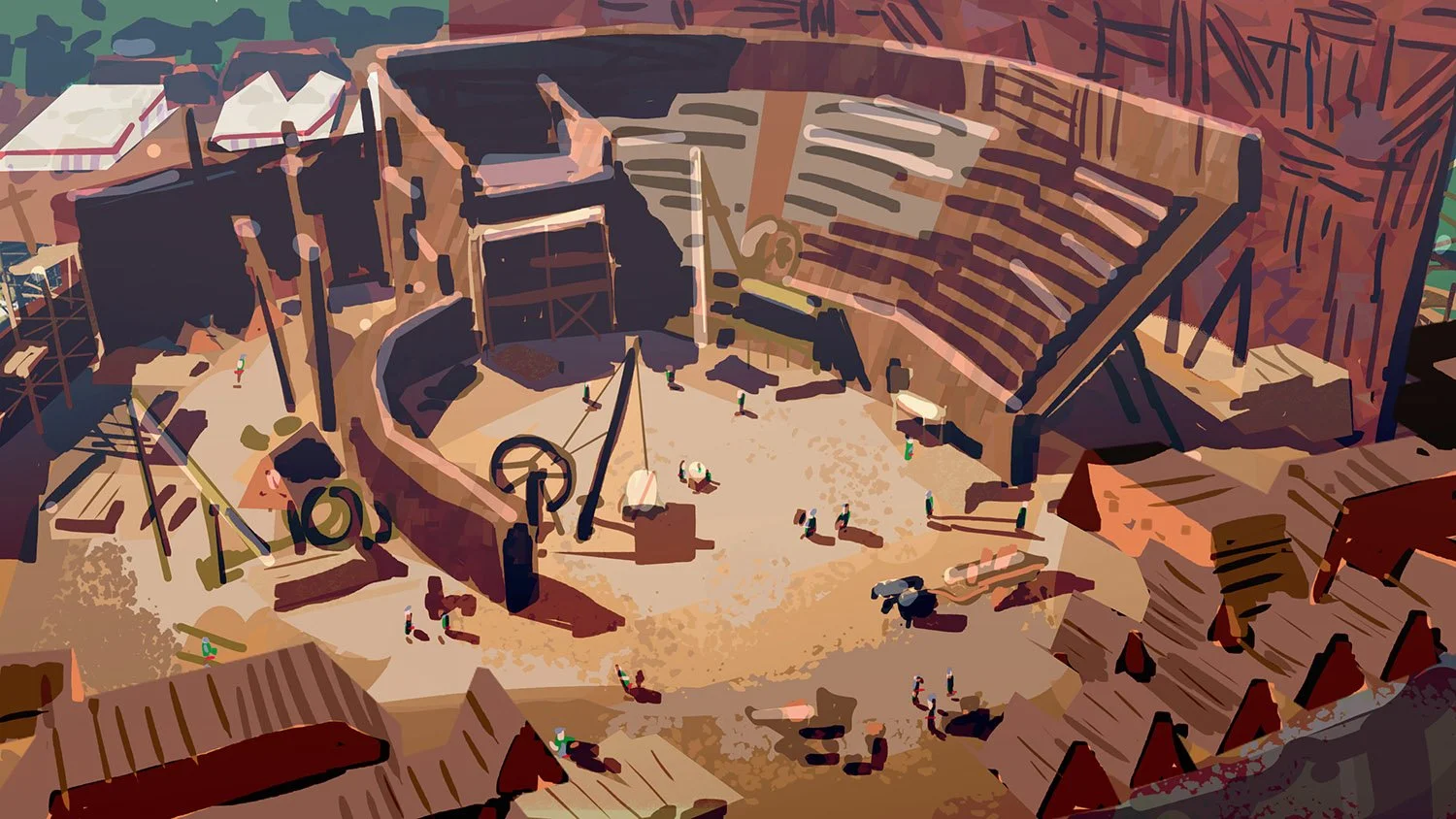
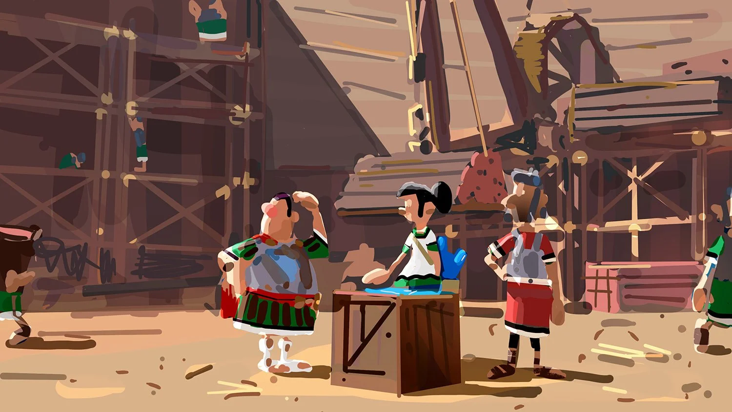
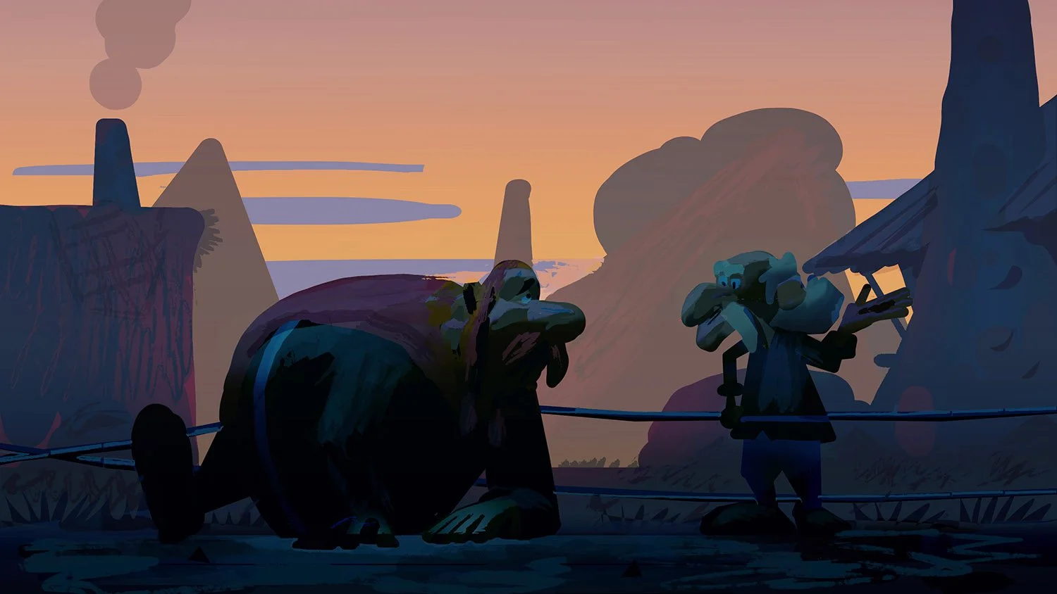
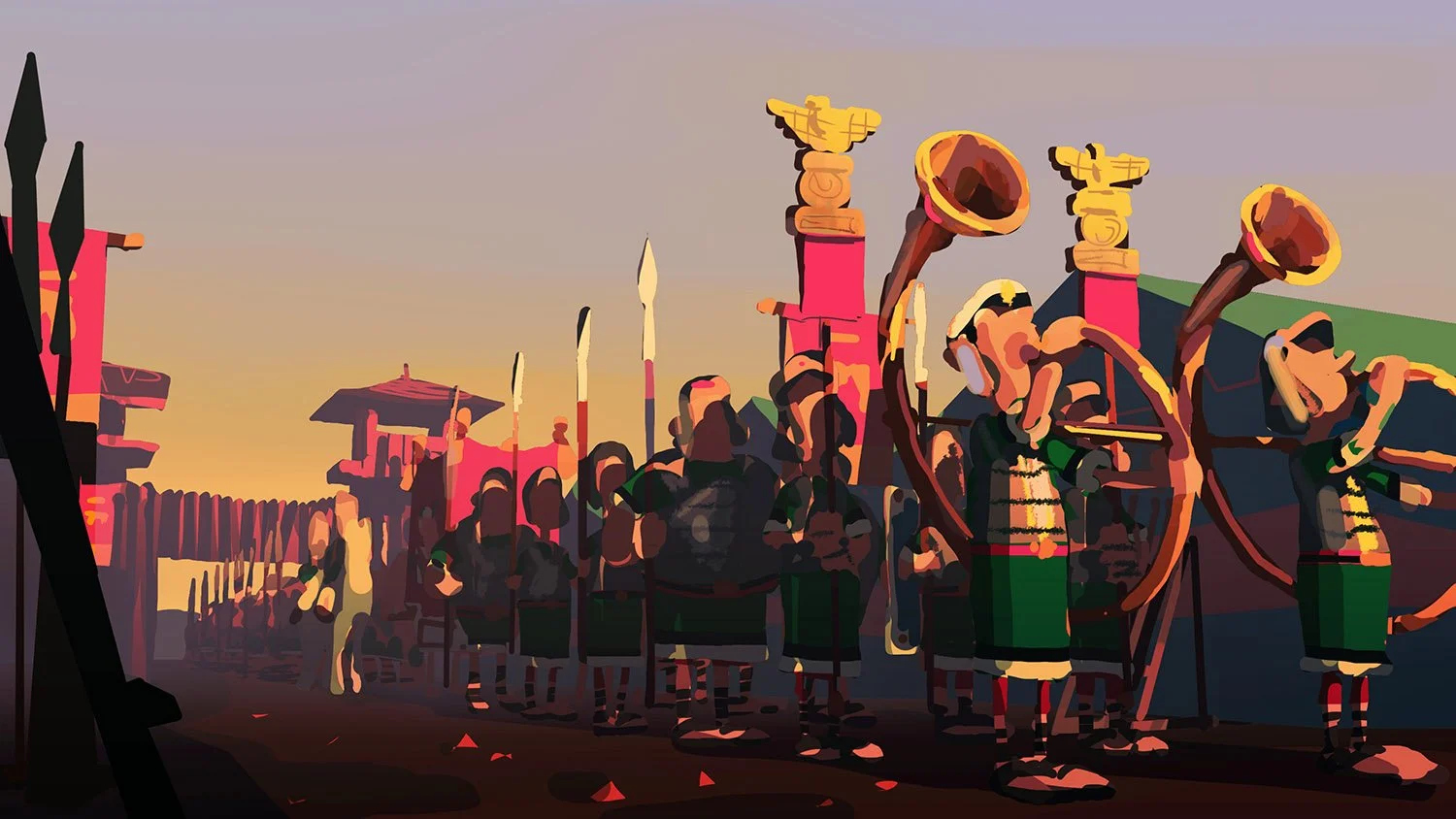
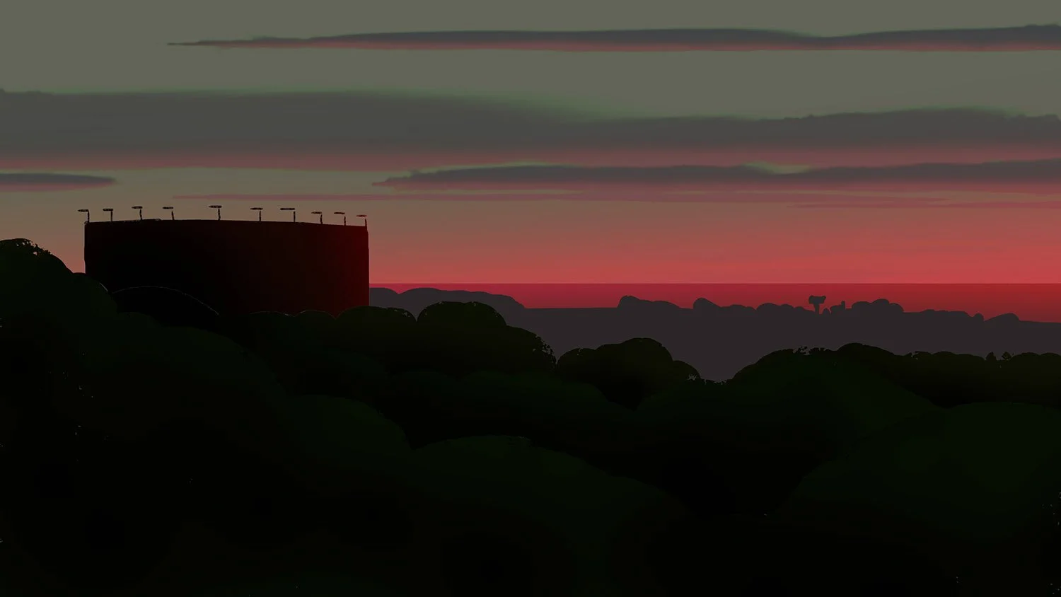
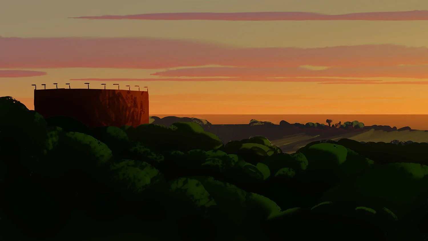
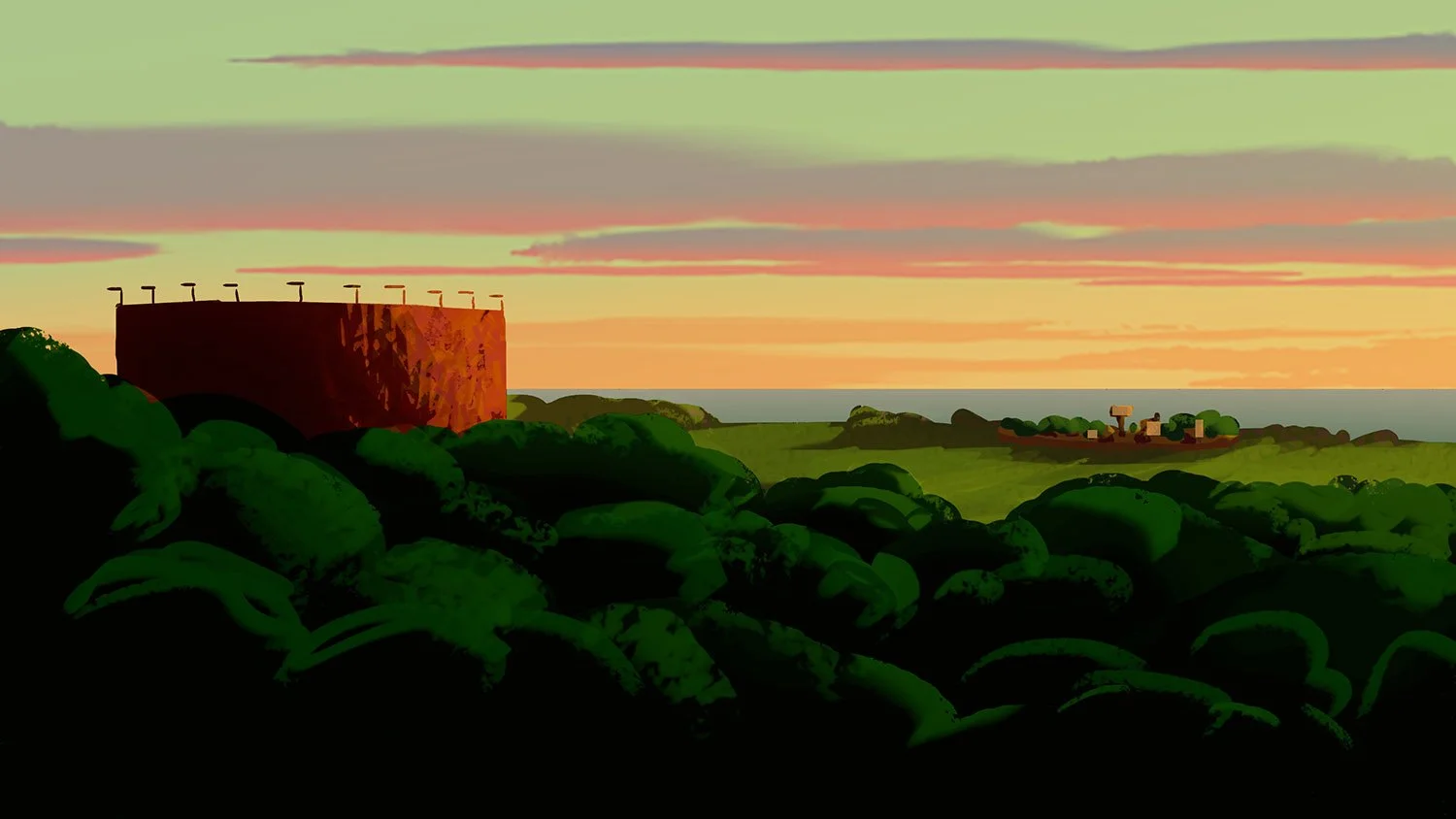
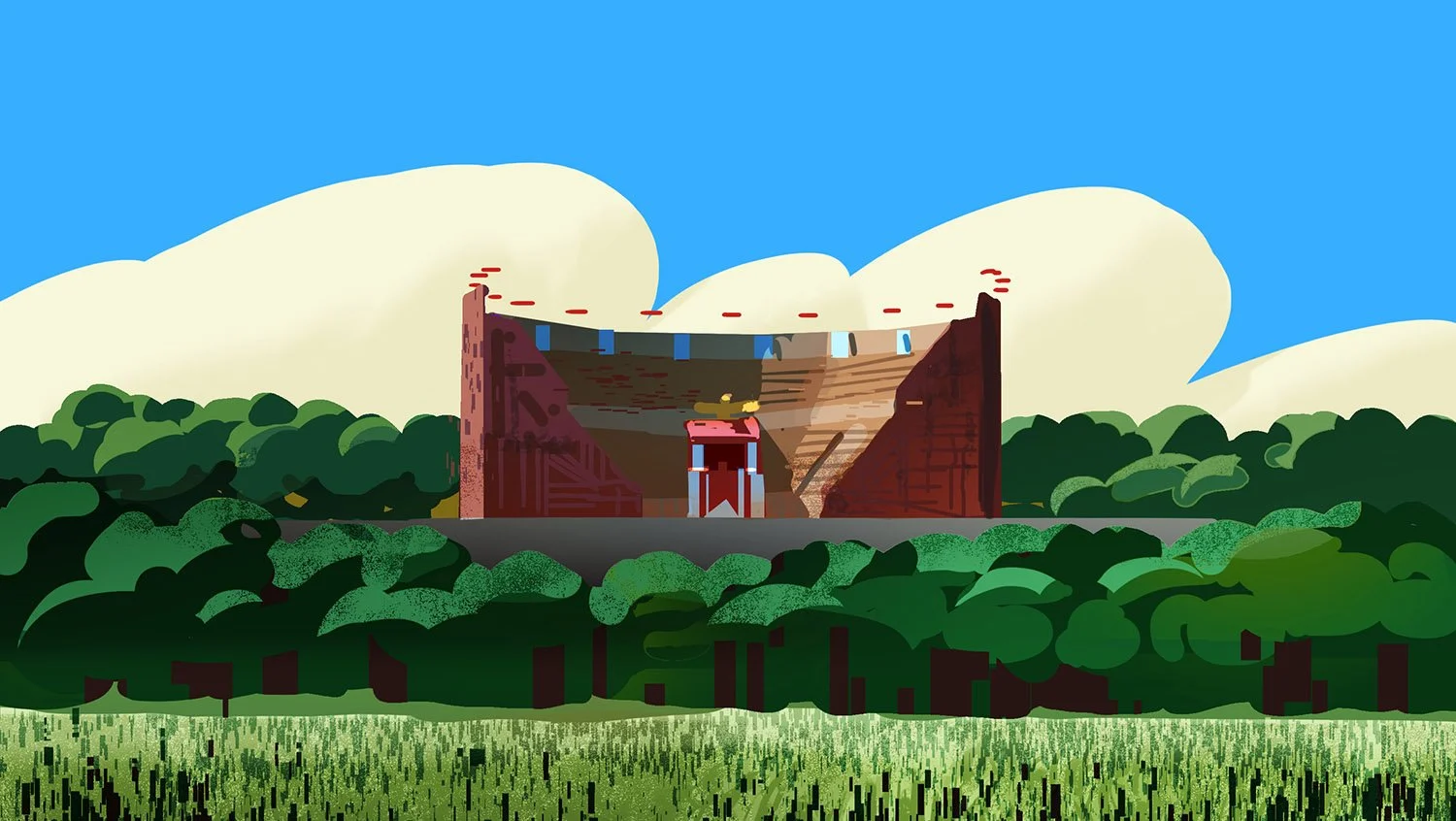
ROMAN’S CAMP
The Roman military camps are designed for discipline, repetition, and industrial order. Uniform layouts, strict symmetry, and utilitarian materials reflect the empire’s militaristic mindset. This stark visual language contrasts sharply with the organic freedom of the Gallic world.
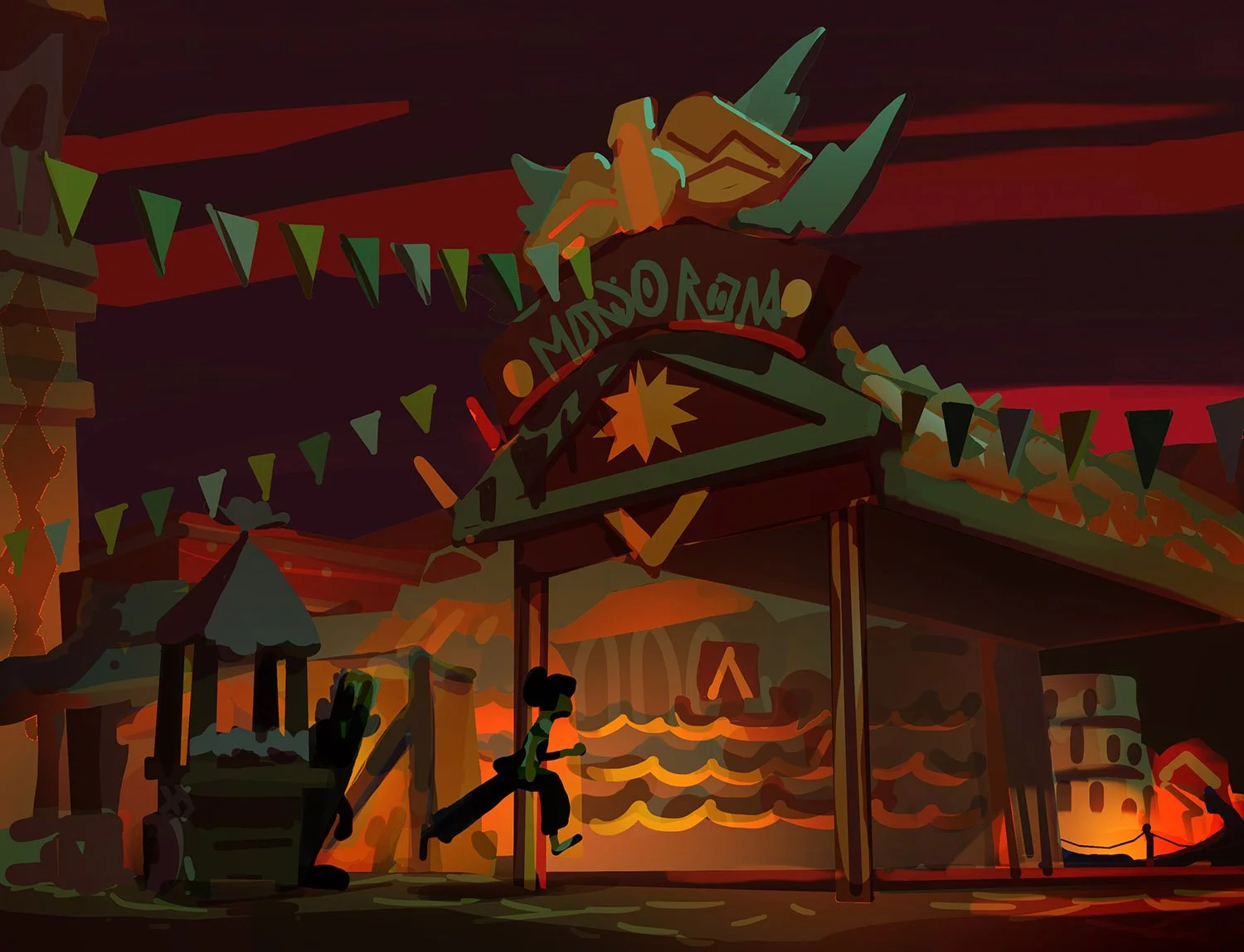
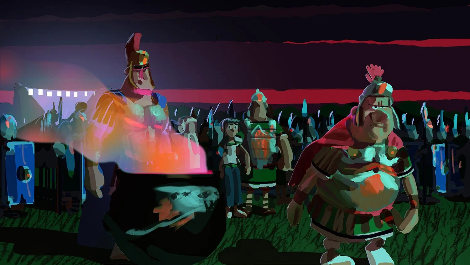
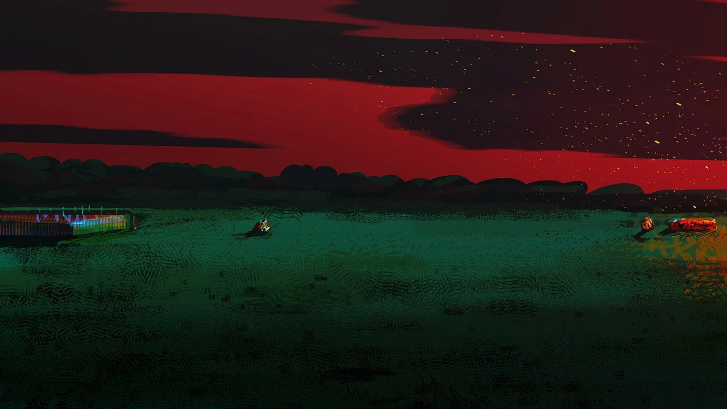
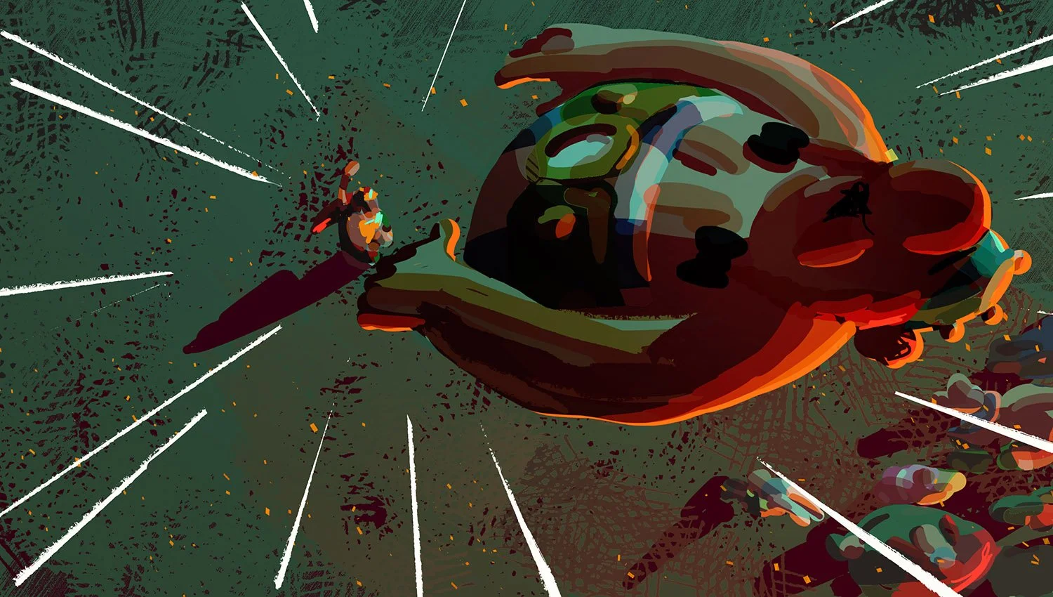
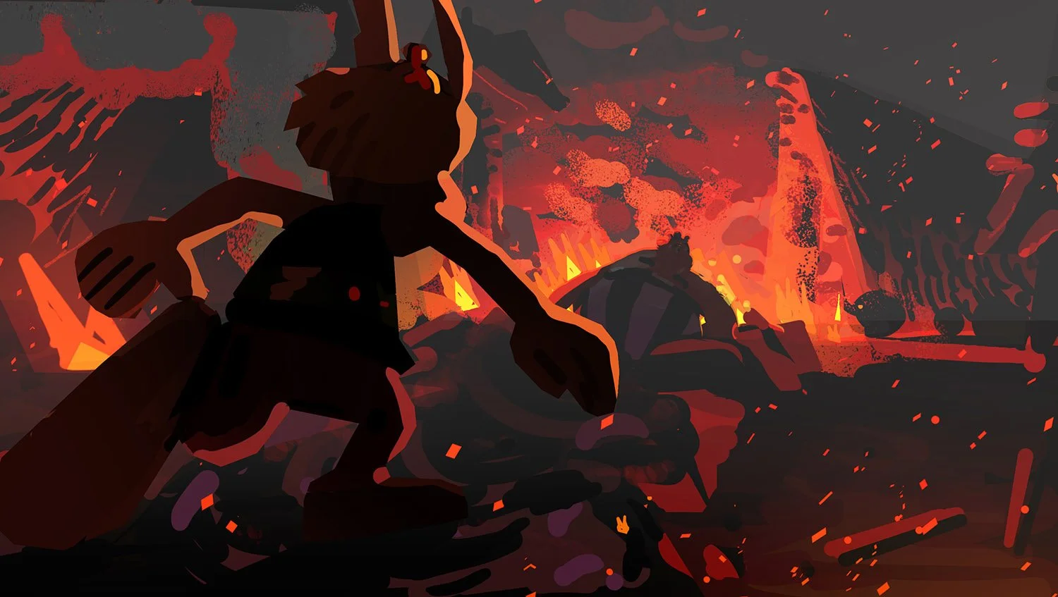
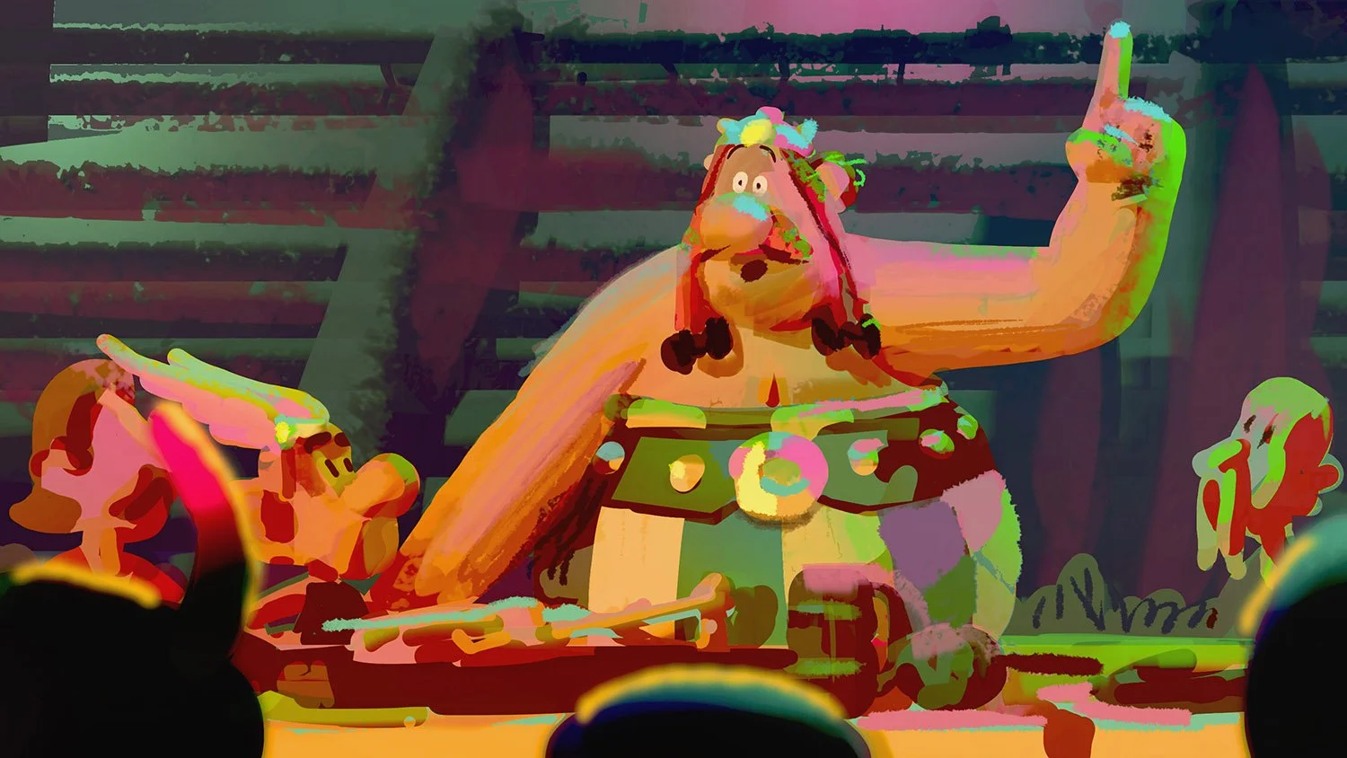
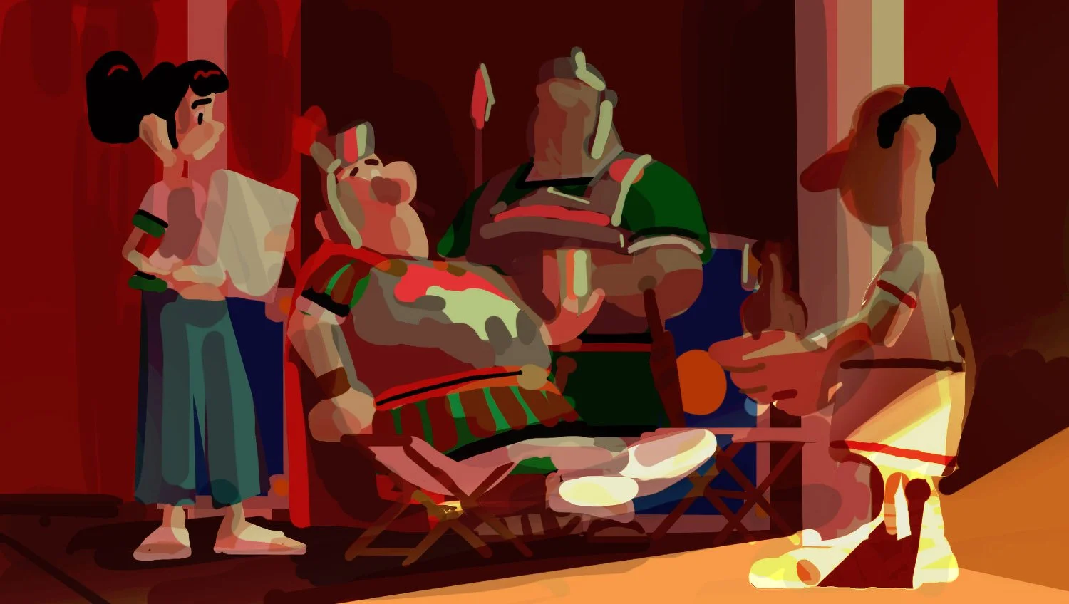
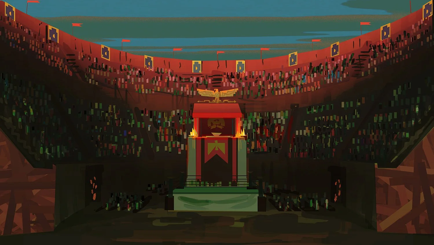
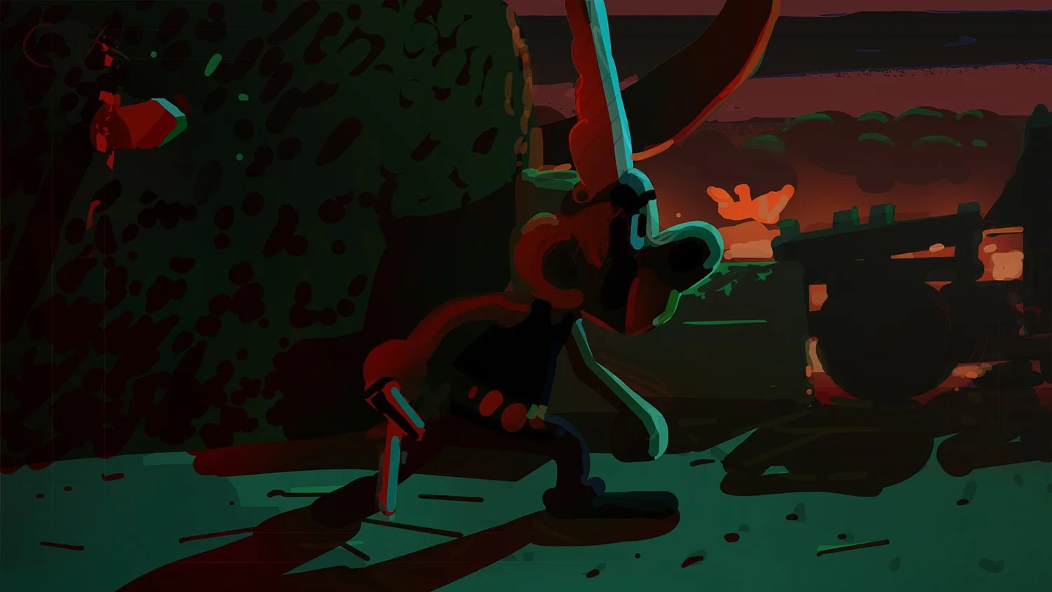
EPISODE I ColorKeys:
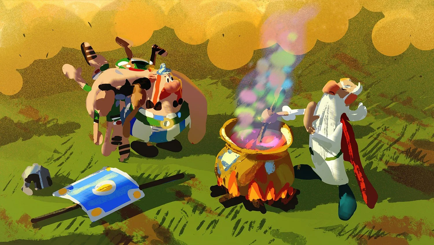
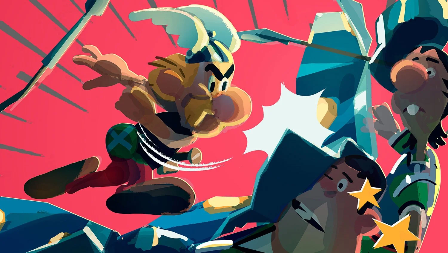
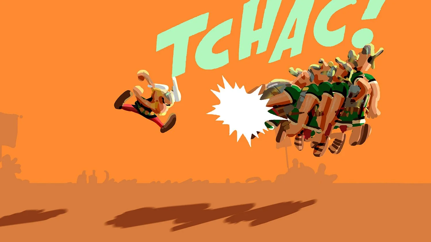
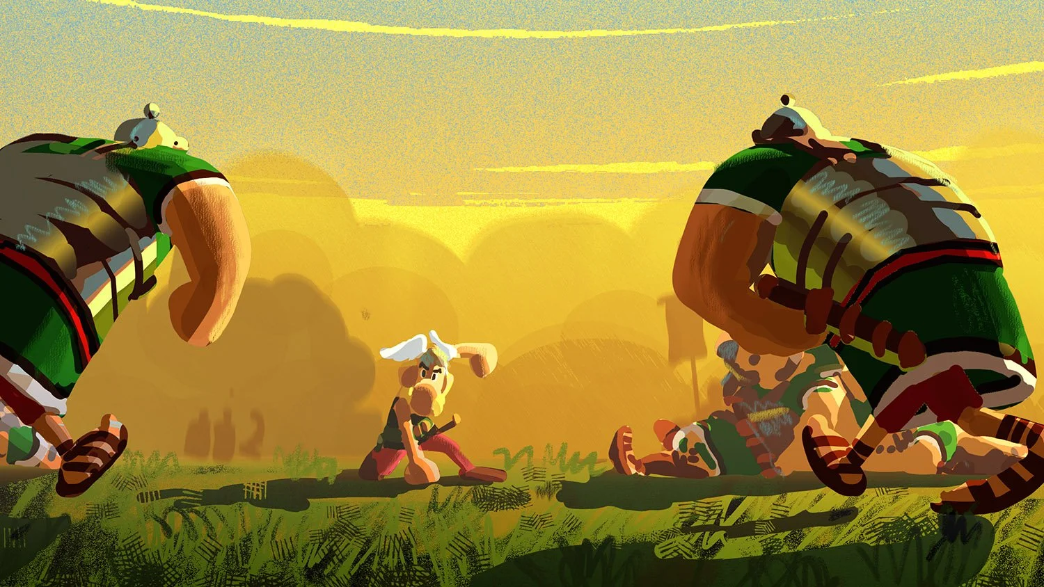

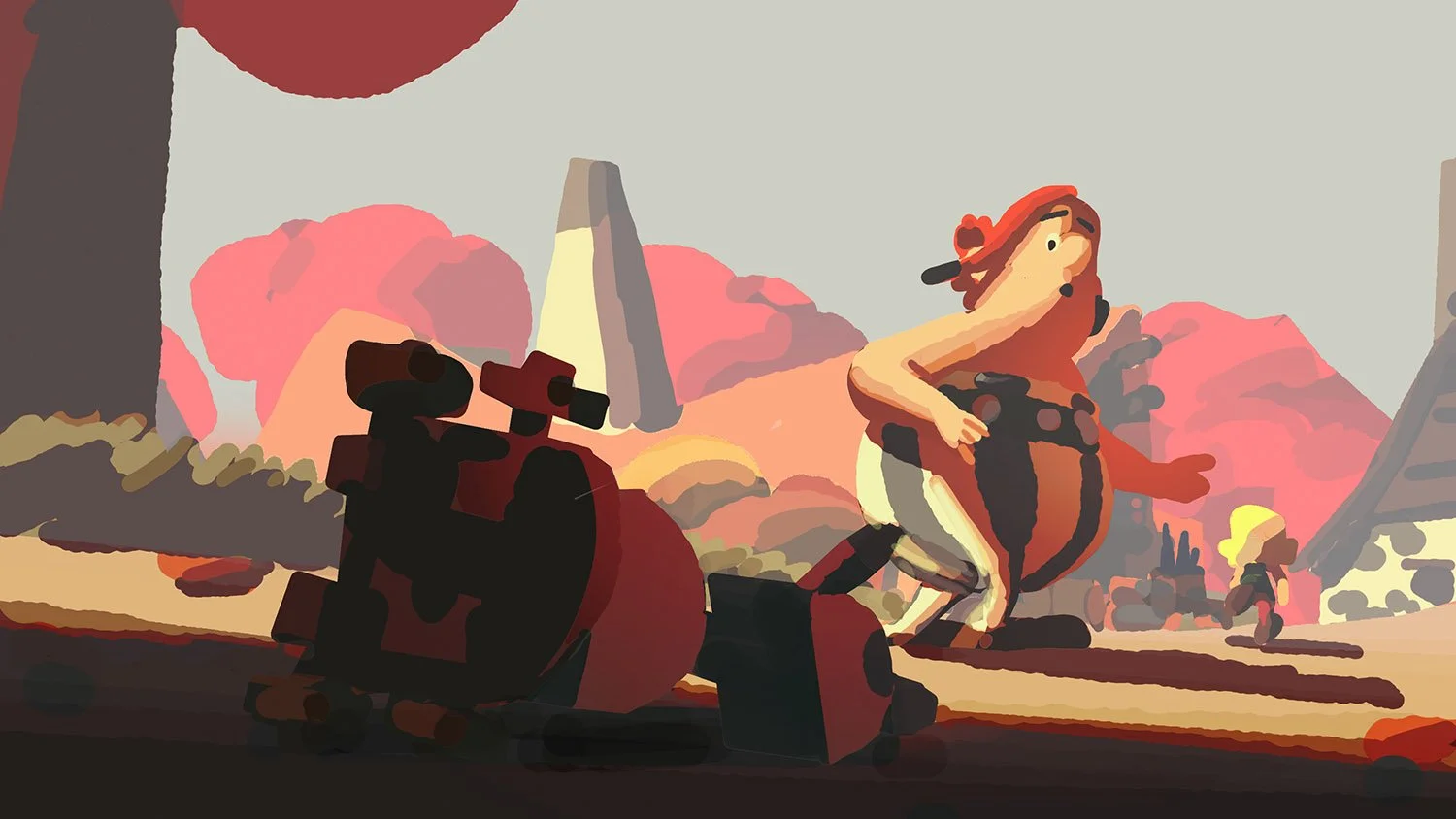
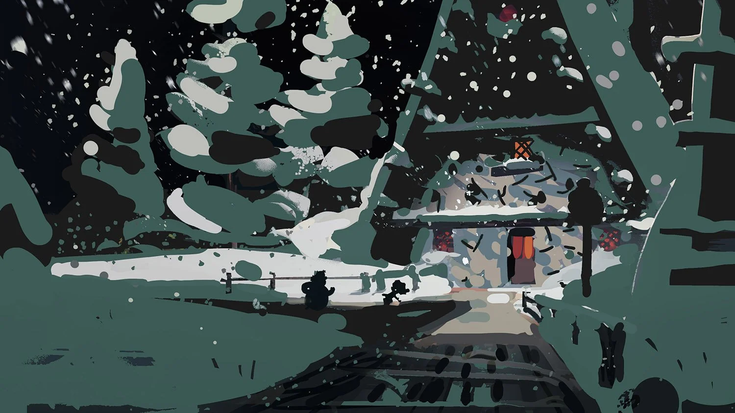

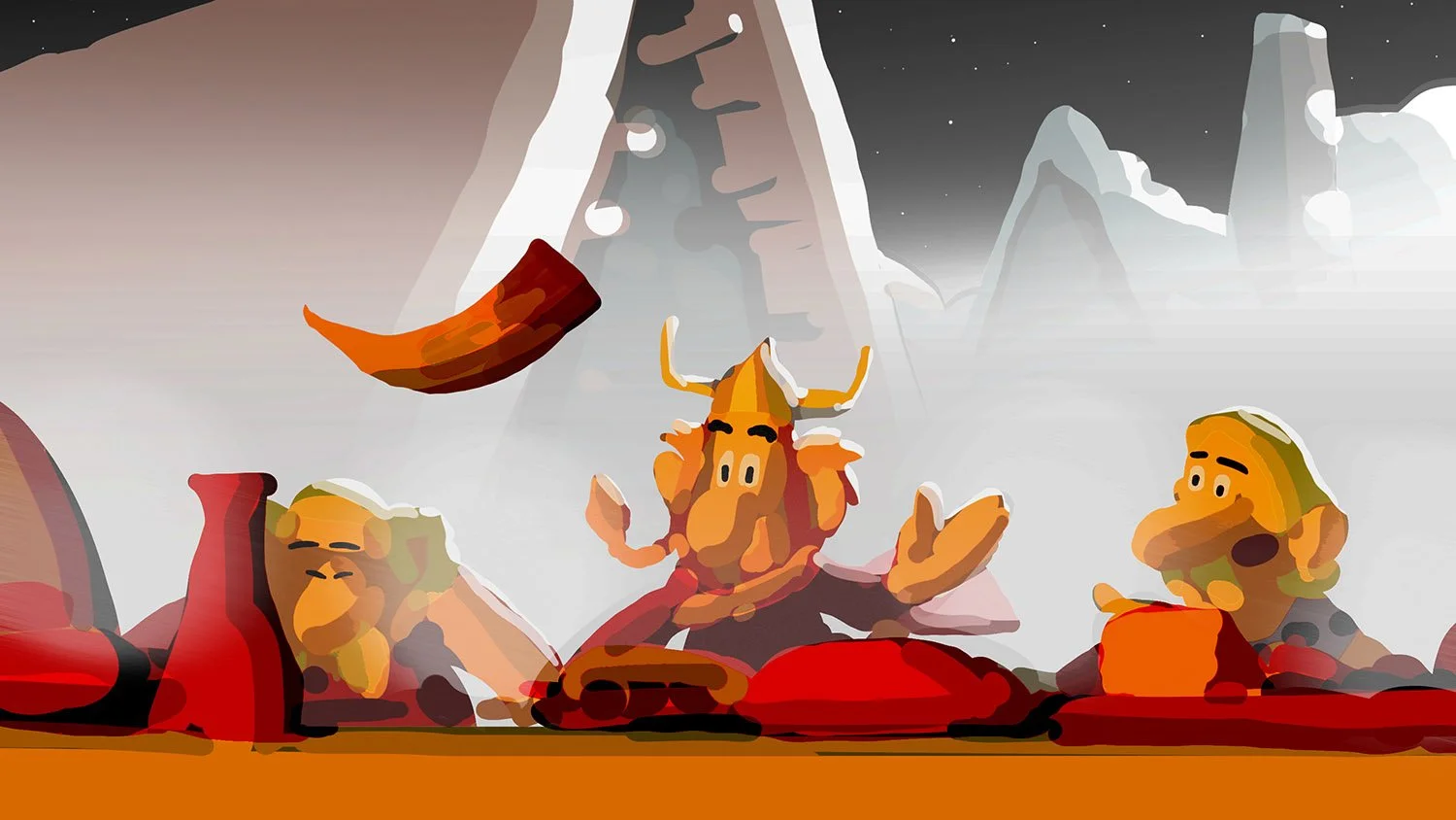
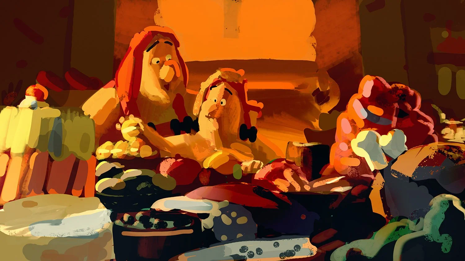
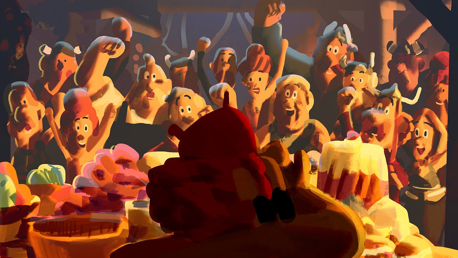
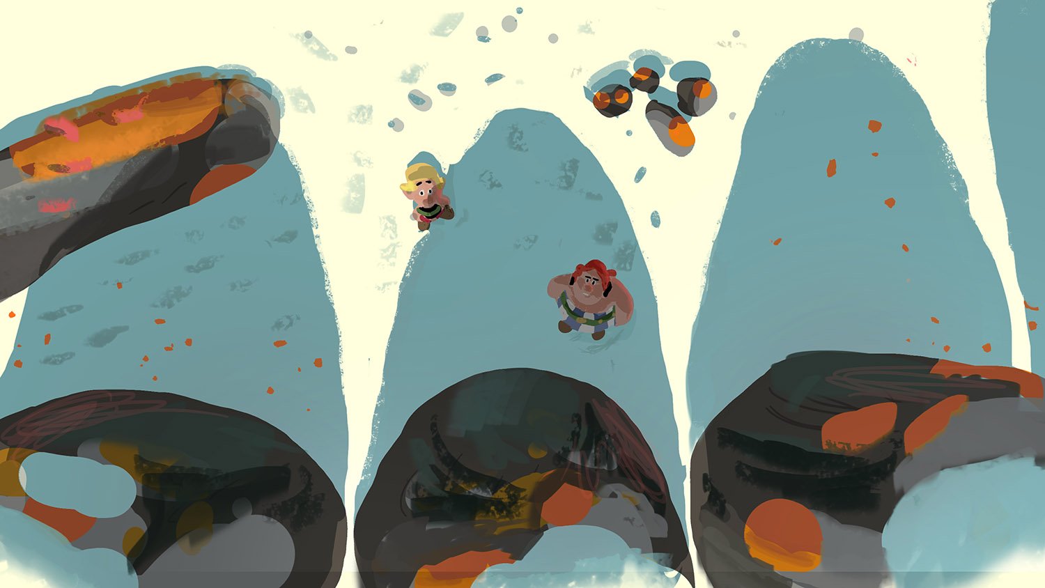
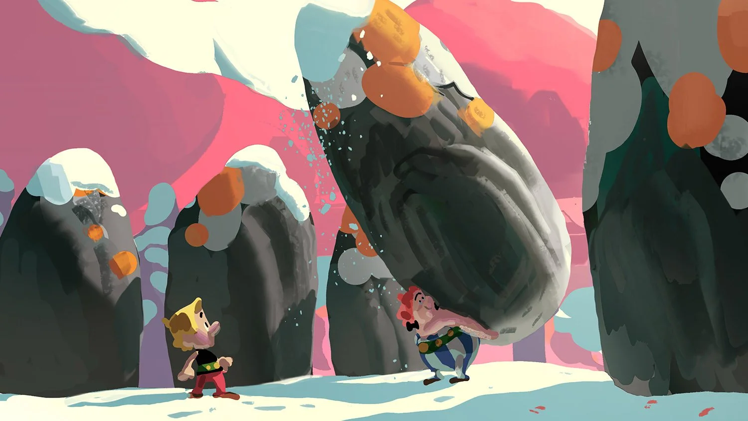
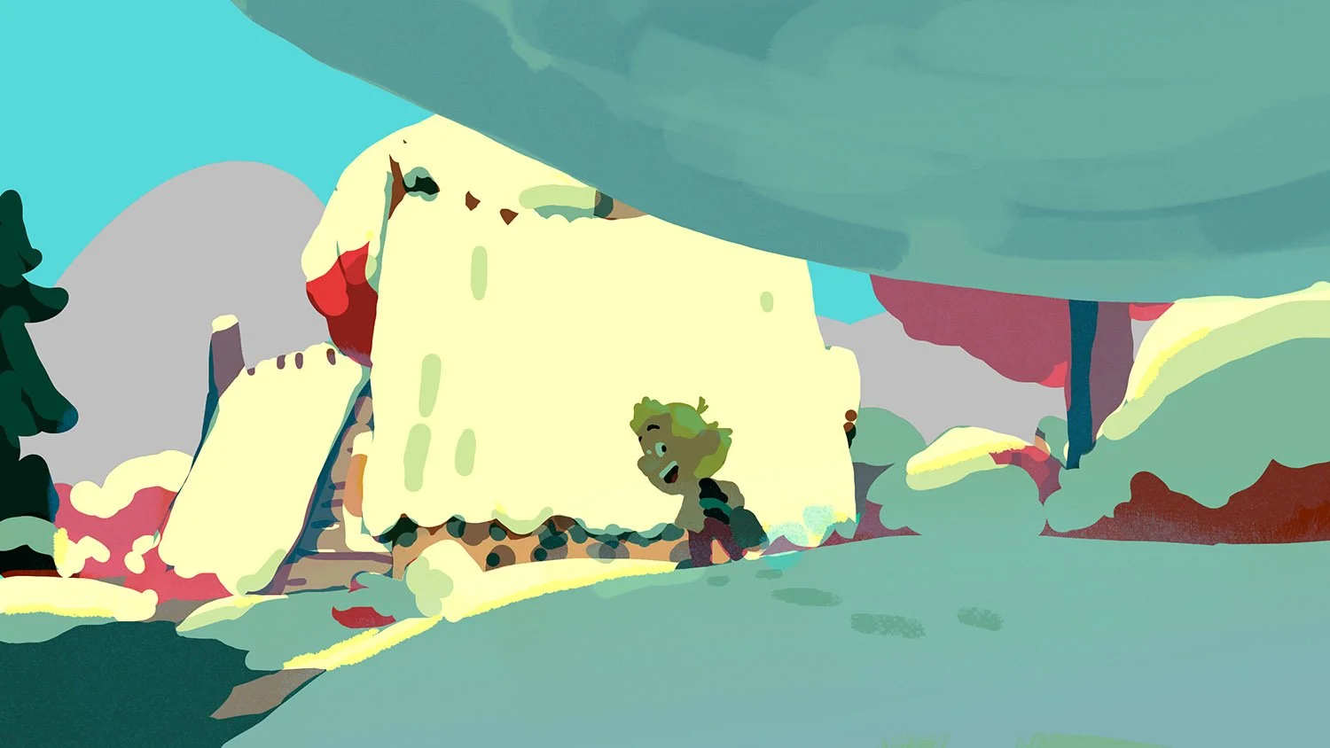
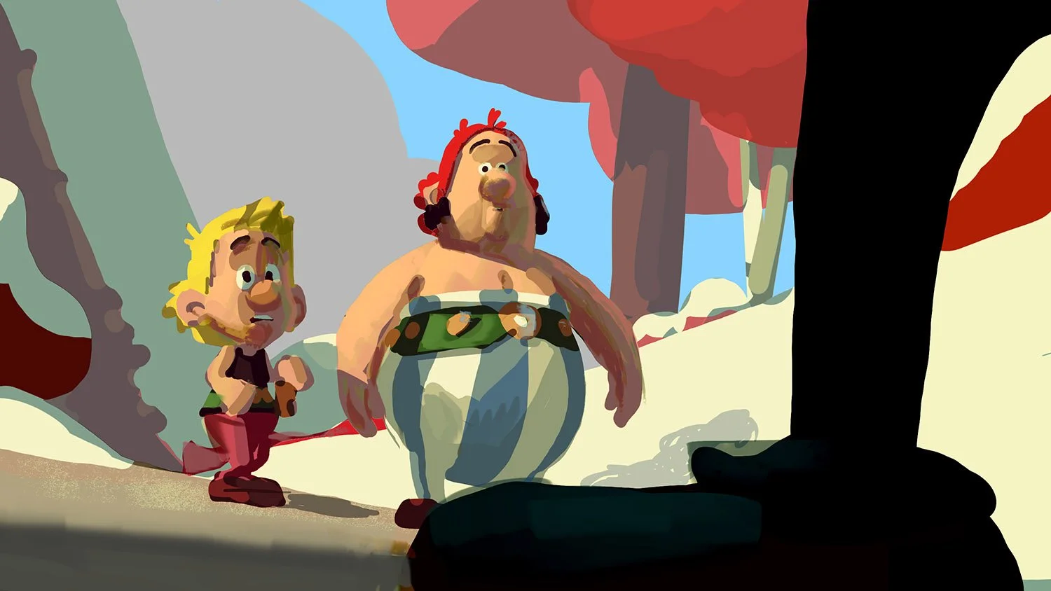


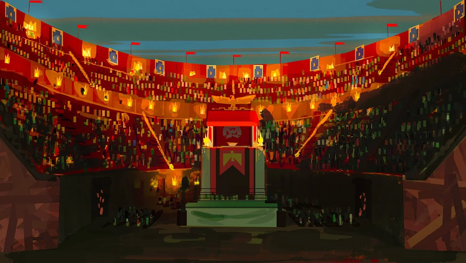
EPISODE II ColorKeys:


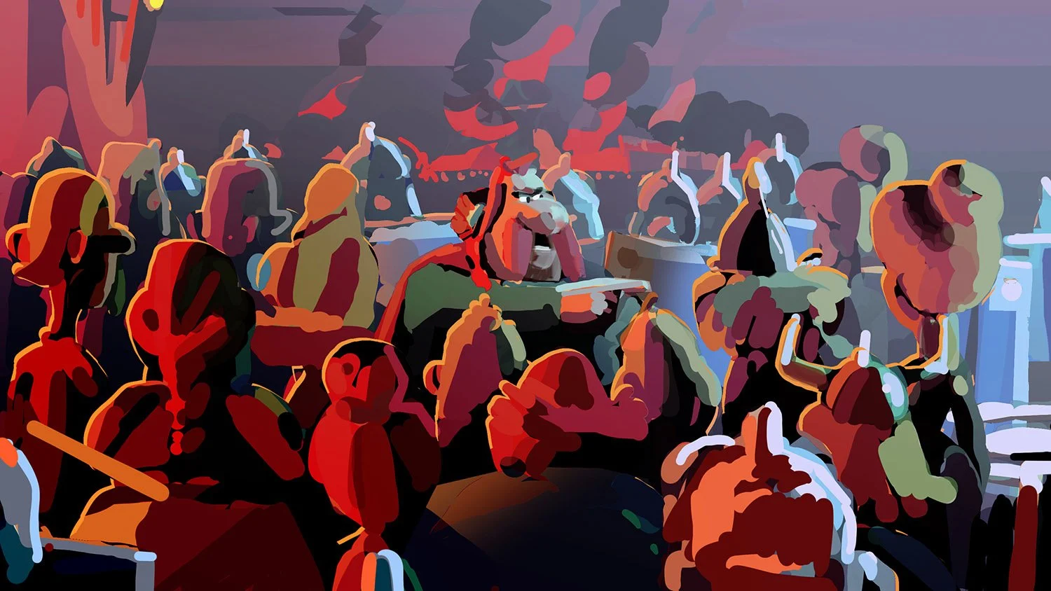
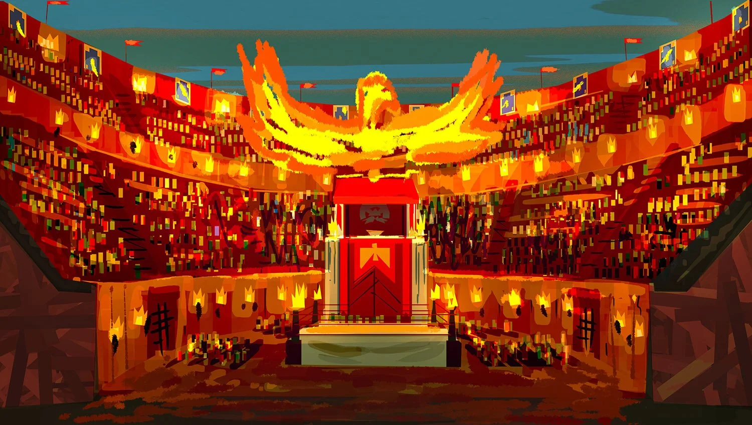
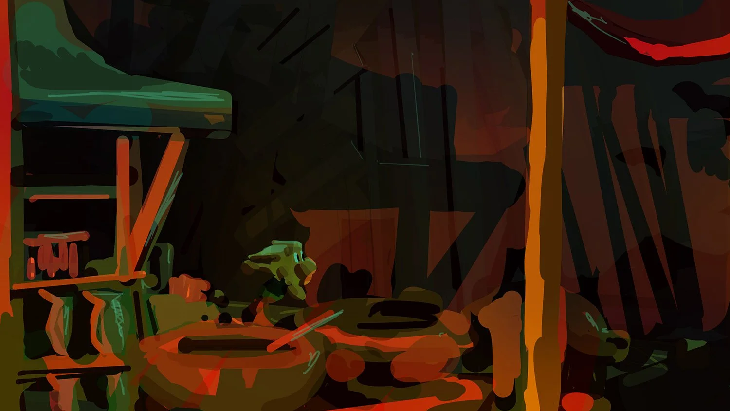
EPISODE III ColorKeys:


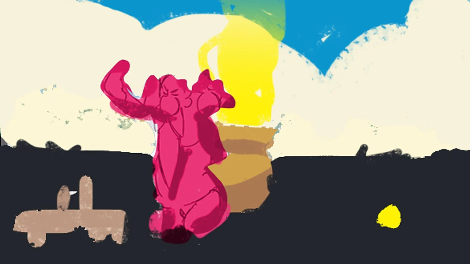
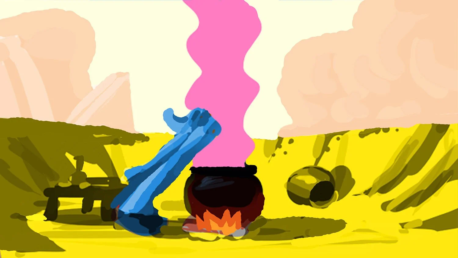

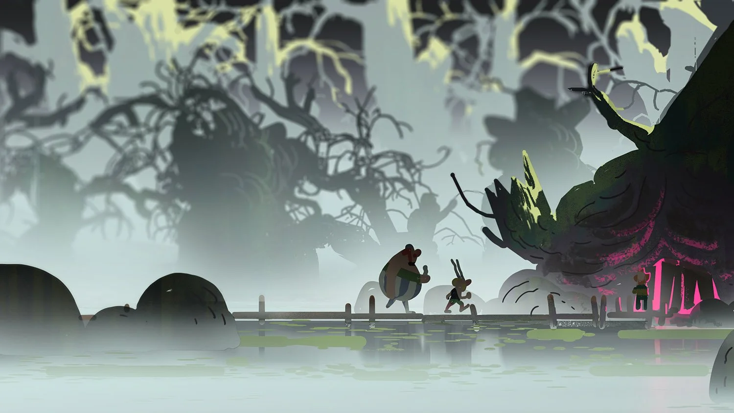

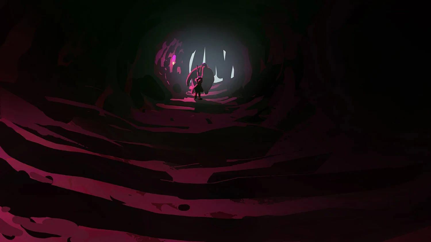
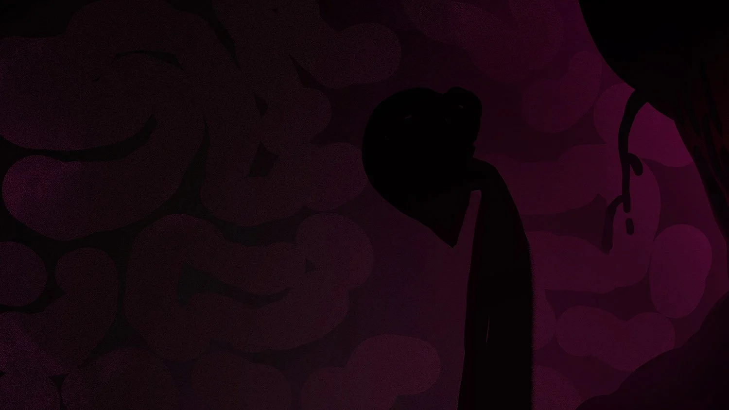
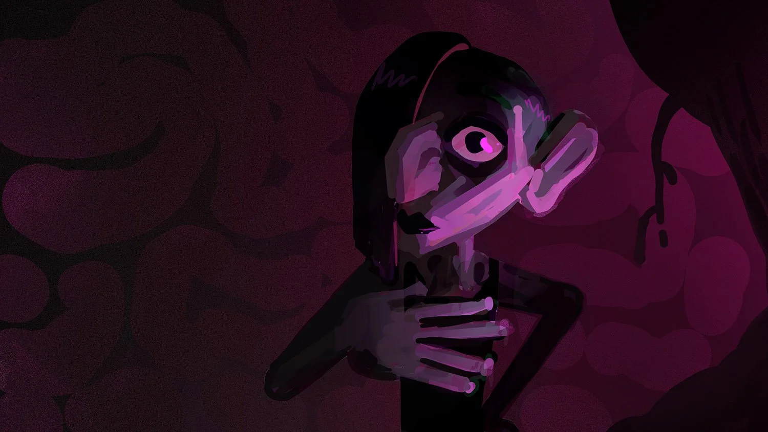
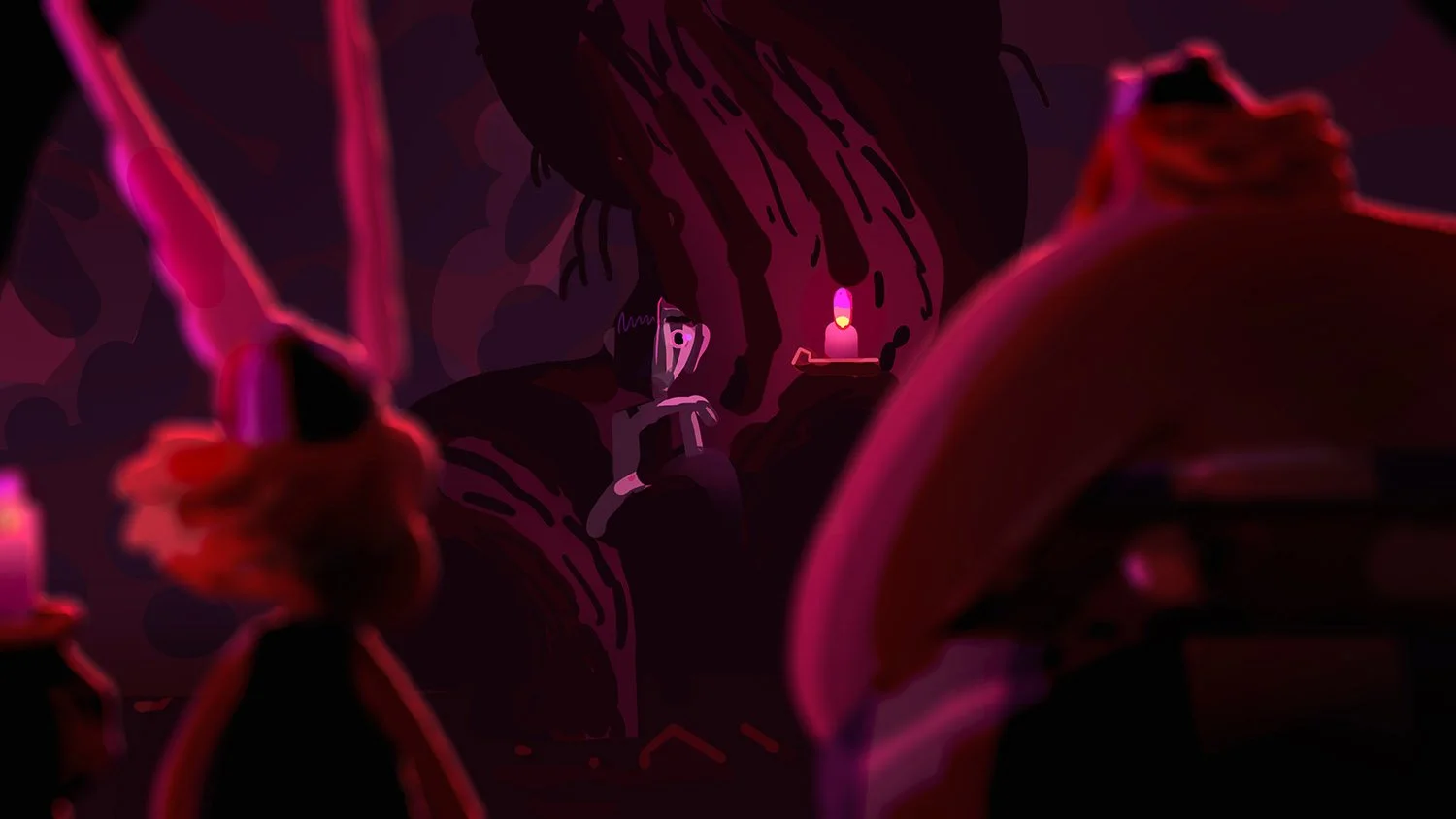
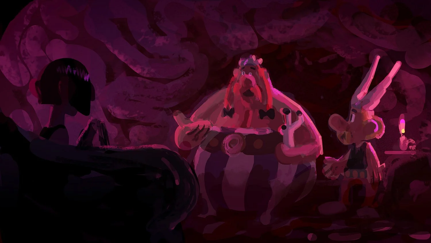
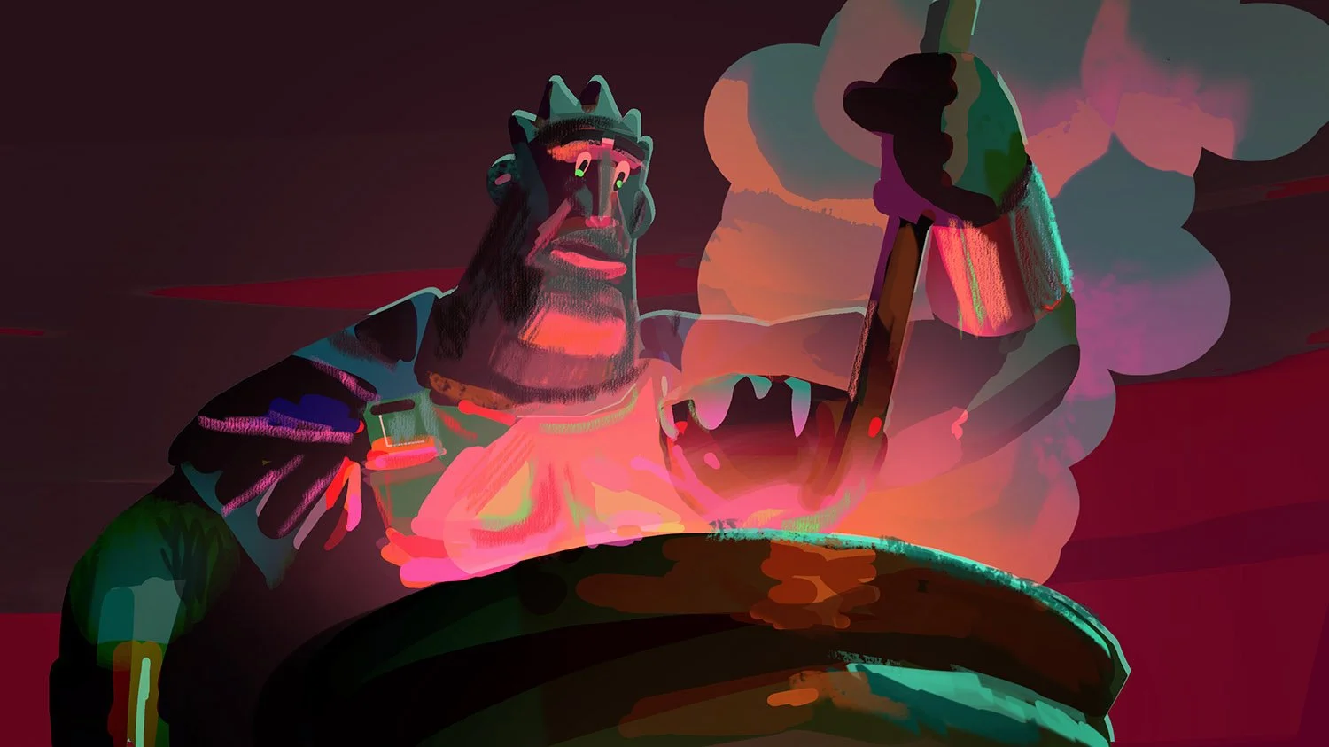
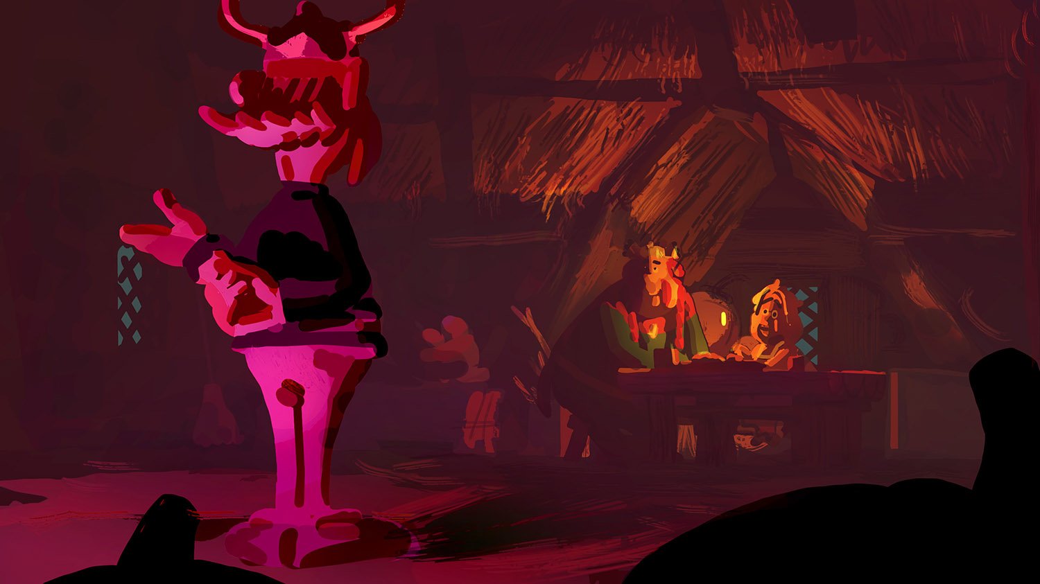
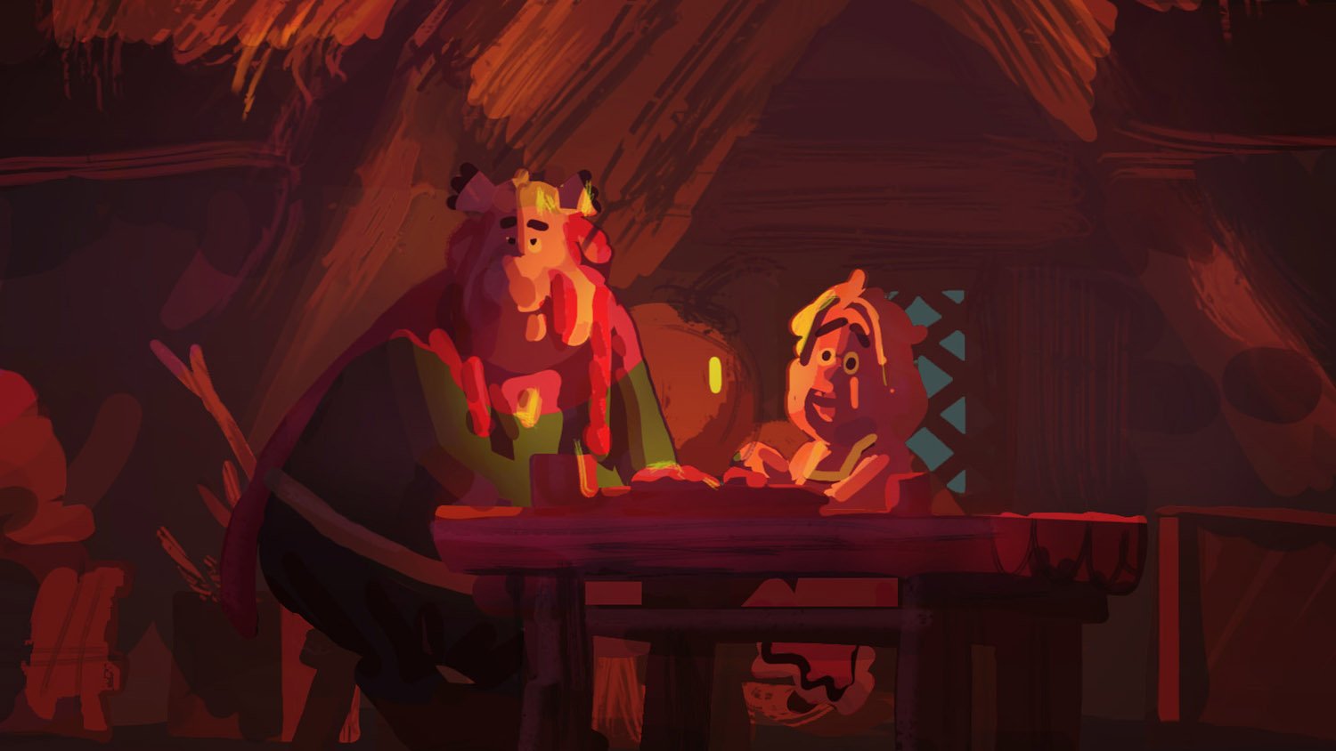
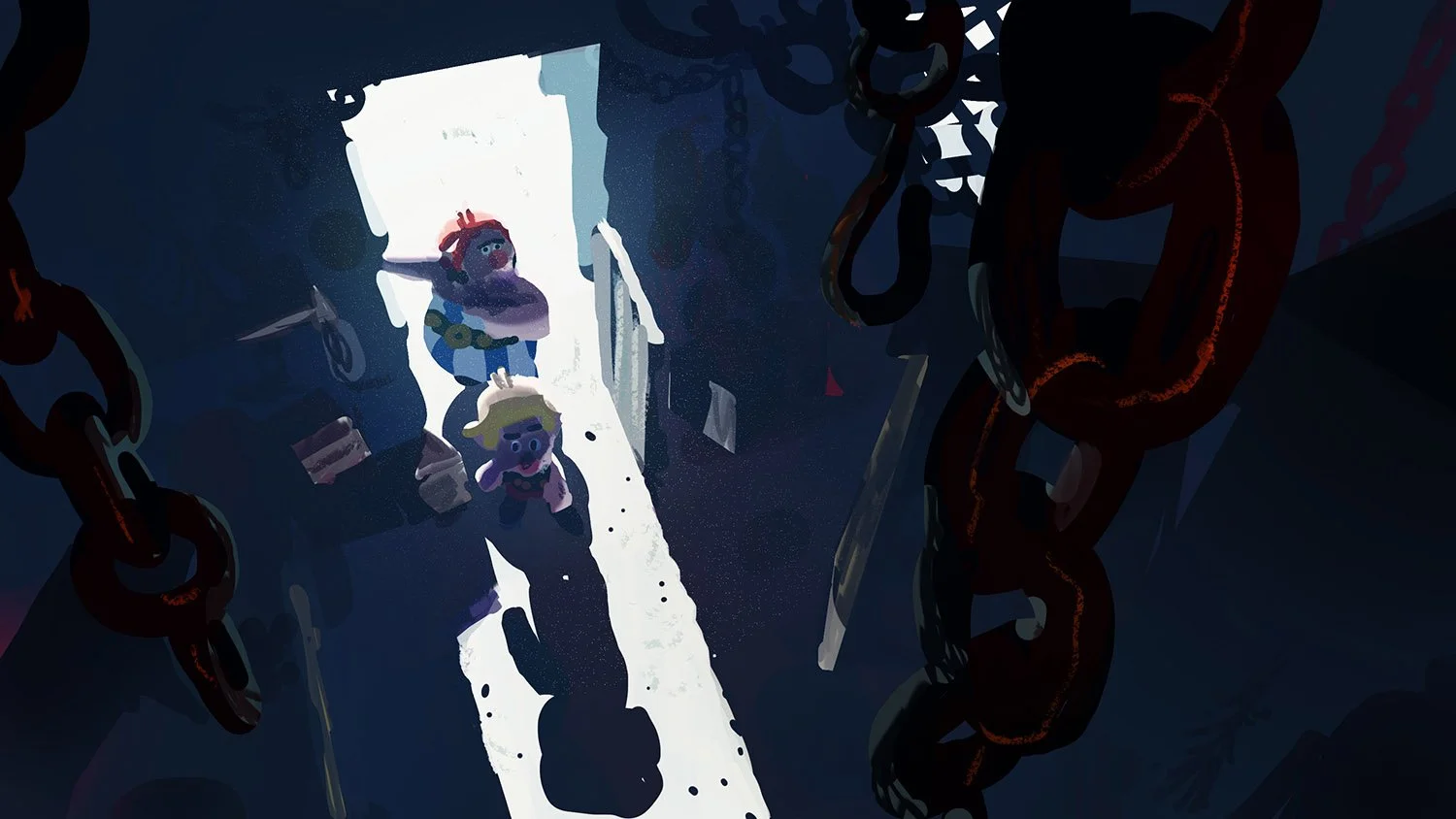
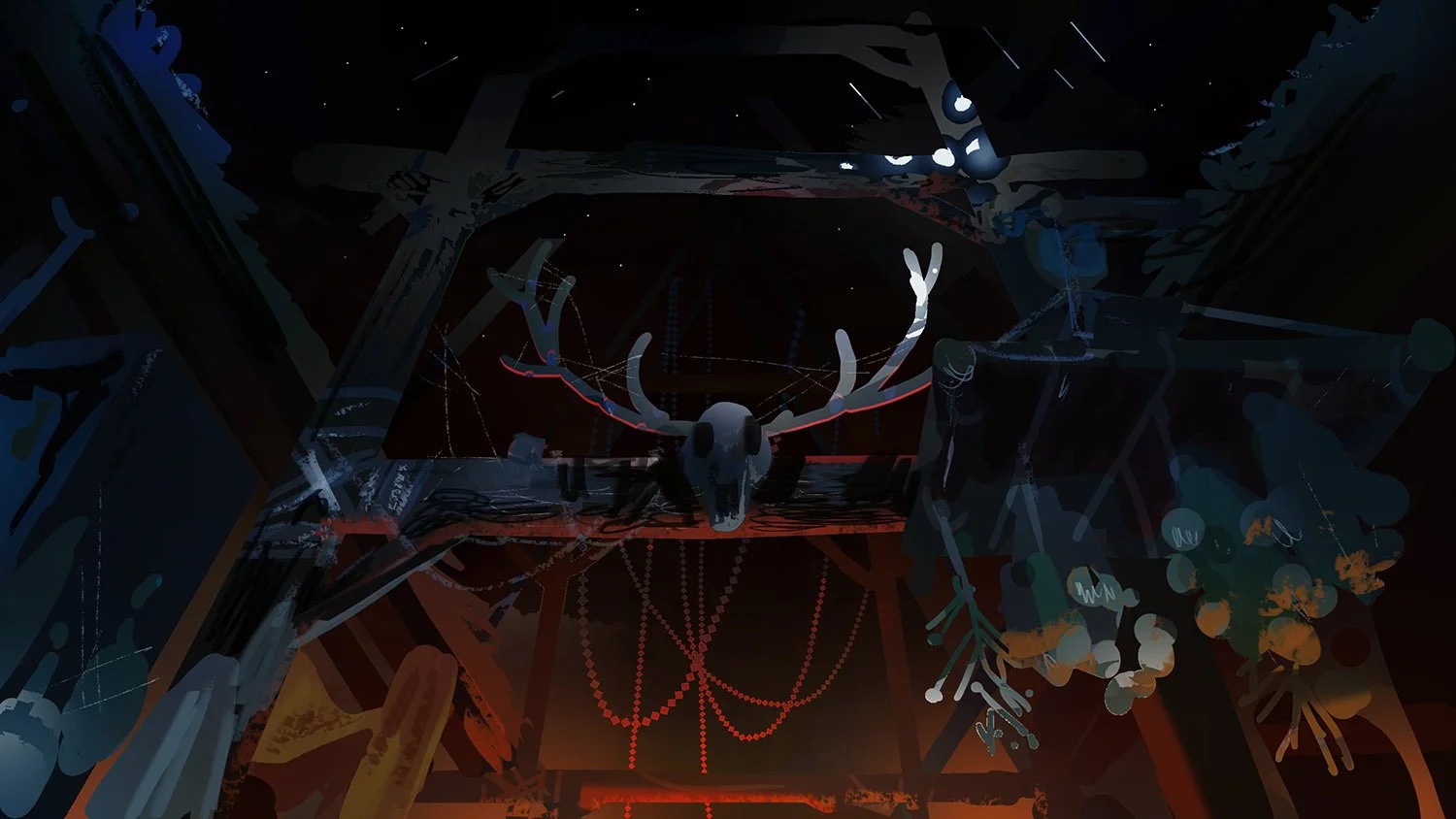
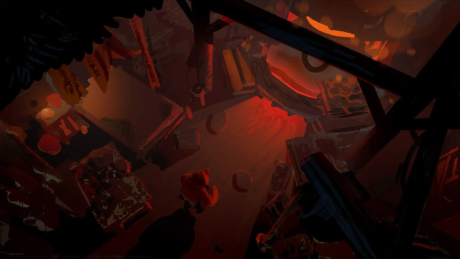
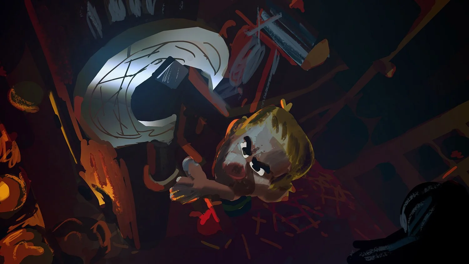
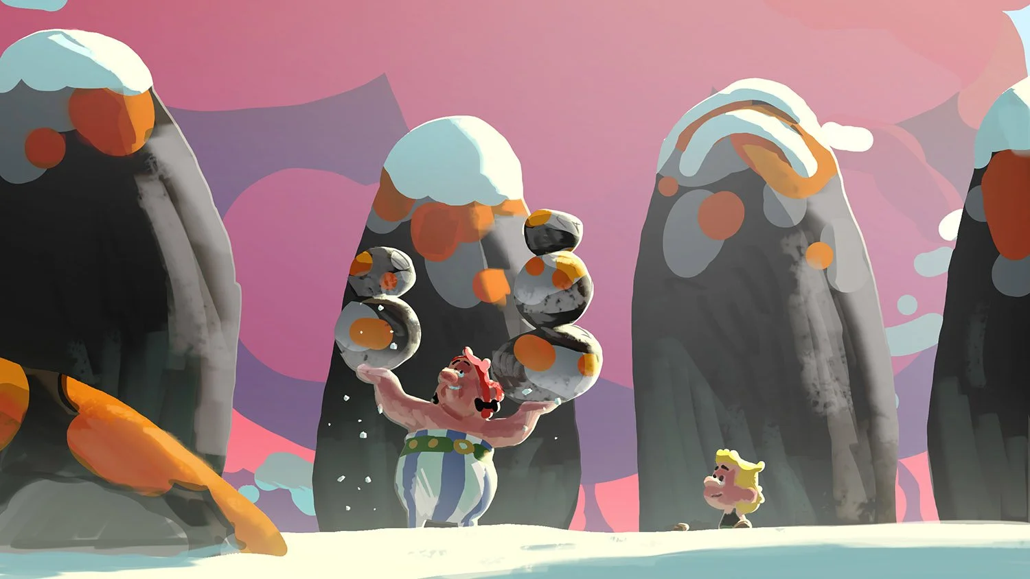
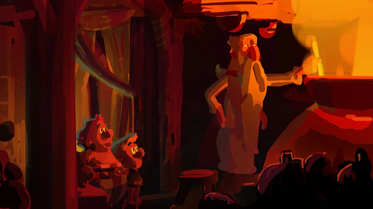
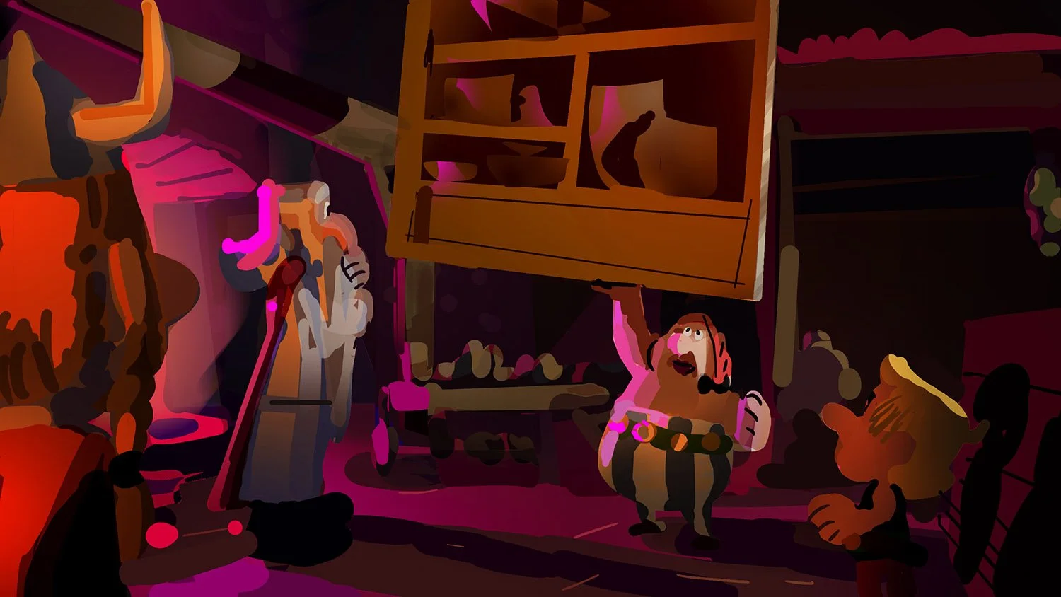
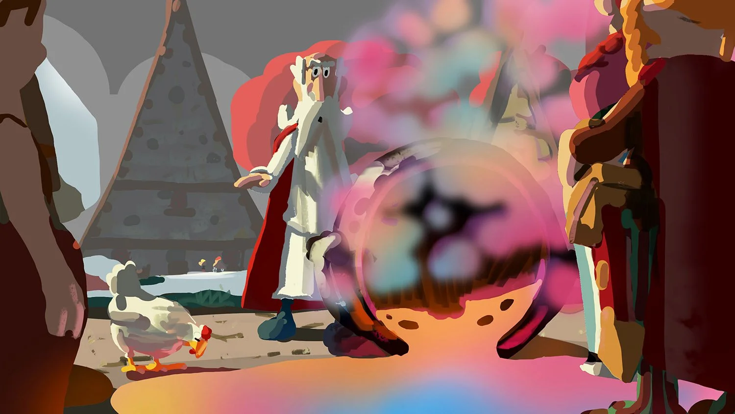
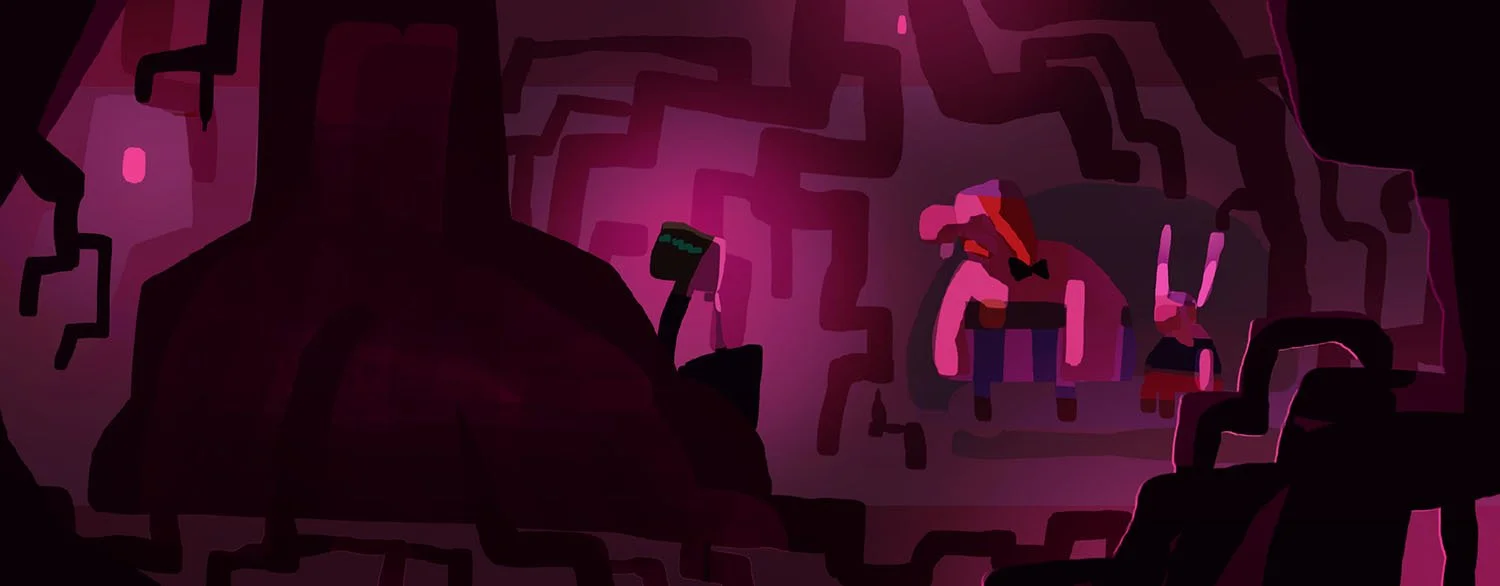
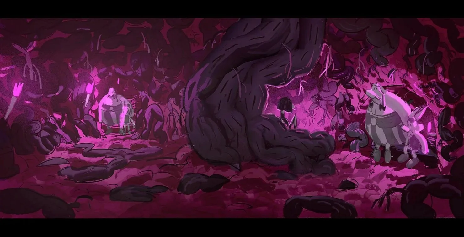
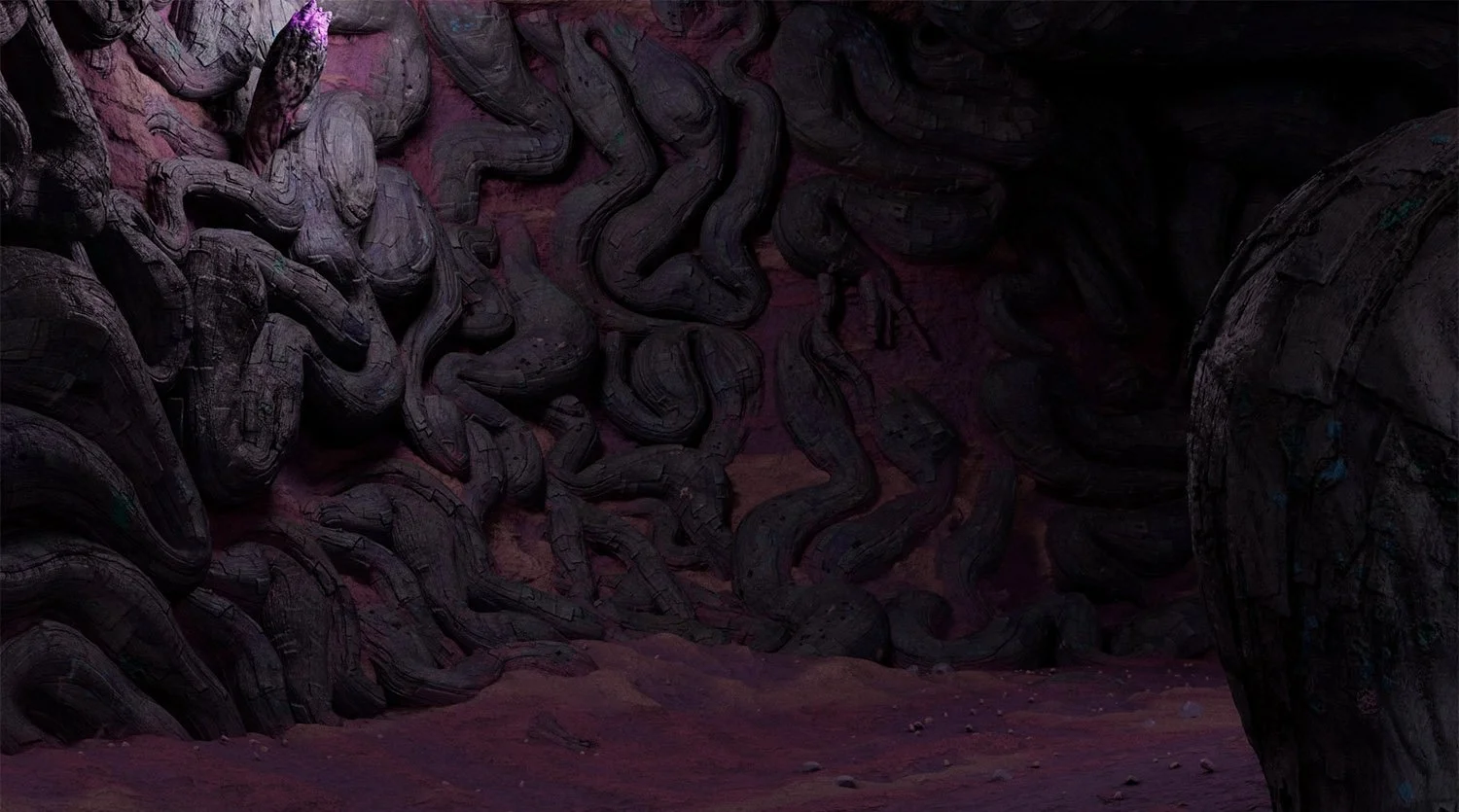
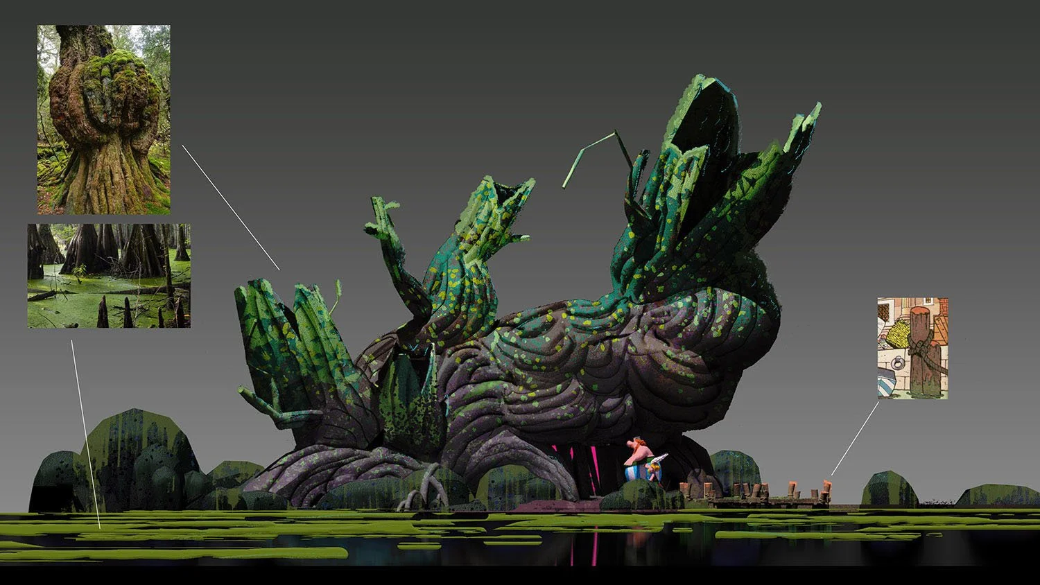
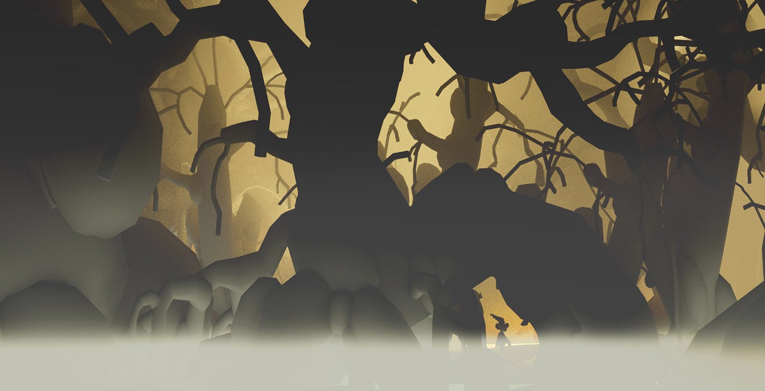
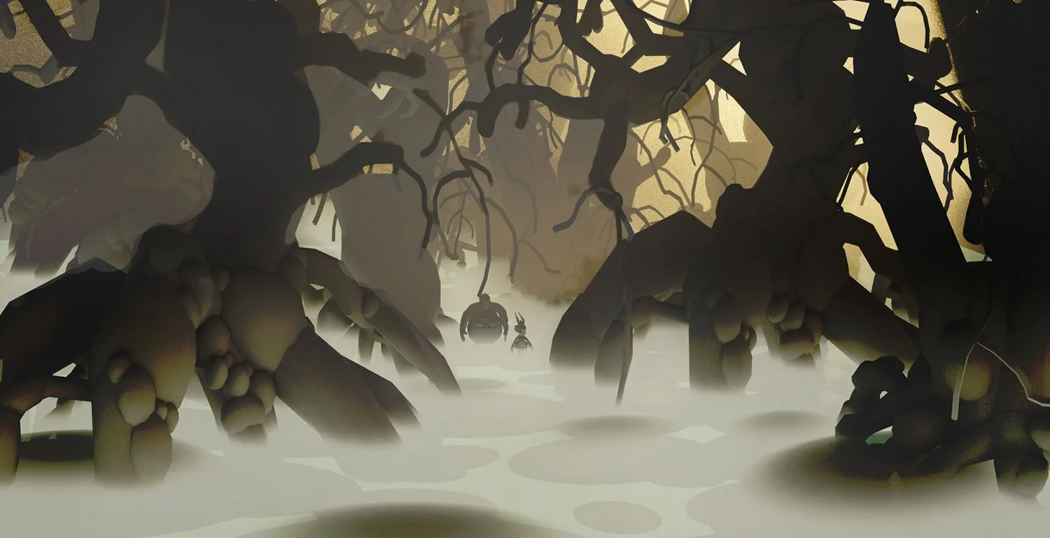
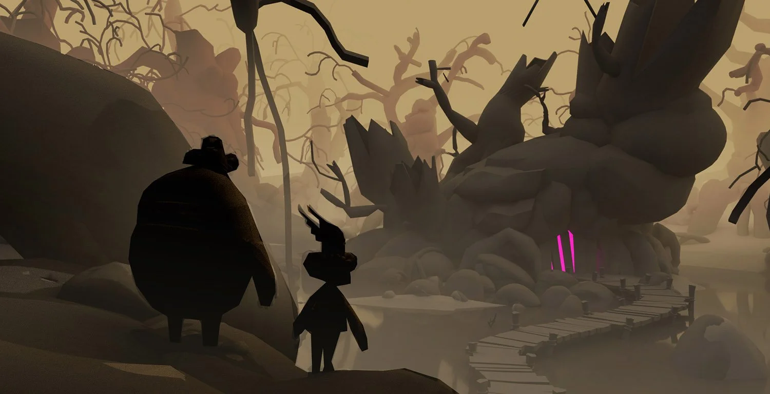
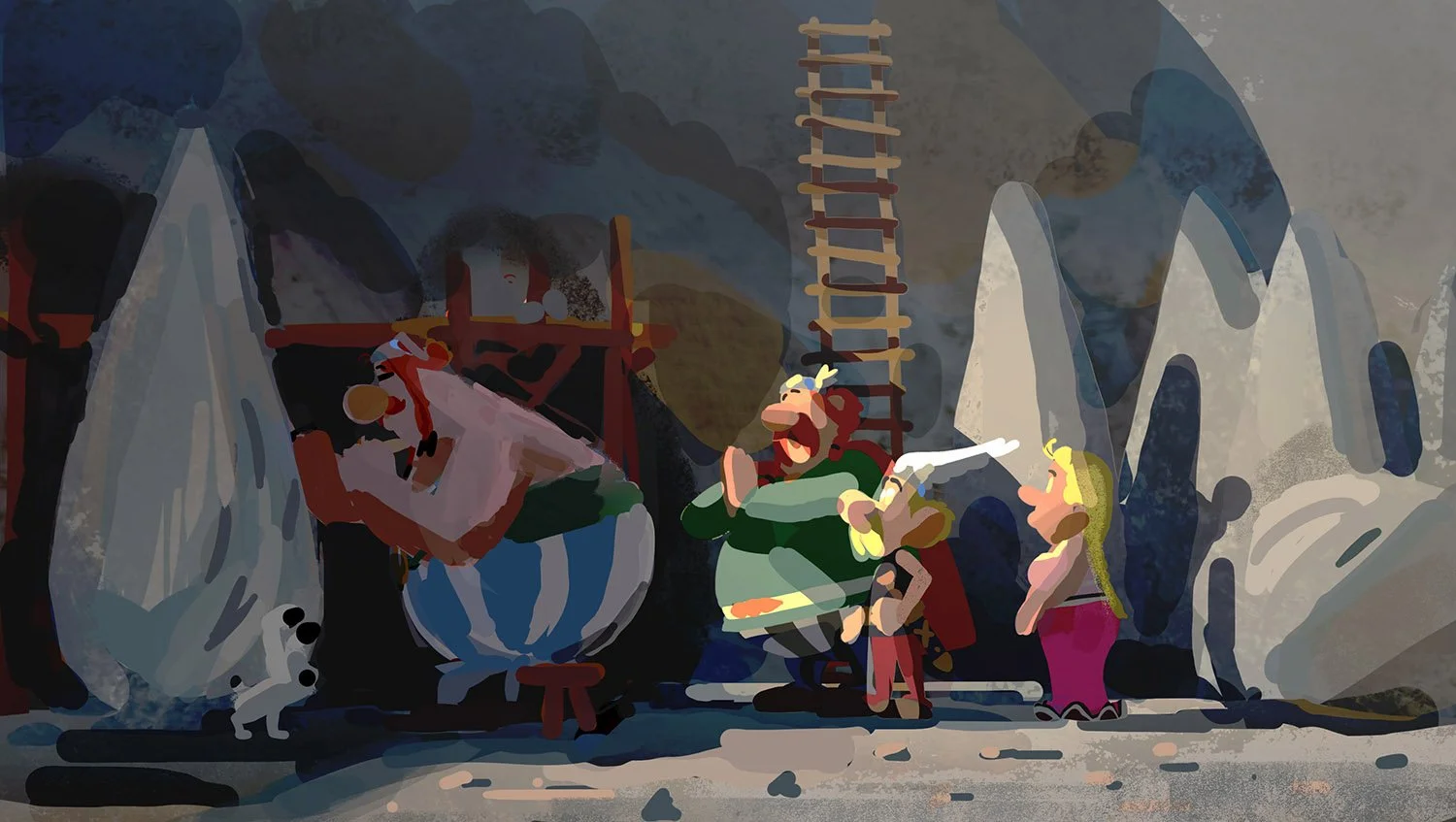
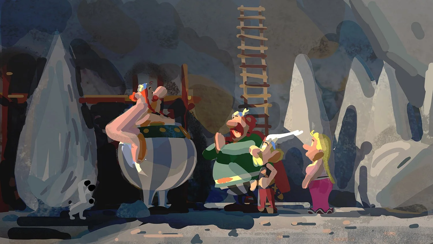
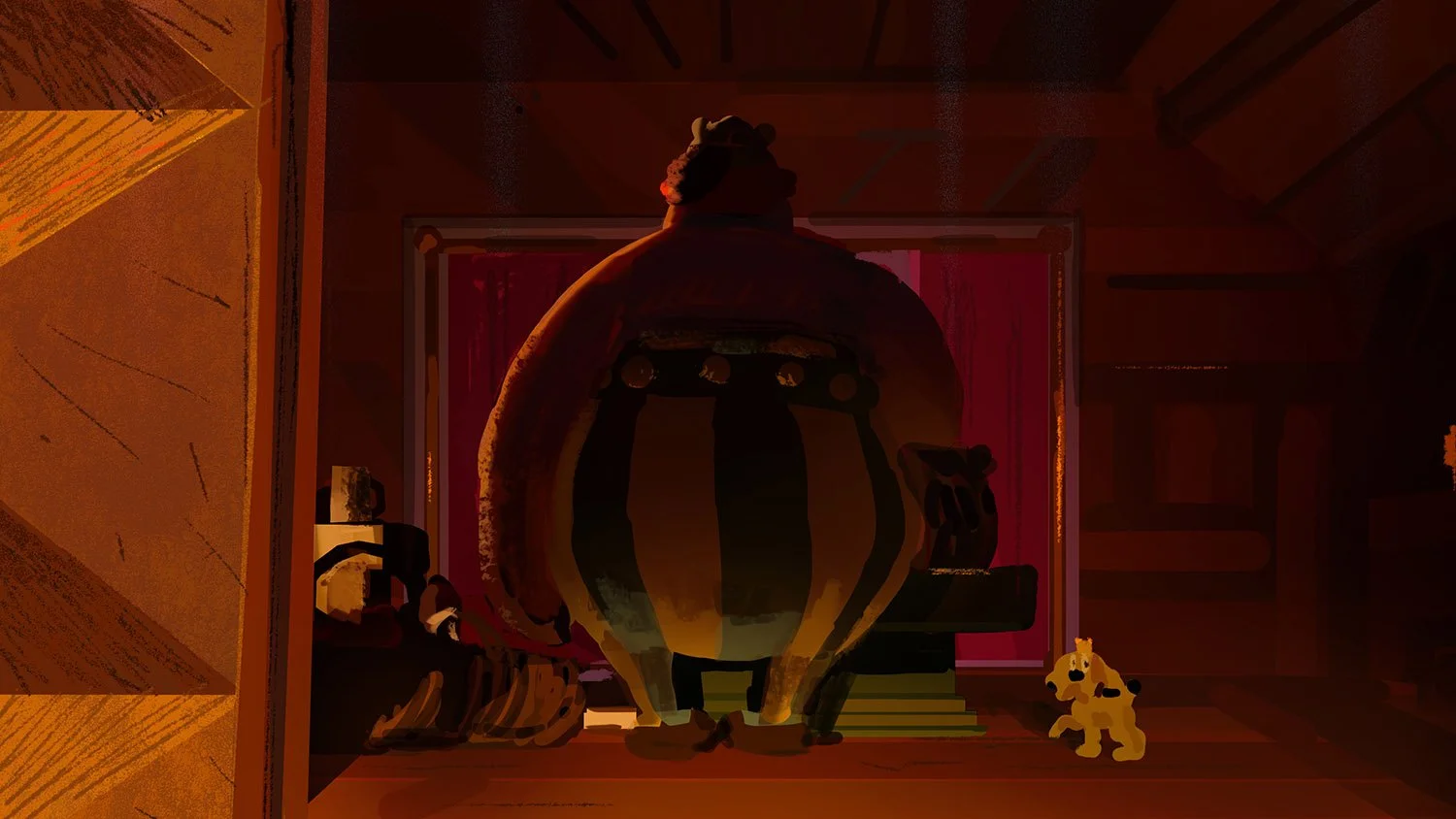
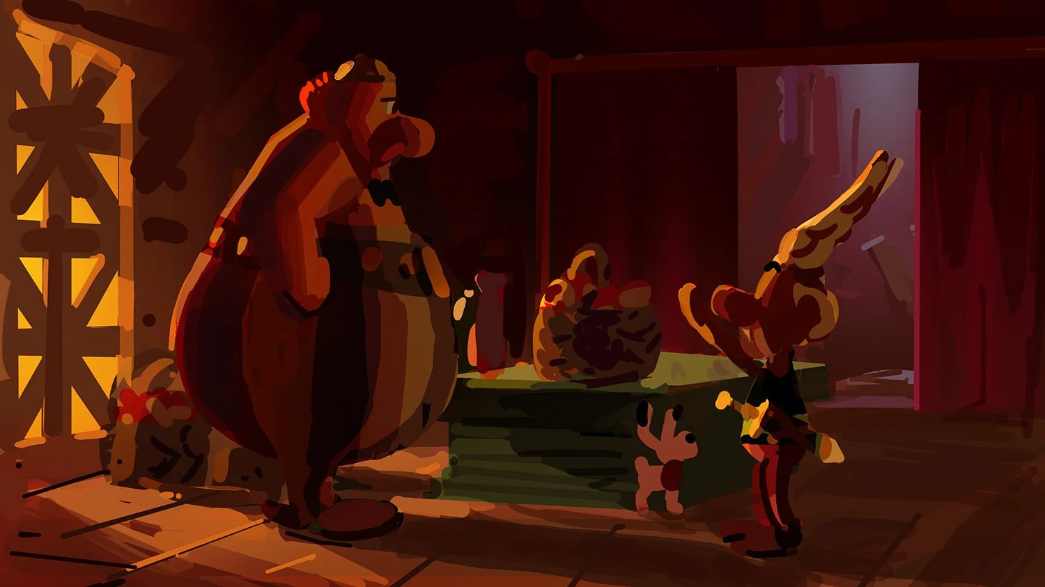
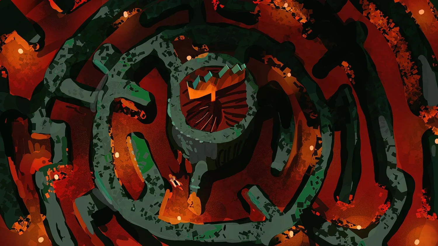
APOTHIKA’S LAIR
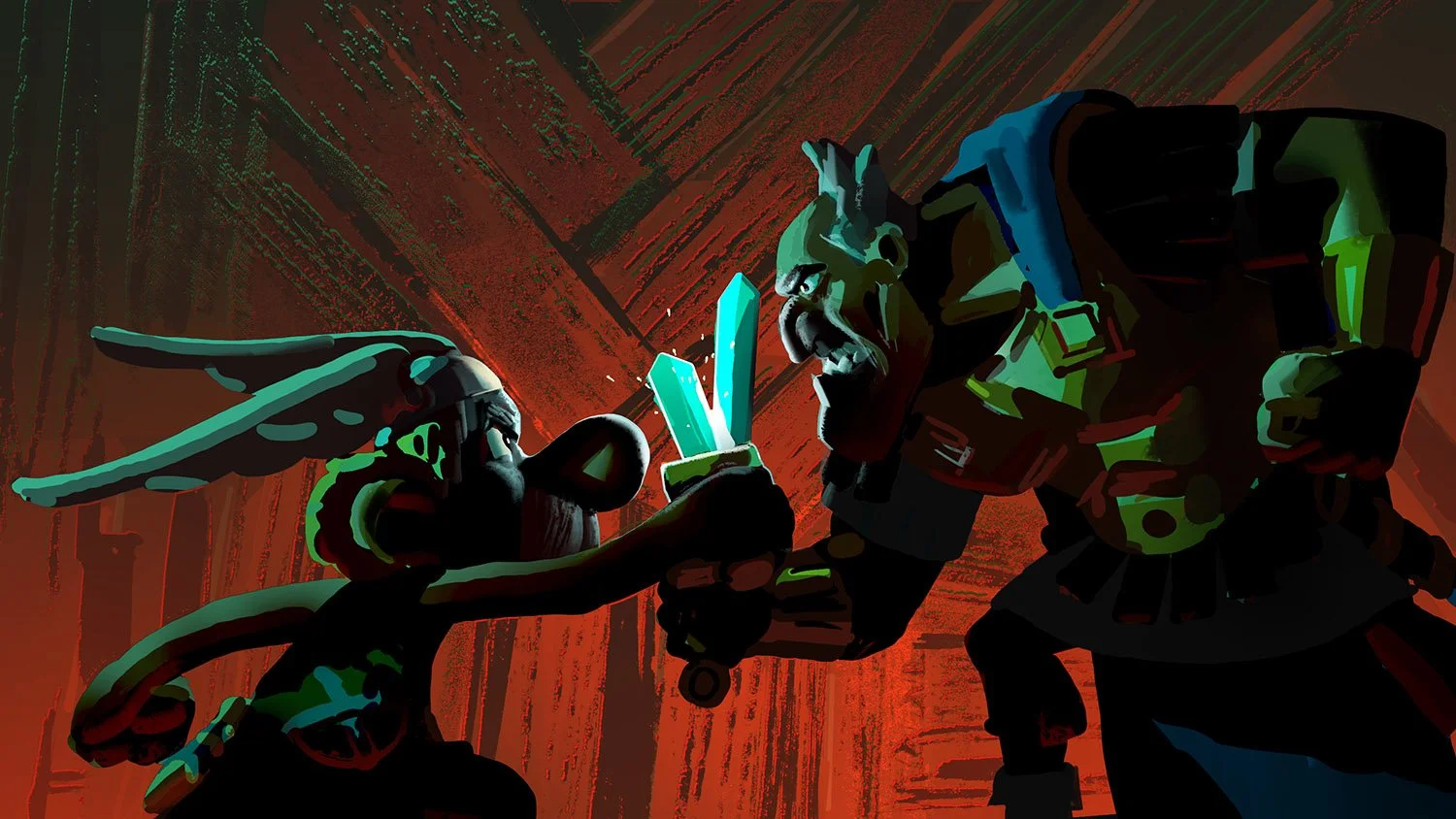
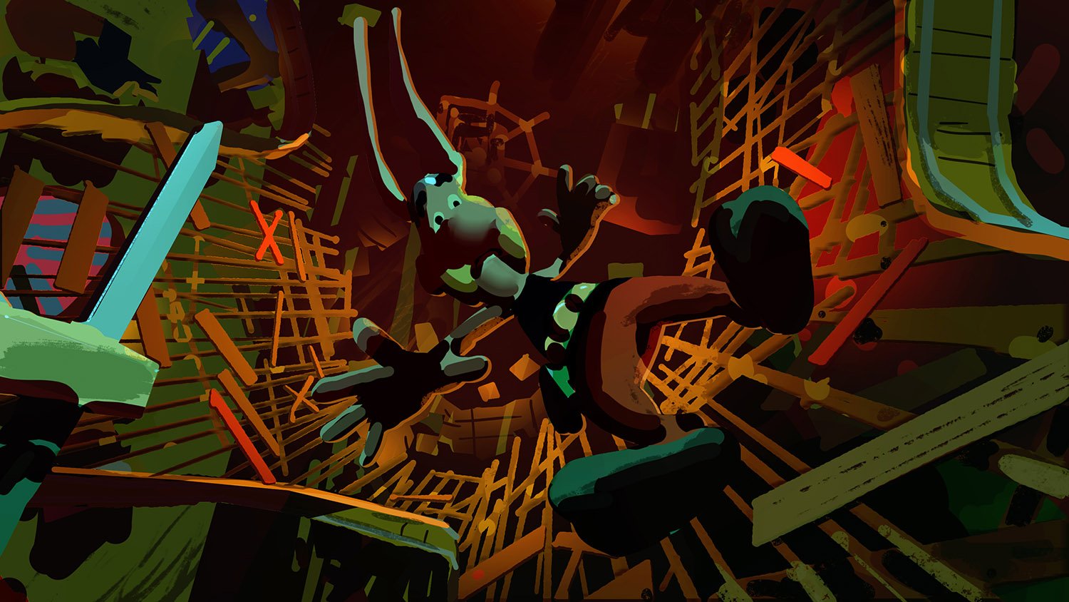
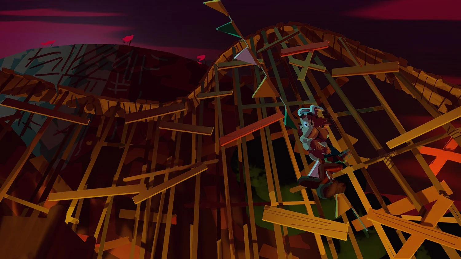
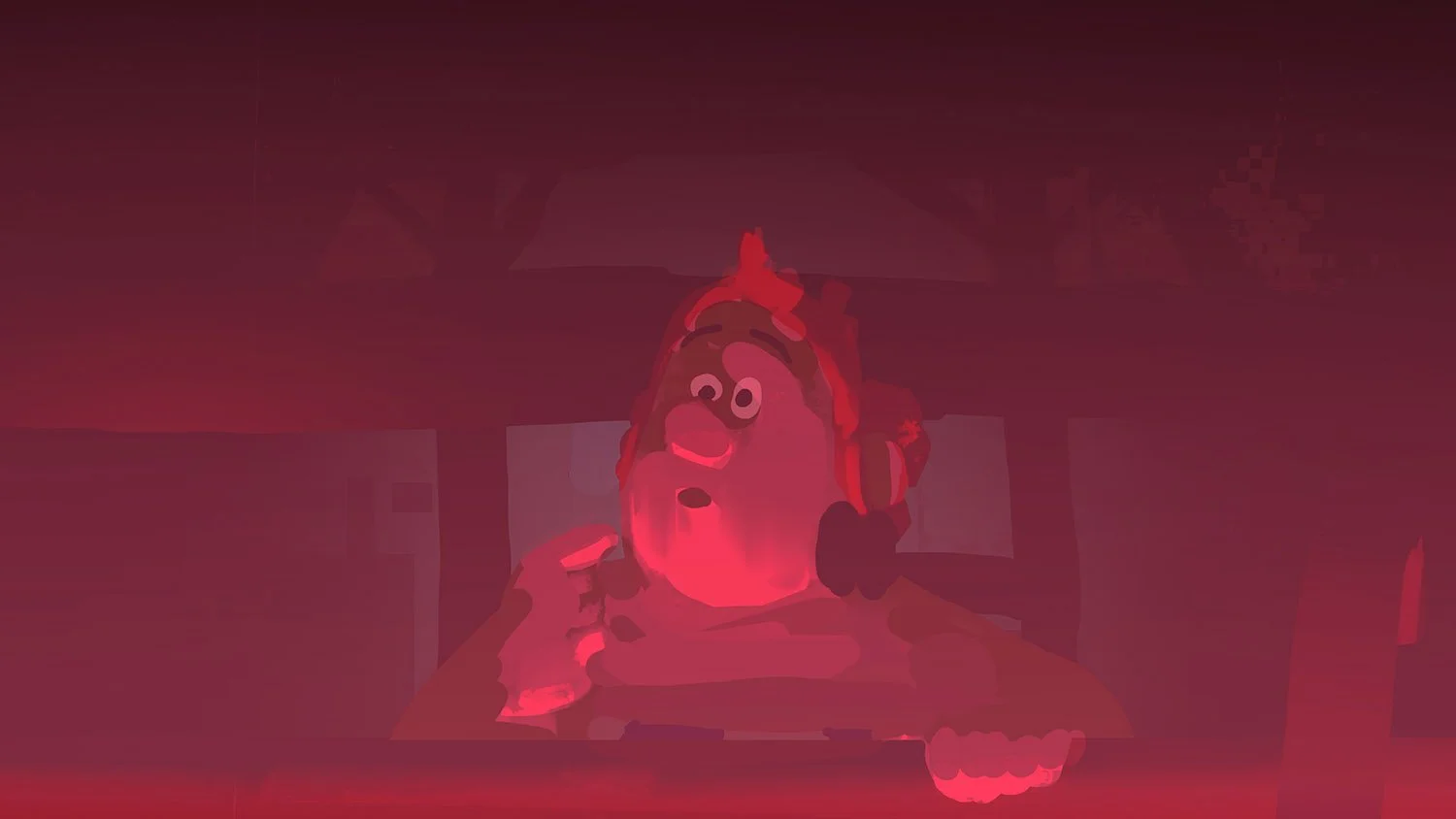
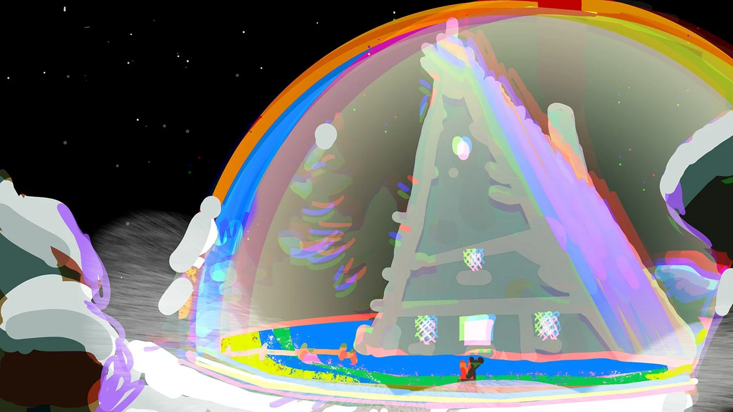
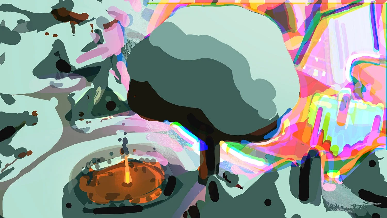
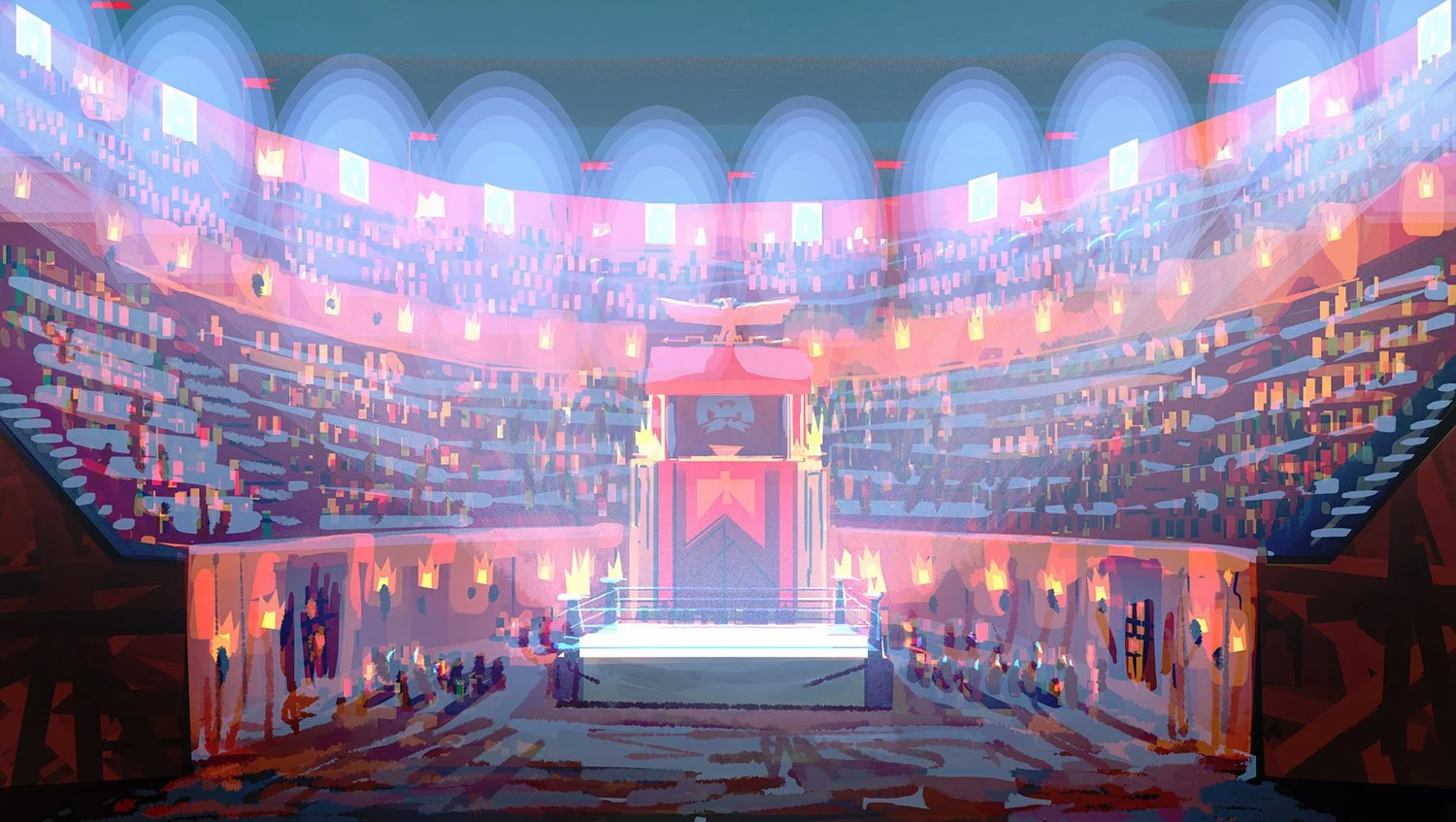
EPISODE IV ColorKeys:
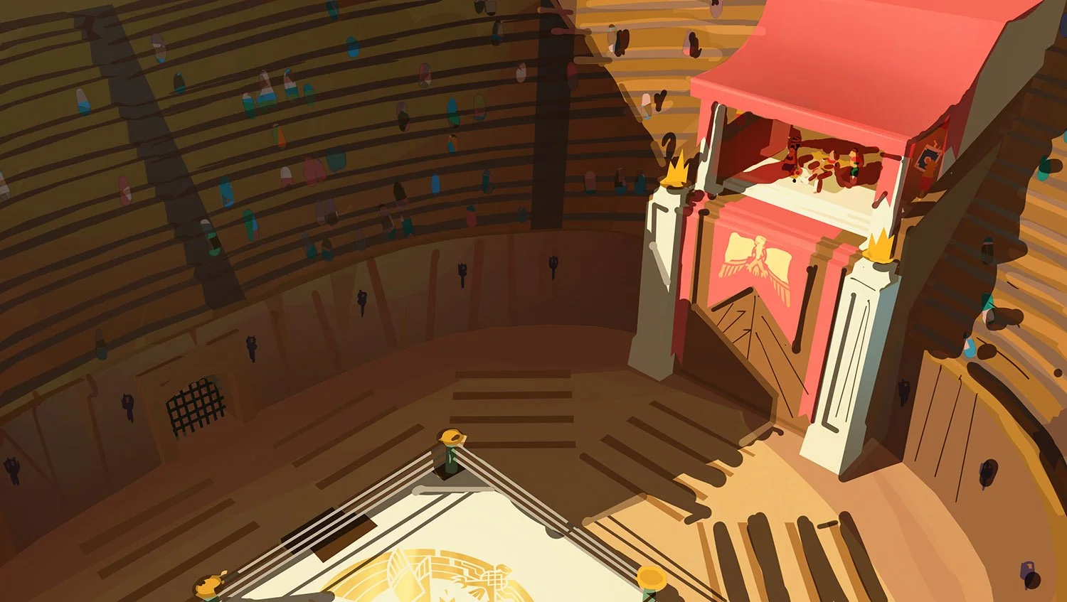
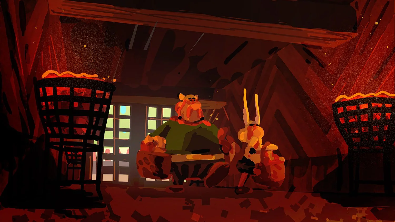
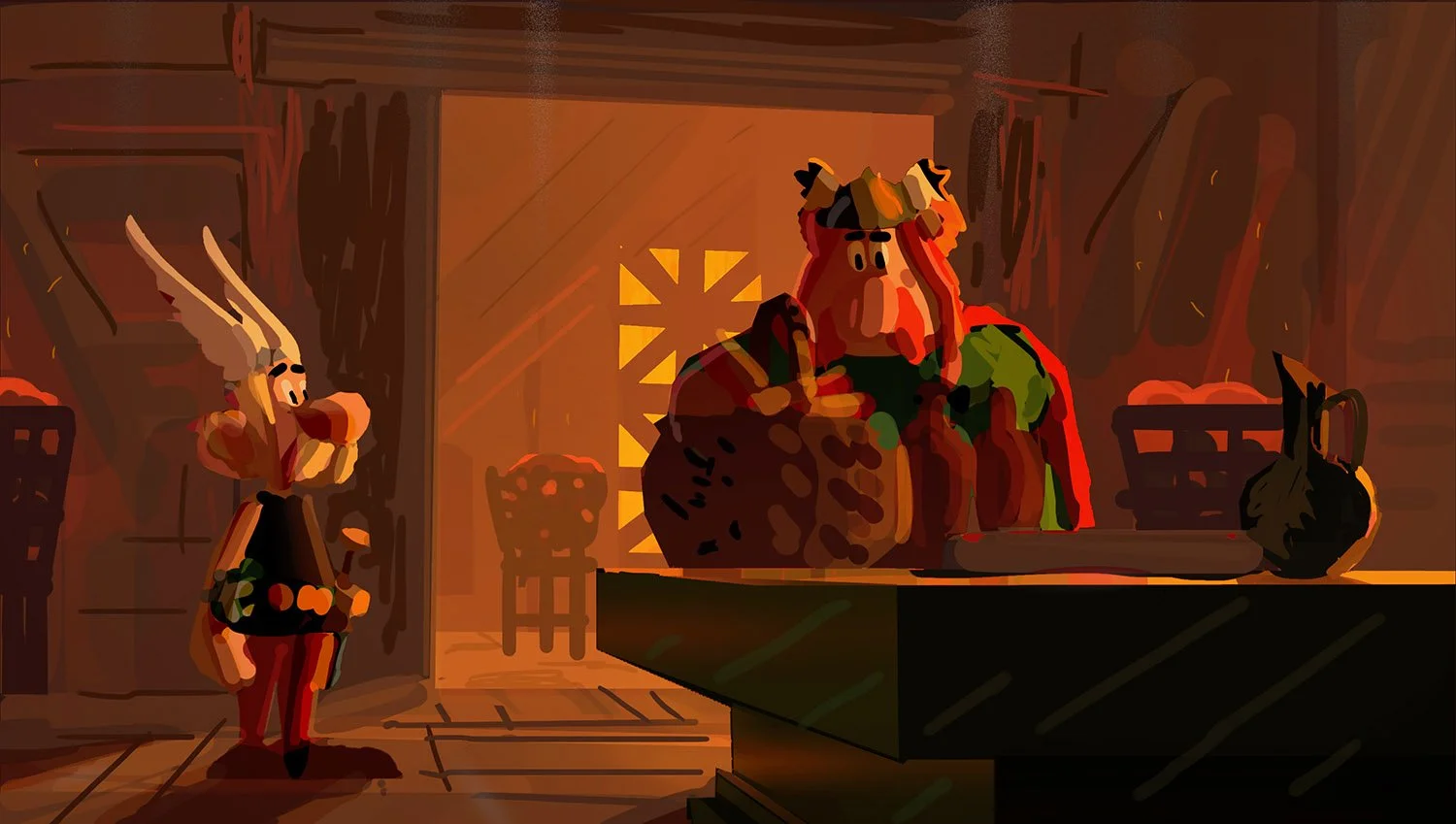
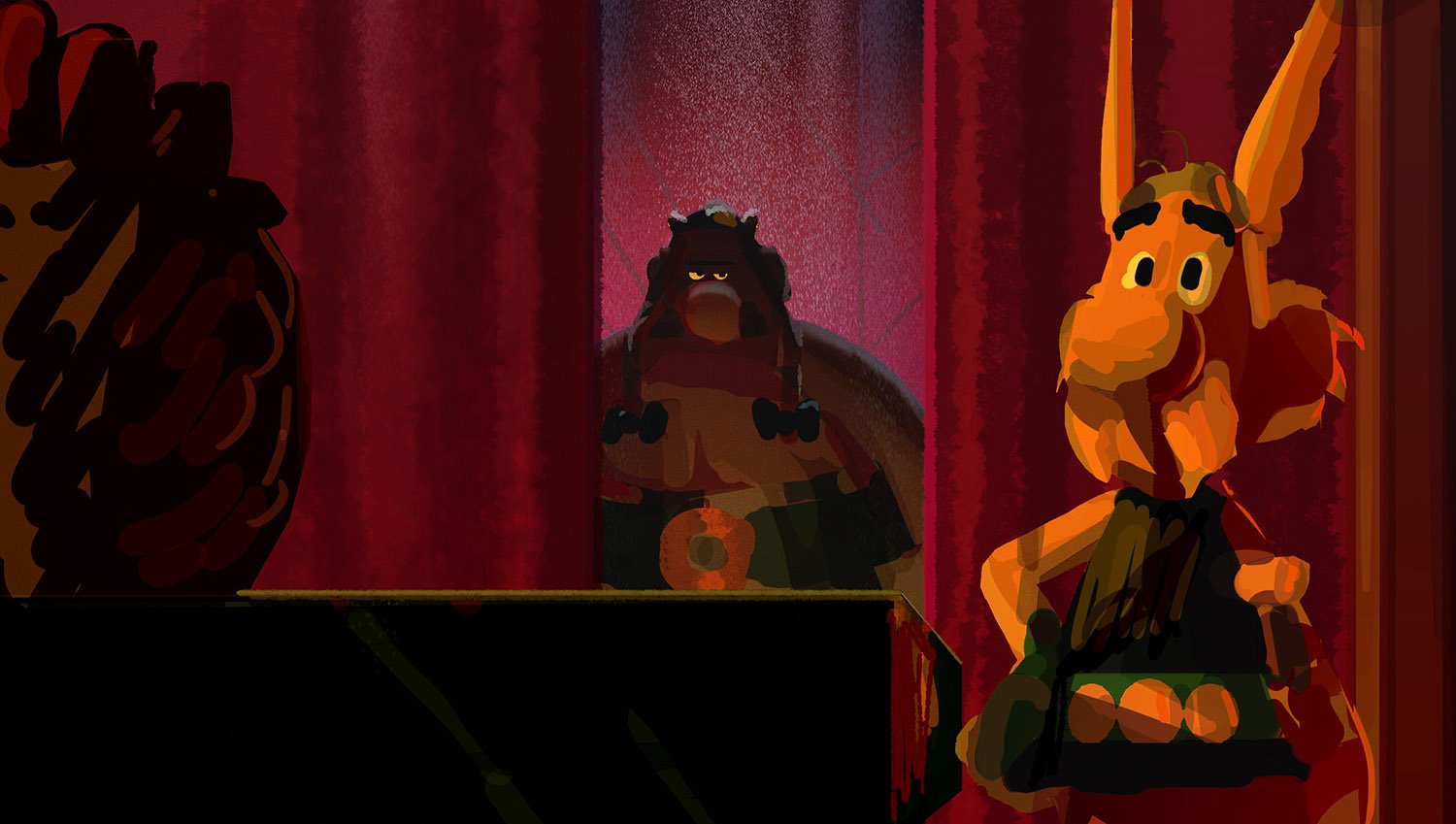
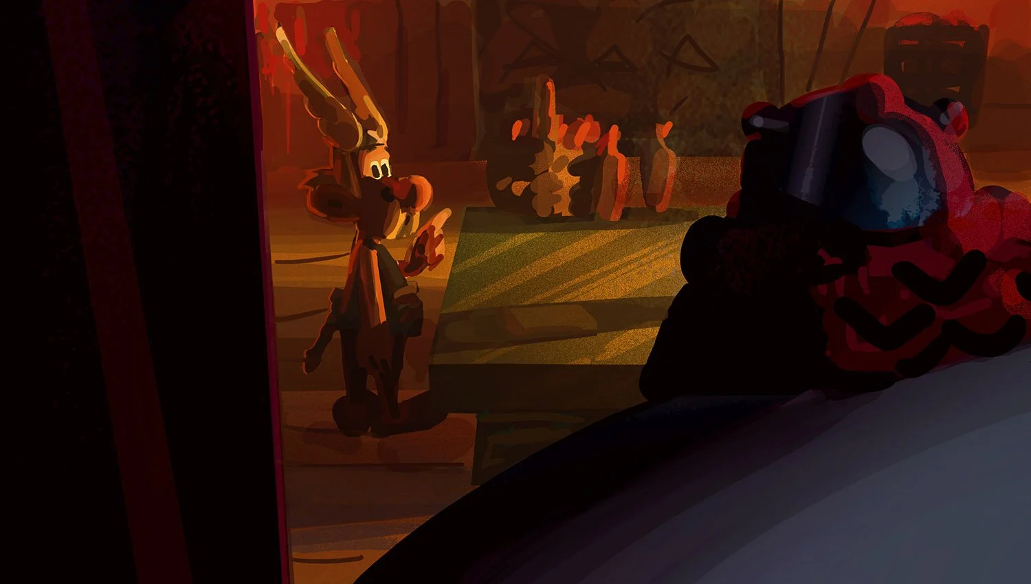
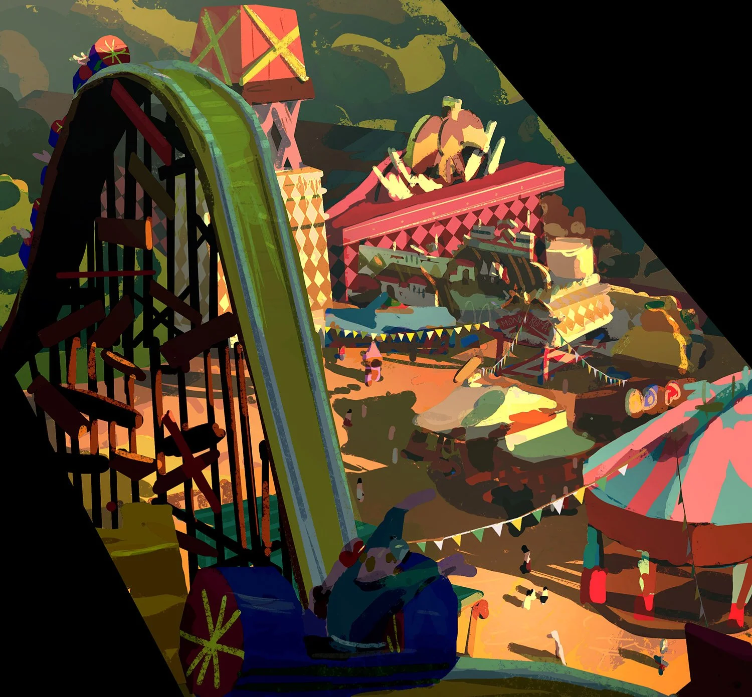
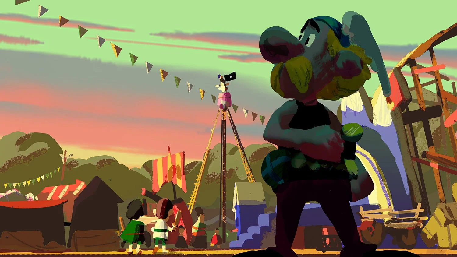
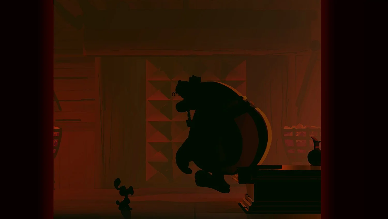

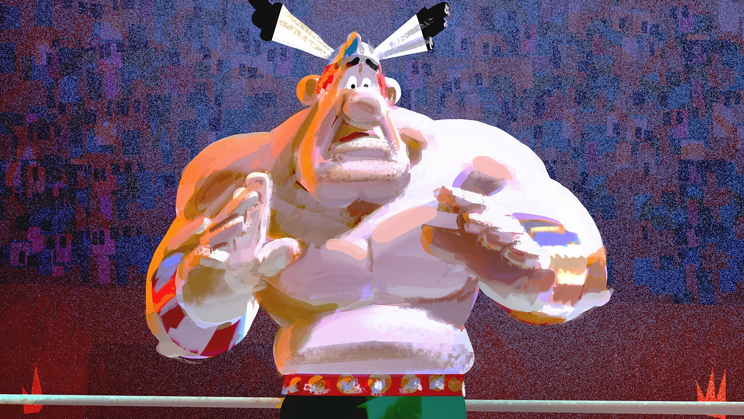
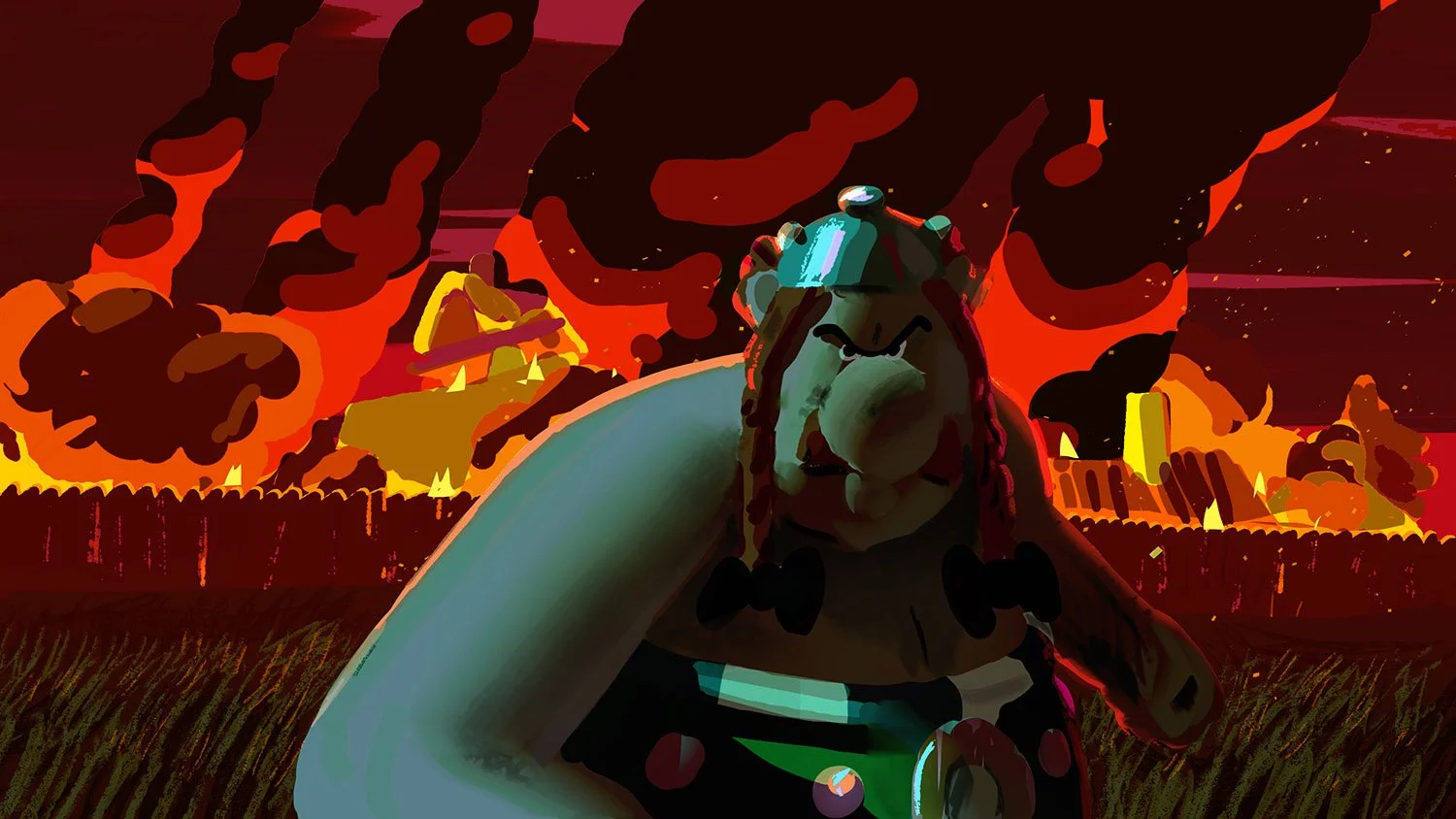
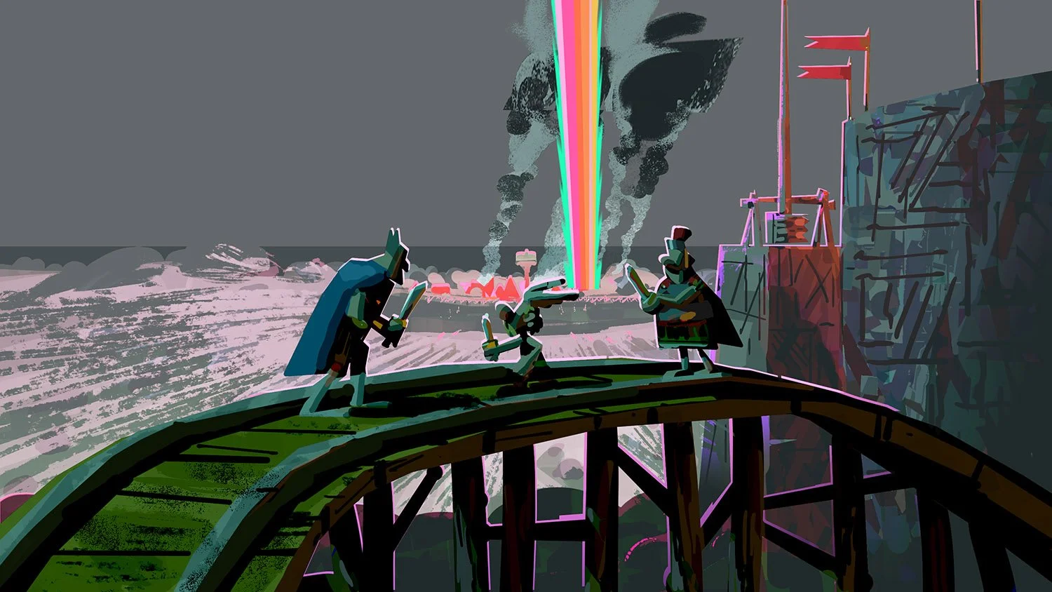
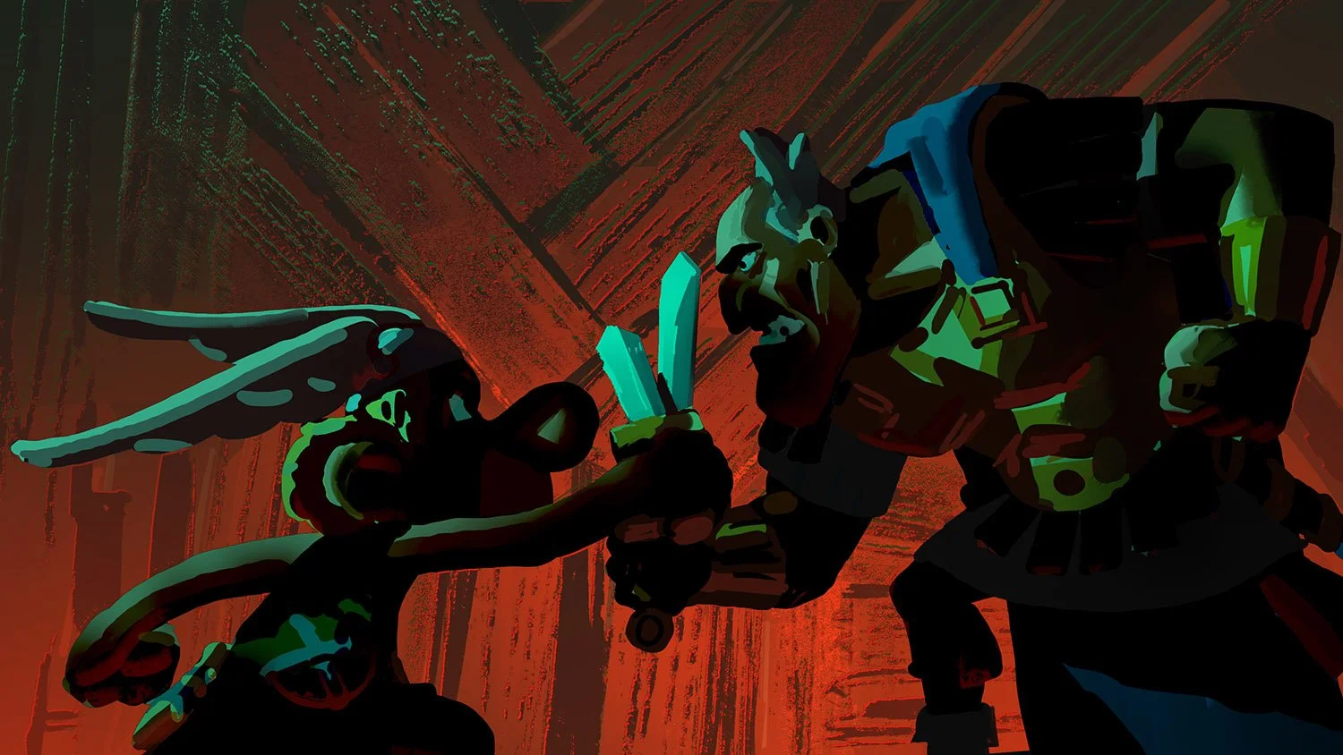
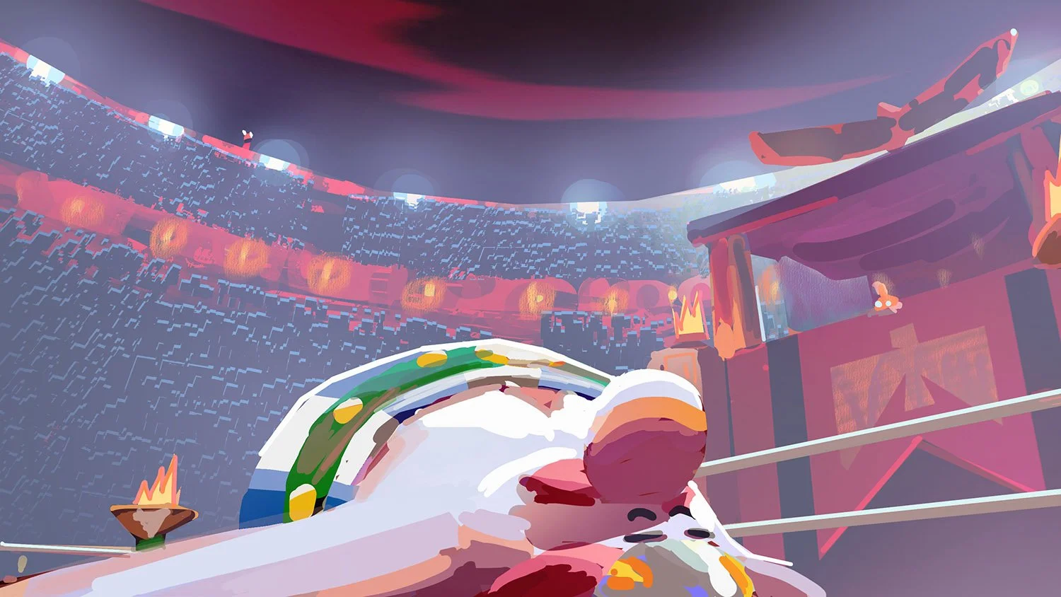
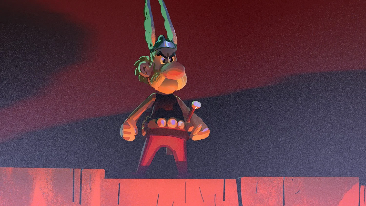
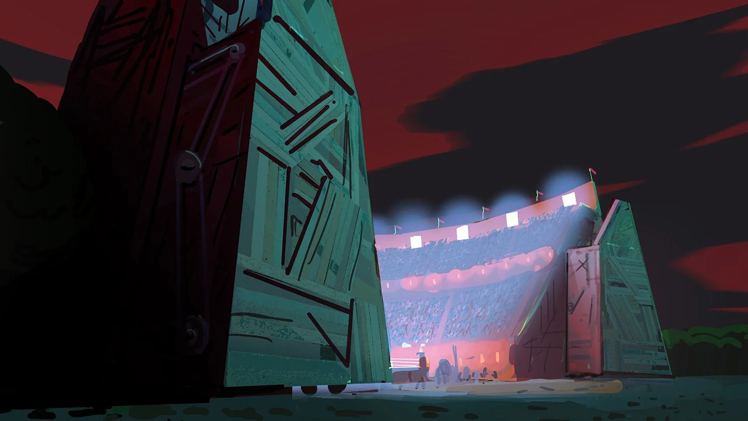
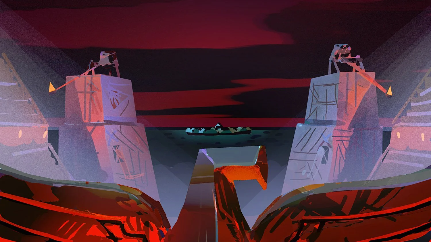
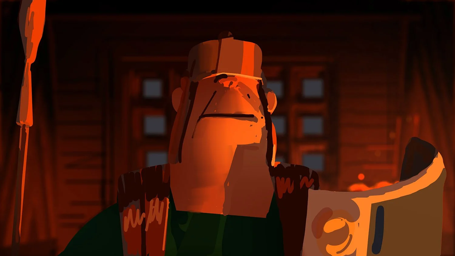
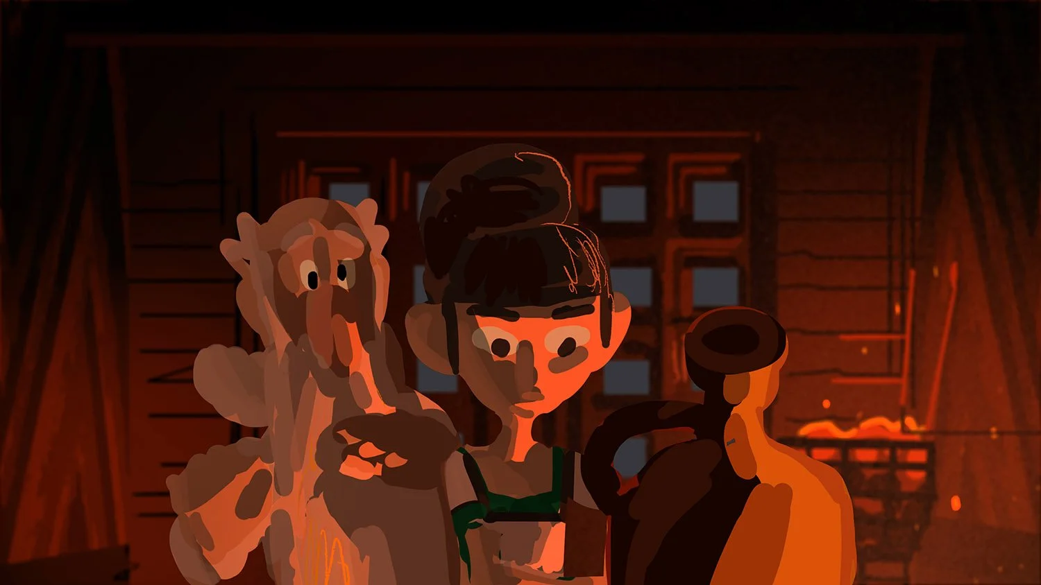
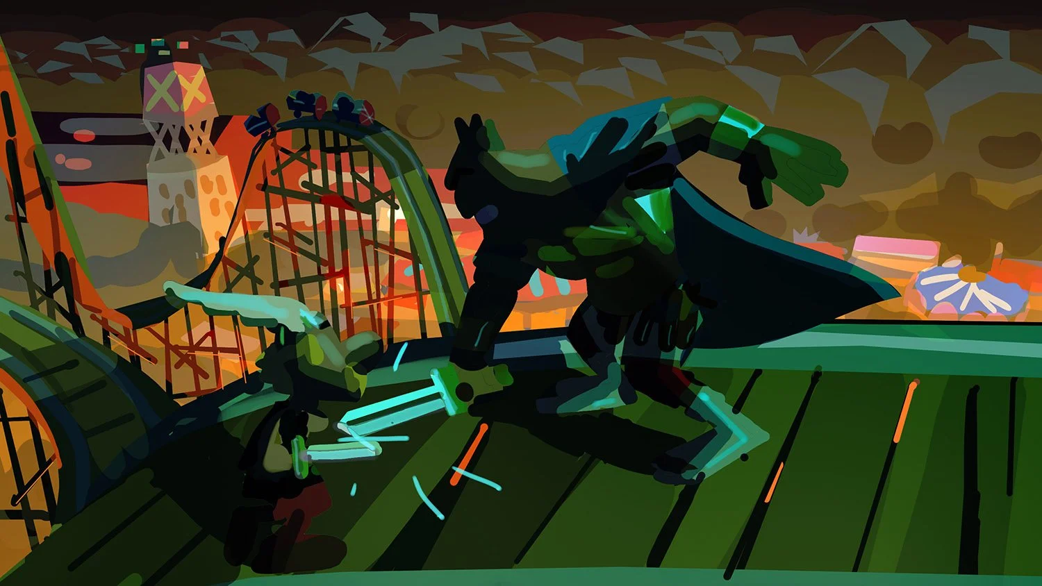
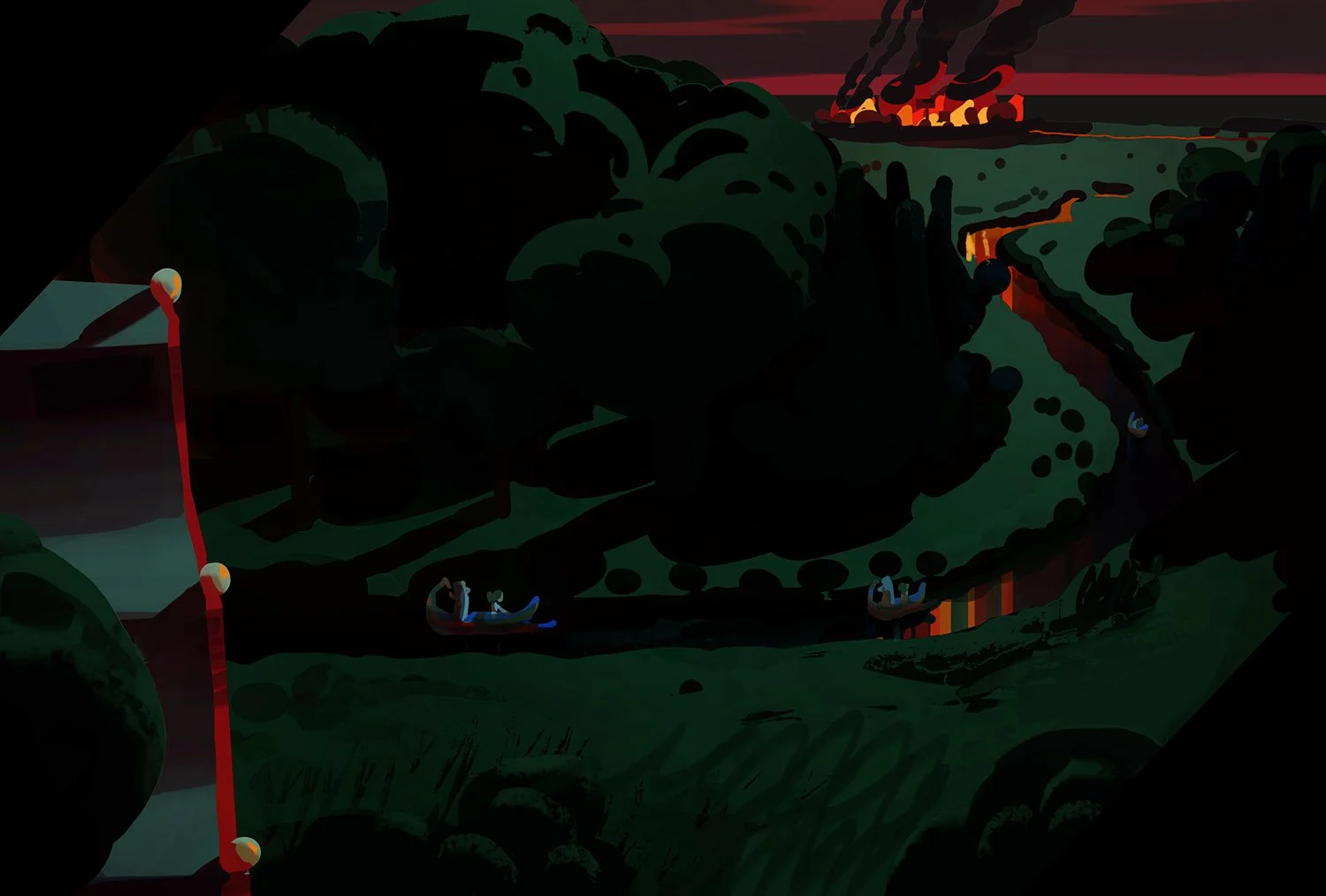
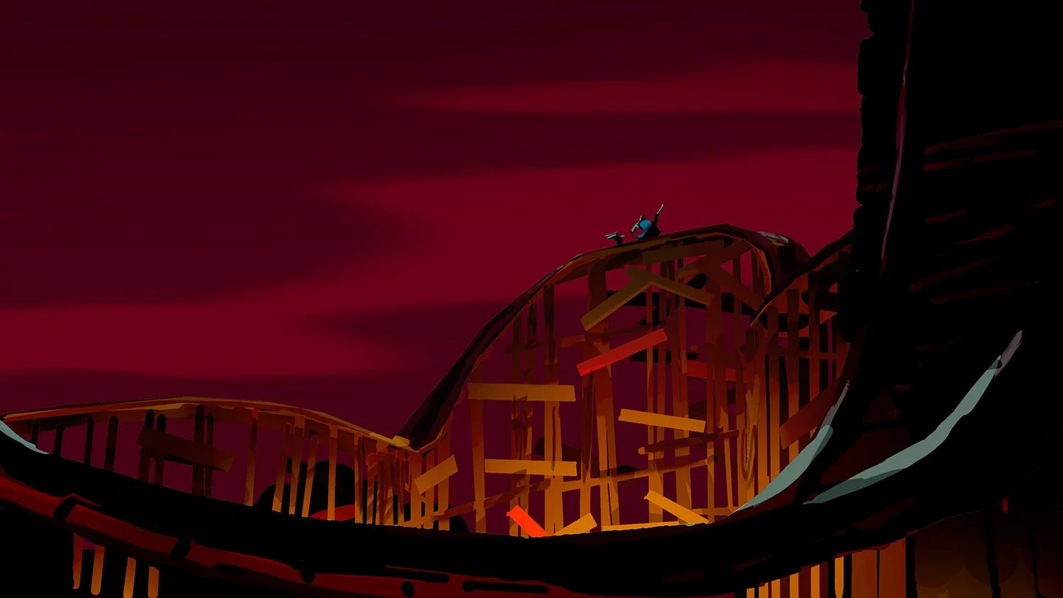
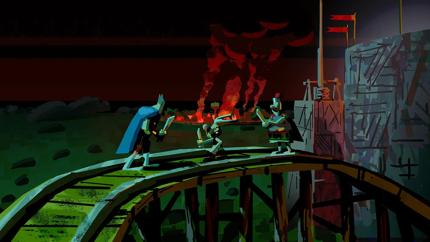
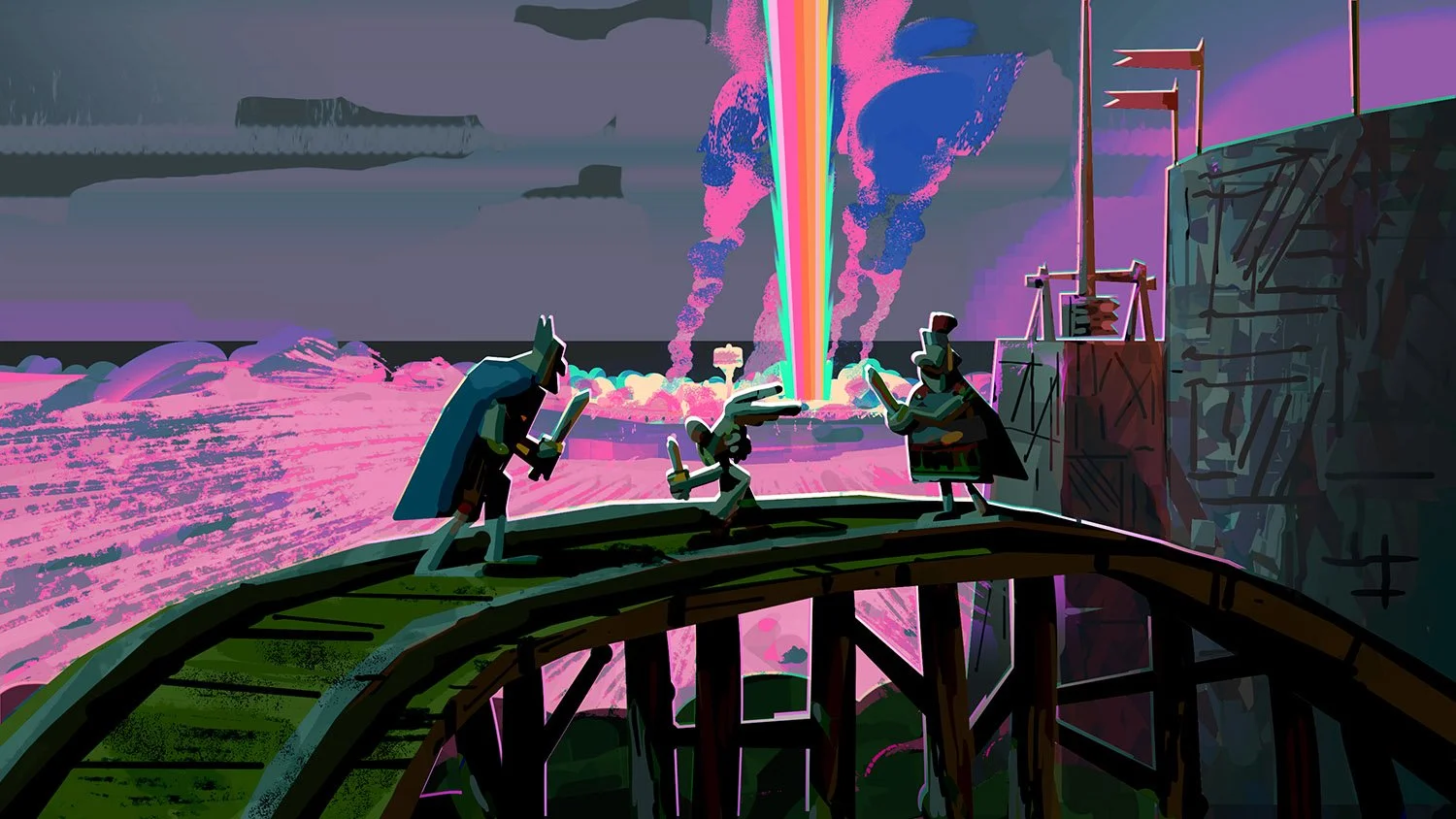
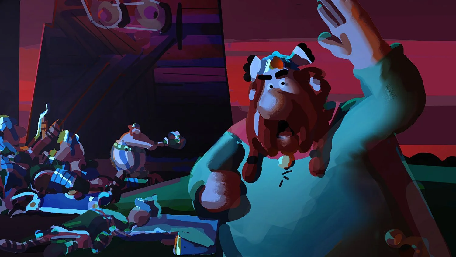
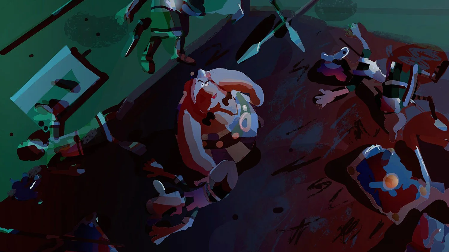
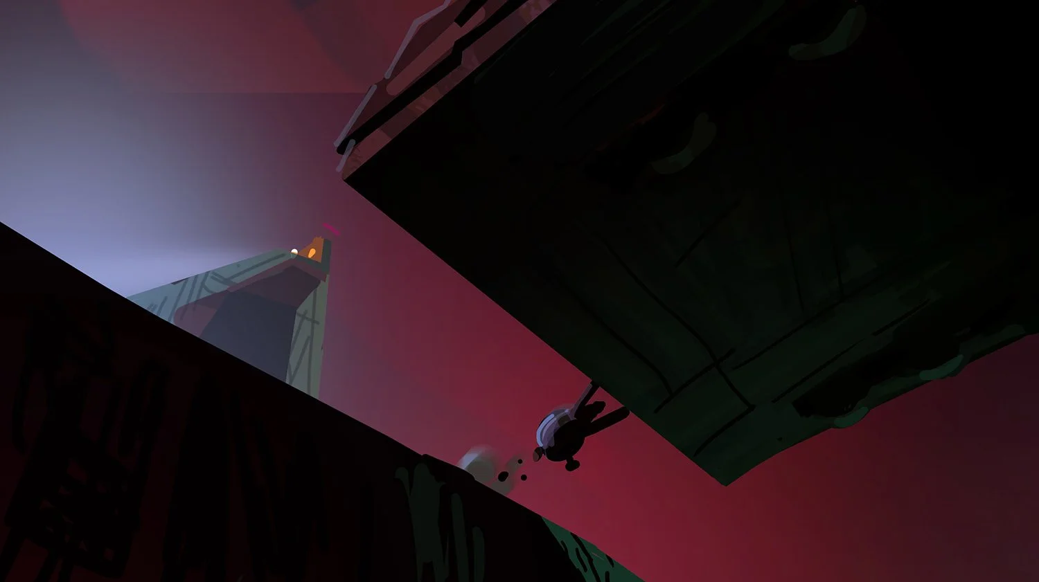
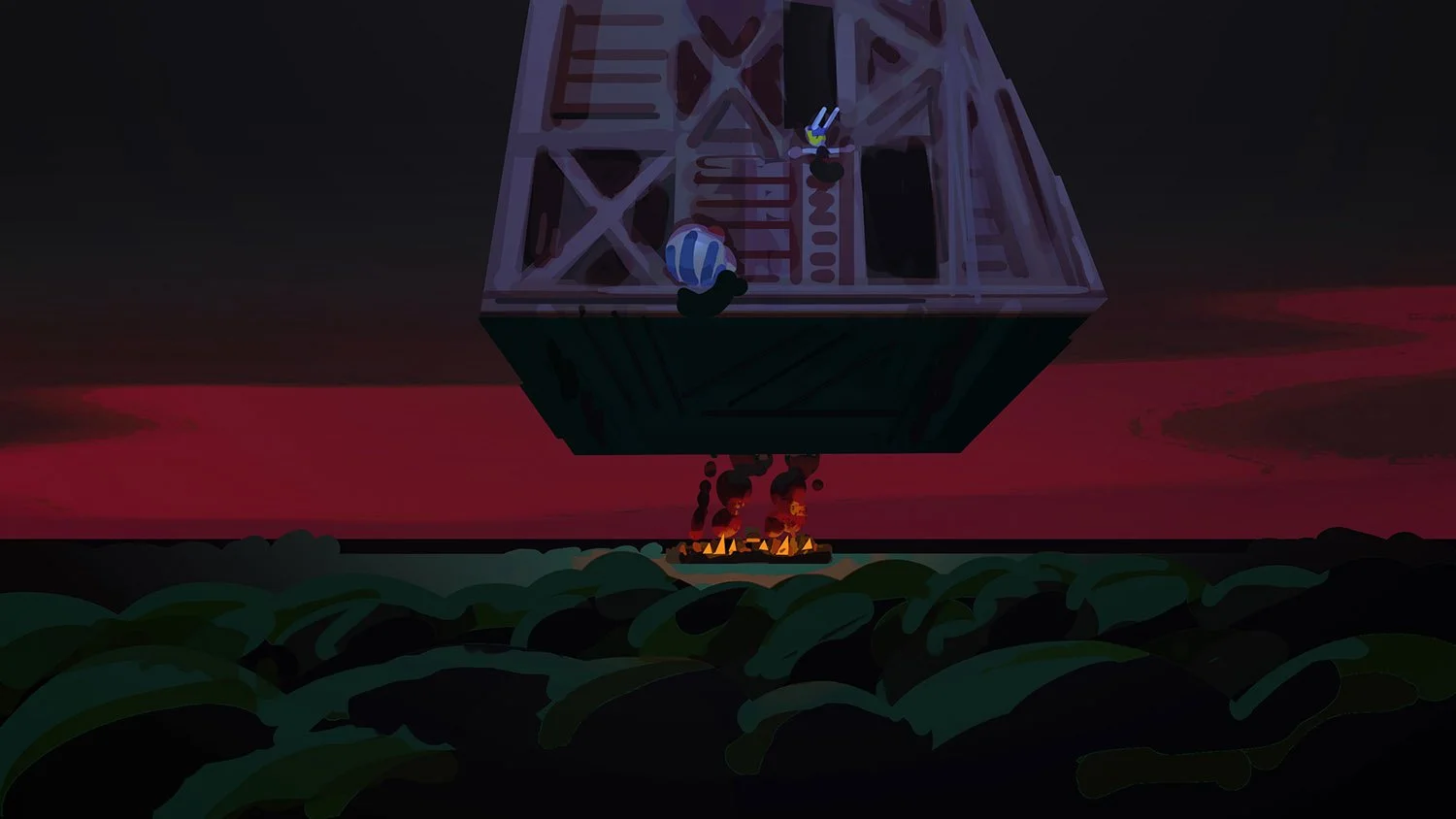
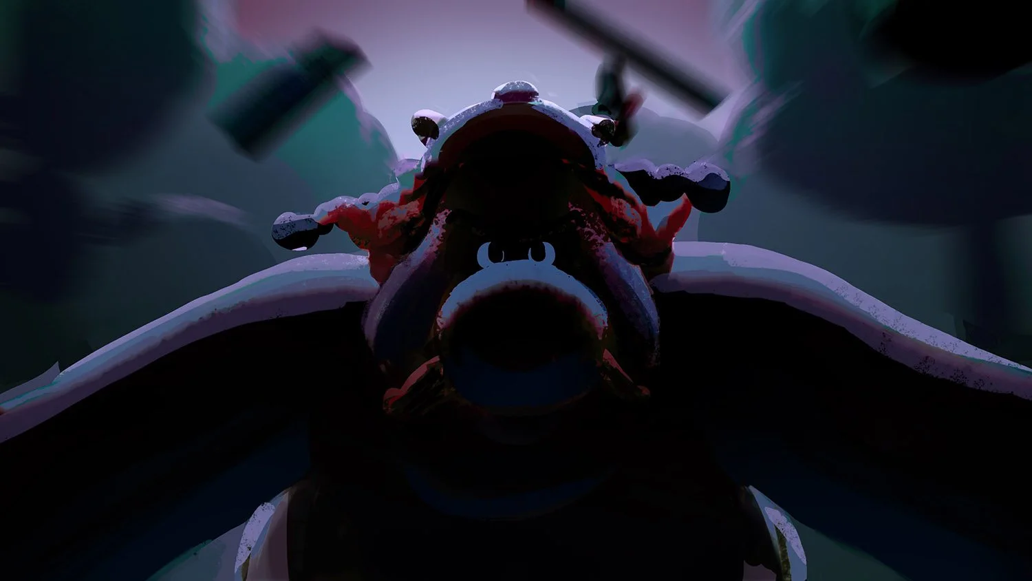
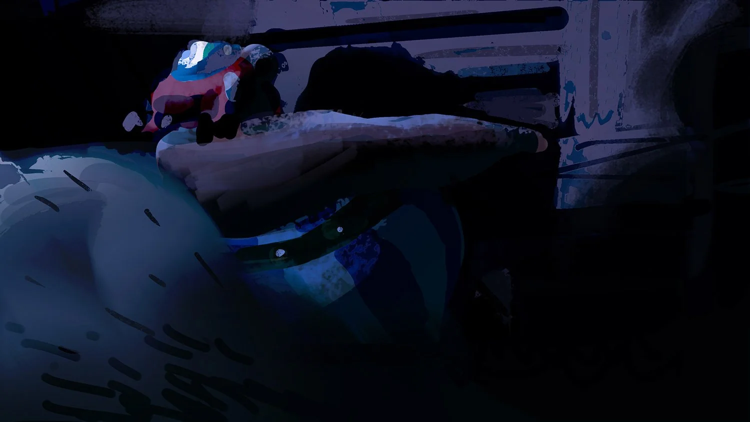
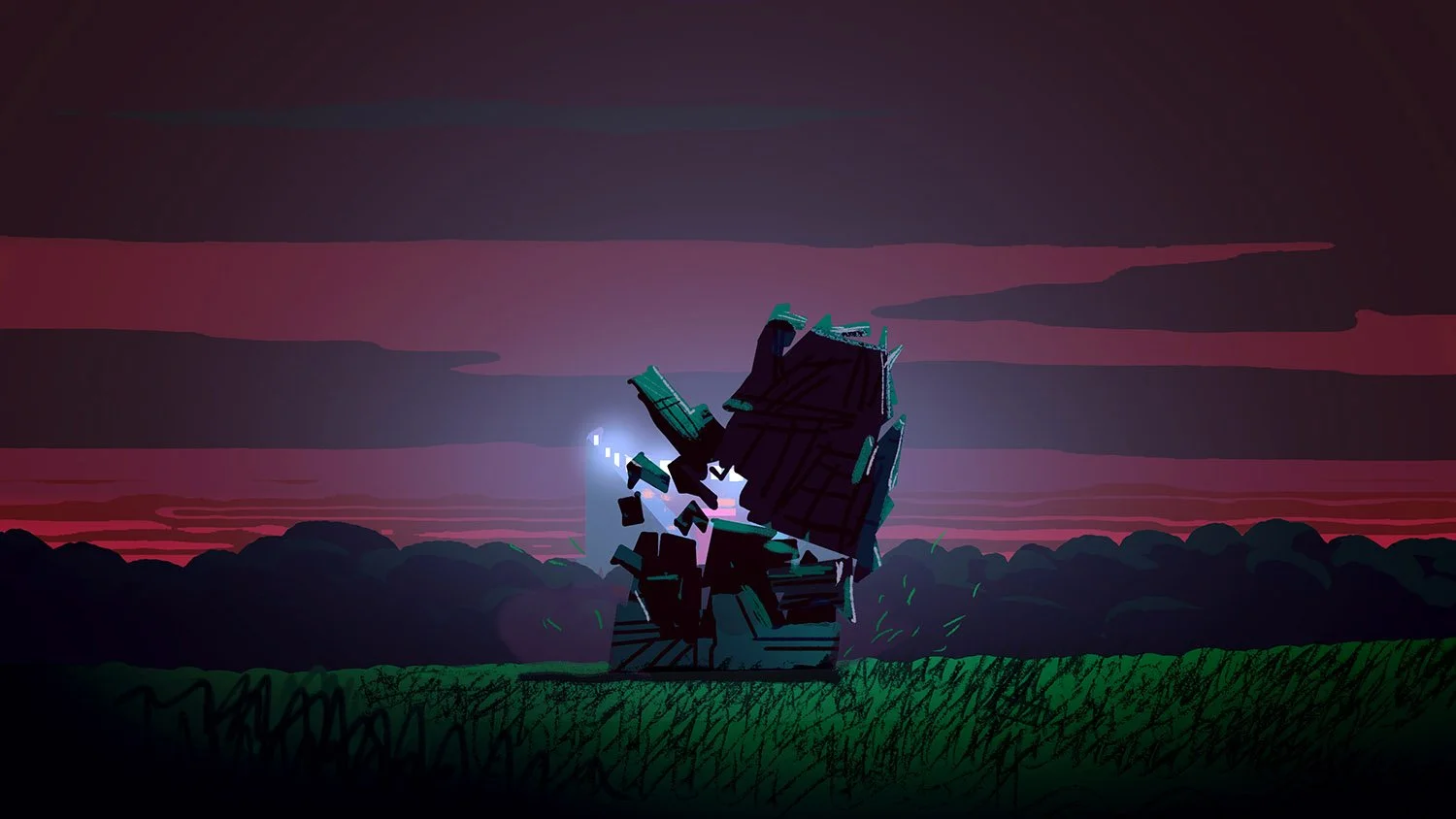
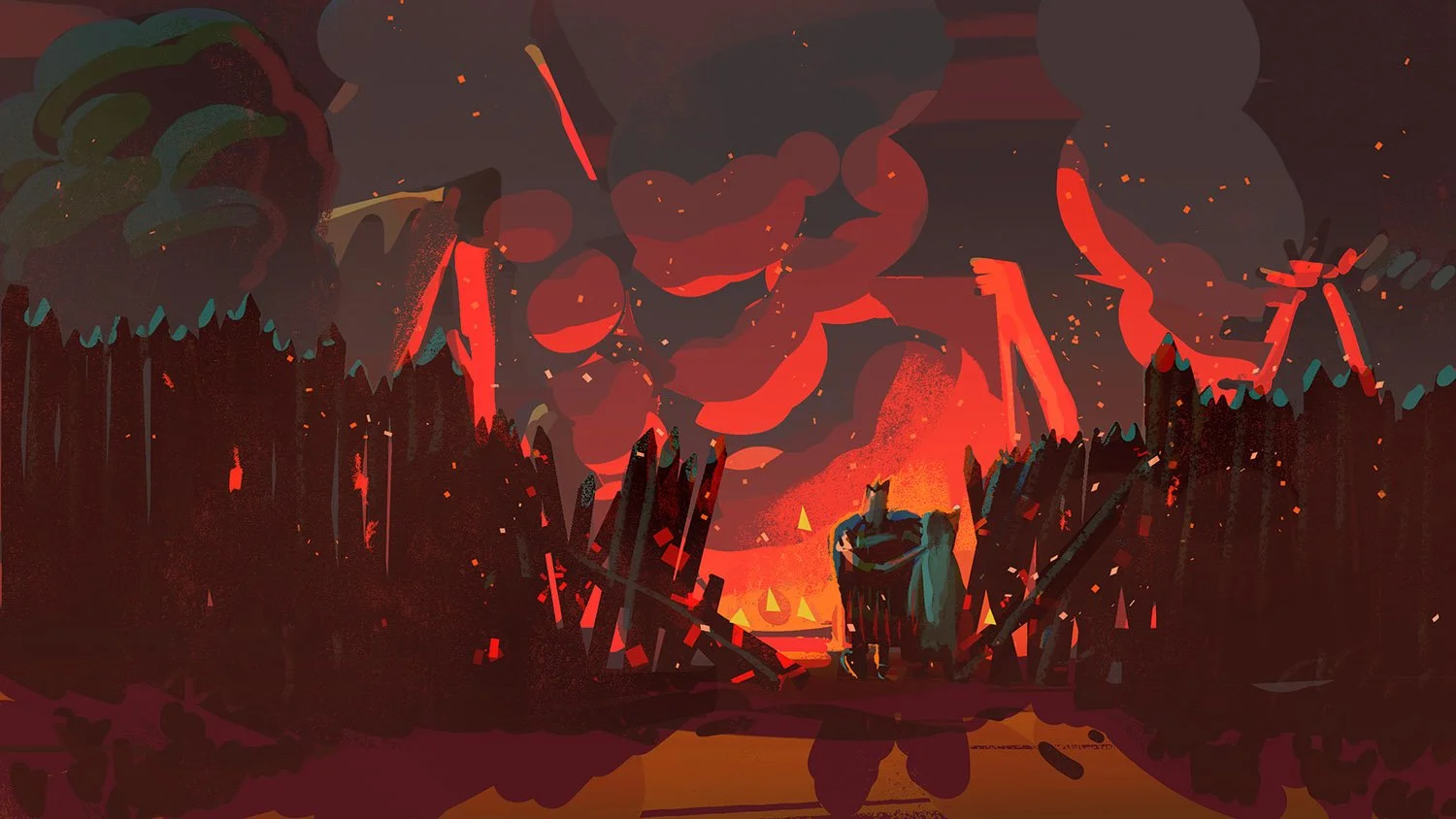
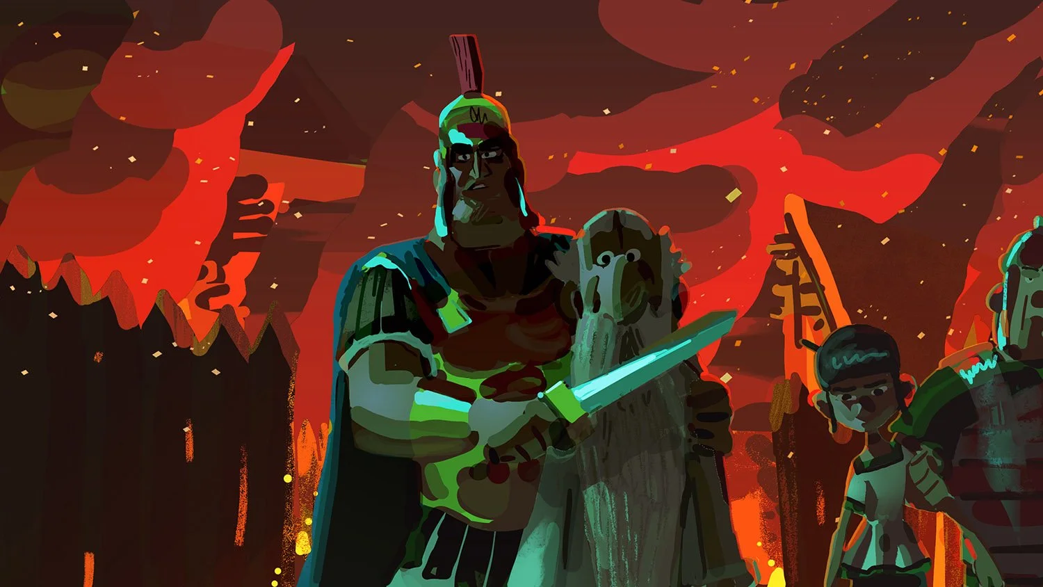
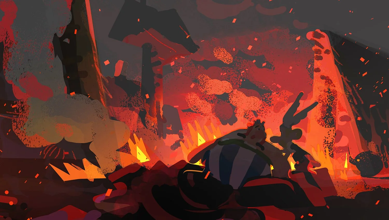
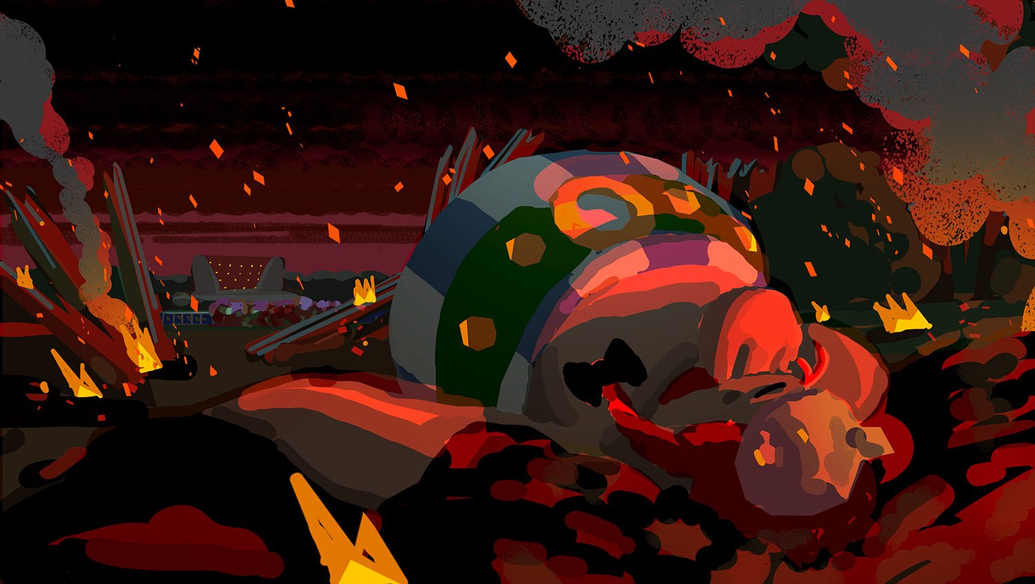
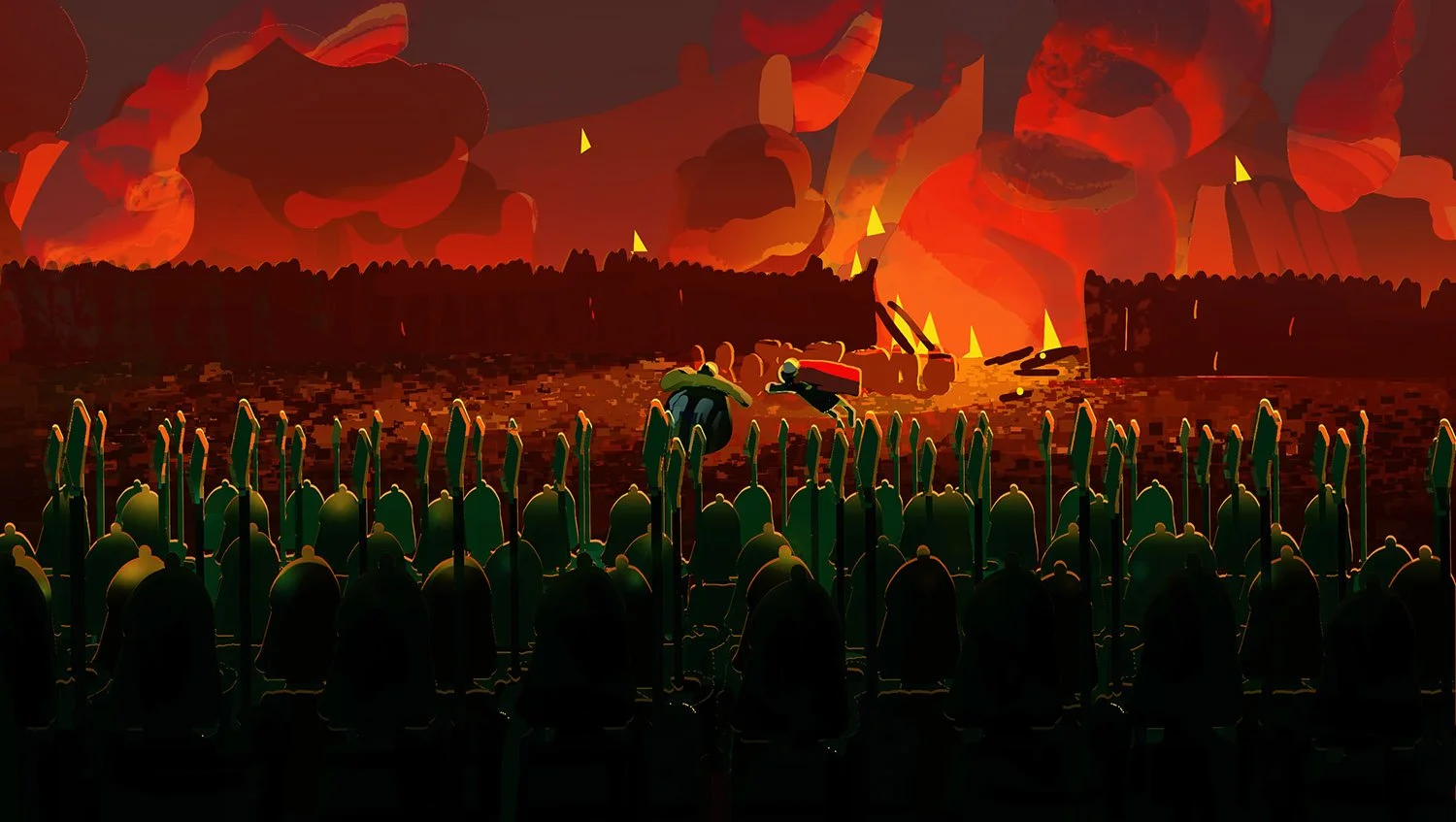
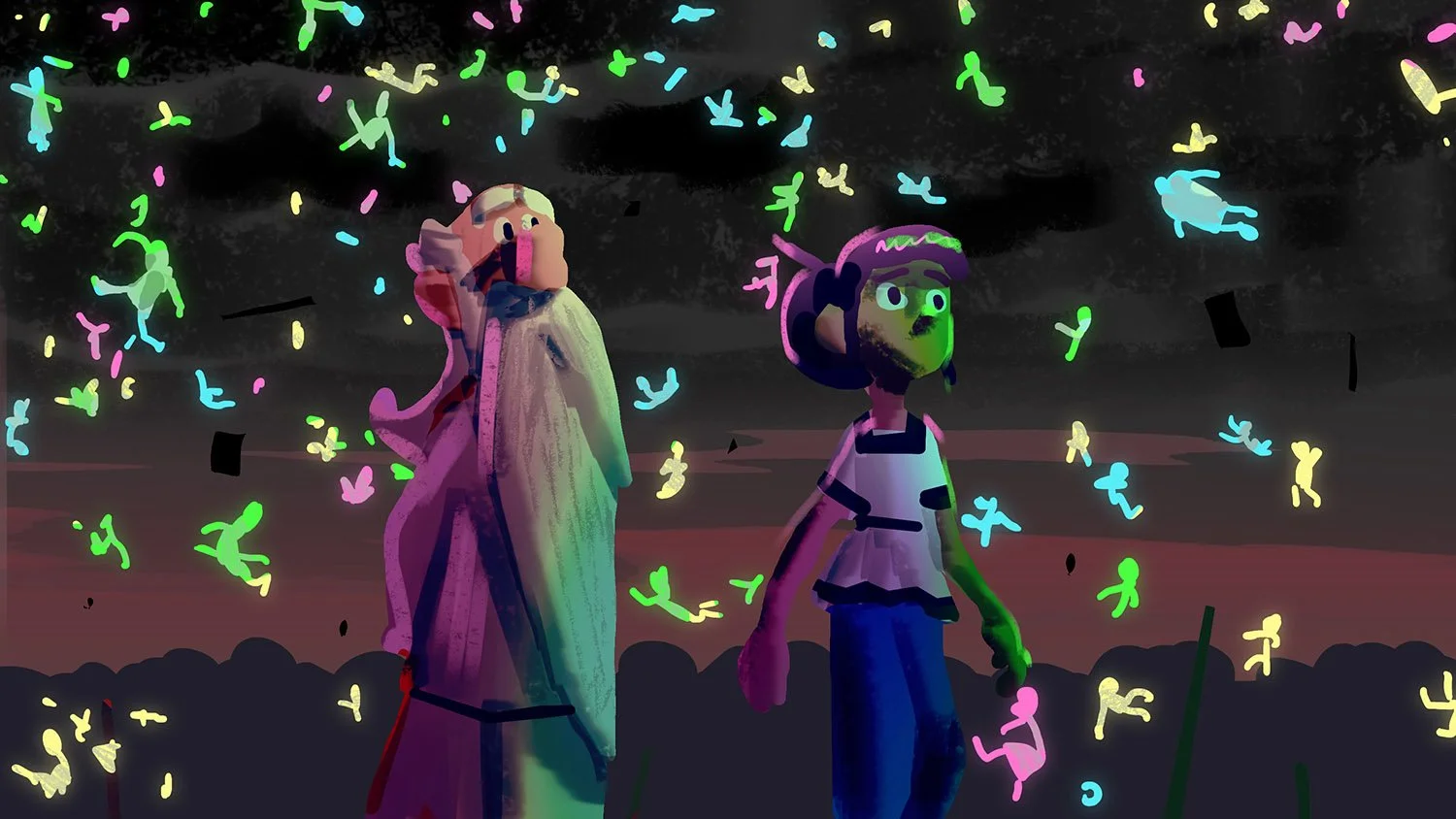
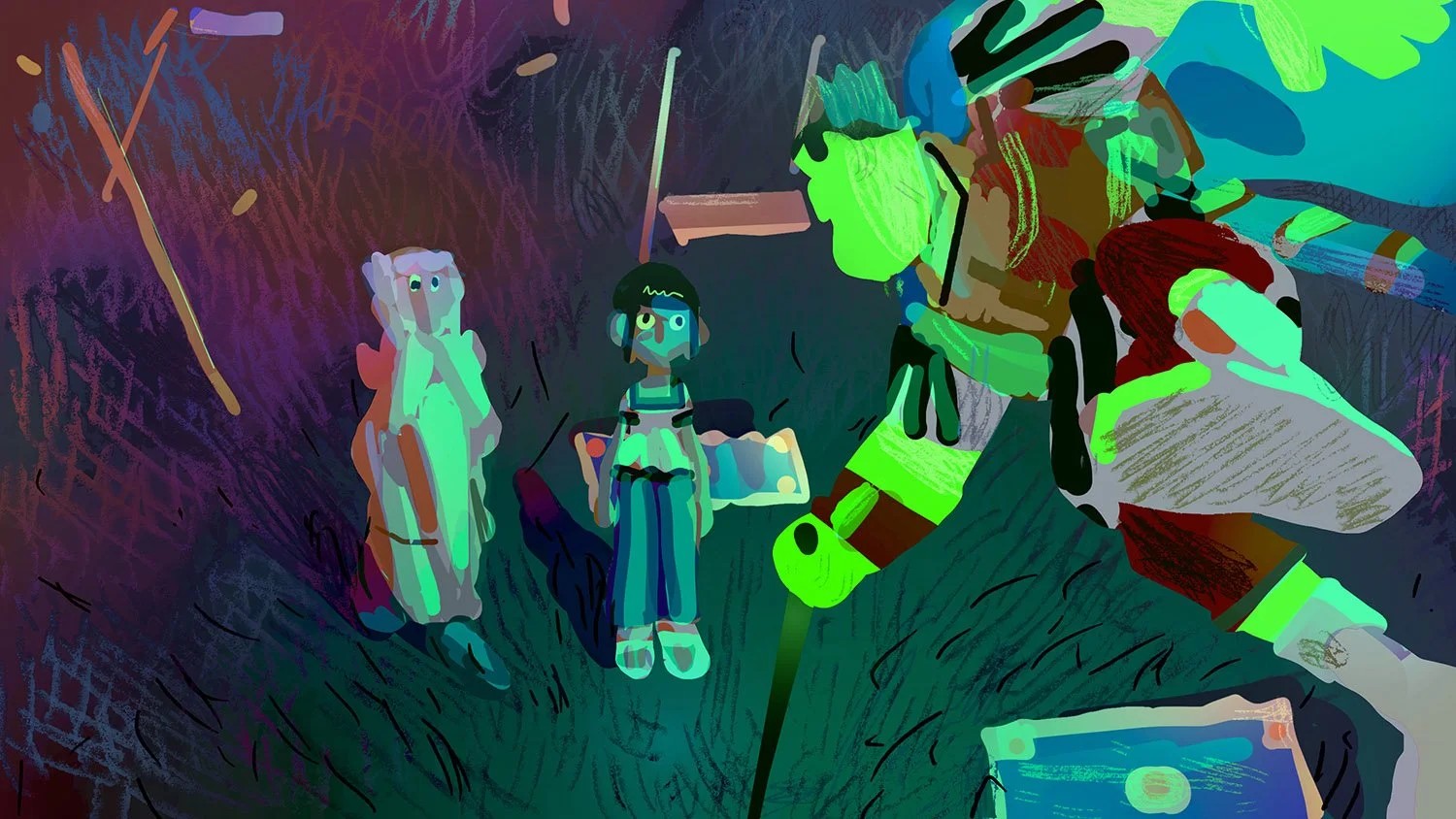
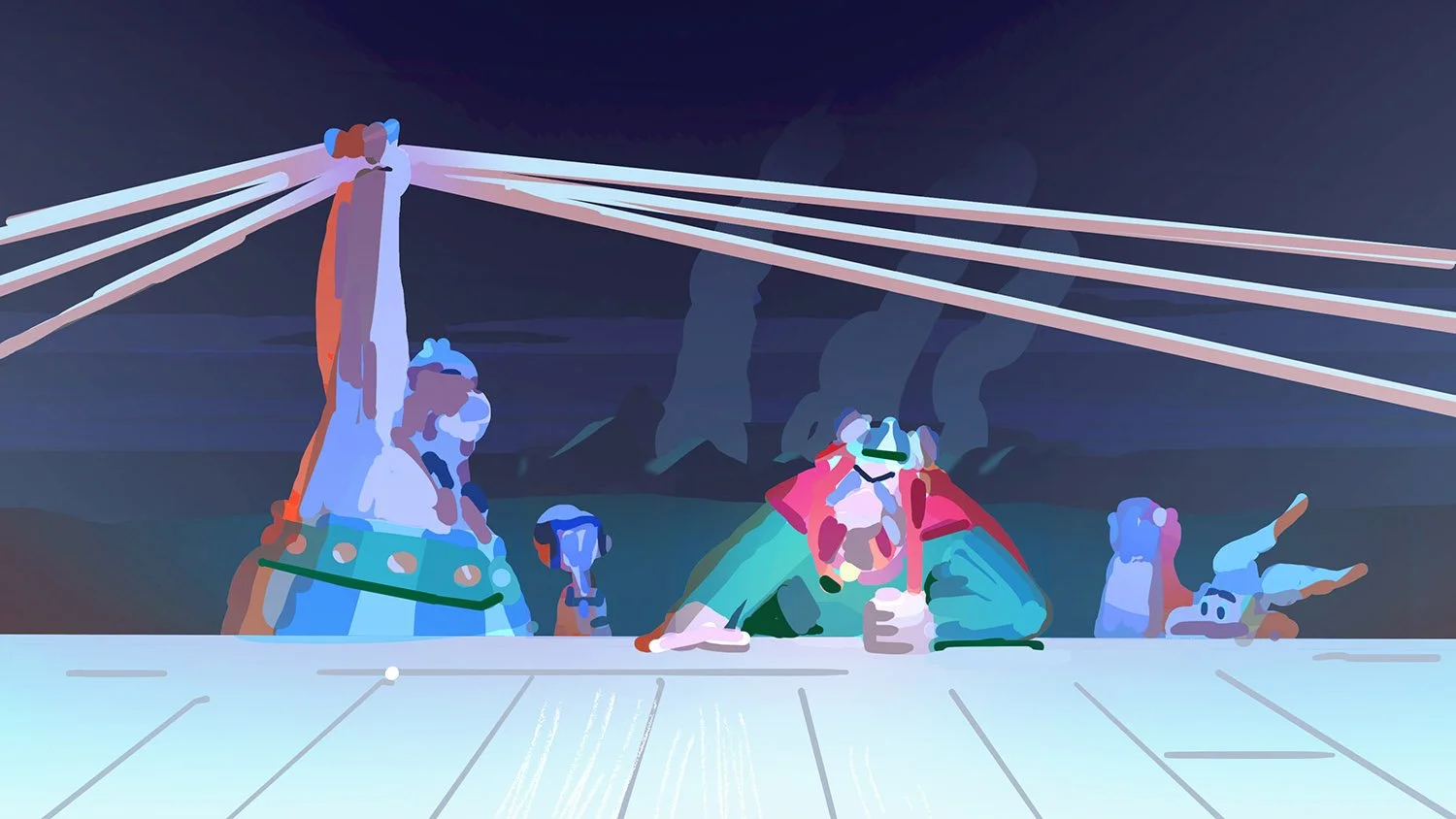
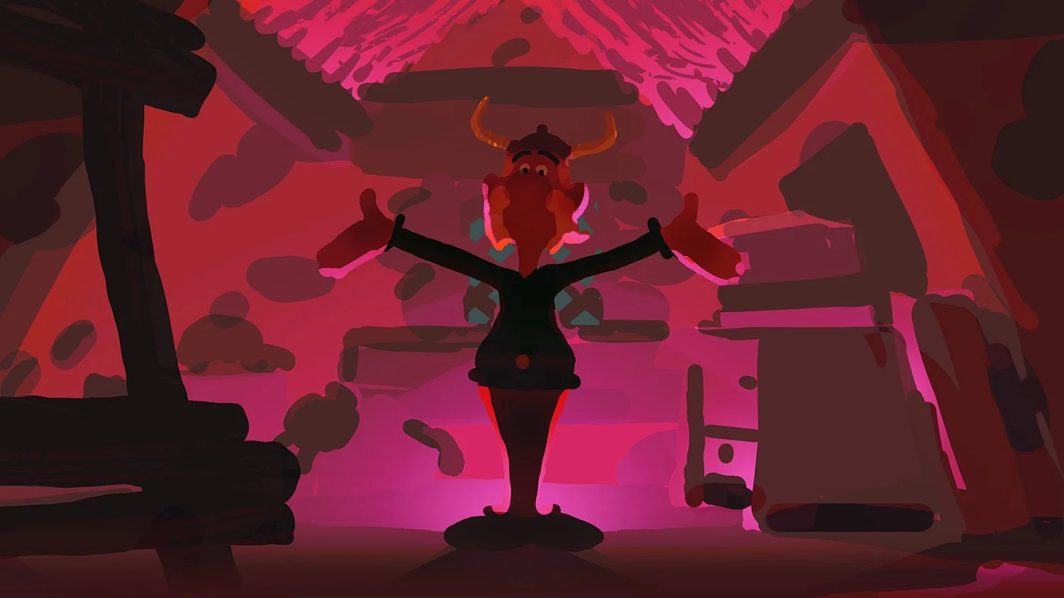
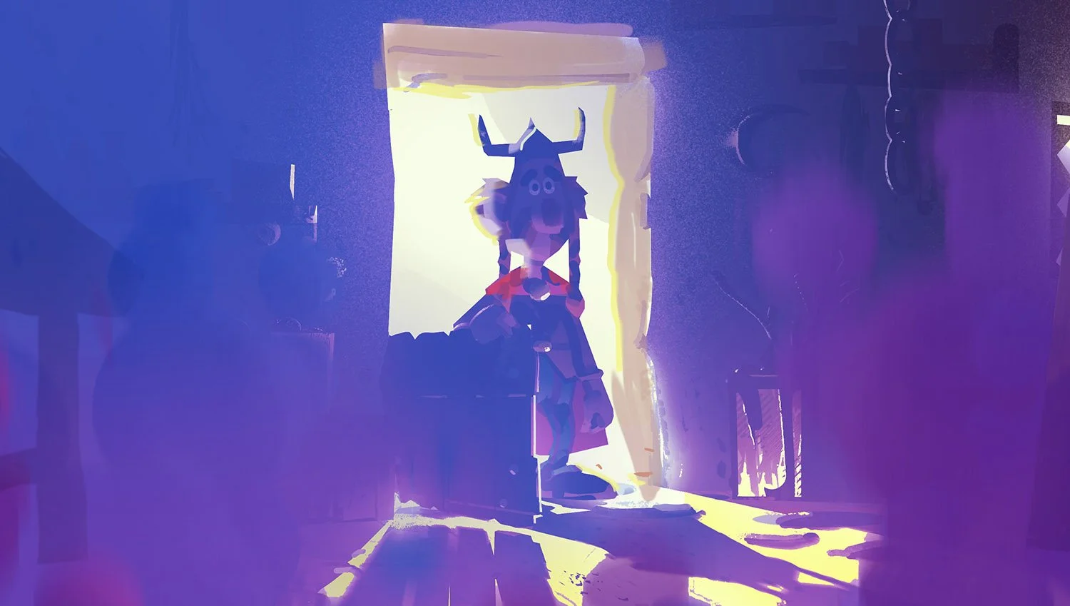
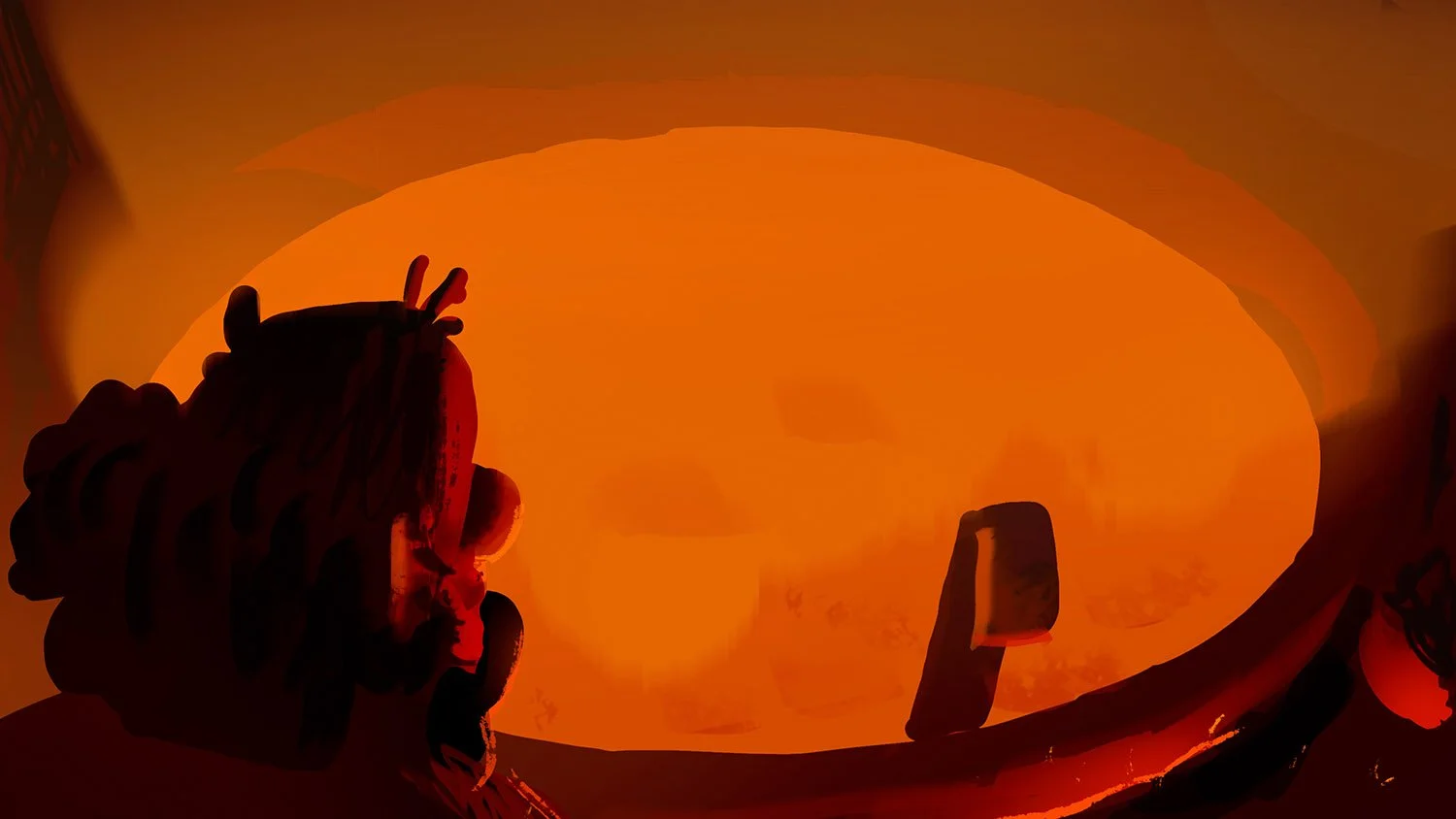
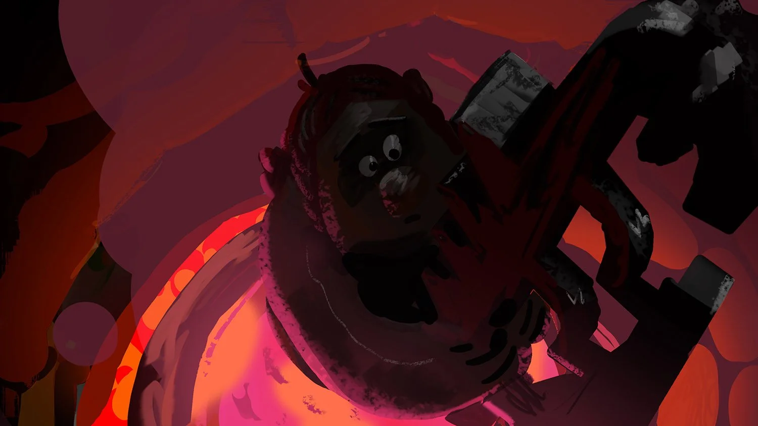
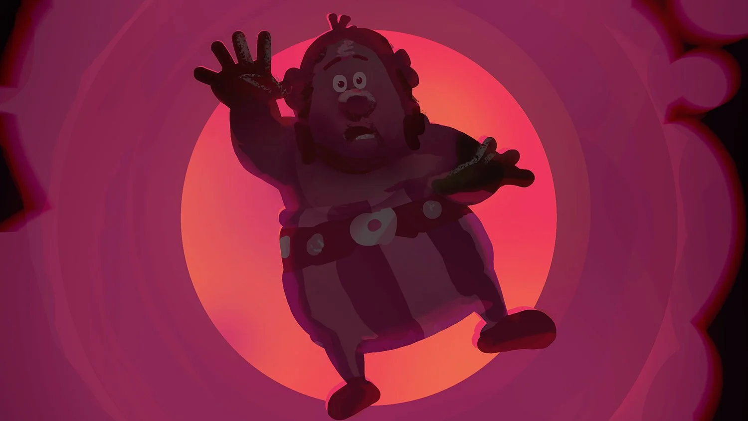
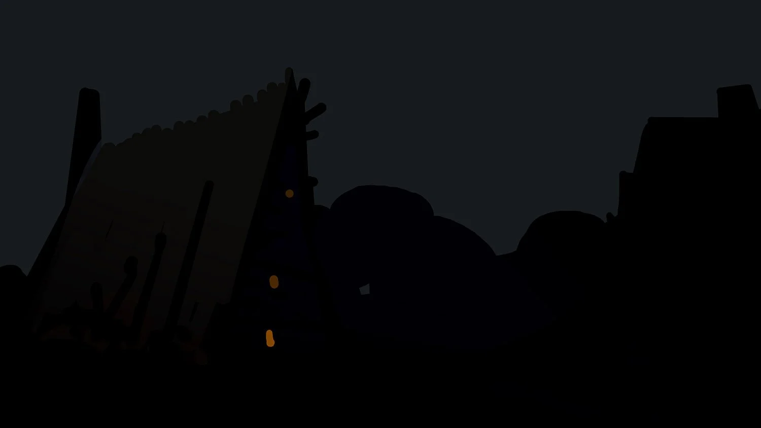
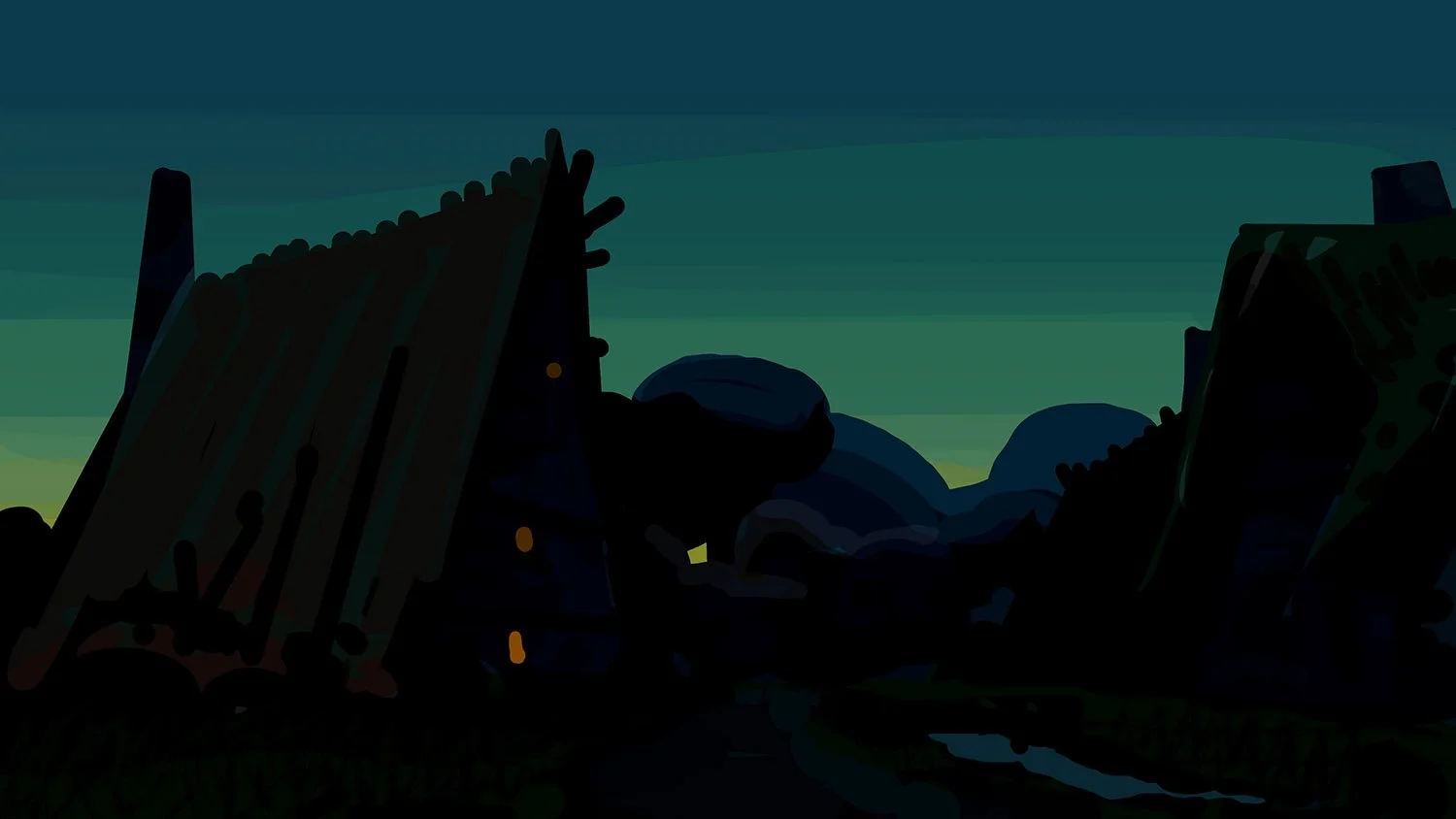
EPISODE V ColorKeys:
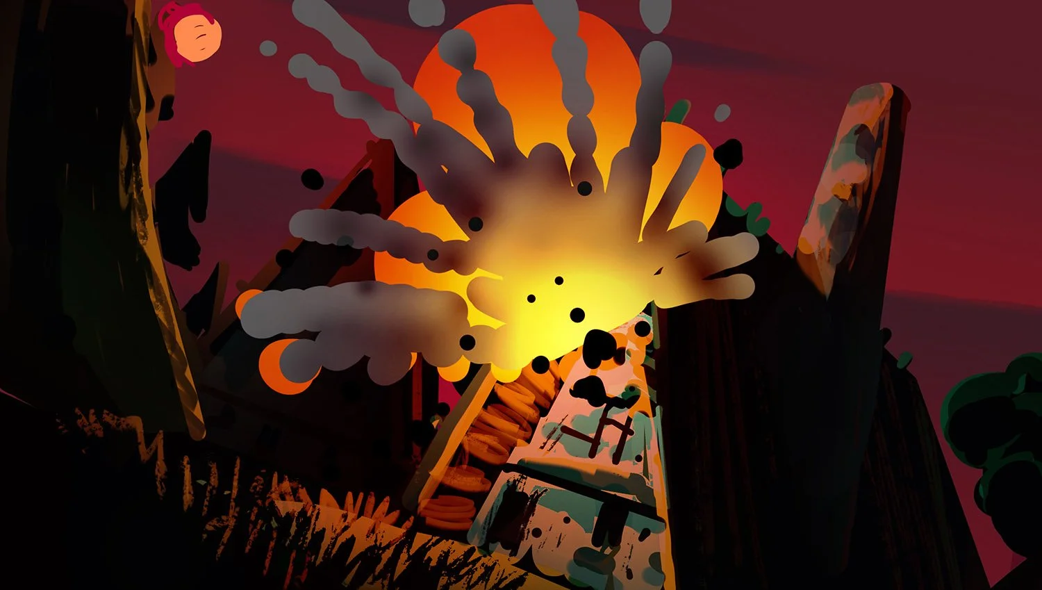
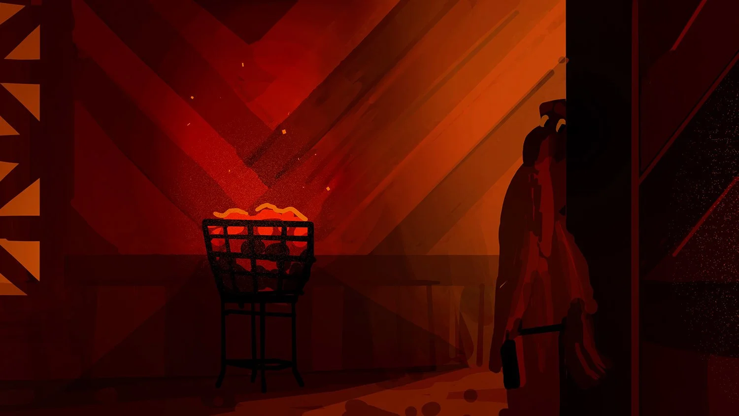
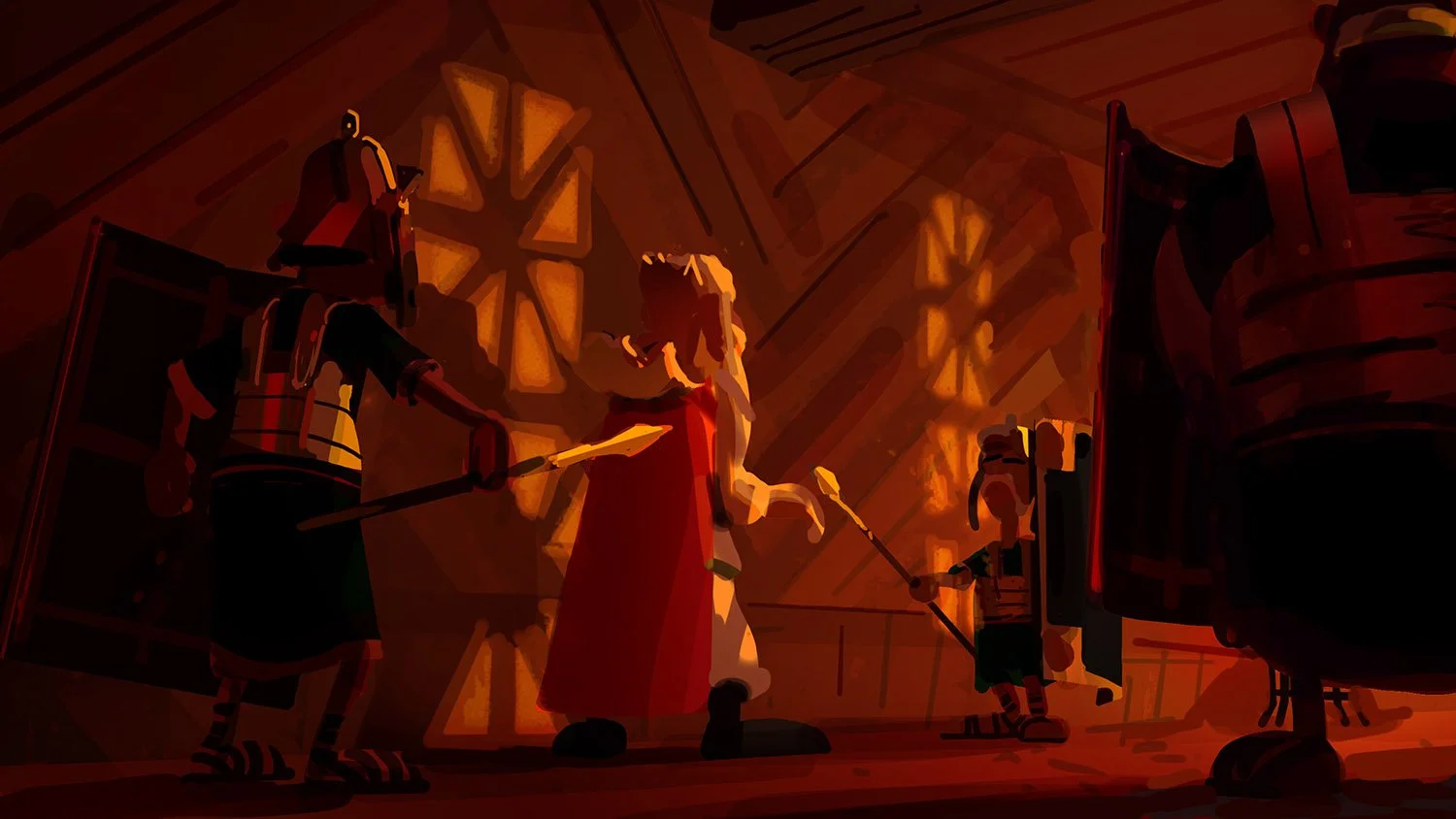
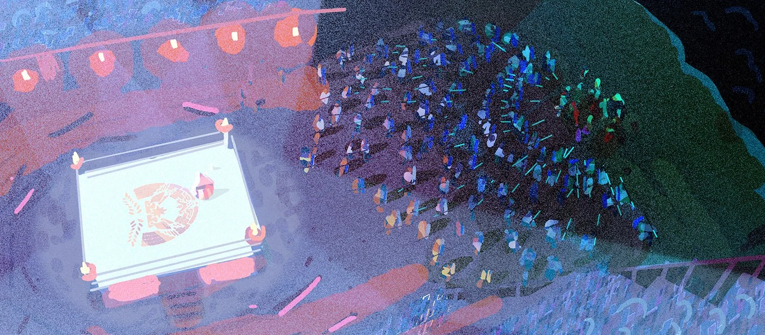
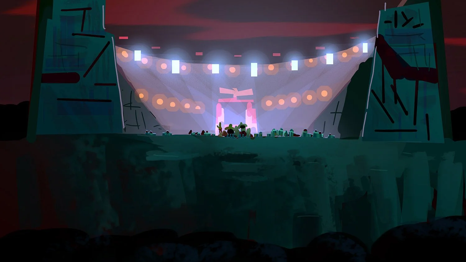
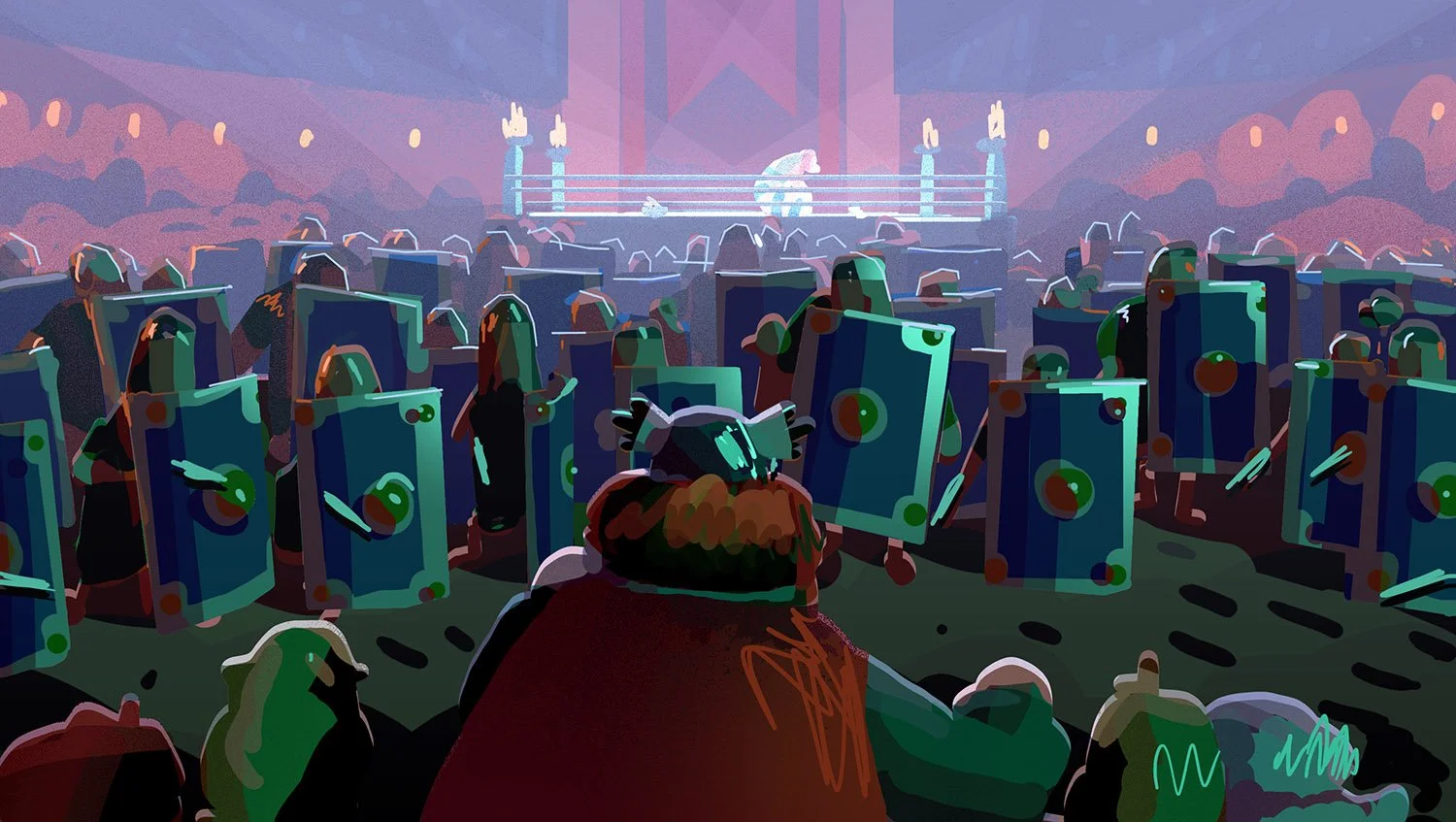
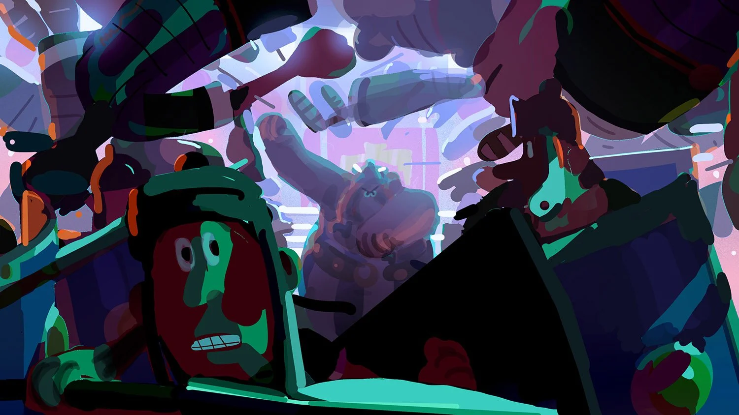
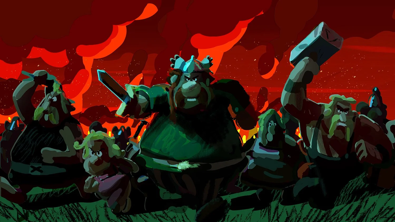
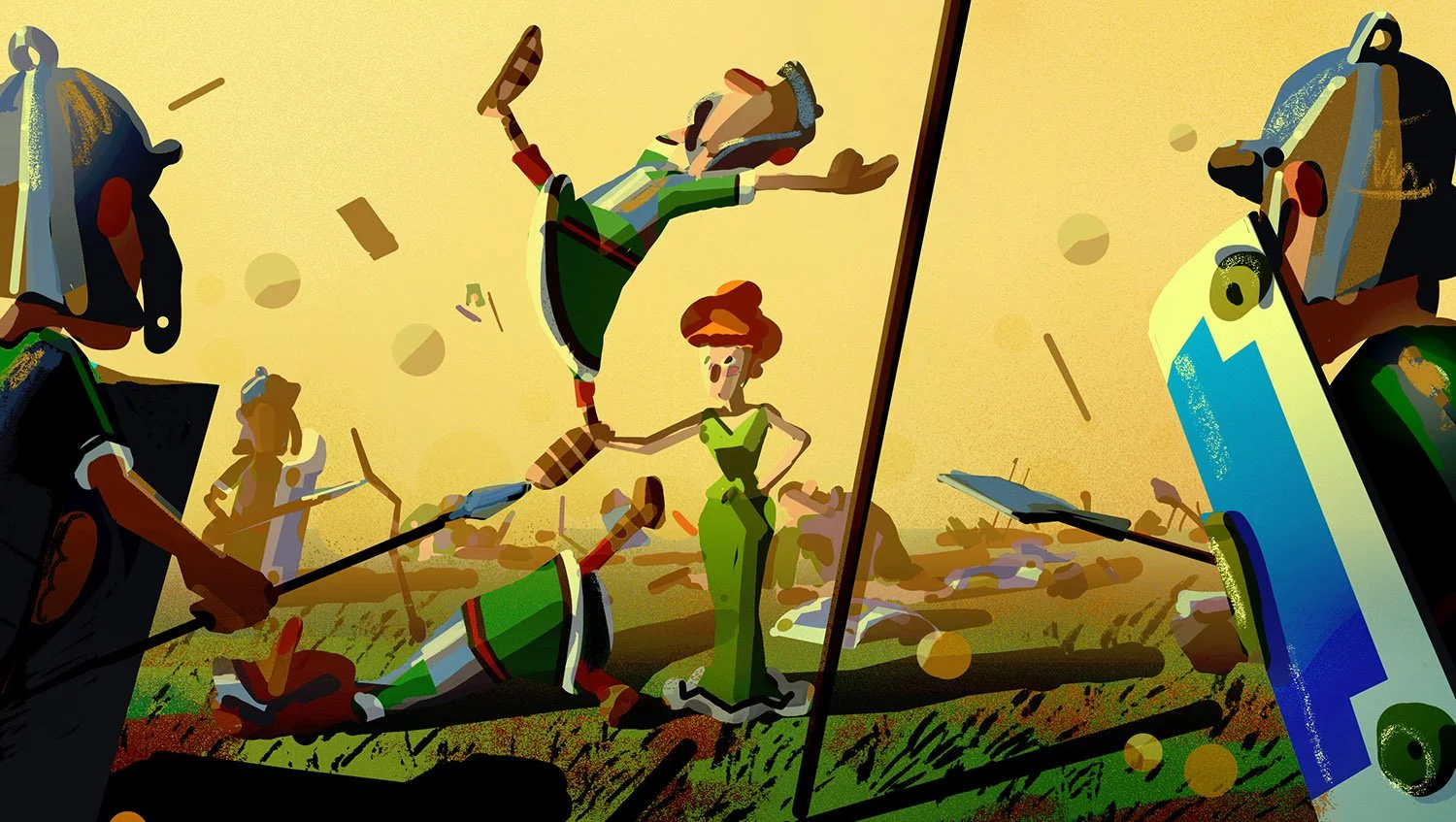
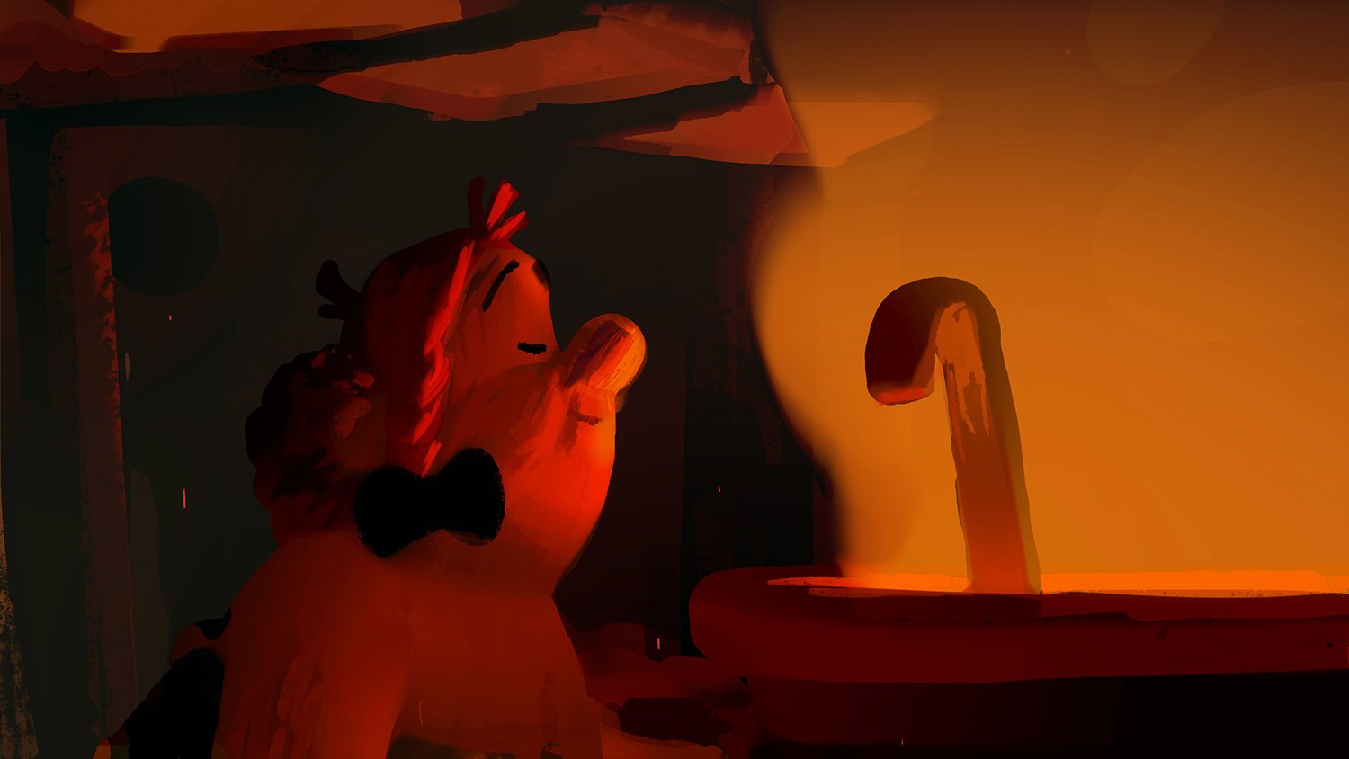
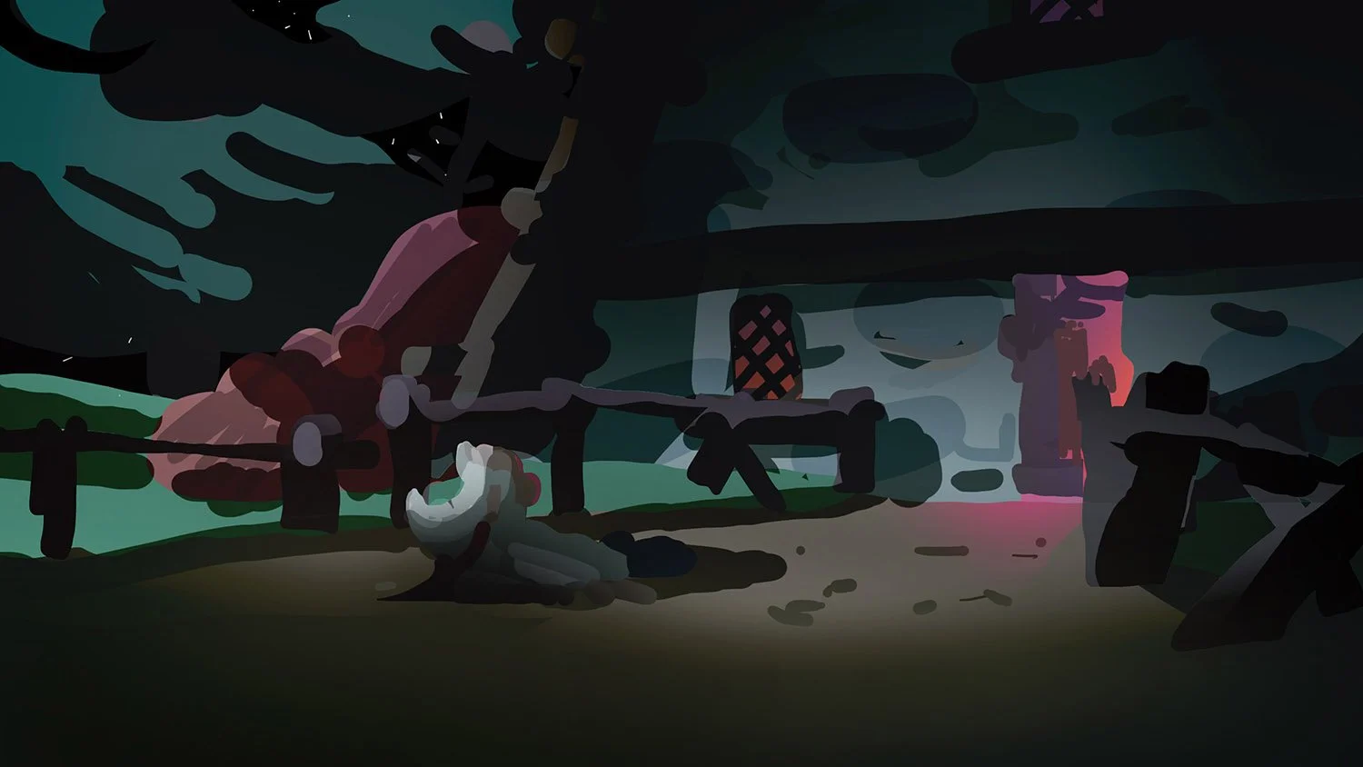
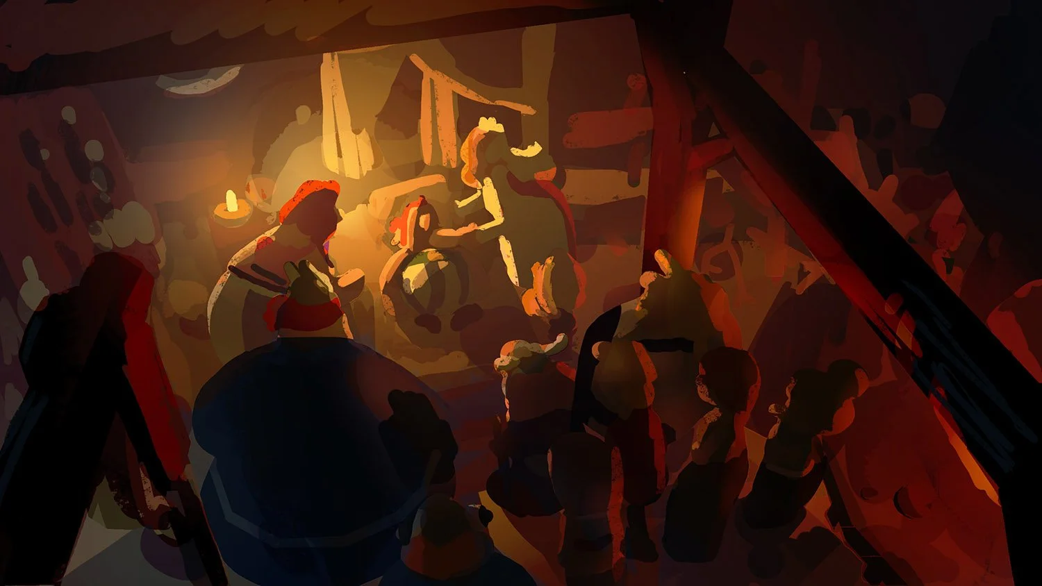
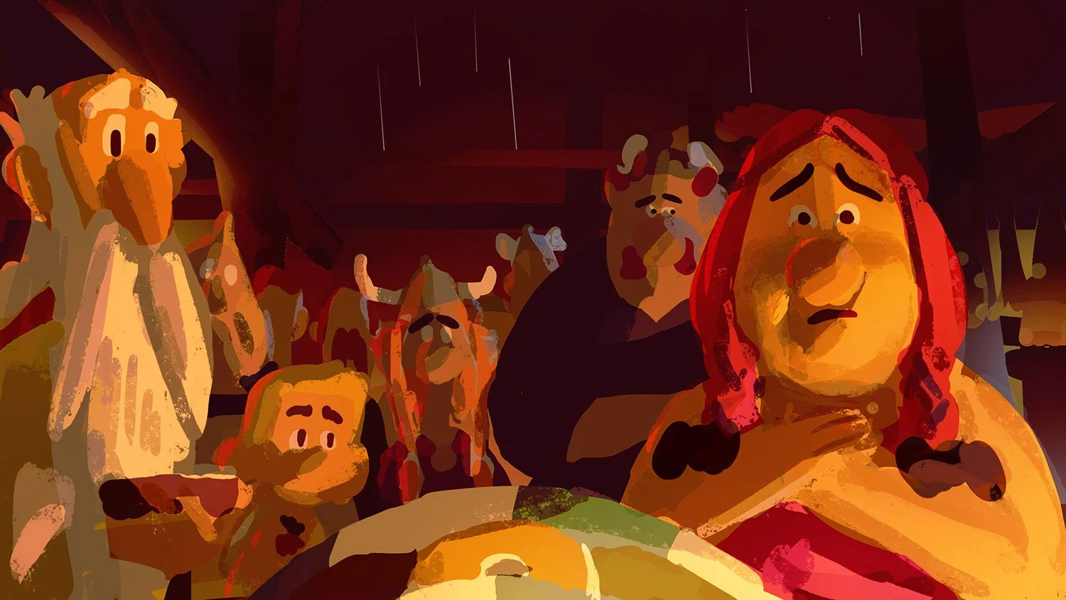
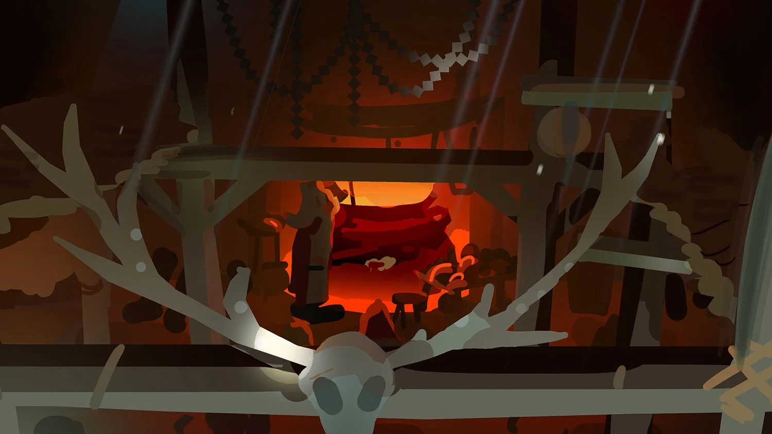
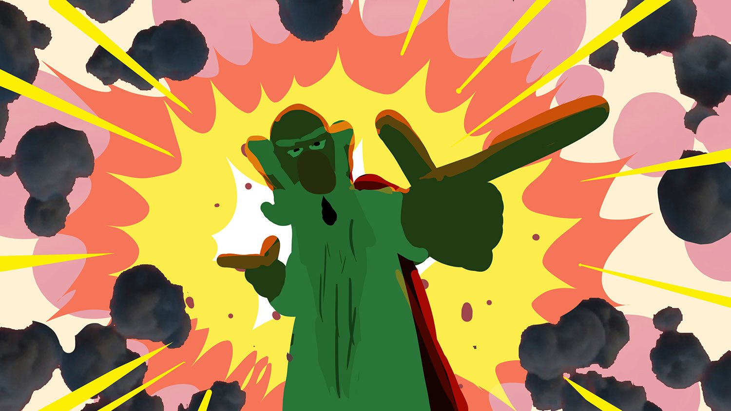
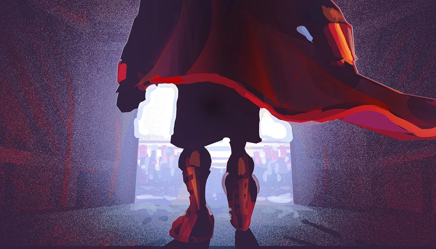
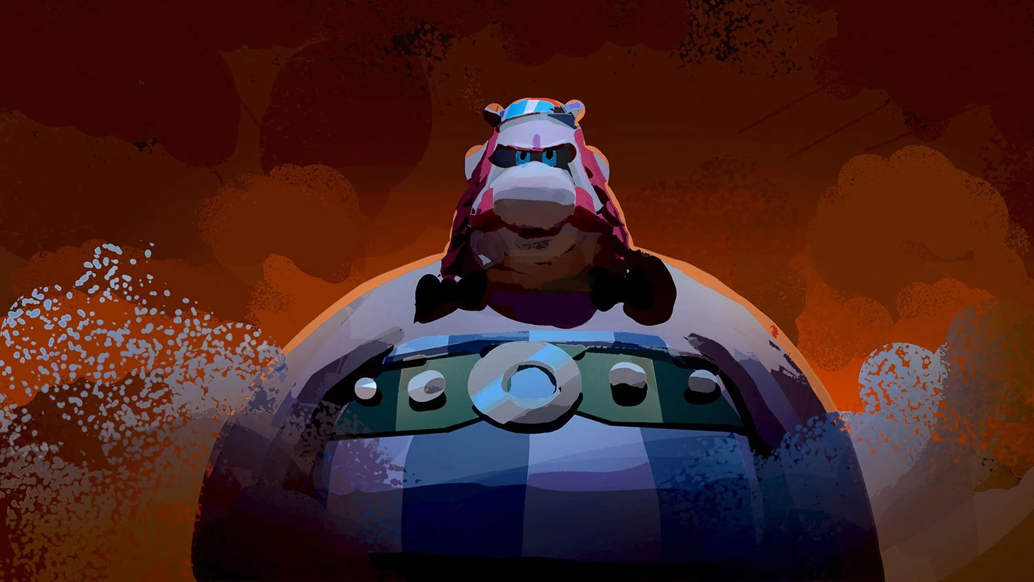
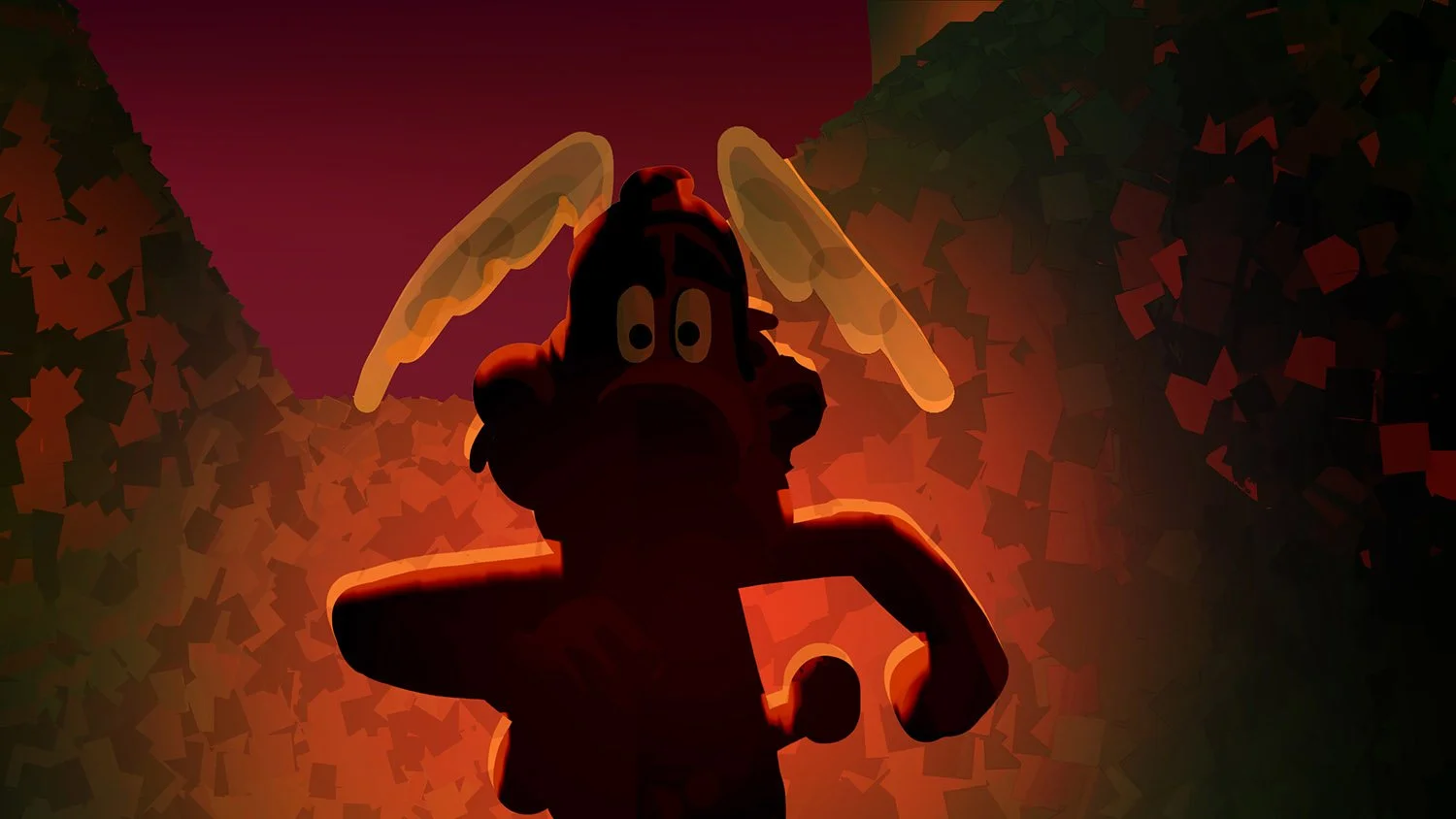
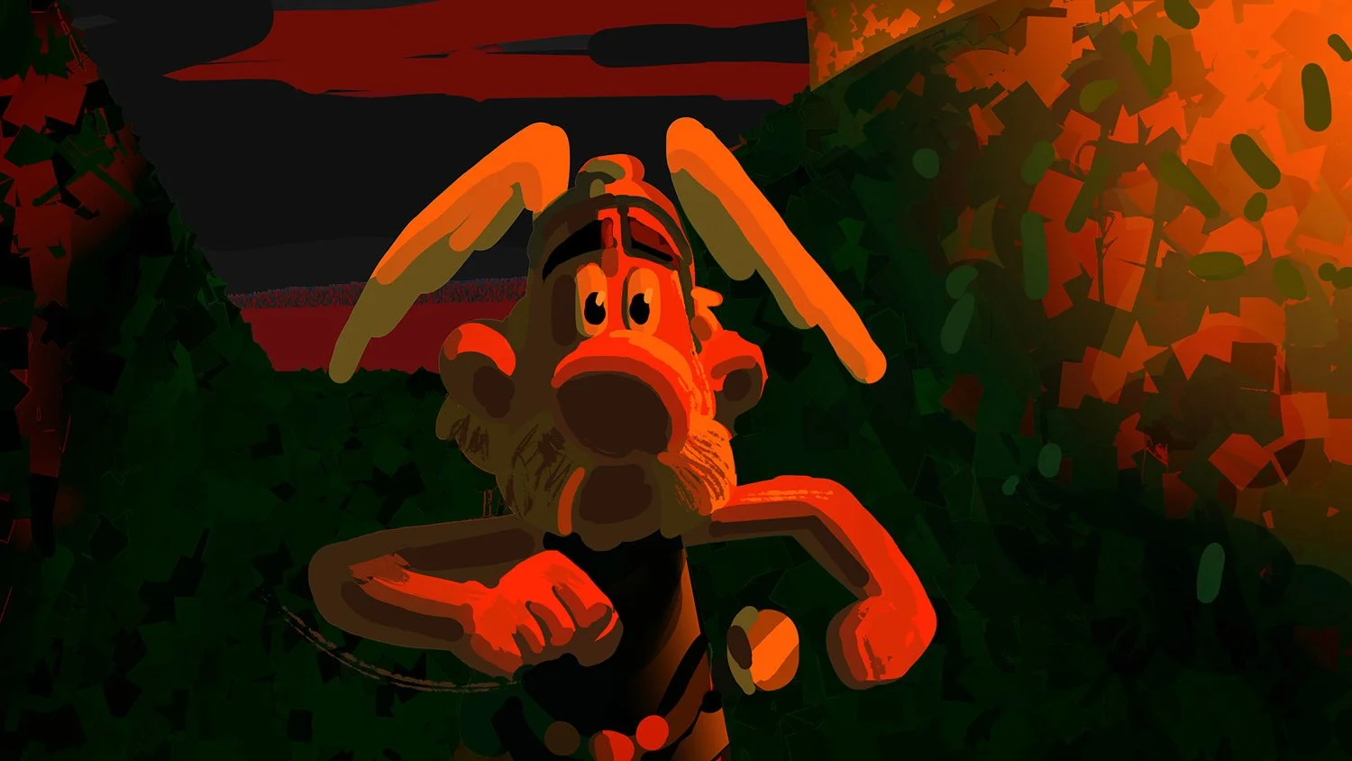
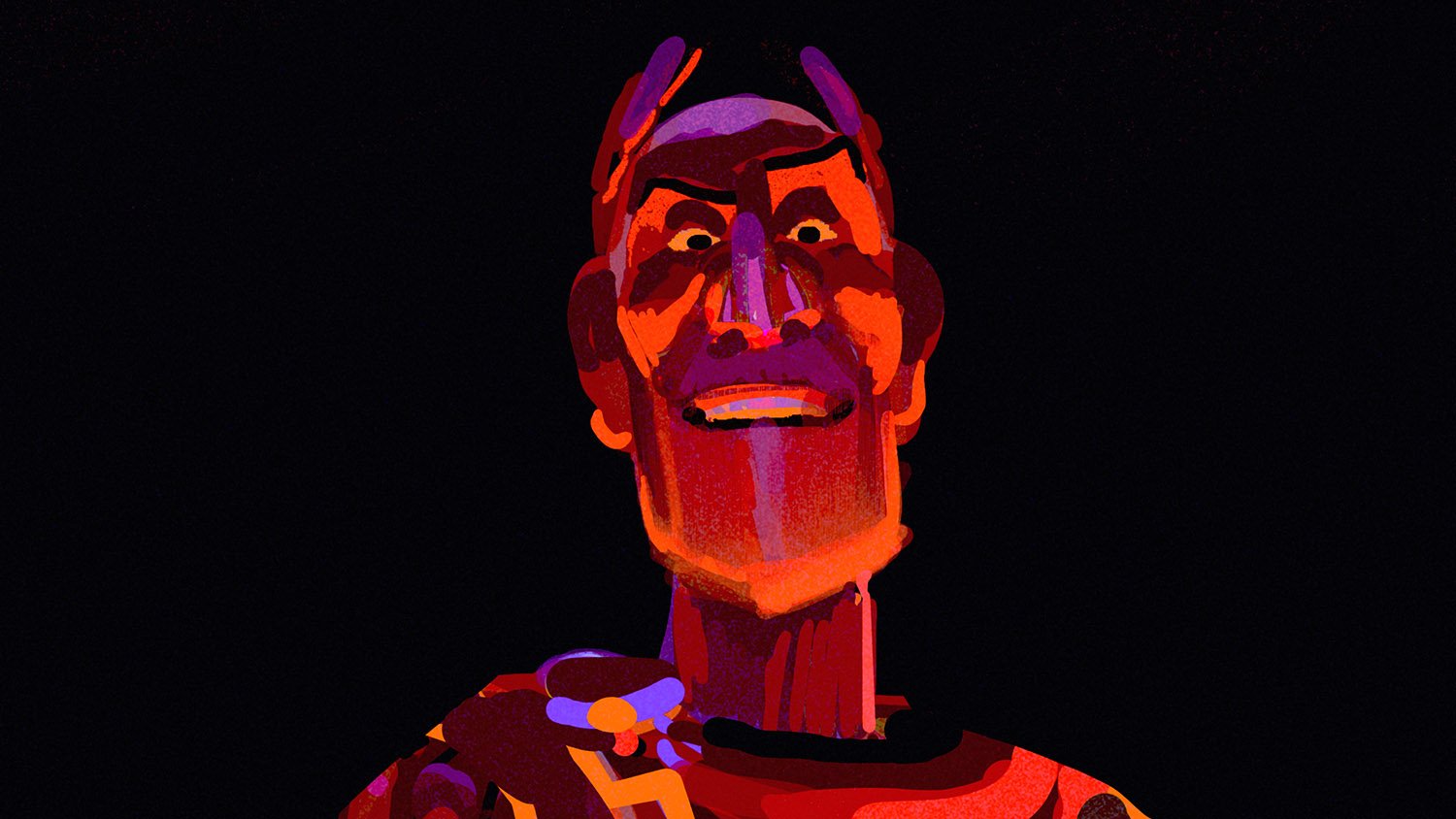
For the last episode it was important to push the cinematography of the lighting beyond what’s typical for a comedy. Even though the tone remains playful, we wanted the dramatic and action moments to feel truly cinematic and impactful. The lighting design relies on large shadow areas and a strong use of chiaroscuro, creating depth, tension, and contrast.